|
| Group |
Round |
C/R |
Comment |
Date |
Image |
| 32 |
Sep 19 |
Reply |
Since there is sunlight on his glasses, maybe a little fill-in flash would have helped to counter that. I do agree that flash is usually a problem -I rarely get it right and it produces hard shadows which then need dealing with. So, a different time of day so the sunlight is not falling actually on to him? |
Sep 13th |
| 32 |
Sep 19 |
Reply |
Yes, that was what I felt. I had asked them to be very serious and cross looking, with one looking at the other. The girl on the right kept dissolving into giggles which made it hard for her. However, as i said, the judges don't seem to get the message at all. |
Sep 13th |
| 32 |
Sep 19 |
Comment |
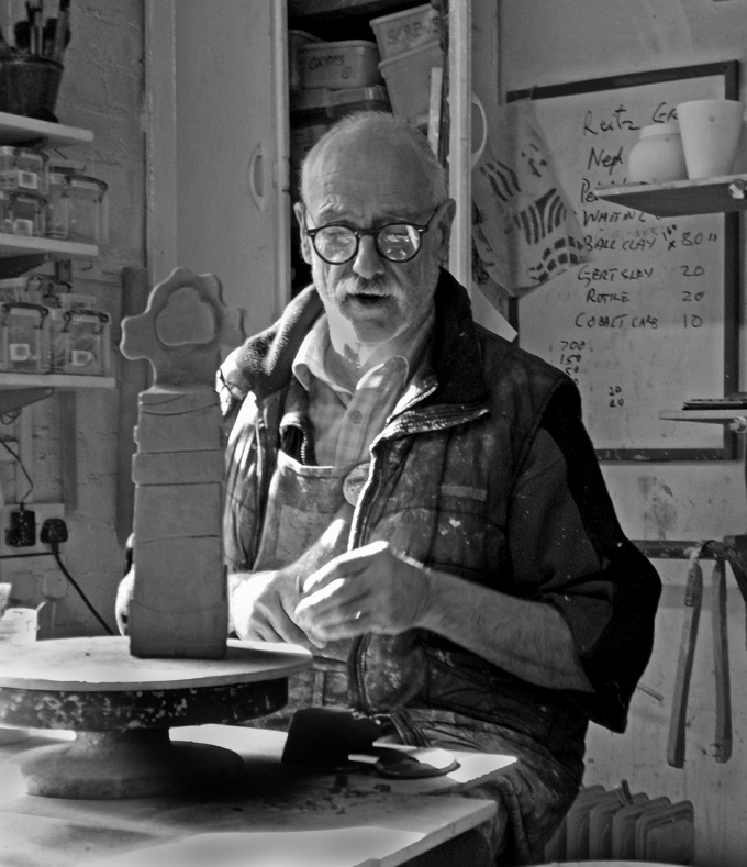
I think you could quite easily darken the overbright highlights as it looks as if you have already started doing that on the front plank. I like him in the setting -it would look completely wrong to extract him. However, I tried cropping a bit of the right and some off the bottom to make him more dominant in the frame and to lose the grey bits at the bottom. It's a pity his hands are not actually doing anything to the work in progress. Do you have any other shots? I have tried the cropping and darkening, leaving enough of the background to show his workshop. |
Sep 12th |
 |
| 32 |
Sep 19 |
Reply |
Thanks for that set of suggestions. I did have a shot of them looking at me, but i didn't think it was a striking as this one where I thought the glare of the left girl was antagonistic with the right one looking so grim. I obviously saw more in the serious looks than anyone else does! I'll have another look at my other shots to see if any of them are better. |
Sep 12th |
| 32 |
Sep 19 |
Comment |
I appreciate this is not mono but the head seemed to fit well. |
Sep 9th |
 |
| 32 |
Sep 19 |
Comment |
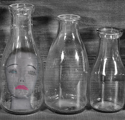
I think this doesn't quite work, partly because they are just in a straight row across the frame. I tried 3 bottle crop, using the 3 different sized ones but it still needs something. maybe you've got to be creative here and put something inside the bottles. |
Sep 9th |
 |
| 32 |
Sep 19 |
Comment |
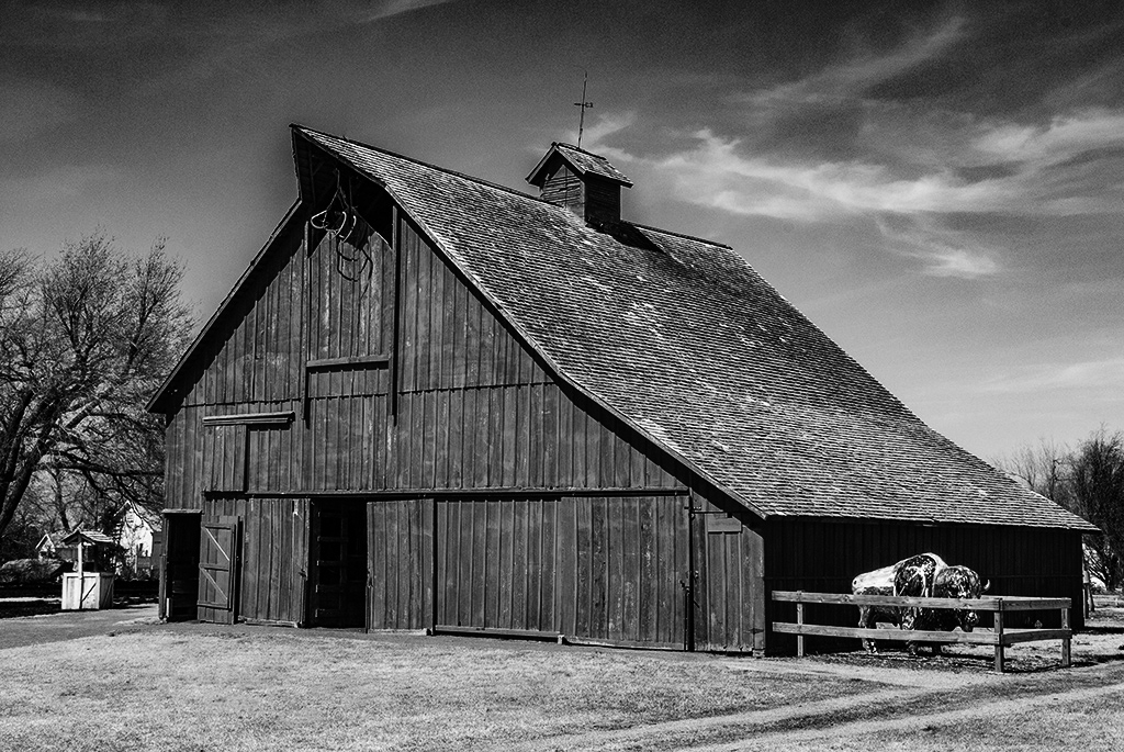
I like this mono version as I do find the bison distracting in colour. I wondered whether you could increase the contrast somewhat to darken the sky and allow the barn to be more dramatic in the frame. It's not easy doing anything with such a small image but I think it looks better. |
Sep 9th |
 |
| 32 |
Sep 19 |
Comment |
I agree with all the comments! We've been on similar buses and maybe the greyness is right because that's just how you feel when you are stuck on them. However, it does need increasing the contrast to make it better because most judges won't like the grey. You do need the whole mirror rim but you were so clever to remember to flip it so we could read Canon.
|
Sep 9th |
| 32 |
Sep 19 |
Comment |
I shouldn't have read the other comments as now I can see all the problems they picked up! I am adding to them as well. When I increased the shot to full screen I was aware of a white halo along all the edges. I don't know whether this is inherent in the original, or due to the conversion or just because I was blowing it up too much, but it detracted from the shot for me. I do like the mono much more than the colour and you've brought out the clouds superbly. The woman does look very unsure of herself but I might have felt the same in that situation. |
Sep 9th |
| 32 |
Sep 19 |
Comment |
I agree that Jennifer's version is really good. I prefer the brightness of the gazebo as it makes it stand out so well. I also think the colour looks good but I think I prefer the mono. |
Sep 9th |
7 comments - 3 replies for Group 32
|
7 comments - 3 replies Total
|


