|
| Group |
Round |
C/R |
Comment |
Date |
Image |
| 32 |
Aug 19 |
Comment |
I think the bird is beautiful but I hate the background! So, since this is not for Nature, go for a good background. A really gloomy, stormy sky would fit well with the angry looking bird. I can't tell it is simply calling to a mate so make it fit with what you want it to be. The feather detail etc are all great so don't waste this shot! |
Aug 30th |
| 32 |
Aug 19 |
Reply |
Yes I think I agree that the clouds are too bright. Thanks Ian. |
Aug 30th |
| 32 |
Aug 19 |
Reply |
That is very true. We do like the environment or habitat to show! |
Aug 11th |
| 32 |
Aug 19 |
Reply |
OK, it's all a question of what the photographer thought of! I think the colour one is too ordinary and wouldn't get anywhere in competitions even if I brought out the structure more. Blue sky and wispy clouds are just too nice! They look like a holiday snap rather than a good photo. I've been looking at other peoples' photos and seeing just how much an ordinary picture can be transformed into a higher level image. maybe I'm just not very good at it yet. |
Aug 11th |
| 32 |
Aug 19 |
Comment |
Now I really like that! The colour just lifts it completely! Much nicer than the mono I think! |
Aug 10th |
| 32 |
Aug 19 |
Comment |
I just hope you are more successful than I am ever going to be! |
Aug 10th |
| 32 |
Aug 19 |
Comment |
I am attaching the second photo now since I couldn't get two on one. |
Aug 10th |
 |
| 32 |
Aug 19 |
Comment |
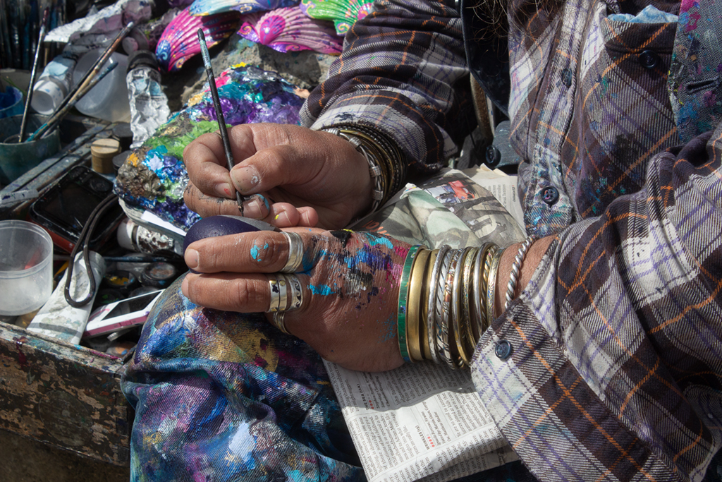
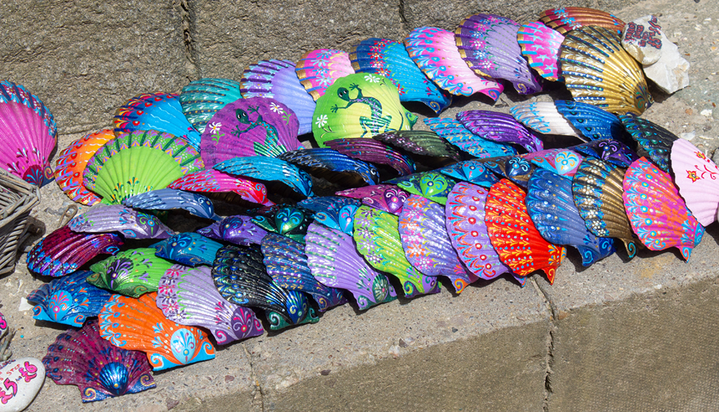
I have also been to Lulworth and Chris the shell man is always there! In fact I have photos of him which I have used in PJ competitions. When you take a photo of him, he also takes one of you. I attach the hands I've used and also one of the shells that he paints. They are 5 or 6 pounds each.
I think I agree that the background is essential and that you need to darken it so he stands out more. At the moment my eye is drawn to the legs and boots and his hat and I think I need to focus more on his hands and what he is doing. |
Aug 10th |
 |
| 32 |
Aug 19 |
Comment |
I agree with Stephen here that the wall is a stopper to the viewer. I think a good crop is needed and I might go further than Stephen and take off the left corner of the square tower to put the bell tower inn a more prominent position. I don't object to the structure behind it as it is smaller and actually creates a triangle shape leading up to the bells. Were you aiming for a semi high-key effect as it appears a bit pale on my monitor? I think i would go for greater contrast -darken the sky so the bell tower stands out more. |
Aug 10th |
| 32 |
Aug 19 |
Comment |
I'm afraid much has changed in GB. WE now have town centres devastated by shop closures as out of town retail centres have taken over. We are aware of it though and some towns are fighting back. I personally live at the edge of a small town with local shops with supermarkets a short drive distance away and then massive retail places further away. As you remark, the locals centres need the flats, houses and other community places like the library as well as the restaurants to attract people.
Now to your picture, I'm not sure the photographer was going to get a good shot -the model isn't sitting elegantly enough! My only thought with this shot is that maybe the best view would have been even further away so the photo shoot became just a small part of the whole street scene. Here, the photographer is too dominant -he occupies a third of the image and he has rather a boring T shirt and back view. The model is so much smaller in the frame. Were there no other people around? It looks very empty. (I've just read Larry's comment and he is saying the same thing). Street photography is always difficult. I'm not good at it at all so maybe my advice is not very good either. |
Aug 10th |
| 32 |
Aug 19 |
Comment |
I'm never sure about sunrises or sunsets in mono, because for me the whole point of being up at that time is the wonderful colour. So, I agree with Stephen that the position of the jetty is good. It leads into the open seascape and the brightest part of the sky is just beyond it so becomes a focal point, but I wonder whether the rest of the sky actually needs even more darkening to emphasise it. |
Aug 10th |
| 32 |
Aug 19 |
Reply |
Thank you! It was surprisingly easy to get there -just using control points in Nik to reduce or enhance different bits of the scene after the initial mono conversion. I do quite like 'playing' with photos! |
Aug 10th |
| 32 |
Aug 19 |
Comment |
I agree that this works for this monument. I also think what Stephen has said is right -the base could be darkened somewhat. The only thing which might change it entirely would have been a dramatic sky on the day instead of a gorgeous blue one. We are never satisfied are we, with the weather? Perhaps you could import a stormy sky behind to emphasise the dreadful wartime conditions which were the background to the Normandy landings. |
Aug 8th |
| 32 |
Aug 19 |
Reply |
OK, I did wonder whether I'd actually gone over the top with the black, but I liked the castle as it was. I actually spent quite a long time with control points in Nik, changing areas, like the trees so there was some hint of detail there. I've been judging a mono section of an International this week and really the ones which stand out are often the very dramatic OTT images or the high key, subtle one. Just ordinary doesn't ever do well. |
Aug 8th |
9 comments - 5 replies for Group 32
|
9 comments - 5 replies Total
|


