|
| Group |
Round |
C/R |
Comment |
Date |
Image |
| 32 |
Apr 19 |
Reply |
I Like the look of this version too. |
Apr 29th |
| 32 |
Apr 19 |
Reply |
It does look as if it's tilting. It may just be an optical illusion but I'll straighten it. |
Apr 29th |
| 32 |
Apr 19 |
Reply |
I've never in my life used chains on tyres. We just don't get snow here but if it does come, and lasts longer than a couple of hours, we hunker down and don't go out! British people by and large have no idea of how to drive in snow so it is very dangerous to be out and about. I have driven a few times in snow when we've been caught out but I hated it. Without Winter tyres again it felt scary. My sister lived in Scotland and she had winter tyres because she lived at the top of a hill and needed them. |
Apr 29th |
| 32 |
Apr 19 |
Reply |
I'm beginning to get the idea that my darker theme was wrong for this , mainly because of the fluffy white clouds which are at variance with the concept of gloom. So perhaps I need to start again and go for brightness instead. Thanks. |
Apr 12th |
| 32 |
Apr 19 |
Reply |
I'm please you weren't horrified at what I'd done! I know the problem of remembering -pictures provide emotional triggers and bring back super memories and then we find it hard to be critical of our own images. It is a pleasant shot with the sitting guy balanced against the walking figures and they help to give a sense of perspective. It does also give a feel of sunshine and a relaxed period of time as Ron and Lynne noted.
Glad English is known in your neck of the woods! |
Apr 11th |
| 32 |
Apr 19 |
Comment |
OK, tel boxes are ten a penny here so don't have the same impact for me but when kept in colour can do quite well in USA comps! One day there won't be any because everyone uses mobile phones. I actually thought you'd tilted the box slightly when you cropped and there is a small white area between the wall and the branch which is very annoying. I think I'd have cropped the right hand side as you did but left a bit more of the brickwork, suitably darkened down, on the left. That would make it more pictorial rather than a snapshot of your friend standing at a tel box. I agree the white leaflet is annoying. |
Apr 10th |
| 32 |
Apr 19 |
Comment |
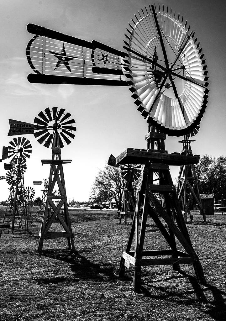
I'm not sure it needed straightening so that would have left more at the top. On my monitor the whole image is rather dark, so maybe it needs lightening of the highlight areas. That would bring the vanes on the front windpump up to the fore and emphasise them. Depending how good you are at cloning, could you take out some more of the windpumps at the back? They are too complex and draw the eye away from the front two. It's a shame they are all so closely clustered! |
Apr 10th |
 |
| 32 |
Apr 19 |
Comment |
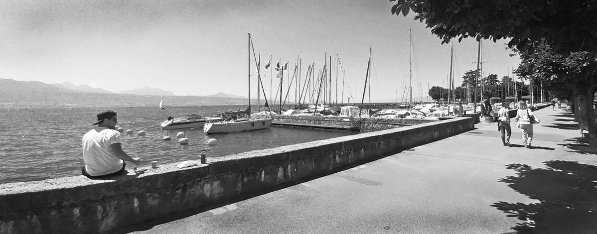
OK, you are probably going to hate what I've done, but I felt this needed some changes! First of all, it may be an optical illusion but the horizon seemed to tilt the water down to the right, so I straightened it up a little. Then I cropped off a lot of the blank sky and some of the boring pavement so it became a letterbox shape -do Americans know what that means since you don't seem to have them in your front doors? Then I decided that I doidn't like the gap between the two figures and the only way to deal with that was to take out the central one as the other guy did provide a lead-in. I found the cars and stalls on the right of the trees rather distracting so they had to go and the trees further away didn't have the gaps between them so they still provided a sense of perspective. Then I darkened the sky at the corners and some of the pavement and finally using curves I increased the contrast. None of that was easy, especially the cloning part, as it is such a small image to work on, but I did feel that I had kept the dynanics of the picture. What do you think? |
Apr 10th |
 |
| 32 |
Apr 19 |
Comment |
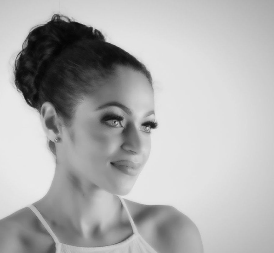
I like the ethereal look and this is not 'out of focus' so they can't have been referring to yours. I do feel the model has been chopped off too much at the bottom. I wanted a bit more of her shoulders, which you've managed not to get overbright. Well done. However i also felt the head was too central against that rather boring background. A nice mottled curtain behind would have been better. I tried cropping some off the left so she was not so central but it still leaves the bland background. It changes the dynamics of the format. |
Apr 10th |
 |
| 32 |
Apr 19 |
Comment |
I am so jealous as we were there in the Summer and Winter is clearly so much better! I love the delicate tracery that the snow produces and the cloudy sky is a bonus. I think maybe the contrast needs to be increased a little but the snow looks white on my screen. It's always a problem when you have a reflected landscape to know how much to include. Since the reflection is not clear at the bottom, I tried cropping it off at the end of the bright tree reflection so the eye is pushed upwards to concentrate on the cliff face and so the water's edge is nearer the base. I think it makes the cliff, waterfall and clouds more dominant. |
Apr 10th |
| 32 |
Apr 19 |
Reply |
Because the light was only catching small bits of the ship and I wanted them to stand out. I couldn't help the good sky behind them -unusual for Iceland where it is frequently overcast and/or raining. Perhaps I shouldn't have lightened the clouds because it made them stand out more. Maybe I should have made the sky darker still. Is there a dichotomy of interest because they compete for attention with the ship? |
Apr 9th |
| 32 |
Apr 19 |
Reply |
I was aiming for DARK! Perhaps I went too far this time. I'll try lightening and see whether it works better. |
Apr 8th |
5 comments - 7 replies for Group 32
|
5 comments - 7 replies Total
|


