|
| Group |
Round |
C/R |
Comment |
Date |
Image |
| 32 |
Dec 18 |
Reply |
The one I entered is actually darker than this one. Thanks Ian. |
Dec 18th |
| 32 |
Dec 18 |
Comment |
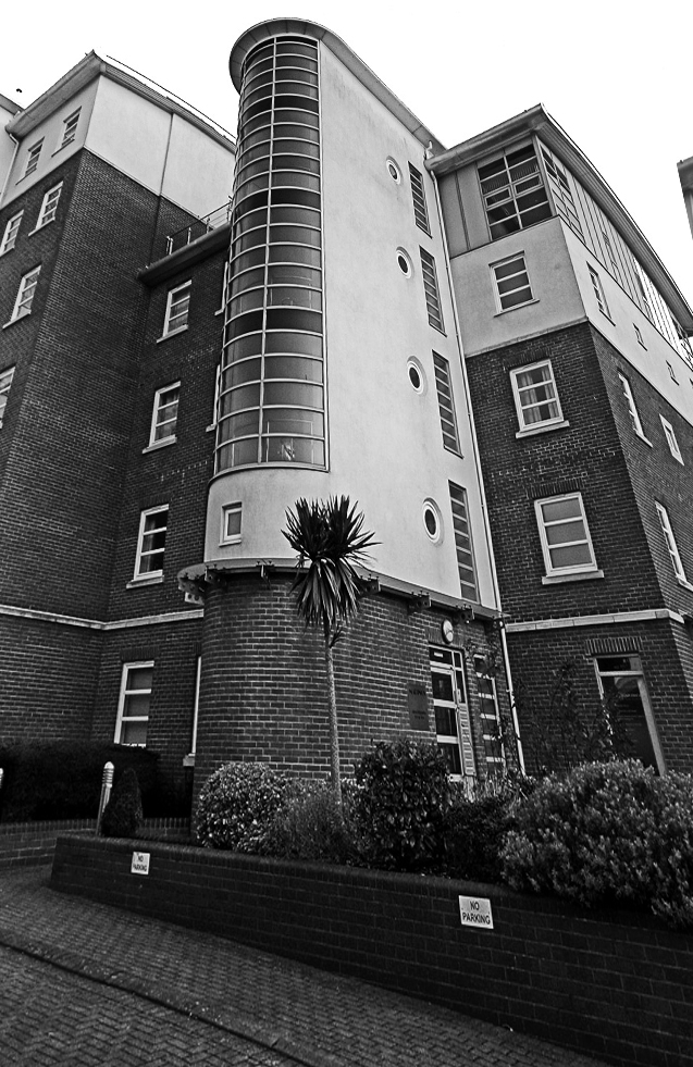
I actually don'y like this amount of tilt. I think it should be either much more or much less as this is neither one nor the other. I put yours through silver efex high structure to add to the texture but the sky is still rather a problem. The signs do stand out too much so clone them out. Also don't like the grid on the pavement. I put it through edit /transform/distort to try to increase the tilt and then cropped in. Do you like this version? |
Dec 18th |
 |
| 32 |
Dec 18 |
Comment |
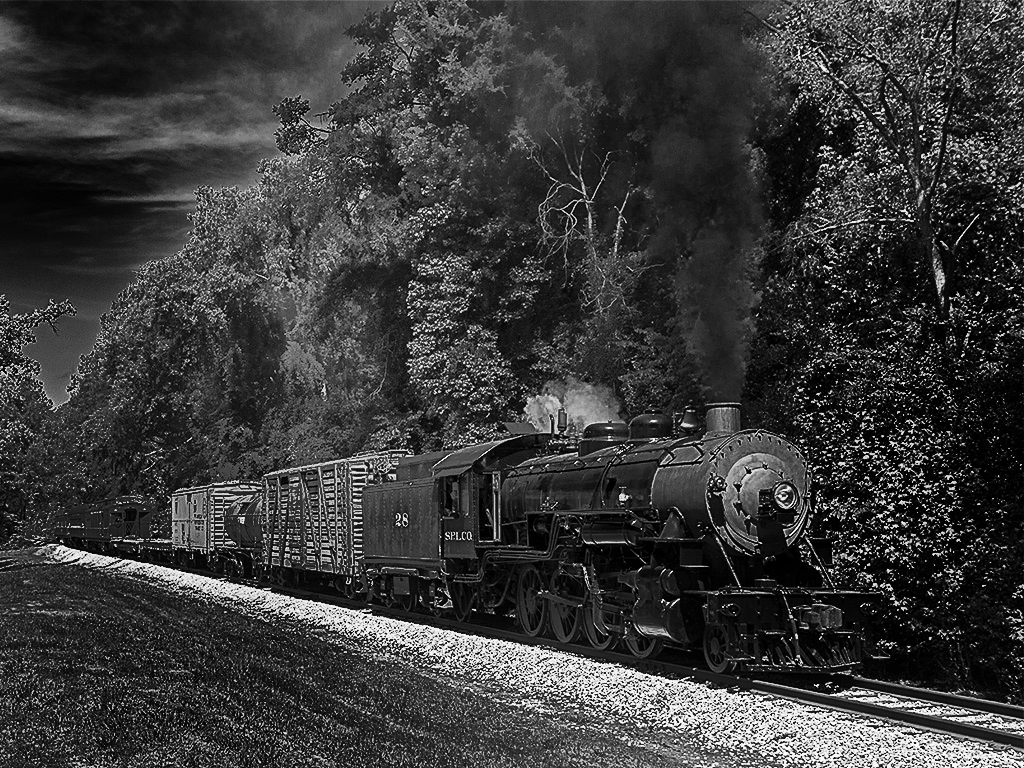
Good shot and much better in mono. I also think the smoke could be more dominant -maybe by lightening the trees or actually making the smoke darker. I feel the grass should be darker as well which would emphasise the streak of white pebbles even more. I've had a little go, but on such a small photo it hasn't worked very well. |
Dec 18th |
 |
| 32 |
Dec 18 |
Comment |
Could be a reflection or maybe a cyclist going past and stopping but then the bike and person would be visible. I found the large expanse of sky rather off putting and I felt the whole image needed more contrast -but you know I like punchy shots. I did feel there were 3 elements in this and my eye kept bouncing round from one to the other -the tower, the figure and the lights. I might crop from the left and increase the texture and variation in light on the pavement. |
Dec 18th |
| 32 |
Dec 18 |
Comment |
I agree with Janice that the mono is better than the colour and also you need to leave more room in front. The rules allow manmade bits if it is typical of the bird's habitat eg like barns for barn owls, but is this high voltage pole relevant to the bird? I think that judges would not be happy with this, partly because the words draw the attention away from the bird. |
Dec 18th |
| 32 |
Dec 18 |
Reply |
Suddenly realised that I hadn't done any comments, for which many apologies. I love pictures like these of patterns. I like the framing of the rushing water and mono seems a good idea as it was probably near mono in real life. In fact I love Janice's other photos as well. I would rate these highly if they appeared in competitions. |
Dec 18th |
| 32 |
Dec 18 |
Reply |
I've just had it accepted in Wareham International! |
Dec 15th |
| 32 |
Dec 18 |
Reply |
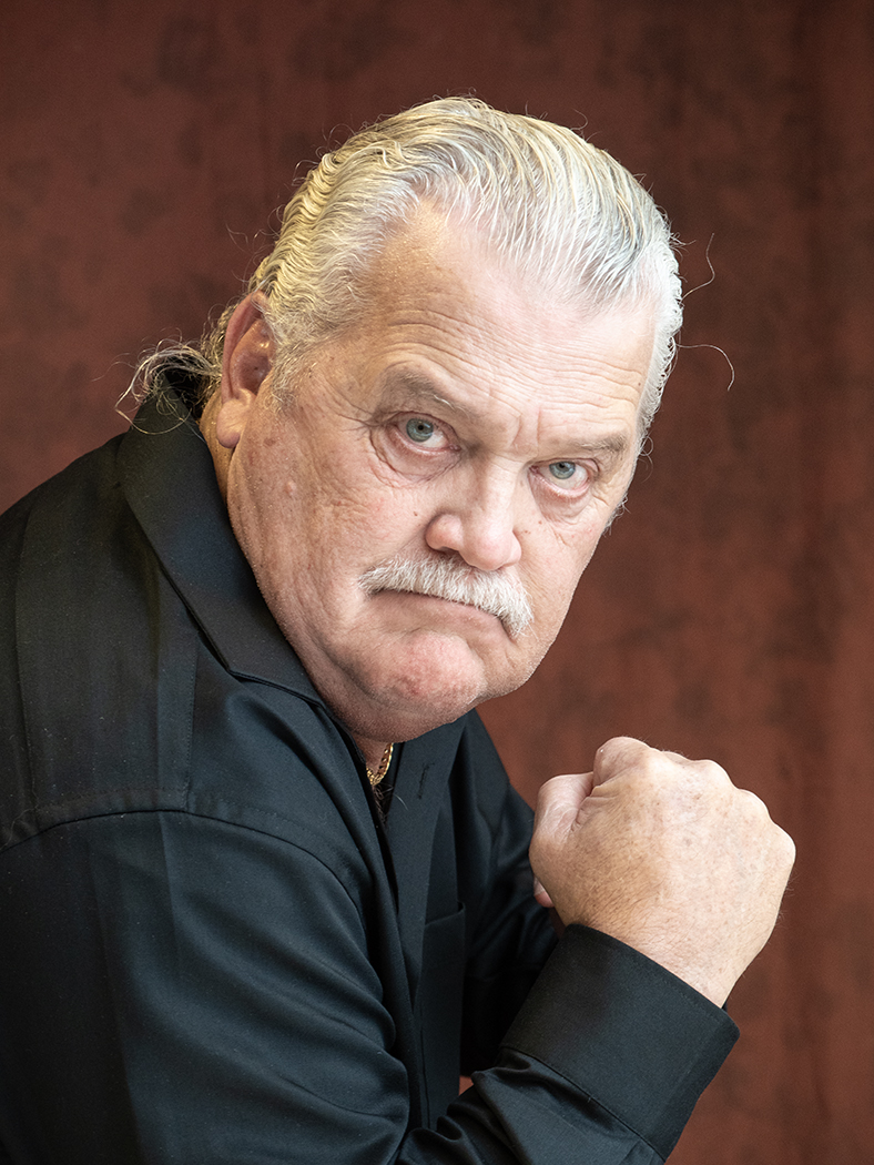
I should point out that Randy is a lovely guy! |
Dec 13th |
| 32 |
Dec 18 |
Reply |
HERE IS THE LOOK AT ME |
Dec 3rd |
 |
| 32 |
Dec 18 |
Reply |
I have just entered this in a comp-I was sent his email address and he said OK. I saw the hair and cloned it out for the comp because I didn't like it. I'll hunt out a picture of him looking at me. |
Dec 3rd |
4 comments - 6 replies for Group 32
|
4 comments - 6 replies Total
|