|
| Group |
Round |
C/R |
Comment |
Date |
Image |
| 32 |
May 18 |
Reply |
yes, I think the right crop is better and I think you've darkened the background more, which is something I've since done. i have entered it in a competition with more contrast and darkness so we'll see if they like it. |
May 17th |
| 32 |
May 18 |
Reply |
I took loads of photos so maybe I have one where the frame is better placed. I liked this one because the horses were separated and one appeared to be looking at me. You are also telling me it's too tame.
Thanks for visiting. |
May 16th |
| 32 |
May 18 |
Reply |
I think you've done a good job-exactly what I meant but didn't have time for. Thanks |
May 15th |
| 32 |
May 18 |
Comment |
It looks fine on mine, but I have found that I need to reduce brightness for actual projection -the difference between projecting and reflecting vision.
I know what you mean by no wow factor, which is kind of what I was thinking. It's a 'nice' photo but nothing special. |
May 15th |
| 32 |
May 18 |
Reply |
I haven't used it at all but quite a lot of our new members have gone for it if they haven't started with Ps. It does seem to cover most of what people might want to do, but I'm not going to change now! I have Nik as an adjunct as well as Topaz for weird things though I have never really got to grips with it and I have ON1 or perfect Suite which seems to change its name frequently. Good for resizing and for removing grain. |
May 13th |
| 32 |
May 18 |
Comment |
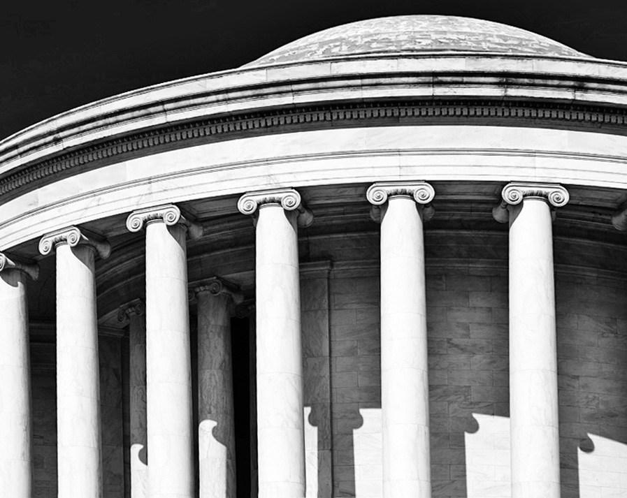
I thought it was a bit grey all over and that there was a tilt to the image, so I tried transform/distort to straighten it and then a crop to put dark bits on the edges. I also used curves to lighten the light bits and then in image/adjust/shadow highlights, I put a little more detail back into the shadowed areas. It's not very exciting -perhaps because there are too many pillars included. |
May 11th |
 |
| 32 |
May 18 |
Comment |
I'm not sure about this one. It is not your usual style of photo at all. You've brought out the detail well and the tones are good, but I don't like the obtrusive background -those bricks also show up too well. I don't like the clipboard he's carrying either -t is wrong for a gnome! So what were you intending this image for? I presume your daughter might like it? Not for me at all! |
May 11th |
| 32 |
May 18 |
Comment |
This one is hard to assess. Clearly you go for odd pictures. The print almost looks as if it is disappearing into the bright light, which without the title, could have been a window. I'm not sure the judge is going to be pleased since it shows up his double chin and wrinkles! Do you get drummed out of the club if you upset the judge? The print looks perfectly sharp to me, so I'm not sure why you are worried by it. I think judges would complain about the large area of brightness which would be glaring when projected. depends what you want to do with your portrait. |
May 8th |
| 32 |
May 18 |
Comment |
I have absolutely no idea what GSCCC stand for something to do with cowboys and horses? This little girl has a super smile but she does look a little hunched. Was she leaning on something or was she uncomfortable with the camera? I like the presentation with the white line round it. carol used to tell me to whiten the eyes a little bit to make them stand out more and I think you need to do this as her eyes are in shadow. I also thought maybe you could have cropped a little bit off the top so her eyes were not below the centre line. Try darkening the bright area on the top left of her hat. I like this shot in colour too. |
May 8th |
| 32 |
May 18 |
Comment |
This works very well as a Photojournalism image. He is clearly working and not just making it look as if he is posing for the camera. he's focused on the job in hand. I would try darkening the building behind him because it is so light which would make him stand out better. A number of our members have started using Picasa and it seems to be as good as Photoshop. What do you think about it? |
May 8th |
| 32 |
May 18 |
Comment |
I think this is a fascinating shot and you were so lucky to be there at just the right moment. Was the snake not bothered by the photographers? I love the way it is actually pointing at the lily -takes the eye right there. I might experiment with lightening the snake's lighter bits so it stands out more from the lily pad and perhaps darkening the lily pad at the top, but I wouldn't worry about the leaf on the right, because the flower is such a bright area that it becomes a stopper for the eye. Excellent and really interesting! |
May 8th |
7 comments - 4 replies for Group 32
|
| 62 |
May 18 |
Comment |
Visiting from group 32 -another mono one. I do like the way so many of you have had a go at the original posted image with lots of suggestions. I was interested to see how you extended the top to make a top to the hat and I liked the much lighter beard because it was so well textured. My problem was the loss of his eyes which have vanished into darkness. I do think the mono is much better than the colour version |
May 16th |
1 comment - 0 replies for Group 62
|
8 comments - 4 replies Total
|


