|
| Group |
Round |
C/R |
Comment |
Date |
Image |
| 32 |
Sep 17 |
Reply |
Yes it was the window sill catching the light so could easily be textured |
Sep 28th |
| 32 |
Sep 17 |
Comment |
OK -I quite liked the bits at the bottom and left side but I'll try it without. |
Sep 20th |
| 32 |
Sep 17 |
Reply |
i do have a bean bag which can be emptied to reduce the weight for a flight and refilled when I get to a foreign place, but this was England and I was trying to reduce all weight and bulk for carrying. Brian has an LED light but didn't have it with him and we were trying to walk round separately so we got different pictures. It's a problem when we go to the same places though surprisingly we do take different things. I fully understand the problem of corroding batteries as I hardly ever use a flash so I have to remember to remove them before putting the flash away. |
Sep 17th |
| 32 |
Sep 17 |
Comment |
Sounds good to me! |
Sep 13th |
| 32 |
Sep 17 |
Comment |
I prefer this one as the face is much sharper -I appreciate that the impact has shifted her head at the decisive moment in the colour one. I think the open mouth suggests effort and aggression. The mono conversion is good because it removes some of the distracting elements seen in the colour one so I prefer this one on several counts. This is good for Pj comps. Can't we have some of your pictures other than boxing ones soon please? I really don't like boxing! |
Sep 13th |
| 32 |
Sep 17 |
Comment |
I agree with you that the side view is the better of the two. The clouds are great in the front view but appear more wispy in the side one which suggests the passage of time to me. As Stephen says -another amazing image from you.The detail is fantastic and the tones are superb. Don't change a thing! |
Sep 13th |
| 32 |
Sep 17 |
Comment |
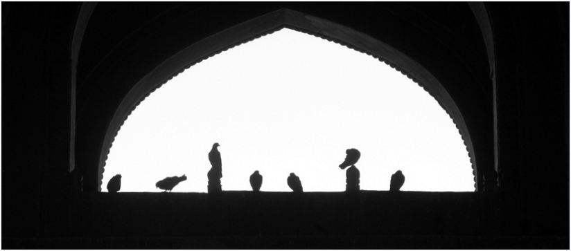
I had to peer very closely to see the double frieze in the black area. I think I would have preferred more easily see-able detail because initially all I saw were the silhouettes in the archway and a huge black area all around. For me, the crop would have been a letterbox shape, just to show the arch and emphasise the birds. |
Sep 13th |
 |
| 32 |
Sep 17 |
Comment |
I like old chains etc so I would have been taking these as well as you. I also like the slight sepia look to your finished shot. i would have tried a smaller aperture to get greater depth of field as the right hand loop at the top is falling out of focus. i think I would darken down the top left corner and the other loops so the eye is forced to stay on the main loop. I would have been stuck taking pictures for quite a while at this old truck, trying for different bits of chain and emphasising the rust. |
Sep 13th |
| 32 |
Sep 17 |
Comment |
This almost looks as if you have used a filter and painted the feathers. they have a smoothed wet look rather than showing distinct feather detail. I appreciate the bird is making them wet but it definitely has a painterly feel to it. Again, I'm not sure how well these shots do in competitions. In GB the criticism would probably be that it is too big in the frame - we do like the habitat to show a bit more. The dark water at the base on the right hand side is a bit odd looking, though I like the lighter swirls above that area and in front of the bird. i also like the water drops off the beak. |
Sep 13th |
| 32 |
Sep 17 |
Comment |
I think this close shot actually shows the power of the waterfall very well as there is so much water cascading down in the background. Iguazu is usually shown with a wide angle viewpoint and then is useful for Photo travel competitions, but this shows only a relatively small section so is more suitable for PID. The shutter speed is neither long nor short so it is interesting that some of the water almost appears to be slow moving as it reaches the point of descent. i don't know how well this type of photo does in competitions. |
Sep 13th |
| 32 |
Sep 17 |
Reply |
If I'd even had a gorillapod it would have been easier as the machine I rested the camera on wasn't quite the right height in the place where I wanted the camera. It meant there was stuff in the foreground, although in this shot I think these help to portray a busy workshop. I had to hold the camera while taking the photo so HDR wasn't really an option. I used the live view because I can ensure a gentler trigger release than pressing the actual trigger. Also it meant I didn't have to bend so far down and be more unsteady on my feet -I could see the tilted out live view screen from a normal standing position. I was very surprised to get anything decent from it. I didn't want a flash effect as there would have been reflections on the window and lamp and/or hard shadows. I liked the dirty but slightly transparent window effect. |
Sep 13th |
8 comments - 3 replies for Group 32
|
8 comments - 3 replies Total
|