|
| Group |
Round |
C/R |
Comment |
Date |
Image |
| 31 |
May 17 |
Comment |
This is my kind of scene. I love the dark clouds and the suggestion that it is going to chuck it down with rain fairly soon. Good one, Ian |
May 18th |
1 comment - 0 replies for Group 31
|
| 32 |
May 17 |
Reply |
yes they are a bit bright. I can do something with the two areas. |
May 25th |
| 32 |
May 17 |
Reply |
The original looks very much the same -just with colour! |
May 23rd |
 |
| 32 |
May 17 |
Reply |
Thanks Ian. I'll check on the original for the white mark. |
May 18th |
| 32 |
May 17 |
Reply |
should I put a white line round the image to stop it bleeding into the background? |
May 16th |
| 32 |
May 17 |
Comment |
Maybe a challenge but you've nailed it. their skin tones are very well handled. The strip light is a nuisance but that's where they box so not a lot you can do about it.I like the stance of the two boxers and big sister really looks as if she is hammering little brother -all the pent up frustration of not being allowed to wallop him normally when he's annoying? This is a good Pj image. |
May 16th |
| 32 |
May 17 |
Comment |
Like you, I love the curves in the field behind the barn. In some ways. I almost prefer the fields without the central barn, as it is quite dark against the bright field. I know you like infra red, but would this have worked just as well in ordinary colour capture and then conversion to mono? As it is, it is very bright centrally and rather dark at the top, which is kind of the wrong way round especially as the base is also light. Do you have a normal colour or mono version od do you only take in IR? |
May 16th |
| 32 |
May 17 |
Comment |
I think you did the photoshopping very well then because I can't tell which one you did. However, because the two older boys are both looking away from you, I think the one looking at you must be made lighter to bring the viewer's eyes down to him. i would also darken the face in the top right corner. if you are not going to use this for PJ or PT, then why not try a small vignette round the group to distance them from their background? I find the patterned blanket behind the middle head a bit distracting. You could really do something with this if you work on it some more. |
May 16th |
| 32 |
May 17 |
Comment |
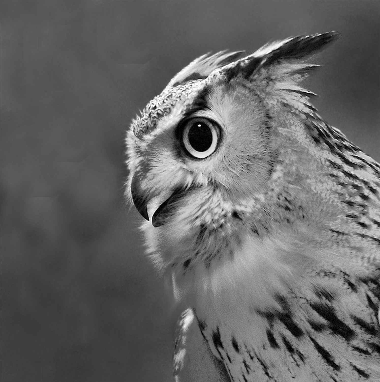
I tried a new version by using Nik to darken the background and keeping the owl the same with control points. I also extended the canvas in front of the beak and cropped the wing off.I'm afraid I haven't done it very well but |
May 16th |
 |
| 32 |
May 17 |
Comment |
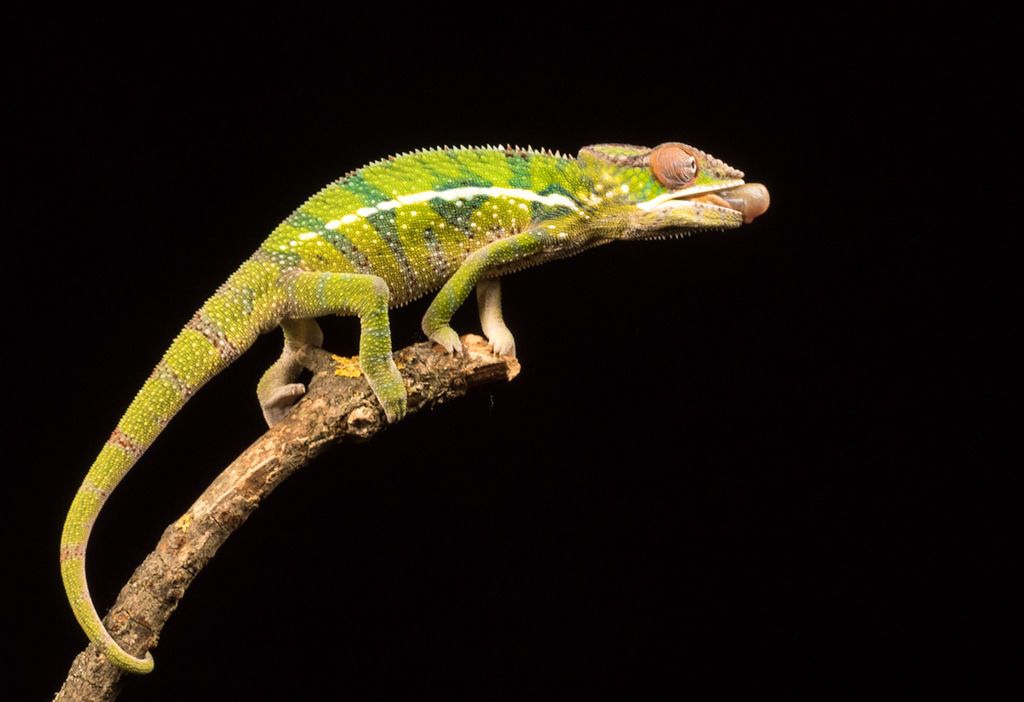
I agree that there is too little difference between the owl and the background, but you could mask the bird and then darken the part behind him. In GB, we prefer not to have such a tight crop round a bird even when it's a studio shot, or rather we like a bit more space in front of the beak. I would have preferred him looking at you though the eye is fabulously sharp. There is a slight shadow be4hind him at the top of the left wing and his head which is odd because you said you didn't use flash. As it is, it's not going to do anything in competitions so you need to work on it some more. |
May 16th |
| 32 |
May 17 |
Comment |
I think you cracked the lighting problems because nowhere is too bright or too dark. The soft light on her face is very pleasing. However, the pose looks a little forced as if she was told to stand there and she didn't quite know what to do. She is also looking away from you so there is no immediate connection between you. It's a pleasant picture but I think it's not a competition one. |
May 16th |
| 32 |
May 17 |
Reply |
Wow! Thanks! |
May 9th |
6 comments - 5 replies for Group 32
|
7 comments - 5 replies Total
|


