|
| Group |
Round |
C/R |
Comment |
Date |
Image |
| 7 |
Aug 23 |
Reply |
Thank you Tom. I always have this dilemma. Whether to maintain the 16:9 aspect ratio or get change it to bring the subject off-centre. I had limited option to crop on the left and retained it at 16:9 and live with the subject in the centre. How does on overcome this? I also read another view point that in the case of architecture centralised images are acceptable. I guess it differs on a case to case basis but I like what you have done to the water. I keep on learning from all of you. |
Aug 21st |
| 7 |
Aug 23 |
Reply |
Thank you Paul. |
Aug 21st |
| 7 |
Aug 23 |
Reply |
Thank you Gaetan. I thought of that but then the angler would have disappeared and would have blurred his figure if he moved. I am not sure I had so much time so clicked it after composing it quickly and getting the exposure mostly right. |
Aug 21st |
| 7 |
Aug 23 |
Reply |
An unusual approach. When I saw the image first I thought it was too dark. But when I clicked on it and saw the result, the angler has come out so well as contrasted with the background. Thank you. Yeah, we have the creative freedom to do what we want. Art is such a subjective thing that what perceives as a good image will be viewed differently by another. So we keep experimenting and enjoying the process. Thank you. |
Aug 21st |
| 7 |
Aug 23 |
Reply |
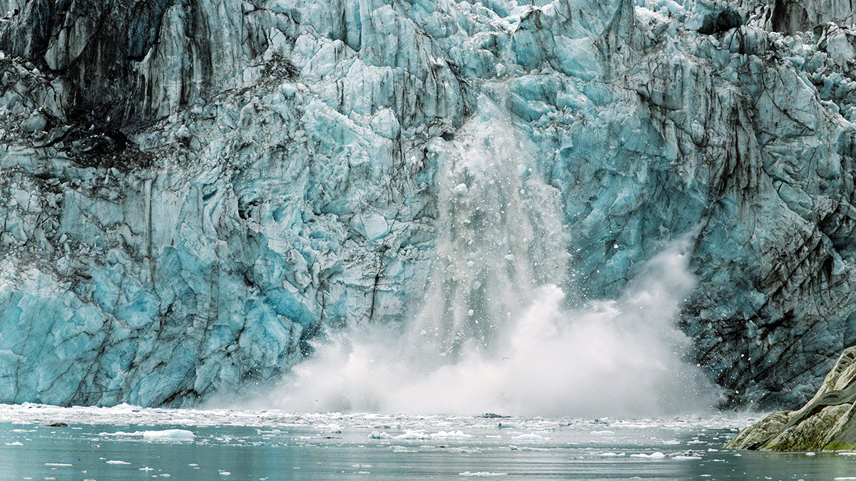
Wow Rich that is a completely new perspective for me. Thank you. The whites in the water have come out so well. Learnt something today. Much appreciated. |
Aug 21st |
| 7 |
Aug 23 |
Comment |
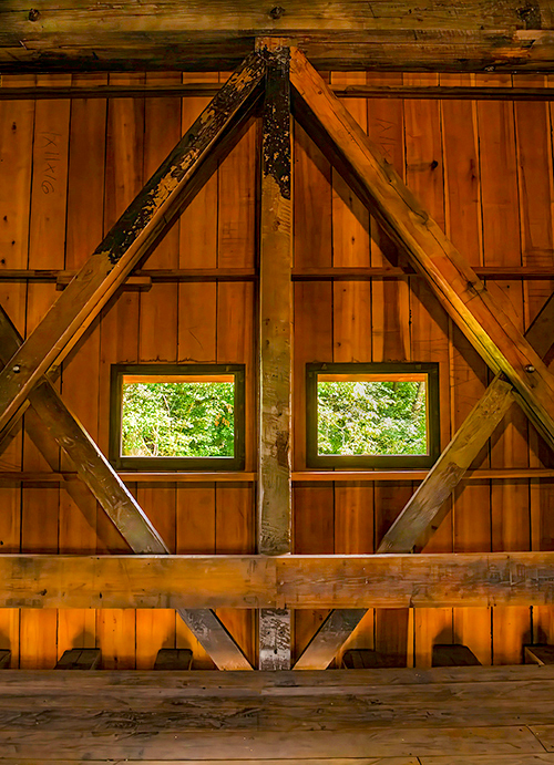
Agree with Judith on the symmetry and the geometry of the subject. I find the image a bit dark. A bit of light would bring out the details in the old wood and also highlight the green in the background? Tried that. Let me know if this works.Thank you. |
Aug 9th |
 |
| 7 |
Aug 23 |
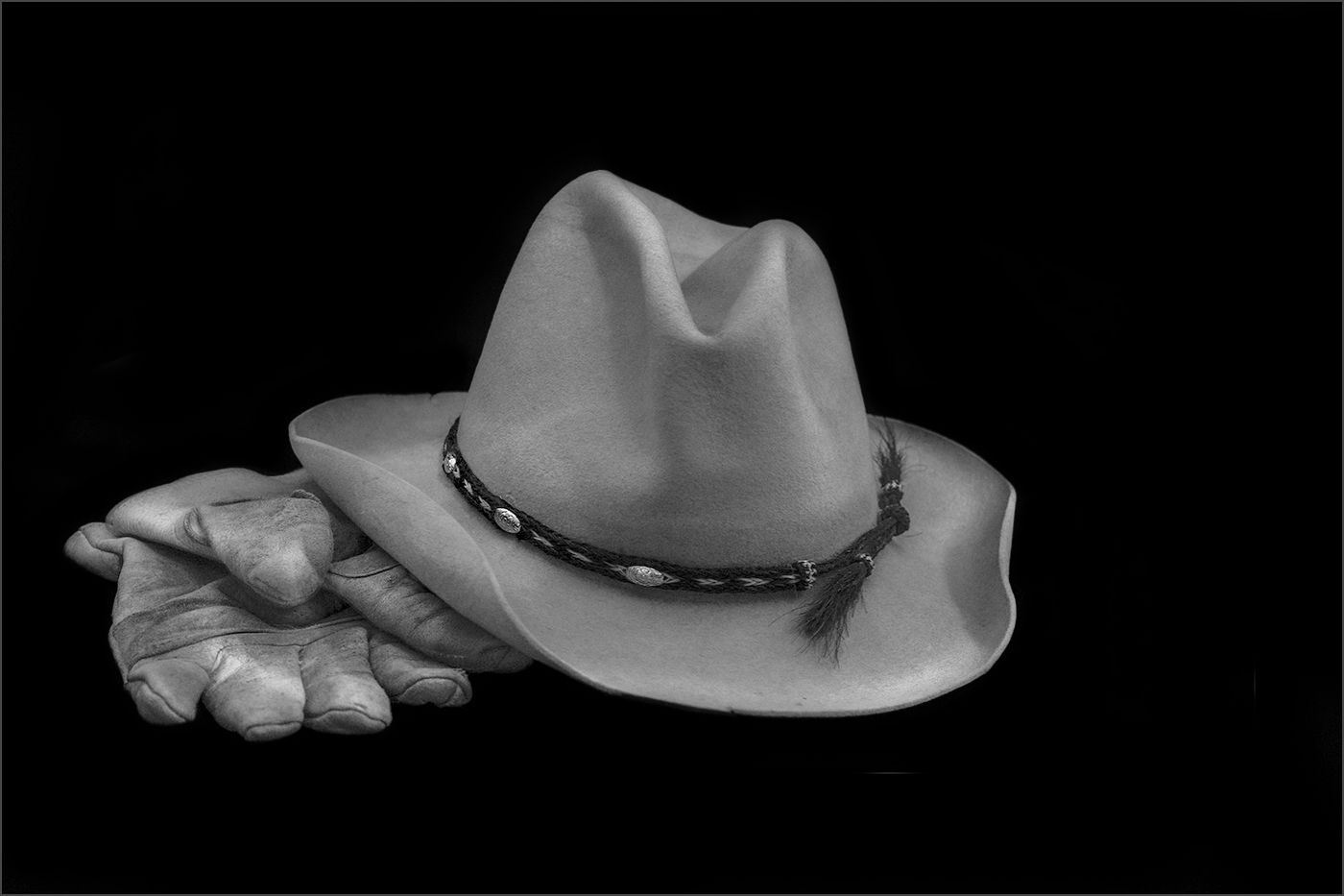
Comment |
Wow two still lifes in one month !!!. Super use of material Paul. Darkened the background a bit and increased the whites in the props to get the black, white and grey in the image. Am a complete newbie to monochrome so please excuse the blunder. Very nice image. |
Aug 9th |
 |
| 7 |
Aug 23 |
Comment |
Nicely done Gaetan. I like play of light on his face and the smoke that gets highlighted against the dark background. All that I would change may be the vertical beam on the right of the image. I also increased the contrast a bit? |
Aug 9th |
 |
| 7 |
Aug 23 |
Comment |
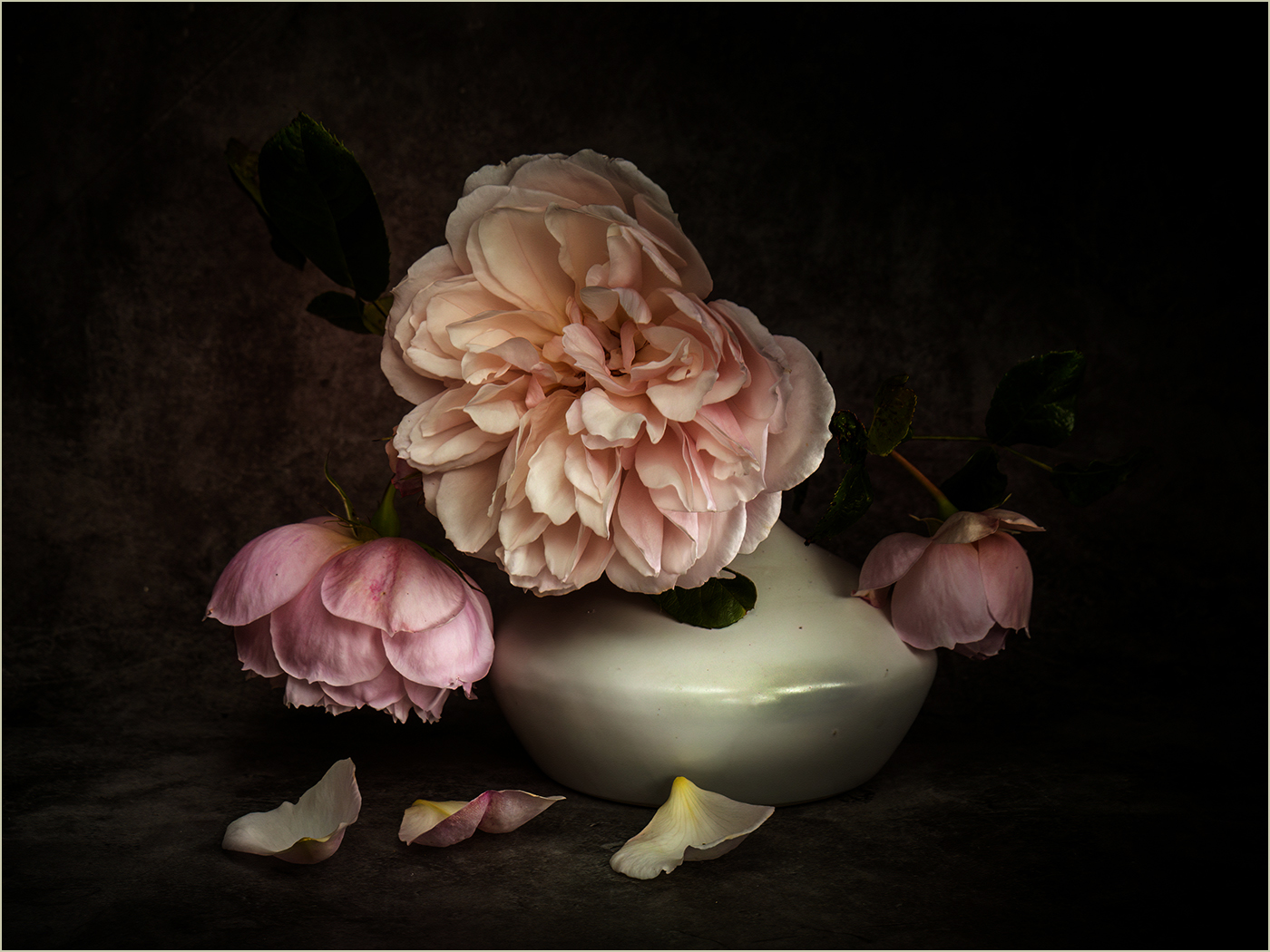
Welcome to the group Judith. There are two genres which I have not explored as yet in my photographic journey- still life and "creative" or "augmented reality" as it is referred to these days. My PS skills are rudimentary at best. I so admire the image you have posted. Very neat and such a creative use of props. The PS work is spot on. I wondered if a darkened background would enhance the flowers and enhance play of light? I tried that. Not sure if it destroyed the image? Burned the bright spot on the right side of the pot to reduce the attention seeking spot of light. |
Aug 9th |
 |
| 7 |
Aug 23 |
Comment |
Sharp clear image. Would I have changed anything? Perhaps rotated the flower a bit to make it diagonal(attempted to do that(as attached). Perhaps I would have shot with a wider aperture and thrown out the the darker bit of the iris to focus on the lighter bits with the water drops. But then easier said the done. Love the image. |
Aug 9th |
 |
| 7 |
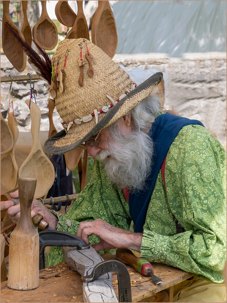
Aug 23 |
Comment |
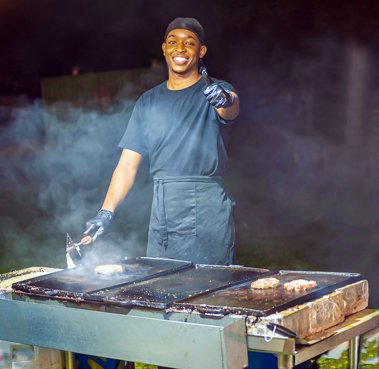
I love the composition of the image and the work ambience of the subject. The image is sharp and conveys as intended. Was wondering if you could have cloned the two vertical bars? They appear to grow out of his back and distracts. I have in my own clumsy way tried to do that. Not sure I succeeded. I was also wondering if there was anything preventing you to step a couple of feet to your right to get his full left arm in the frame?Looks a bit too cropped. Would like hear from you. |
Aug 9th |
 |
6 comments - 5 replies for Group 7
|
6 comments - 5 replies Total
|