|
| Group |
Round |
C/R |
Comment |
Date |
Image |
| 7 |
Sep 22 |
Reply |
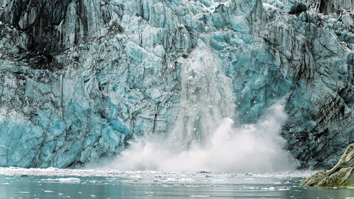
Noted Barbara. Let me crop out a lot of the buoy and retain only a hint. Thank you. |
Sep 27th |
| 7 |
Sep 22 |
Reply |
Well spotted Tom. There was a piece of plastic obscuring the view. Had to clone that. Poor processing. I apologise. |
Sep 27th |
| 7 |
Sep 22 |
Reply |
I agree Gaetan. Should have gone down a bit more to include more of the base of the tower. |
Sep 27th |
| 7 |
Sep 22 |
Reply |
hank you Bev. But it is the bright red juxtaposed with the blue that drew my attention. I appreciate what you have done but prefer the red and the unevenness of the buoy. |
Sep 27th |
| 7 |
Sep 22 |
Comment |
Very good starlight and the work that you have done in PS. Whilst the heads are a distraction and could have been avoided, the light on the singers and the colours salvage the image. The play of light in the hair of the singers and audience saved the day. Like the image the way it is. |
Sep 27th |
| 7 |
Sep 22 |
Comment |
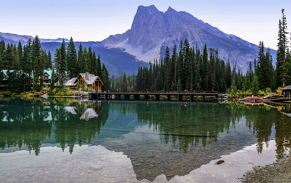
I like the image the way it is. Whilst there are many elements they are not jarring and add to the scene. I like the red that the canoes add. I changed the aspect ratio to bring it close to 16:9, adjusted the light a bit, increased saturation a little to better reflect the mountain and sky. |
Sep 27th |
 |
| 7 |
Sep 22 |
Comment |
Tom, Gaetan and Barbara have echoed my thoughts. If there was something near the white patch which would stop the viewer from leaving the image. A gnome or something similar would complete the picture. |
Sep 27th |
| 7 |
Sep 22 |
Comment |
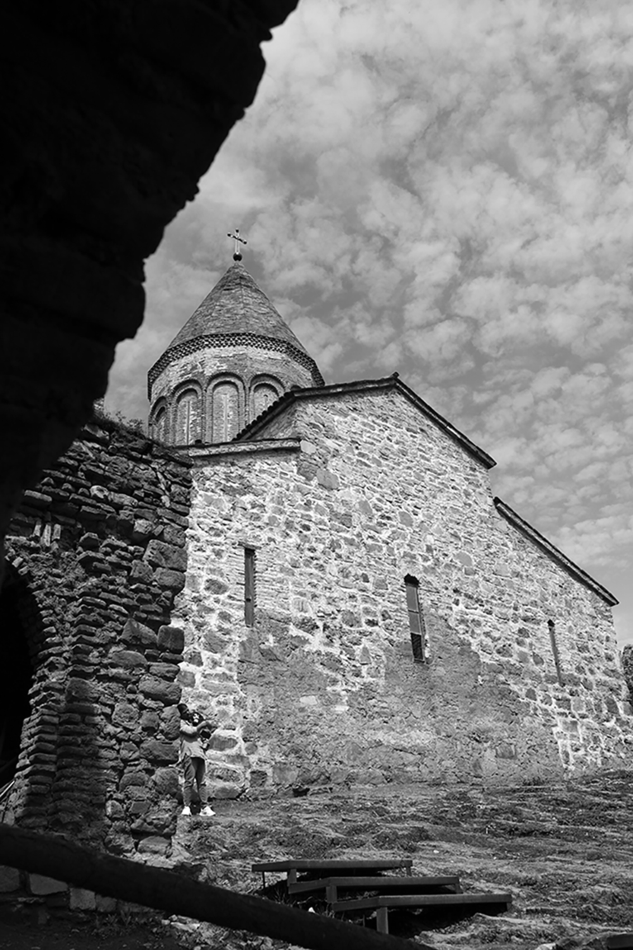
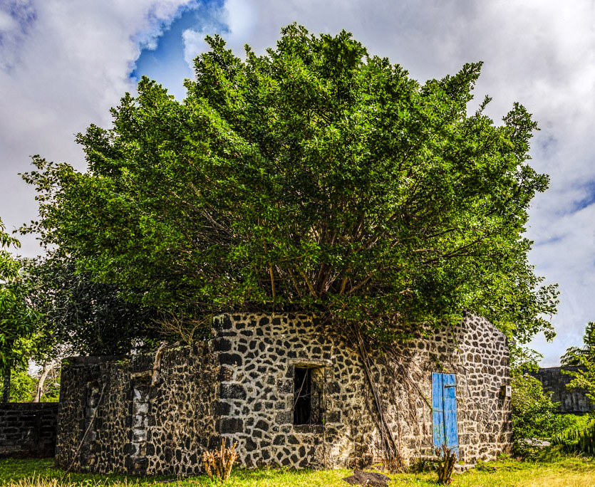
Agree with Tom and Barbara. I would change the aspect ratio to make it almost a square so as to reduce the slight negative space on the right which draws attention away from the beautiful stone structure and the tree. Saturated the colours a bit. Beautiful image. |
Sep 27th |
 |
| 7 |
Sep 22 |
Comment |
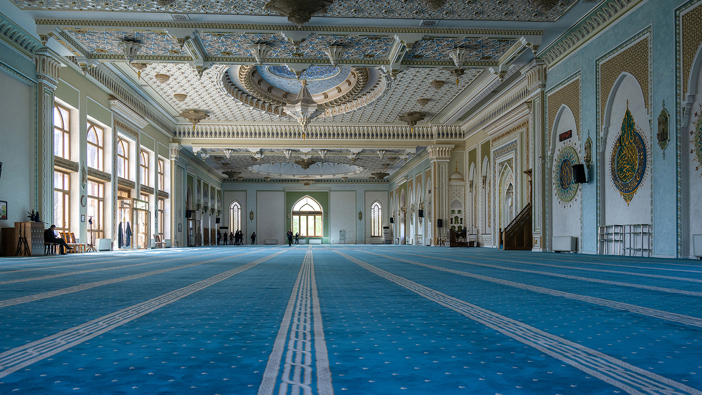
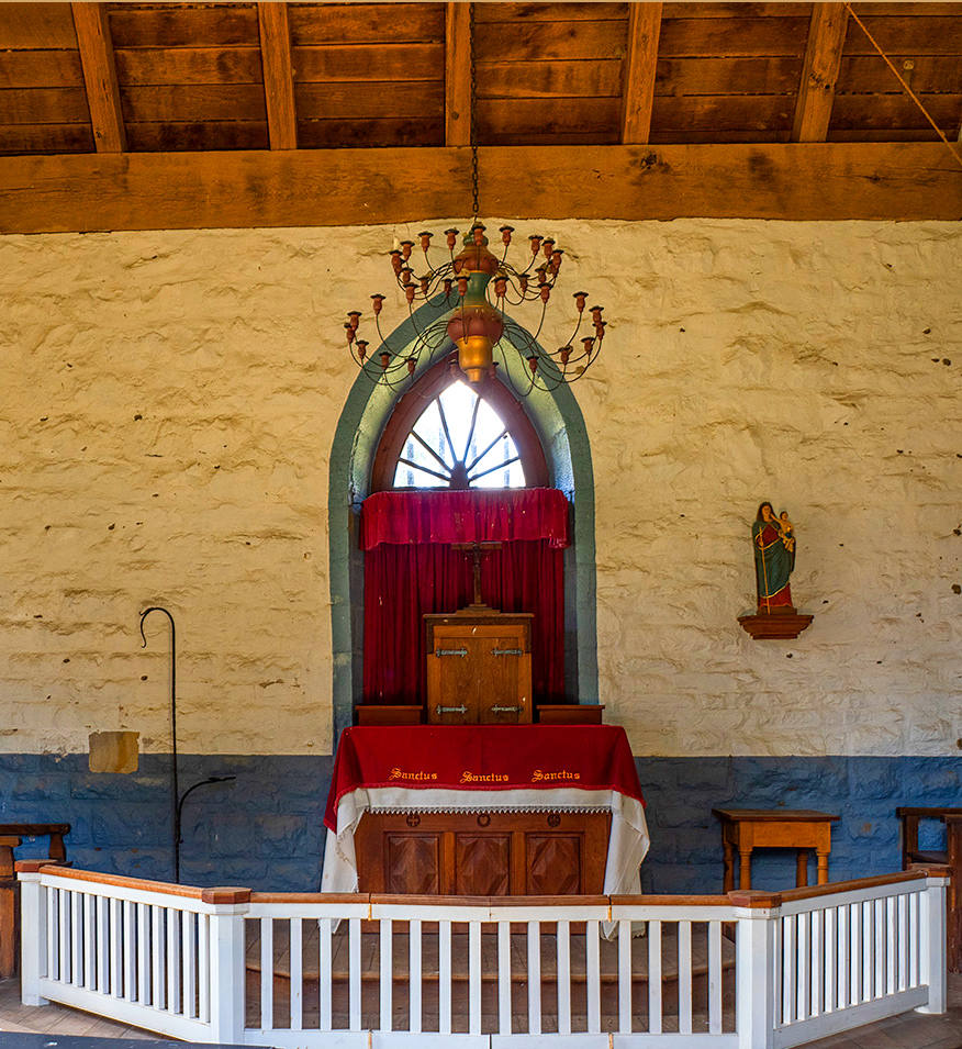
I would remove it. The light on the floor is a very small part of the overall image. If your intent was to highlight the structure, I would concentrate on the centre window and the colours there and highlight the natural light streaming in. I saturated the colours a bit and cropped the image to focus on the main area of the image. I suspect converting to a monochrome will lose the bright red. I love the lines of the wood in the ceiling drawing the viewer towards the window. |
Sep 27th |
 |
5 comments - 4 replies for Group 7
|
5 comments - 4 replies Total
|