|
| Group |
Round |
C/R |
Comment |
Date |
Image |
| 7 |
Jul 22 |
Reply |
Hi Rich, the blue colour is the covering of the bridge. Only thing I did was to adjust the lighting and make it a bit brighter as I was there just when the sun rose but when it was a bit cloudy to avoid crowds. It is a very popular destination !!! |
Jul 26th |
| 7 |
Jul 22 |
Reply |
Hi Tony, have done that and planning to use this as one of the 10 images to earn an LRPA. Hopefully it will be appreciated. |
Jul 26th |
| 7 |
Jul 22 |
Comment |
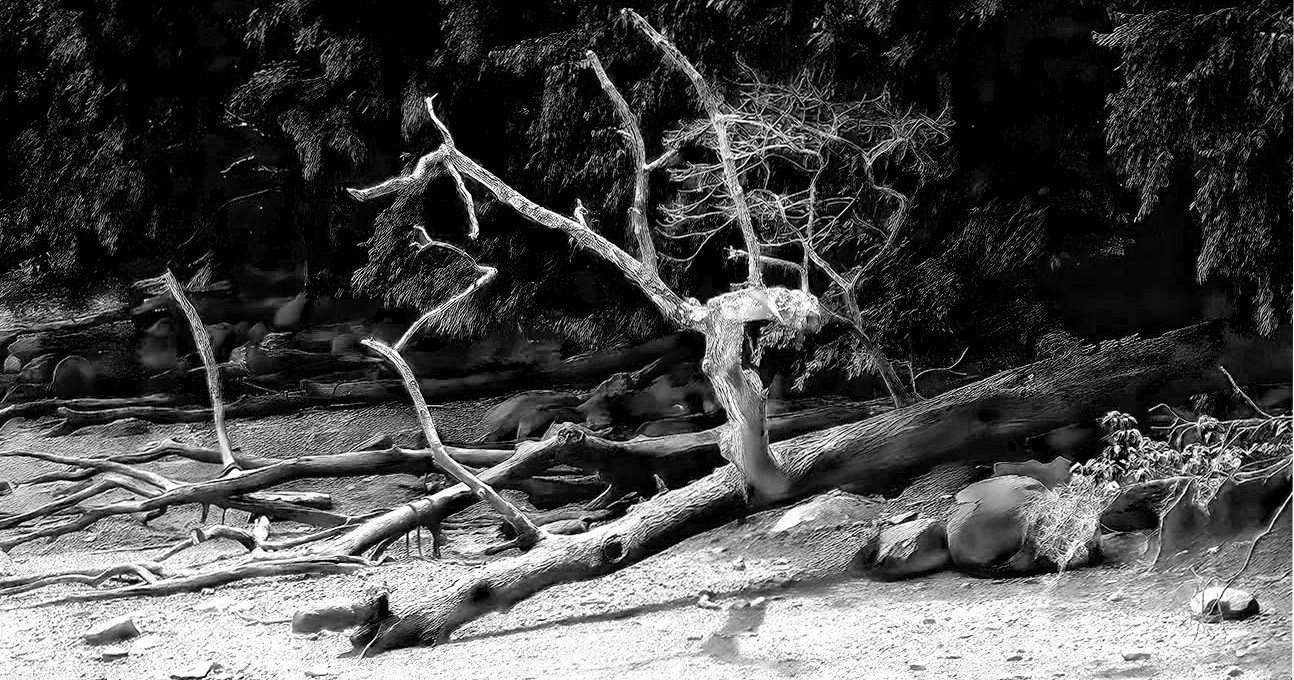
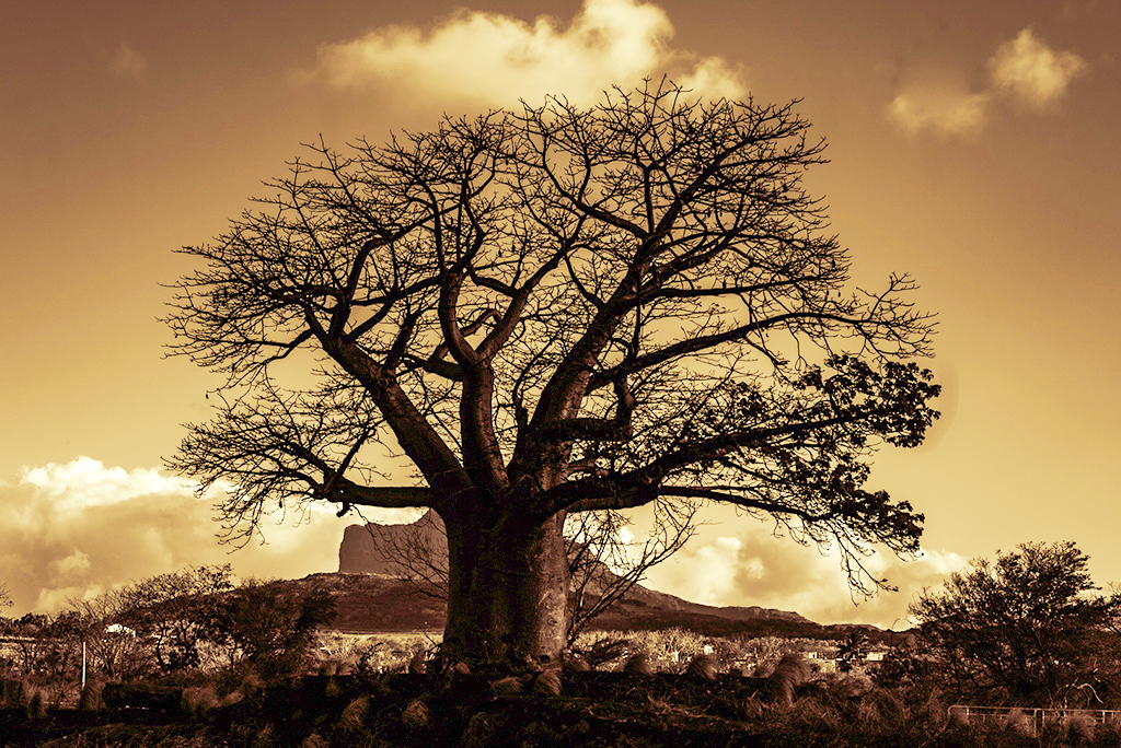
Hi Paul, I note that you appreciated the log and the branches and those were your main subjects. Whilst there is some colour there, the play of light would have emphasised the subject more. So I converted to mono and played around with the colours. Do let me know if this could be an interesting way of looking at the image. Thank you. |
Jul 26th |
 |
| 7 |
Jul 22 |
Comment |
Hello Gaetan. I agree with most comments made, specially on the lighting and the composition. Did some quick adjustments to hopefully improve the image. Do let me know if that works for you. Thank you. |
Jul 26th |
 |
| 7 |
Jul 22 |
Comment |
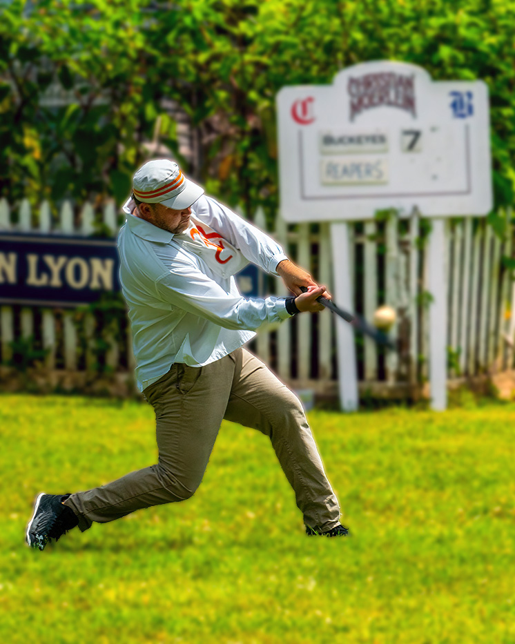
Hi Rich,
Good action shot. Love the blur highlighting the movement. Since the emphasis is on the player, the background distracts. I tried blurring the background and improving the lighting just a bit to stay focussed on the player. |
Jul 26th |
 |
| 7 |
Jul 22 |
Comment |
Lovely image Barbara. Only two comments if I may? The shadow on the dog's head is distracting. Is there any way you can lighten that? Secondly not sure if you would have been able to improve the composition if you had gone down a bit lower? |
Jul 26th |
| 7 |
Jul 22 |
Comment |
Hello Tony. Lovely image. Most of what I had to say has already been said. |
Jul 26th |
| 7 |
Jul 22 |
Comment |
Hi Tom,
Nice crisp image. Nicely done with the clouds. Glad to know you collect clouds, I thought I was the odd one out !!! I was wondering if the image would have enhanced if there was a slight diagonal layout? |
Jul 26th |
| 7 |
Jul 22 |
Reply |
Thank you Tom. Yes I noticed the tilt and have since corrected it. Thank you for the conversion, but to be honest I like the colour of the structure and the different shades of blue and acqua. I will tone down the colours of the background buildings. Will also convert to monochrome and perhaps use it in a salon as a monochrome entry. |
Jul 10th |
| 7 |
Jul 22 |
Reply |
Thank you for your inputs Paul. Will reduce the saturation and do the cropping as suggested. |
Jul 10th |
| 7 |
Jul 22 |
Reply |
Going any lower would have impacted the leading lines of the railing which are drawing the viewer to the end of the picture plus not sure I would have got the roof of the bridge in the form that I have now. Agree with the buildings being distracting, but cannot do much as it is a travel image and I do not want to tamper with facts, else would lead to disqualification. Thank you Gaetan. |
Jul 10th |
| 7 |
Jul 22 |
Reply |
Thank you Barbara for your feedback. I will try and desaturate the neon sign and also crop from the top as suggested. I think it may enhance the symmetry. |
Jul 10th |
6 comments - 6 replies for Group 7
|
6 comments - 6 replies Total
|