|
| Group |
Round |
C/R |
Comment |
Date |
Image |
| 99 |
Jun 21 |
Comment |
Hi Michael,
Lovely monochrome image with texture and lines. The diagonal line just leads my eye straight up the mountain.
I agree with Gerard to crop out the foreground trees. I too have Peter's vision to concentrate on the little tree with all the texture behind it. As did you I see.
Both images are perfect for monochrome.
|
Jun 11th |
| 99 |
Jun 21 |
Comment |
Hi Randy,
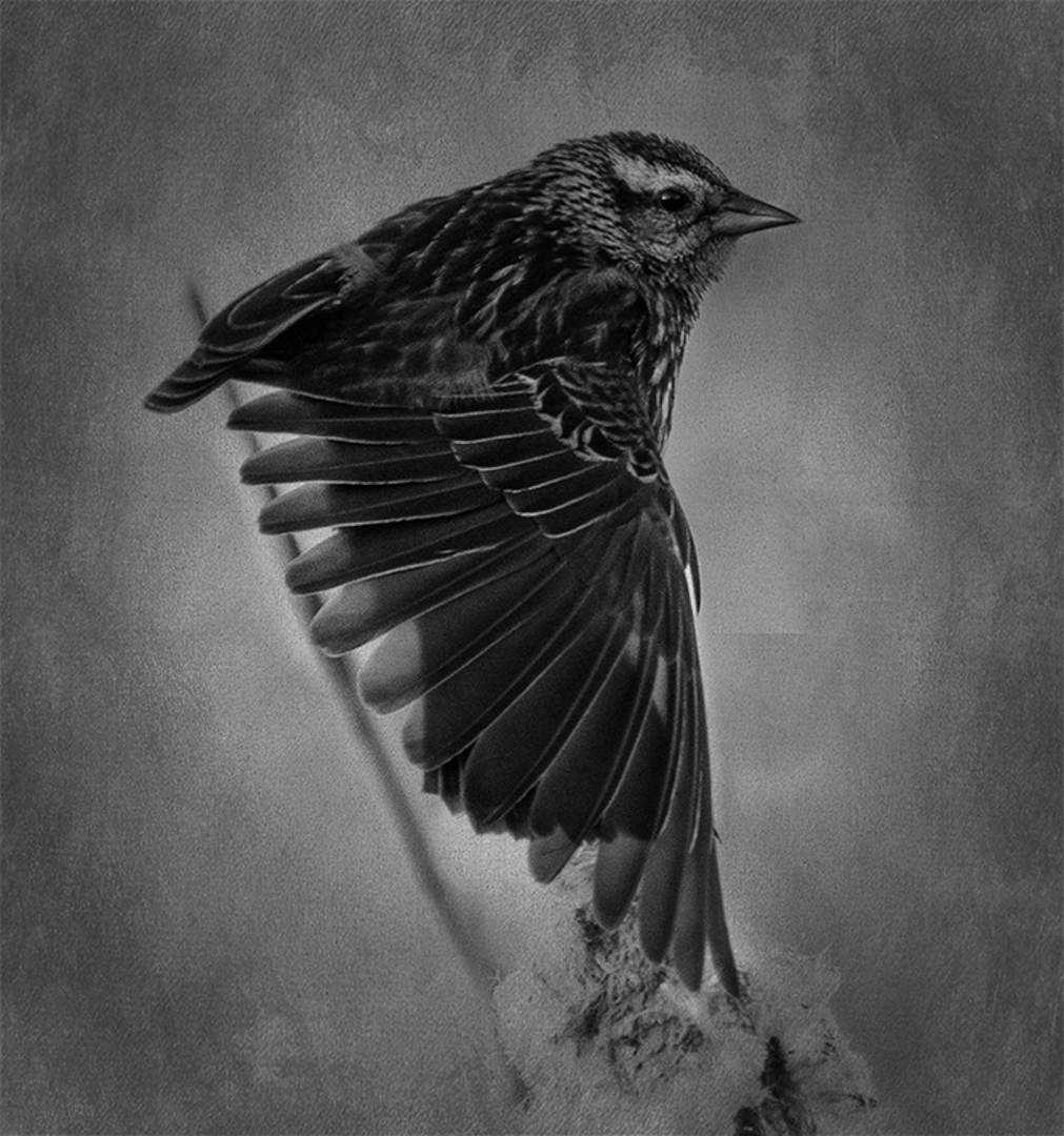
You have captured the bird well, even a catch light. I too would of liked to have seen more of the cattails. I like how the bird is not just sitting there like most bird images. Capturing the extended wing gives the image a lot more interest. A suggestion for the background would be to add a texture in photoshop and then use a blending mode. Mask the texture off the bird so its only in the background. This would blend out the lines in your background. |
Jun 11th |
 |
| 99 |
Jun 21 |
Comment |
Hi Linda,
I agree with everyone such a great image. The reflection is so clear. The tone and contrast is spot on. I do agree with Gerard that it is a little dark for my liking. I find the poles on the right are distracting and taking my attention away from the boat. I would crop the right out. You did an excellent job in removing the power lines ... well done. |
Jun 10th |
 |
| 99 |
Jun 21 |
Comment |
Hi Peter,
You have captured a lovely portrait and it works so well in monochrome. I would crop the bottom to just above the big leaf as I find that very distracting. Maybe a light black vignette might draw your eyes to the face and not the edge and the out of focus leaves to the right of him. Just a suggestion.
Apart from that you have just enough light and shadow on his face to show off all the detail. |
Jun 10th |
| 99 |
Jun 21 |
Comment |
Hi Gerard,
I agree with everyone else and agree that the second image is better softer lighting. The power plant image is a bit busy and distracting, my eyes don't know where to look.
I find the the flat stone under the bottle is a bit distracting . I suggest maybe cropping the image at the bottom and only showing 1/3 of the rock. Great choice to go monochrome with this image too. |
Jun 10th |
| 99 |
Jun 21 |
Comment |
Barbara, Great observation to see this shot in a place you look at regularly. I think sometimes we tend to miss what's around us because it is everyday and in our own backyard. I do agree with Gerard though, the image would have more impact on the lines and shadows if the top 1/3 was cropped. Its a great mono image. |
Jun 10th |
| 99 |
Jun 21 |
Reply |
Hi Michael, Thanks for your comments. After reading your comments and looking at the image closer, I do agree with you and see that the image is better cropped in and having the emphasise more on the bird. I do like the high key look and do agree I might have overdone the white a bit. |
Jun 10th |
| 99 |
Jun 21 |
Reply |
Hi Barbara, I totally agree with you the flipped version is much more appealing to the eye....thanks |
Jun 10th |
| 99 |
Jun 21 |
Reply |
Thanks for your comments Gerard. I do like your suggestions to crop the image. You are right it does emphasise the birds feathers alot more. But with this crop i do not like the lower branch in the image. |
Jun 10th |
6 comments - 3 replies for Group 99
|
6 comments - 3 replies Total
|