|
| Group |
Round |
C/R |
Comment |
Date |
Image |
| 76 |
Sep 21 |
Comment |
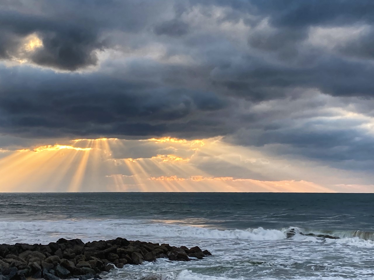
As a child I could stay for hours watching a fire in the fireplace. It fascinated me. I could see little dancing goblins, amazing scenes of life that were the fruit of my imagination. I find this atmosphere between red and orange flaming in this image. Bravo |
Sep 22nd |
| 76 |
Sep 21 |
Comment |
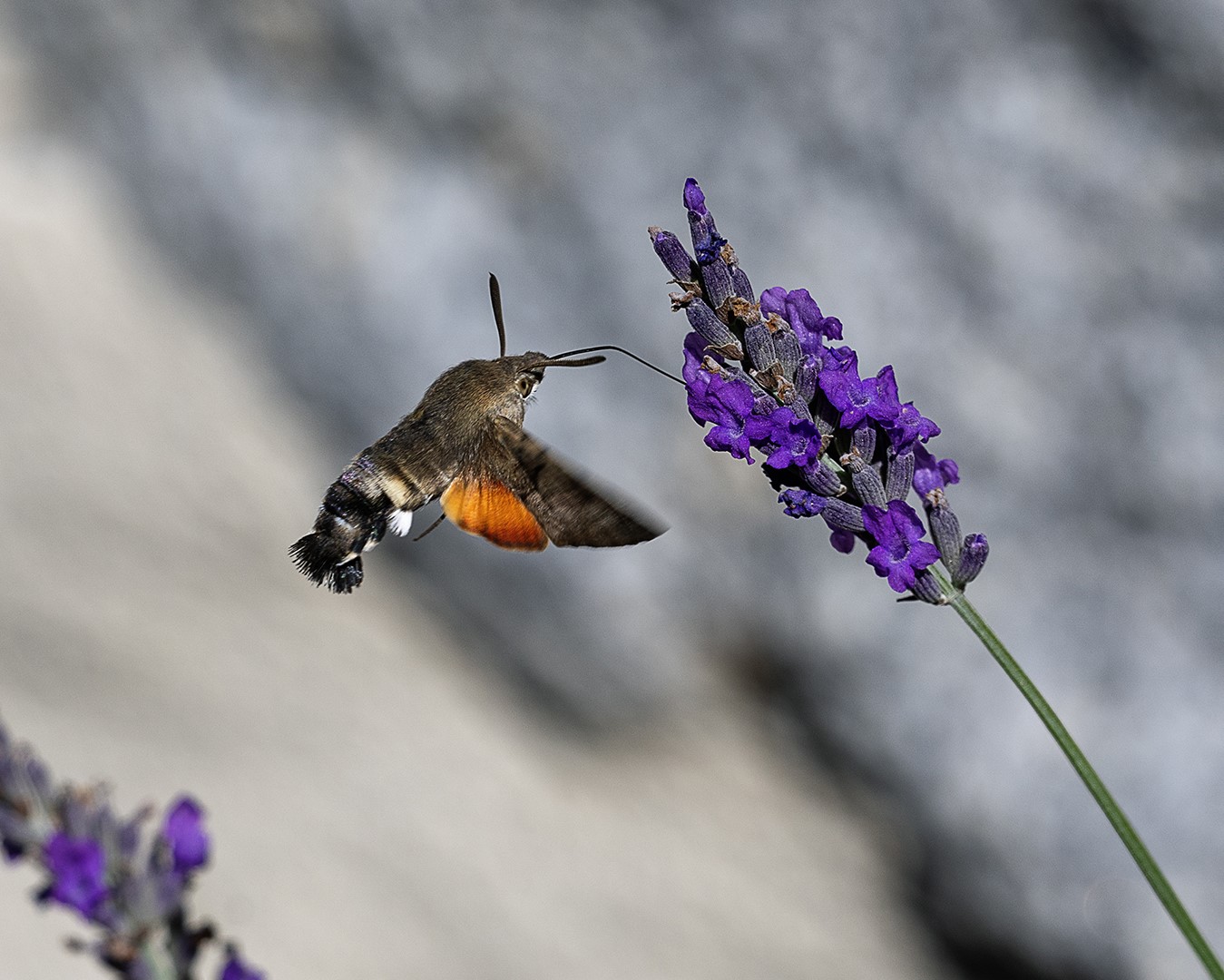
The treatment, the composition, everything is harmonious.
I thank you for putting a stem. I see too many photos where the flowers seem to levitate above a clear mist. We have two feet that anchor us to the ground as the flower has its stem.
The background is particularly good.
The graphics of the flowers are well highlighted.
Bravo |
Sep 22nd |
| 76 |
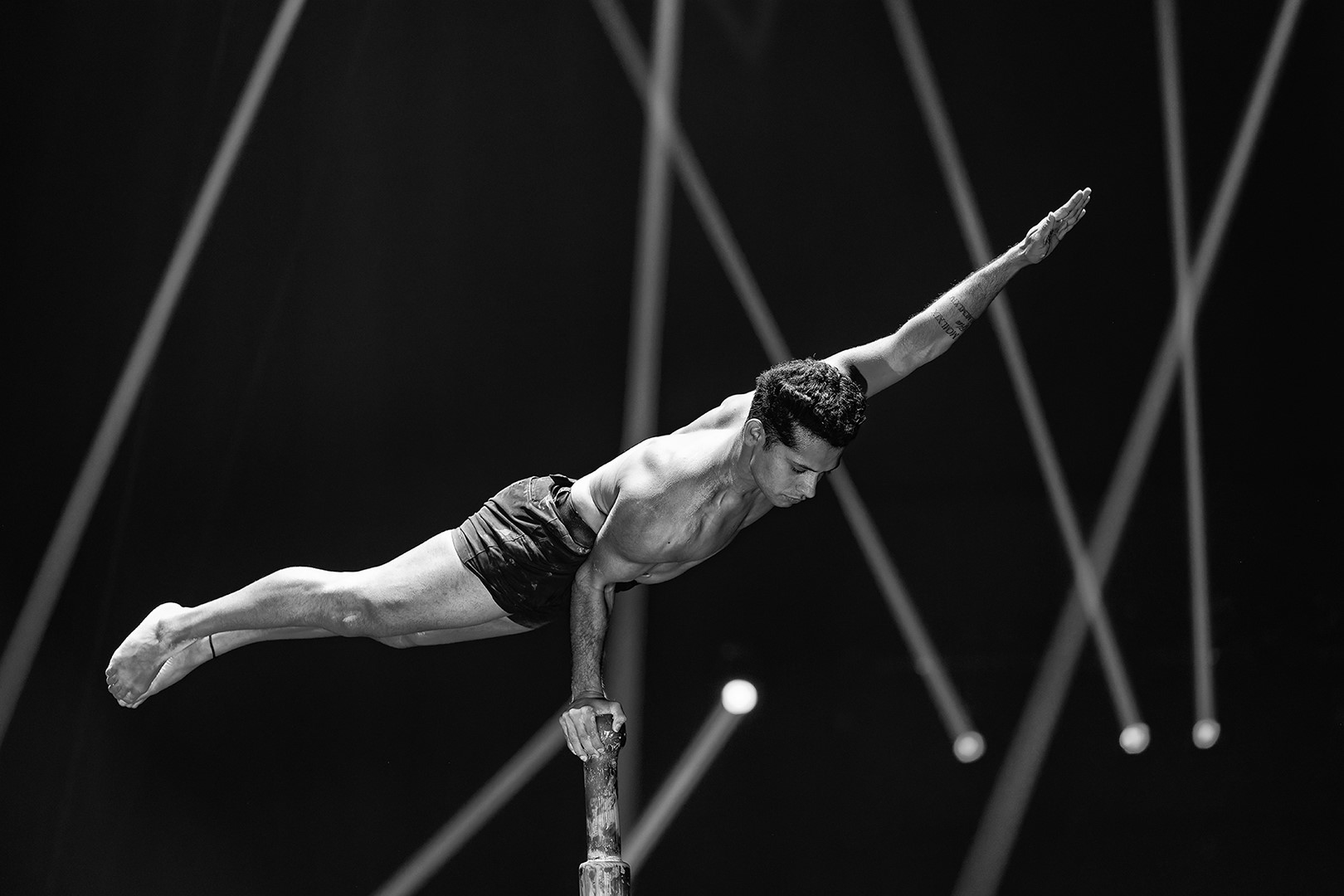
Sep 21 |
Comment |
I really like this image.
It contains the look in a drawn frame. The lines make the strength.
Your monochrome treatment makes the photo graphic but at the same time more tragic. Is it the astronomical amount of money involved? I don't know.
The original version brings a touch of light and cheerfulness that is not there in monochrome. If it's the drama you're after, you'd have to accentuate the monochrome effect to get more black. But I see it from my window, as we say in France. It's not easy to do.
Another idea, a red scarf on one of the ledges in the floors.
The building looks sad and lifeless, if it was one of your intentions it is successful. Bravo |
Sep 22nd |
| 76 |
Sep 21 |
Comment |
The appearance of a human element allows us to give a scale to this image and in addition it represents a point of balance. It's a nice touch.
I also like to work in black and white because even though I am a colorist at heart, my best successes in international competitions are in monochrome. In short, everyone has his own perception of the image, but after the work sylver pro effect, I would have perhaps ironed a pro'contrast to densify and give more relief. But I didn't try.
The author chose to show us the image like this, I will not try to dissuade him because it is well like that.
That said, and the blue of the glacier ??? There is no way in color to make it stand out? We always look for what we don't have in front of us. Let's enjoy the picture and especially thank you for this image. |
Sep 9th |
| 76 |
Sep 21 |
Comment |
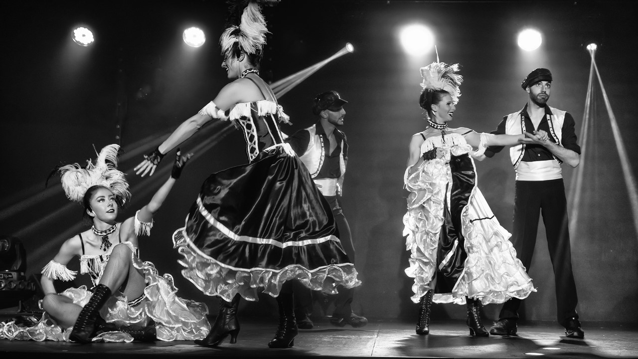
Very graphic image, you knew how to make the most of all the details by making them stand out. The careful composition allows us to stay in the image and not to leave it. With each passage of the eye we notice a new detail. The black and white allows to reinforce what you want to show. Thank you for this image |
Sep 9th |
| 76 |
Sep 21 |
Comment |
Very beautiful image, soft and full of nostalgia . The flowers are starting to fade, it's the end of the summer... Sniff.
The harmony of colors here is very nice. I also like the fact that it's a little darker on the right when looking at the image to close the picture and force the eye to go look at everything.
The image is soothing and indeed the best gift would be to hang it in your home.
This picture corresponds for me to a cozy atmosphere, with an old oak wardrobe of the "grandparents" and the round table. An atmosphere of happy childhood where nothing could happen to us not even the return of the rain and the winter cold.
I know I'm embroidering, but I love these images that make us travel in our childhood and / or in our imagination. Thank you for this beautiful image, subtle and warm. |
Sep 9th |
6 comments - 0 replies for Group 76
|
6 comments - 0 replies Total
|