|
| Group |
Round |
C/R |
Comment |
Date |
Image |
| 30 |
Aug 25 |
Reply |
I like it too |
Aug 22nd |
| 30 |
Aug 25 |
Comment |
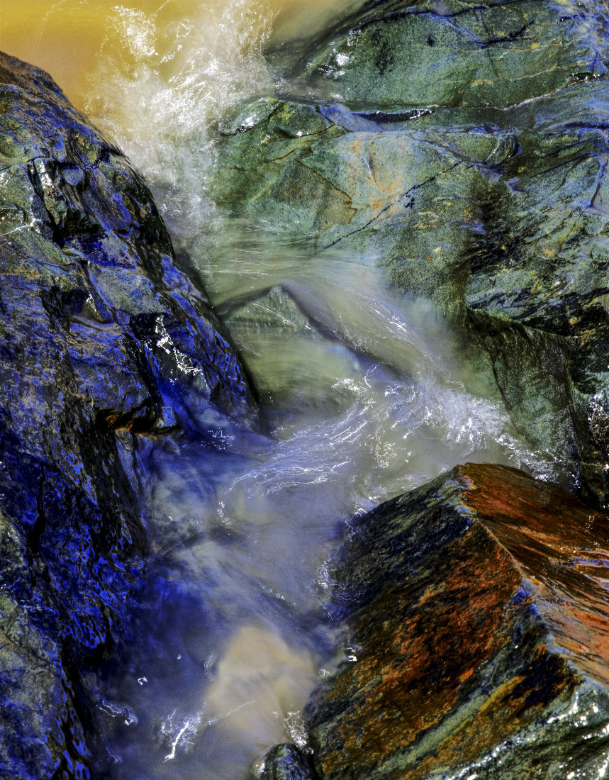
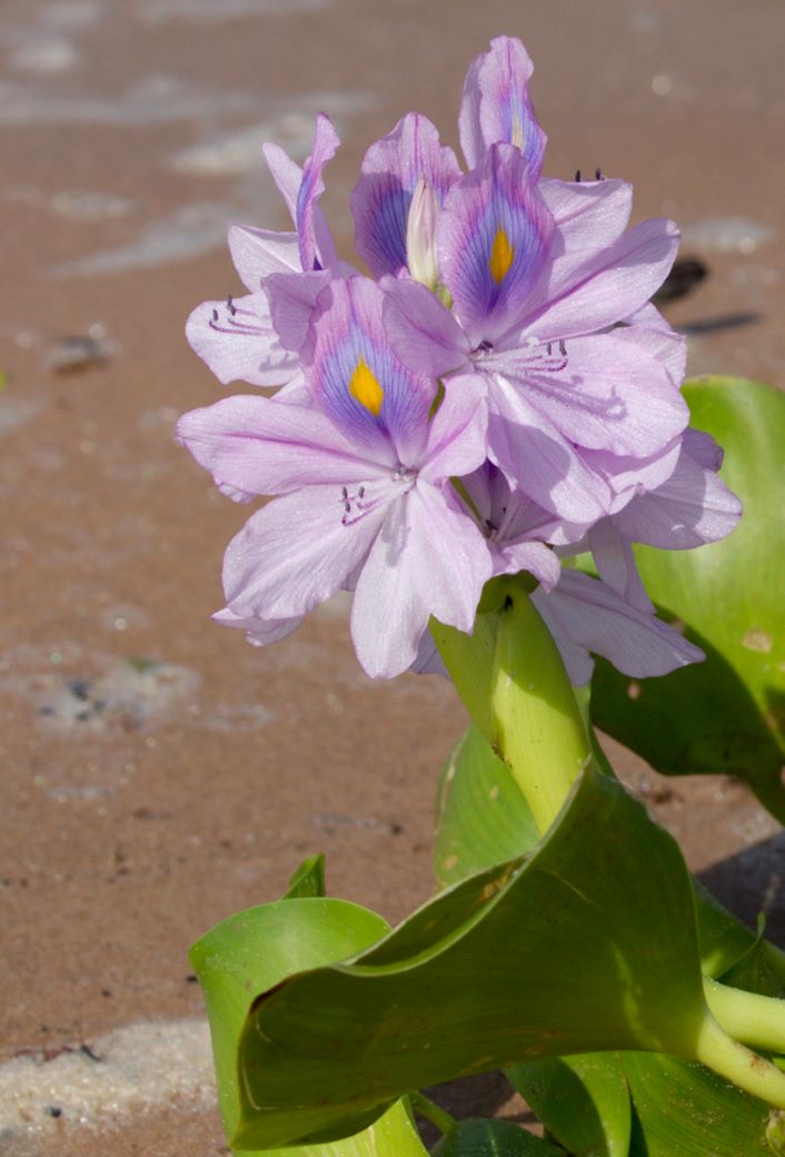
Nice balanced subject. The brightest high lites are little washed out maybe a stop less exposure. The rest of it was good enough for the cove so job well done.. |
Aug 22nd |
| 30 |
Aug 25 |
Comment |
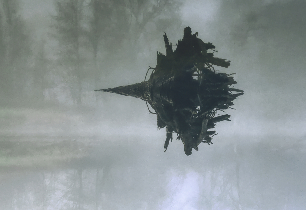
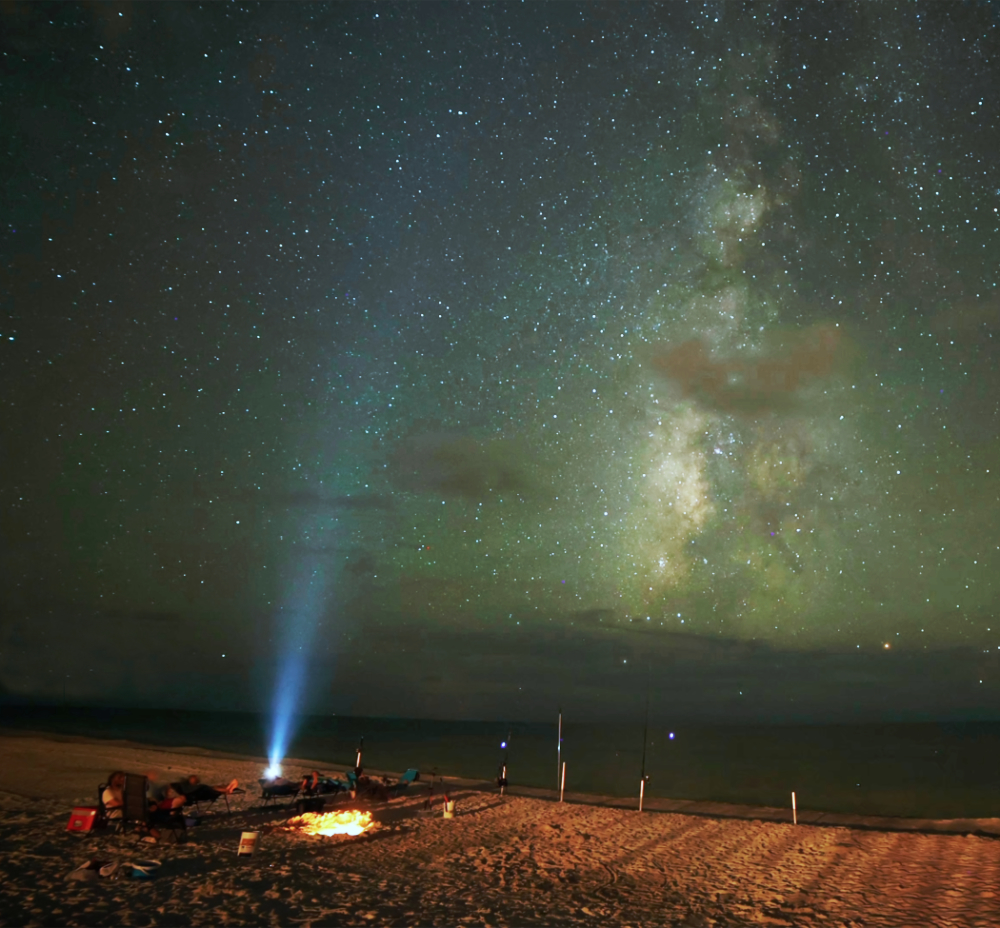
Love a good Milky Way image, well done. I particularly like the thunder storm at the base, like it's feeding the lightning.. Nice image |
Aug 22nd |
| 30 |
Aug 25 |
Comment |
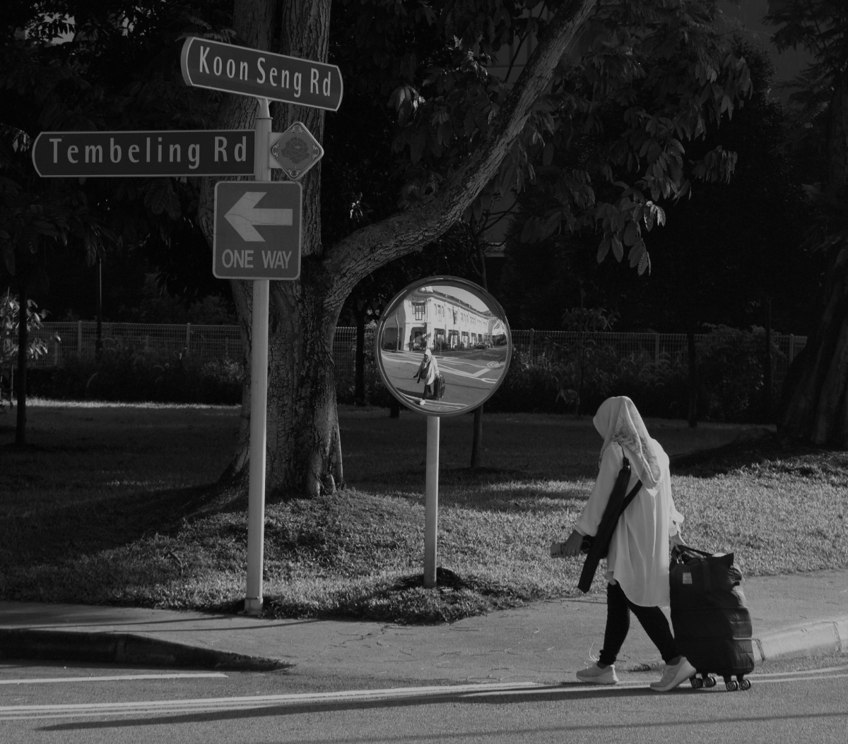
I like it Leonid. B&W works for this, I think a little darker vignette would be nice. I can see where Patrick is coming from with the trash can and bike, but I also think they are supporting the street vibe of the image. That said the white bike needs to be toned down a little. |
Aug 22nd |
| 30 |
Aug 25 |
Comment |
Nicely done Patrick. For me there is enough detail left in the image, I know what the subject is and now it's up to my minds eye to fill in what's missing. Also there is good amount of perceived movement, like any Koi pond at feeding time. |
Aug 22nd |
| 30 |
Aug 25 |
Comment |
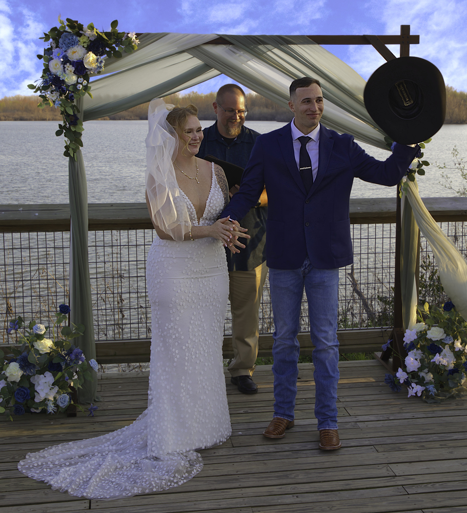
I like the photo and it sounds like your group has some great outings. I agree with the group, the image would benefit from a tighter crop. I took the liberty of putting their suggestions to the test. Cropped the image and did a B&W conversion. I think the crop now has a strong diagonal connection between the woman, the mirror, and the sign. |
Aug 22nd |
 |
| 30 |
Aug 25 |
Comment |
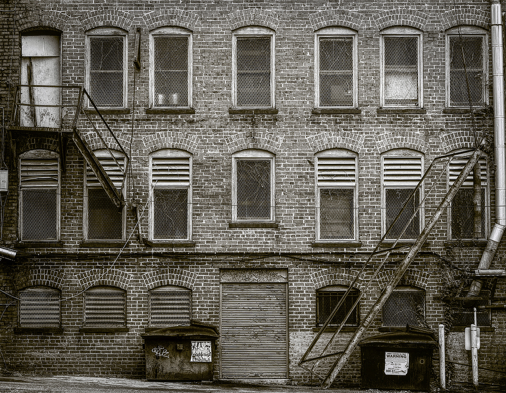
I like the image and the affect. I do feel that the bike seem to be the prominent item in the photo. Not saying that is a bad thing just that it is where my eye wants to rest. The leading line formed by the wall wants to take me out of the frame, more tree on the left would help keep us in the frame. |
Aug 22nd |
| 30 |
Aug 25 |
Comment |
Im wondering if this one is more to G30s liking |
Aug 22nd |
 |
| 30 |
Aug 25 |
Reply |
Thanks Patrick, the group seem to be in agreement, more off the left LOL
please see edited image below |
Aug 22nd |
| 30 |
Aug 25 |
Reply |
Thanks Walter, my main reason for not including more of the upper part were the nasty dead branches in that area. I couldn't quite get the removed without leaving artifacts that were less desirable than a short crop.
please see edited image below
|
Aug 22nd |
| 30 |
Aug 25 |
Reply |
thanks Dorinda, I can see the merit in your suggestion. thanks for the input
please see edited image below
|
Aug 22nd |
| 30 |
Aug 25 |
Reply |
Thanks Mark, I too considered a little tighter crop, and as the others have noted maybe a little off the left and bottom would still give the space for movement and reduce the overall size.
please see edited image below |
Aug 22nd |
7 comments - 5 replies for Group 30
|
7 comments - 5 replies Total
|