|
| Group |
Round |
C/R |
Comment |
Date |
Image |
| 30 |
Jan 25 |
Comment |
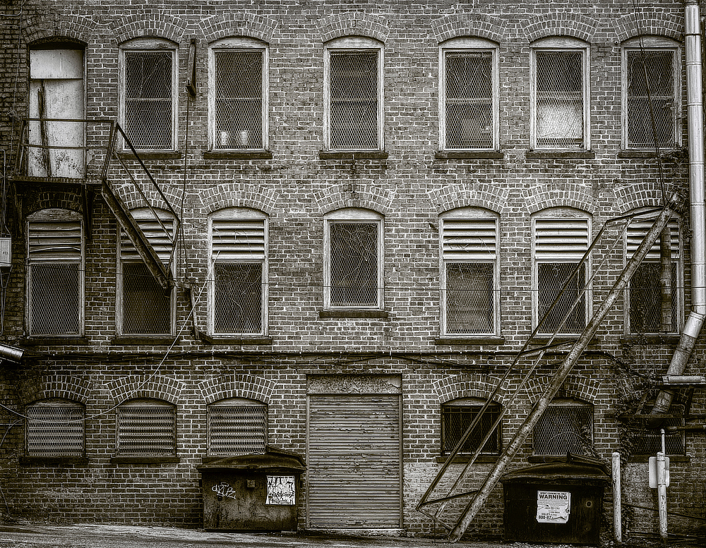
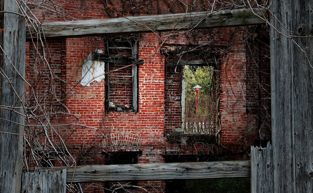
Interesting capture, I wonder if the architect knew it would be perceived that way? LOL. I like being able to easily tell that we are looking at windows, like seeing the blinds in the bottom window, but I don't really know what to make of the detail in the top window. I wanted to tone down or obscure the top window detail without removing it totally, so I selected just the window and added a fill layer set to a blue color sampled from the lower window. The fill layer's opacity was then set to about 60%. |
Jan 8th |
 |
| 30 |
Jan 25 |
Reply |
Absolutely understand, artistically speaking the layout and lighting is totally a choice of the person behind the lens. |
Jan 7th |
| 30 |
Jan 25 |
Comment |
Interesting photo, good color and I like the motion blur in the rain. I kind of agree with Walter and Mark, it might be nice to see more of the surroundings and please pick up the trash on the right side :-) |
Jan 6th |
| 30 |
Jan 25 |
Comment |
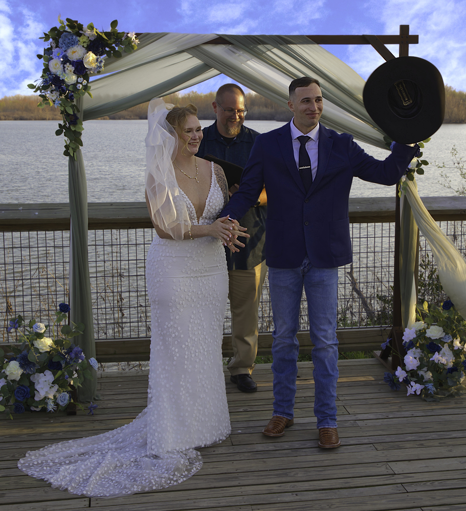
Lovely wedding photo. Good use of fill to lighten their faces. For me Mark the sunlit highlights are a bit washed out. Know that whites in the bright sun can be a real pain because getting a correct exposure there means under exposing your subjects face by a couple of stops. You were already shooting at iso 100 so the only options I see would be bumping the shutter speed up and using high speed sync on the fill flash or bumping the f-stop up, but that would bring the background more win to focus. Use of an ND filter would be an option too.
Also this one is a little off level to the right. I used the roof of the building to find level. |
Jan 6th |
 |
| 30 |
Jan 25 |
Comment |
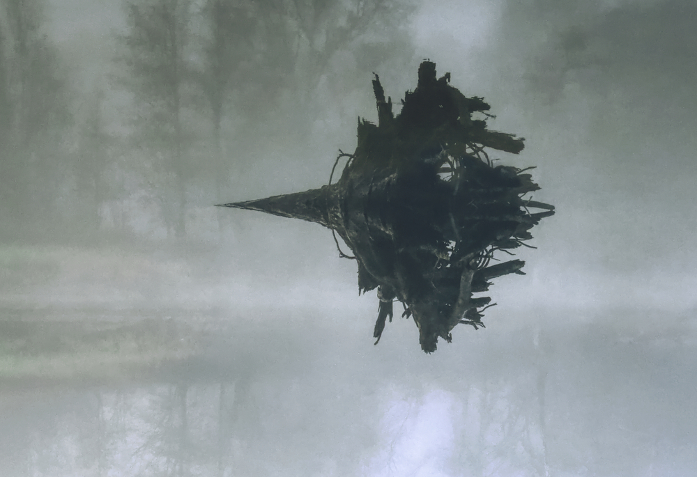
I really enjoy this type of image. Items like this one are for the most part common place and often overlooked but when a person stops to look they are quite fascinating. I like how the lines follow the curve of the mirror and the smily face is a big bonus.
I can see where Walter is coming from on a contextual level the original does have merit. I personally feel that the abstract nature the mirror when isolated from the surroundings is stronger. So I ran with that and cropped in tighter on the mirror with a 1x1 crop. |
Jan 6th |
 |
| 30 |
Jan 25 |
Reply |
I tried that just now, WOW I can't believe I didn't see B&W for the color. Good catch!! |
Jan 5th |
 |
| 30 |
Jan 25 |
Comment |
Walter, I agree totally with Mark on your photo, well done. Walter, imo, a little brighter and a touch sharper and it would be perfect.
|
Jan 5th |
5 comments - 2 replies for Group 30
|
5 comments - 2 replies Total
|