|
| Group |
Round |
C/R |
Comment |
Date |
Image |
| 87 |
Mar 23 |
Reply |
I tried to take suggestions. See what you think. |
Mar 7th |
| 87 |
Mar 23 |
Comment |
|
Mar 7th |
 |
| 87 |
Mar 23 |
Comment |
Thank you, Jennifer. |
Mar 4th |
| 87 |
Mar 23 |
Comment |
I am going to take everyone's thoughts and re-edit. Thank you. |
Mar 3rd |
| 87 |
Mar 23 |
Comment |
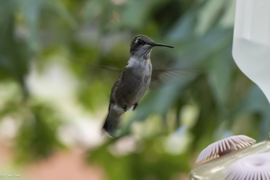
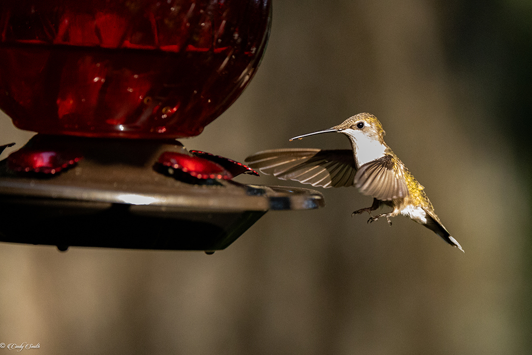
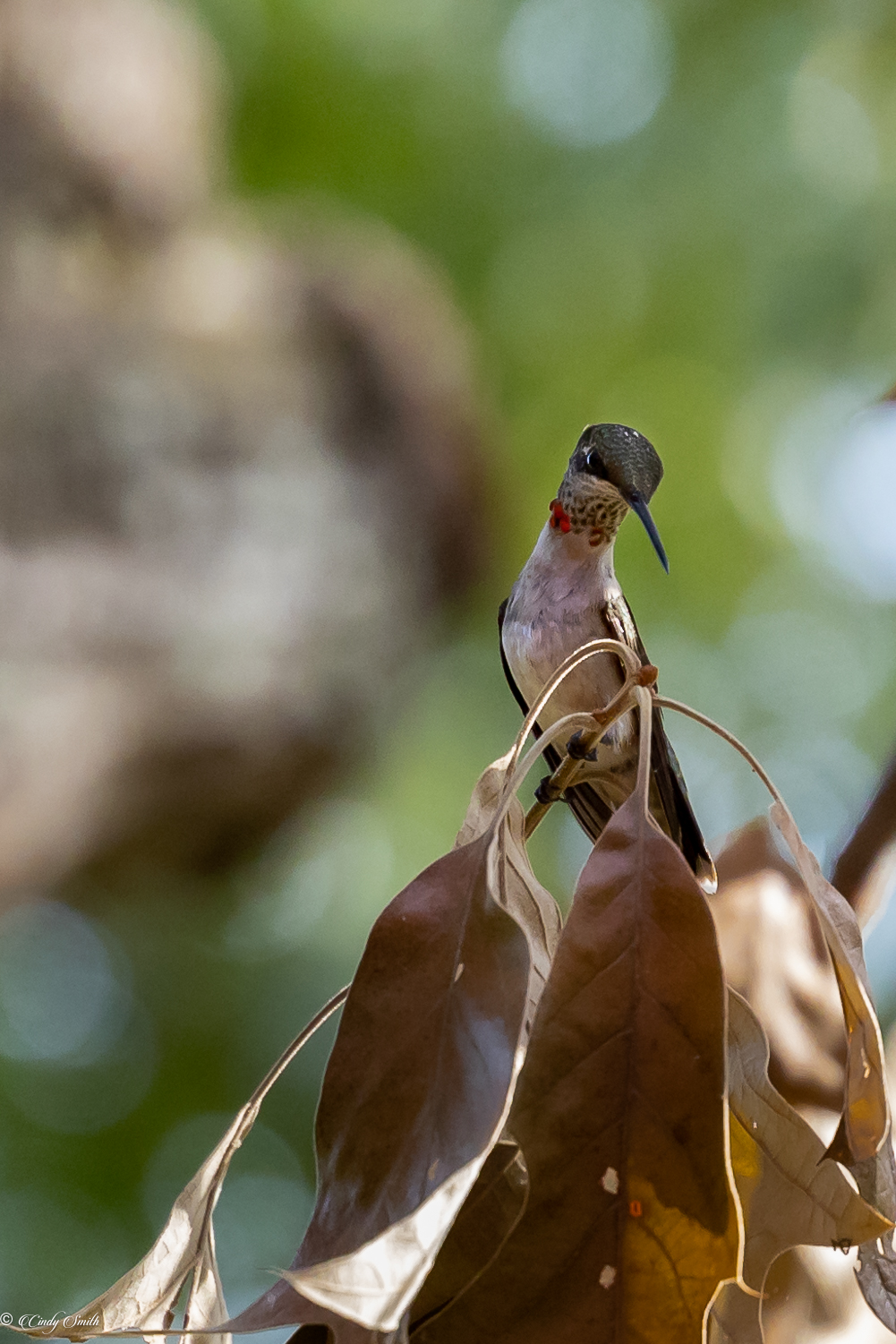
Thank you, Steven. I'll try to redo the image with all the suggestions to see how it looks. I used the masking tool in LR to darken the leaves quite a bit, but I didn't think about lightening the hummer.
|
Mar 2nd |
| 87 |
Mar 23 |
Comment |
Thank you, Lance. I'm just learning how to use the new masks in LR. I'll try it. |
Mar 2nd |
| 87 |
Mar 23 |
Comment |
Jennifer, I want to come and travel with you!! Your images are so wonderful. WaS the camel in the front just getting up? His back legs do not look fully extended? I love the way the camels are silhouetted against the golden sky with the sun a perfect circle! Perfect! |
Mar 1st |
| 87 |
Mar 23 |
Comment |
This is very beautiful, and you have shown the water flowing and the eddies. The colors of the leaves match the color in the top edge of the bridge, and the lower part of the bridge is similar to the lighter parts of the water and the buildings in the background. Great job!
|
Mar 1st |
| 87 |
Mar 23 |
Comment |
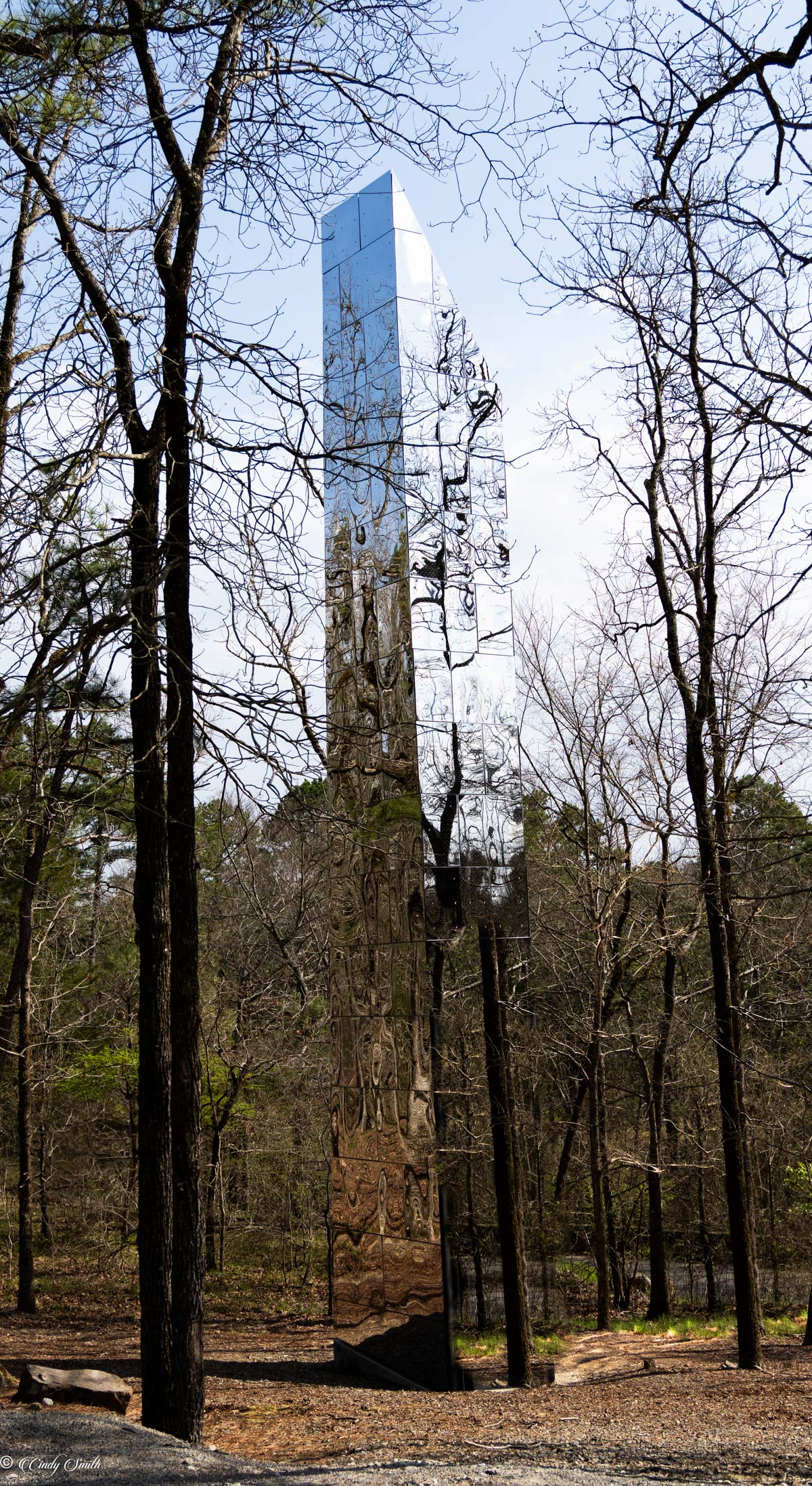
WOW!! I really had to study this to realize what (I think) you had done in this image. It is quite interesting, and the contrast between the bushes and the sky--with the clouds is quite interesting. |
Mar 1st |
| 87 |
Mar 23 |
Comment |
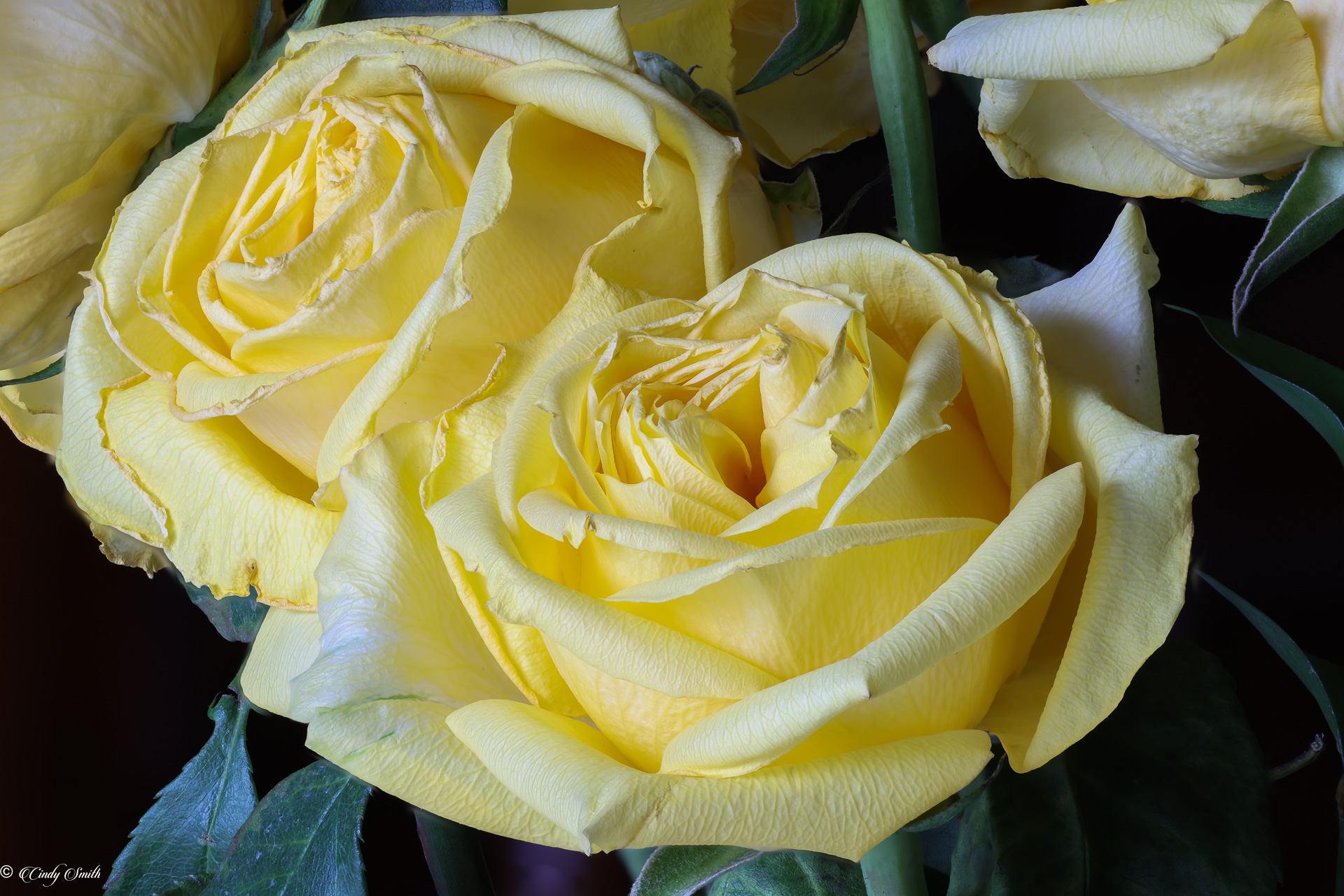
It is beautiful, but the pitcher gets lost in the background in the BW. I don't know enough about post processing to know if there could be more contrast. The fact that the white roses are more in the middle of the colored ones and the leaves allows them to stand out. Beautiful image. |
Mar 1st |
| 87 |
Mar 23 |
Comment |
You have definitely succeeded in the "contemplative structure" of the image. It took me a while to realize exactly what was in the image, making me really study it. I'm not sure I prefer the blue, although blue tends to be a very serene color, which is most likely what you were trying to achieve. I'm not sure that a diptych or triptych would make it more effective--it is very interesting as it is. |
Mar 1st |
10 comments - 1 reply for Group 87
|
10 comments - 1 reply Total
|