|
| Group |
Round |
C/R |
Comment |
Date |
Image |
| 20 |
Apr 23 |
Comment |
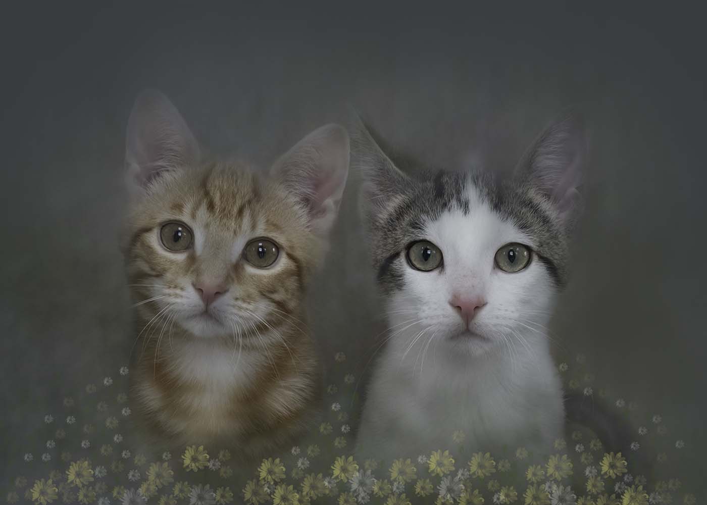
Another masterpiece Angela. There is a lot of work in this image too so well done.
Hazel from Group 41 |
Apr 7th |
1 comment - 0 replies for Group 20
|
| 41 |
Apr 23 |
Reply |
Thank you for your kind words Henry. it was all a bit of an experiment. |
Apr 26th |
| 41 |
Apr 23 |
Reply |
Thank you for your kind words Tom. |
Apr 16th |
| 41 |
Apr 23 |
Comment |
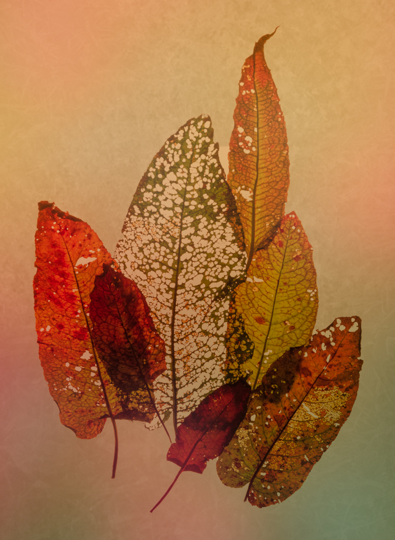
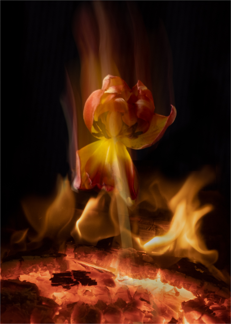
Hi Lisa,
This reminds me of a dragon especially a Welsh dragon. I don't know if you could add some eyes and some flames. |
Apr 13th |
| 41 |
Apr 23 |
Reply |
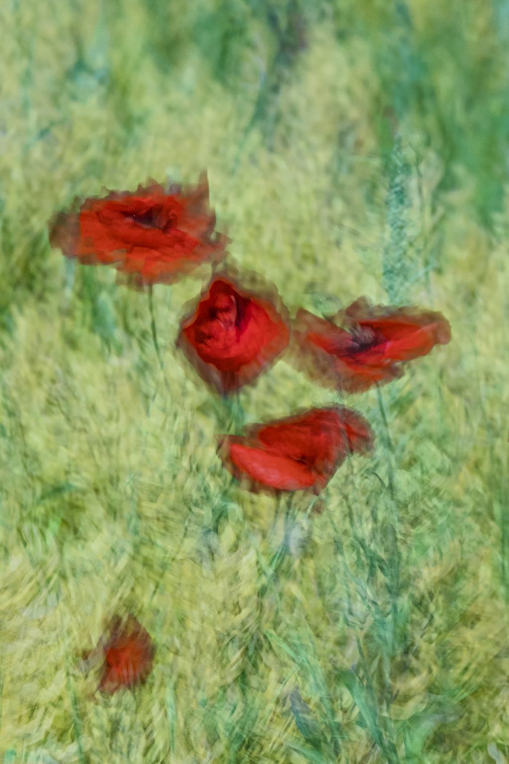
Thank you Brian for your valuable input. The one labelled Original 3 is actually the original image and the others are variations. You are right about the poppy one being more vibrant. That is my favourite too. |
Apr 13th |
| 41 |
Apr 23 |
Reply |
Thanks for your suggestion Ian. I will give it a try. |
Apr 11th |
| 41 |
Apr 23 |
Reply |
Do you mean the empty one without any motifs? |
Apr 7th |
| 41 |
Apr 23 |
Comment |
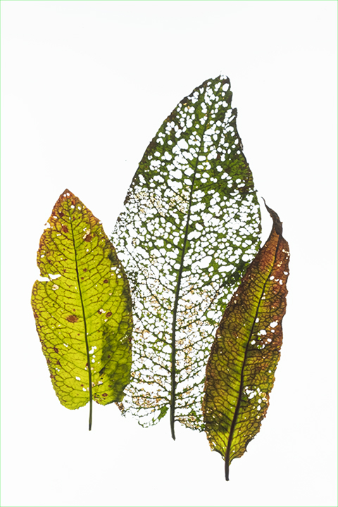
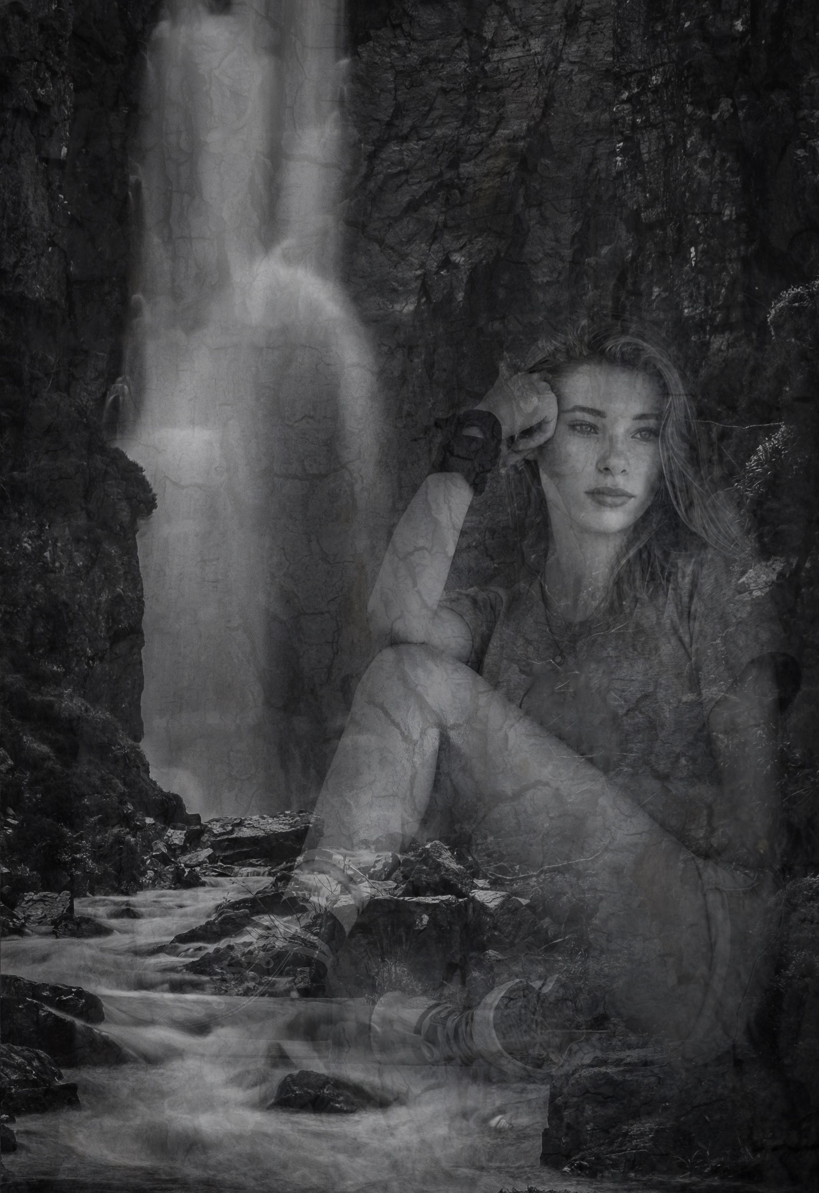
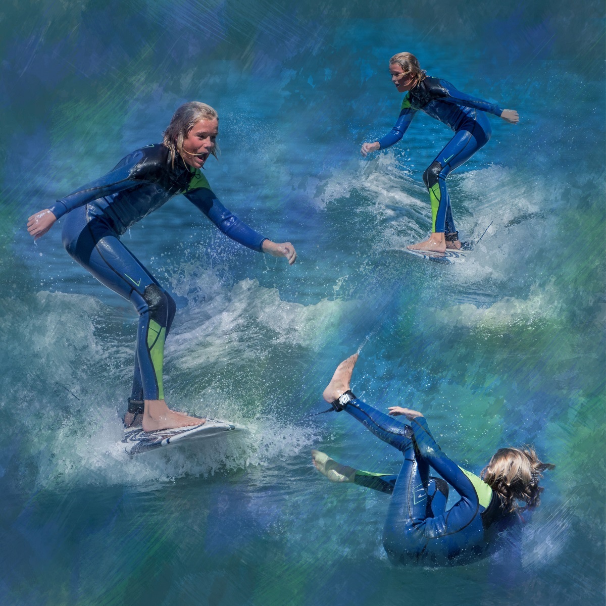
Your image has a lovely nostalgic feel Nadia. I like the image with the moon on the right. It reminded me of an elderly relative with dementia who continually tried to go back to the house she'd lived in as a child when she was out on her own. It was only when she started doing this in the middle of the night
that she finally had to be looked after in a care home. The man in your picture looks confused as well so this made me also feel sad. |
Apr 7th |
| 41 |
Apr 23 |
Comment |
This is really different Brian. I am not sure how the spheres within the square are related to the fireworks theme as they seem to contain gears of some sort. It certainly had me looking for quite some time which I expect you intended. It is very creative and other worldly. The escaping sphere and stars with motion blur add some great movement to the image. |
Apr 7th |
| 41 |
Apr 23 |
Reply |
Hi Angela,
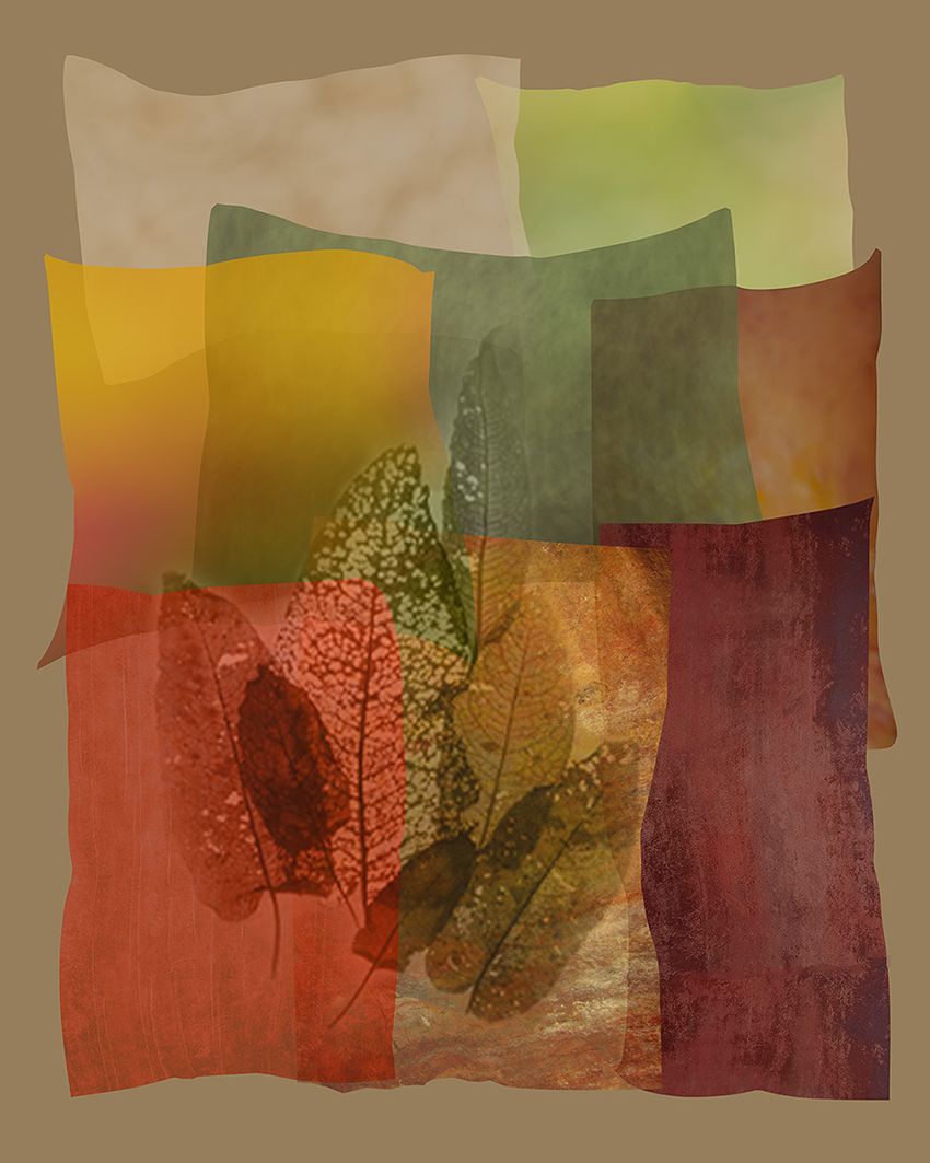
My original is the last one to be added which is the basic shapes without any added motifs. Because I thought it looked a bit empty I began trying to add some interest hence the different variations. I have made an absolute pigs ear of labelling and sending the images resulting in extra work for Brad for which I am sincerely sorry. I would value your opinion on the variations please.....or maybe you prefer the blank shapes?? |
Apr 7th |
| 41 |
Apr 23 |
Comment |
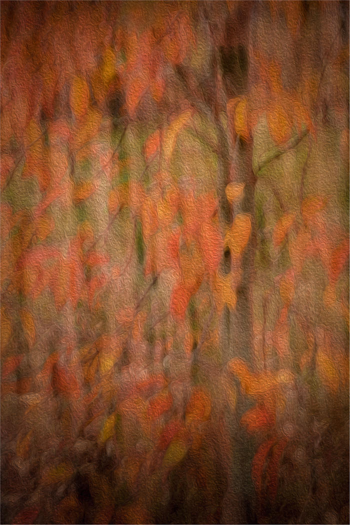
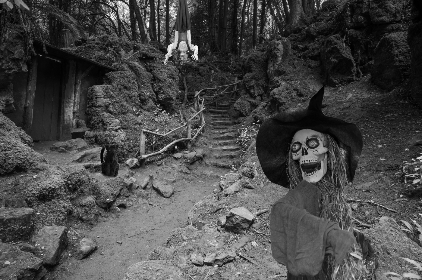
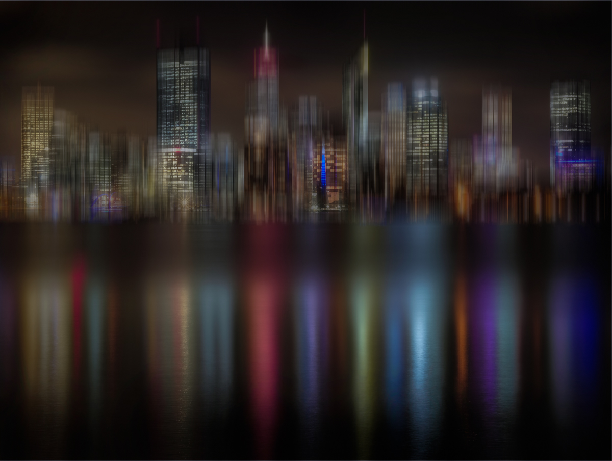
You are certainly visiting some interesting places in your imagination Tom, or should I say creating interesting places. I like the feeing of contemplation and the contrast between the grounded earthly urban surroundings and the beauty of the other worldly, night sky. I wonder what the effect would be if you cropped a bit off each side, making the sky more prominent in the picture. But it works very well as it is. |
Apr 5th |
| 41 |
Apr 23 |
Comment |
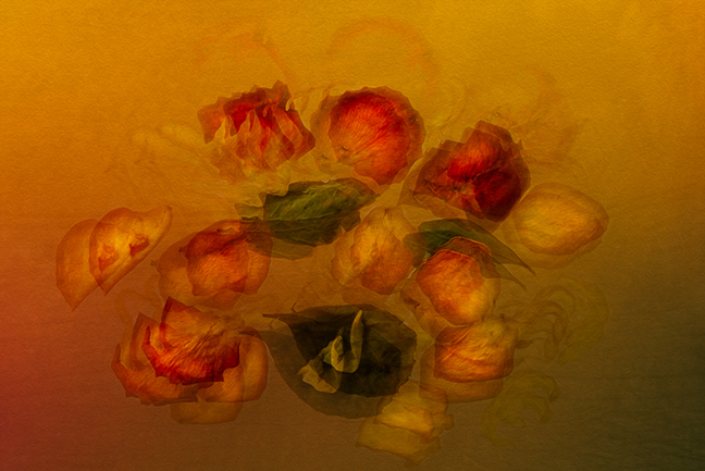
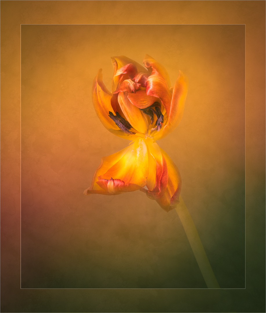
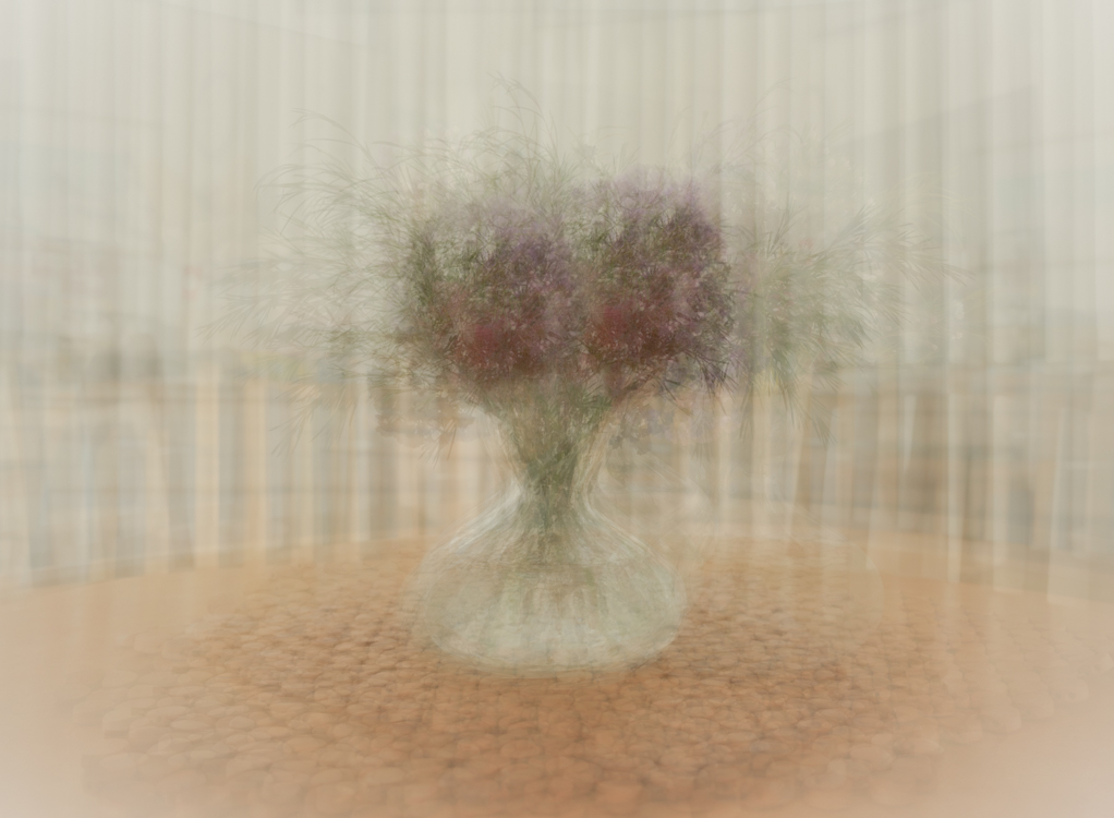
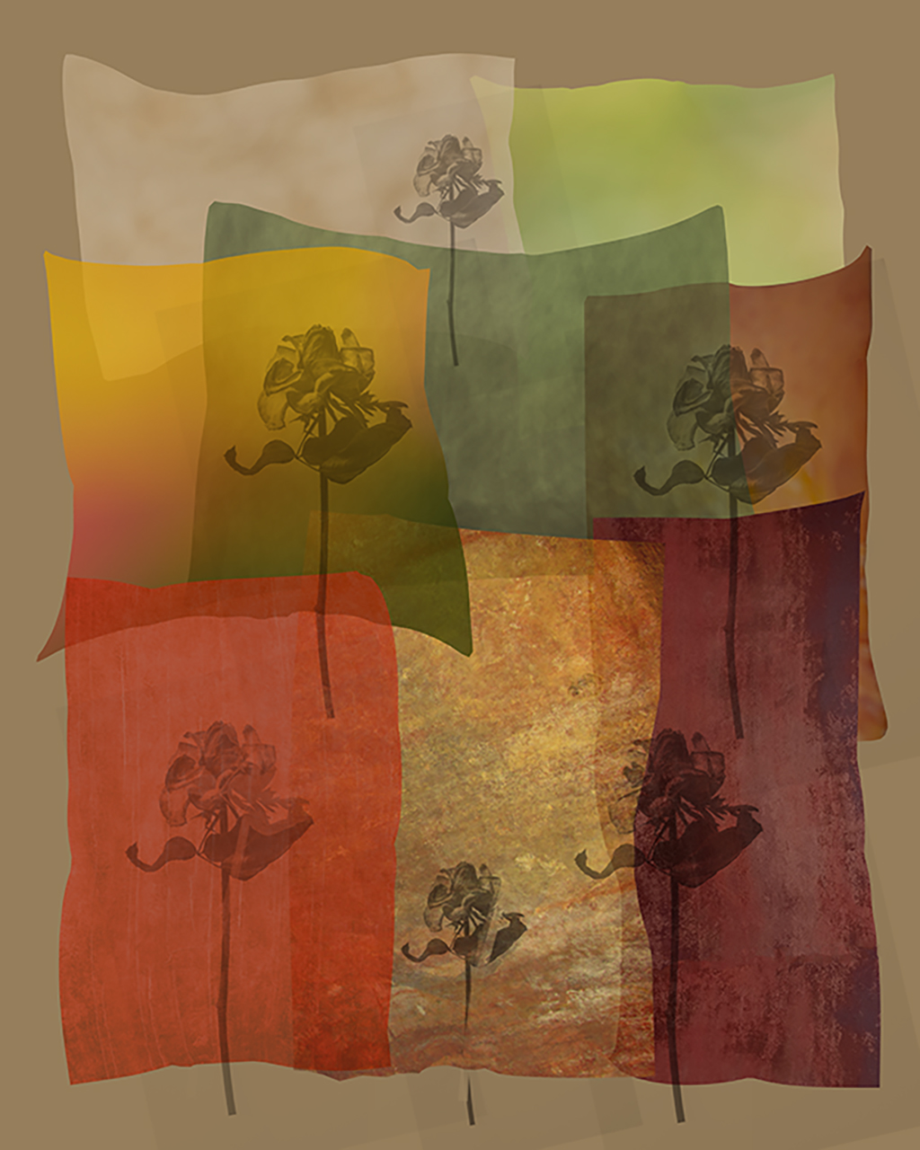
Hi Henry,
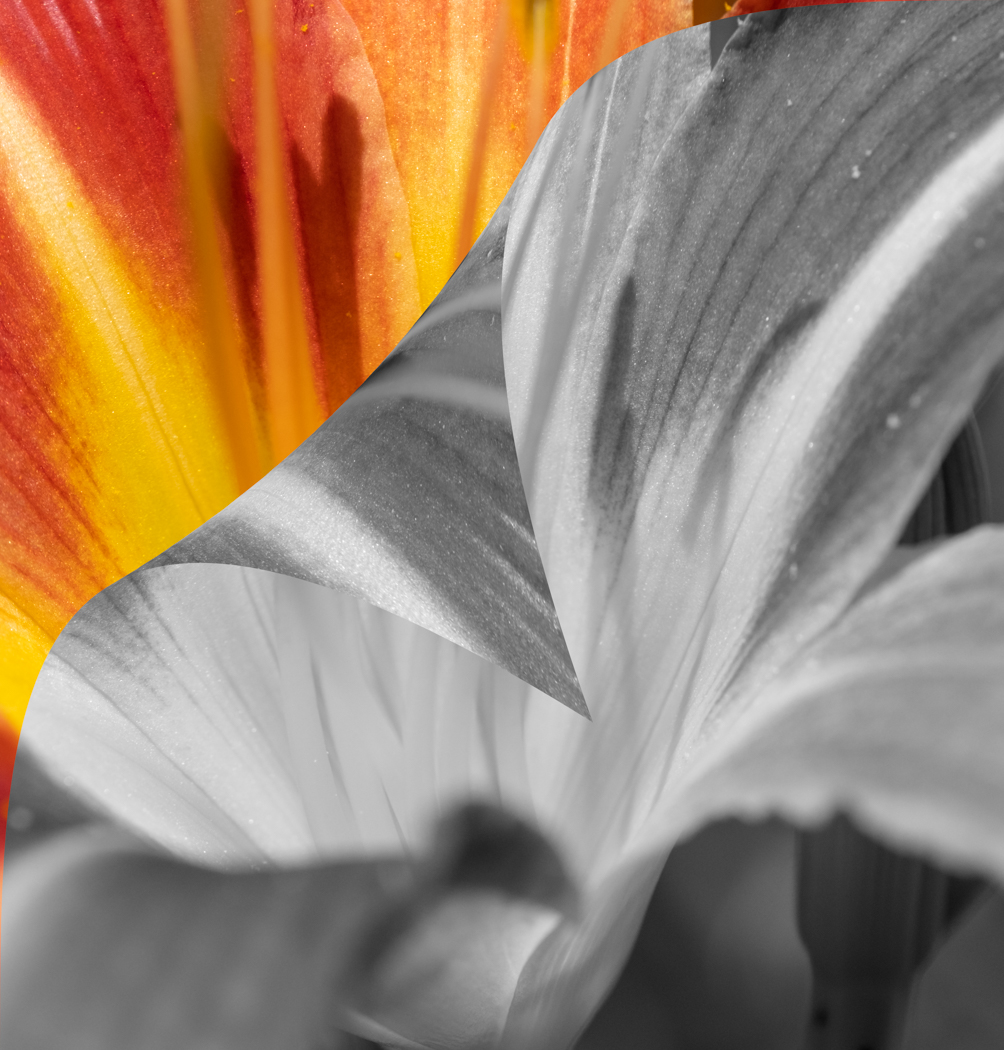
I too am inclined to prefer Original 2. I think it is because of what the processes you used have rendered red something...maybe the small flowers in amongst the tulips. I think the small sprays of flowers in the first image distract a little from the rest of the image which is very successful cropped in. The crop draws the eye to the actual flowers which are nicely arranged in the image. Interesting work. |
Apr 5th |
5 comments - 6 replies for Group 41
|
6 comments - 6 replies Total
|