|
| Group |
Round |
C/R |
Comment |
Date |
Image |
| 21 |
Feb 22 |
Reply |
That Sounds like a good idea Steve. I think that is what I was after really so will give it a try. |
Feb 21st |
| 21 |
Feb 22 |
Comment |
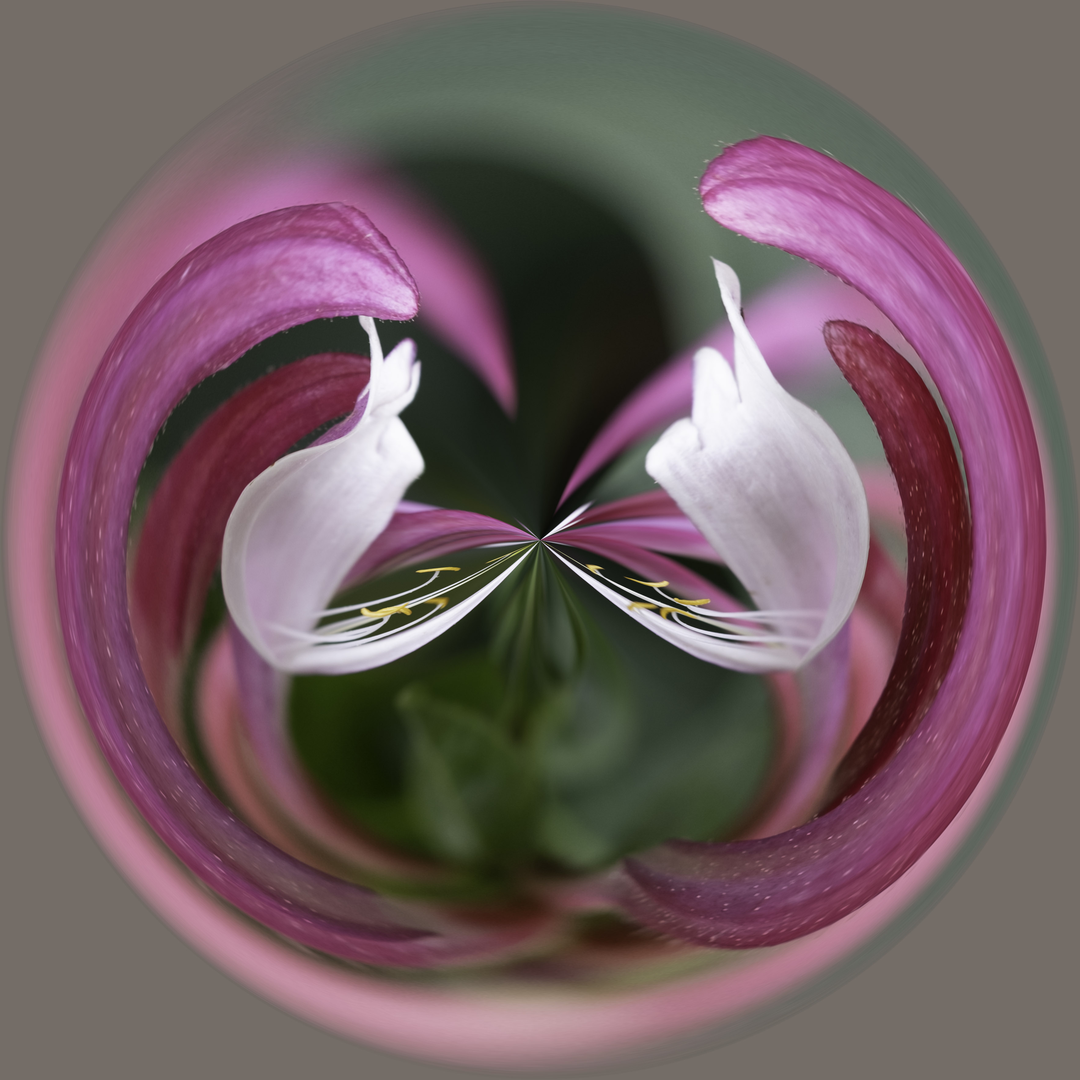
Hi Mike,
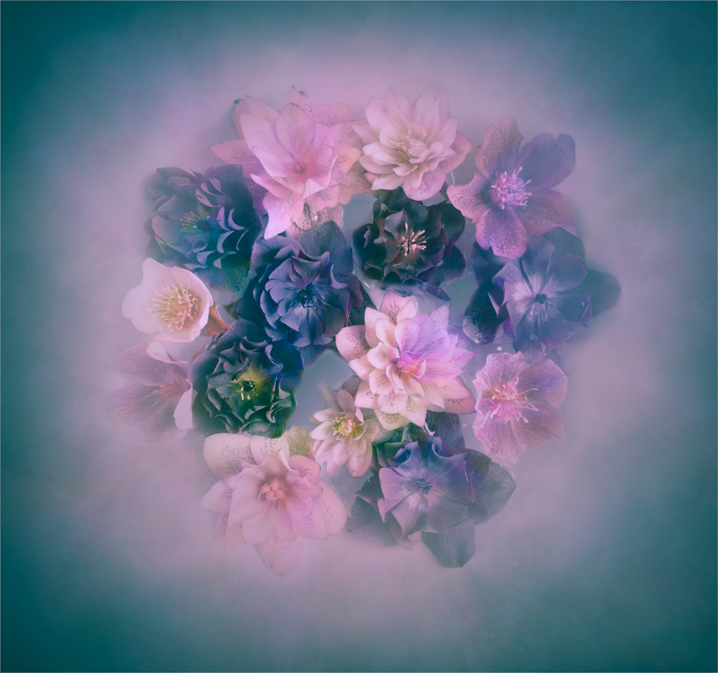
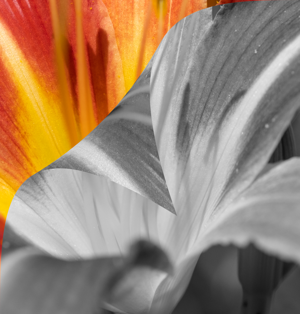
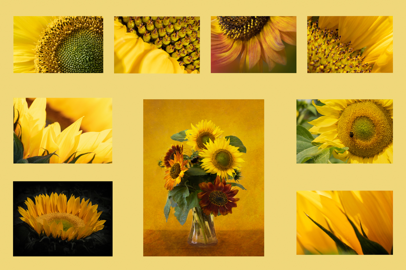
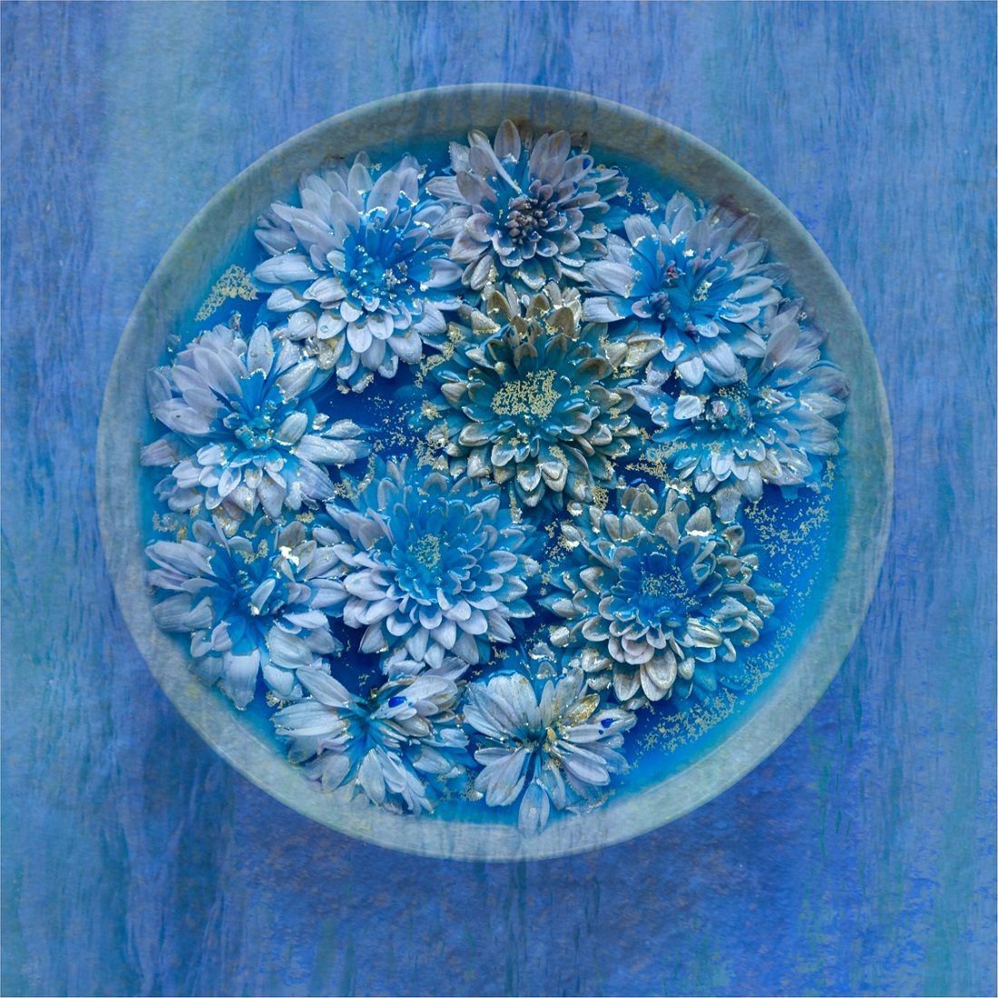
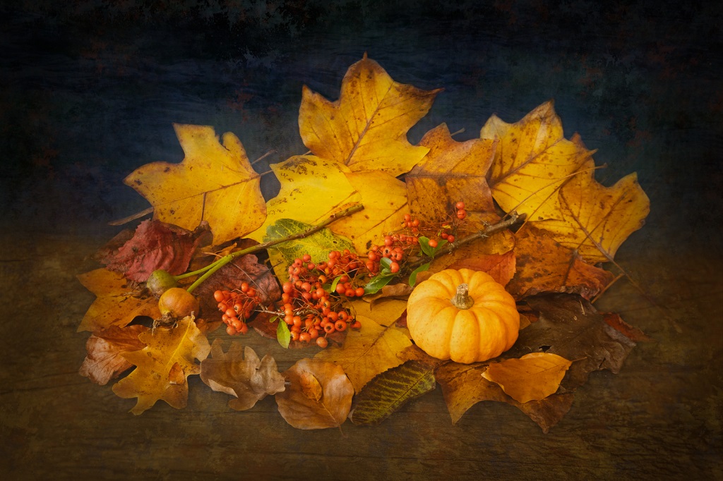
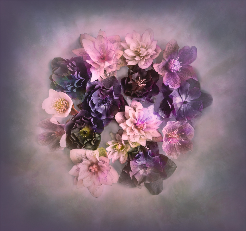
Your's is an unusual image and I am sorry for being very late in my critique. I am not sure about the colours you have chosen. The blue is a good contrast to the yellow but the addition of green and also brown for me is too many different colours. Try adding some splashes or smudges of blue into the green to fuse the colours together somewhat. Personally, I would dispense with the vignette and the border as well. If you do add a border, as a key line, judges tend to suggest 2 pixels and this really is to separate the image from any black or white display background. I think also that there are a lot of more interesting flowers you could have used which have a centre which would attract the butterfly more and draw your eye into the globe centre. Altogether a great creative idea which could have lots of variations in colour or content. |
Feb 21st |
| 21 |
Feb 22 |
Comment |
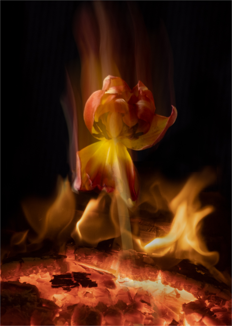
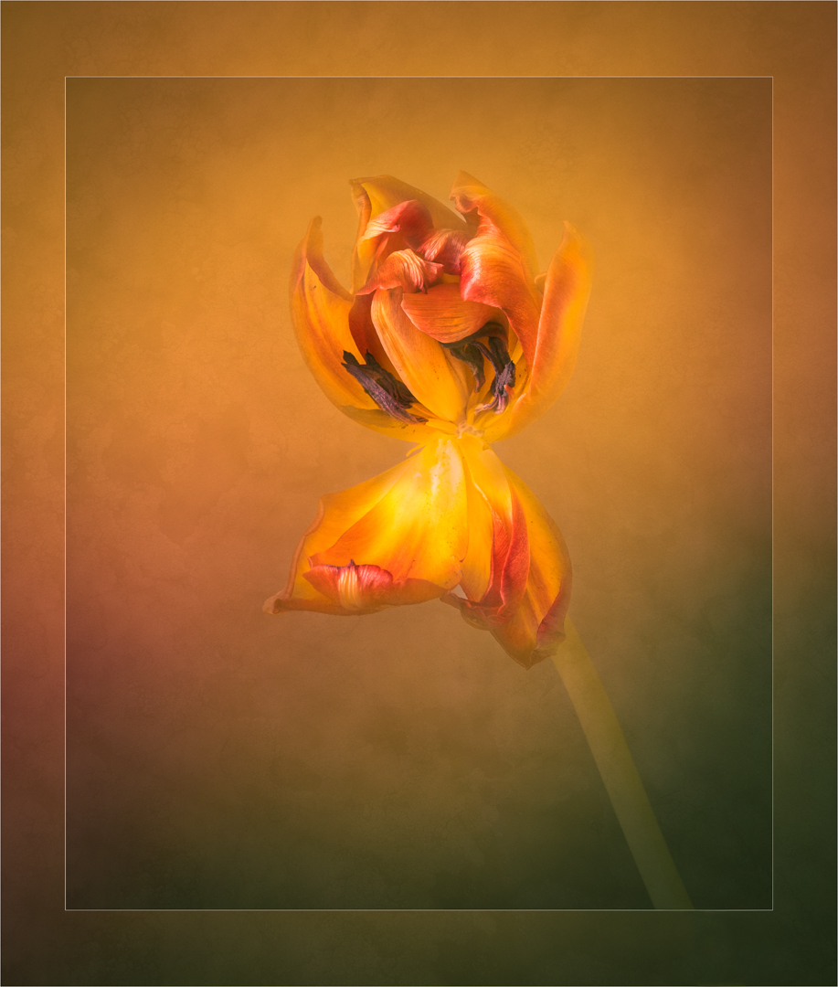
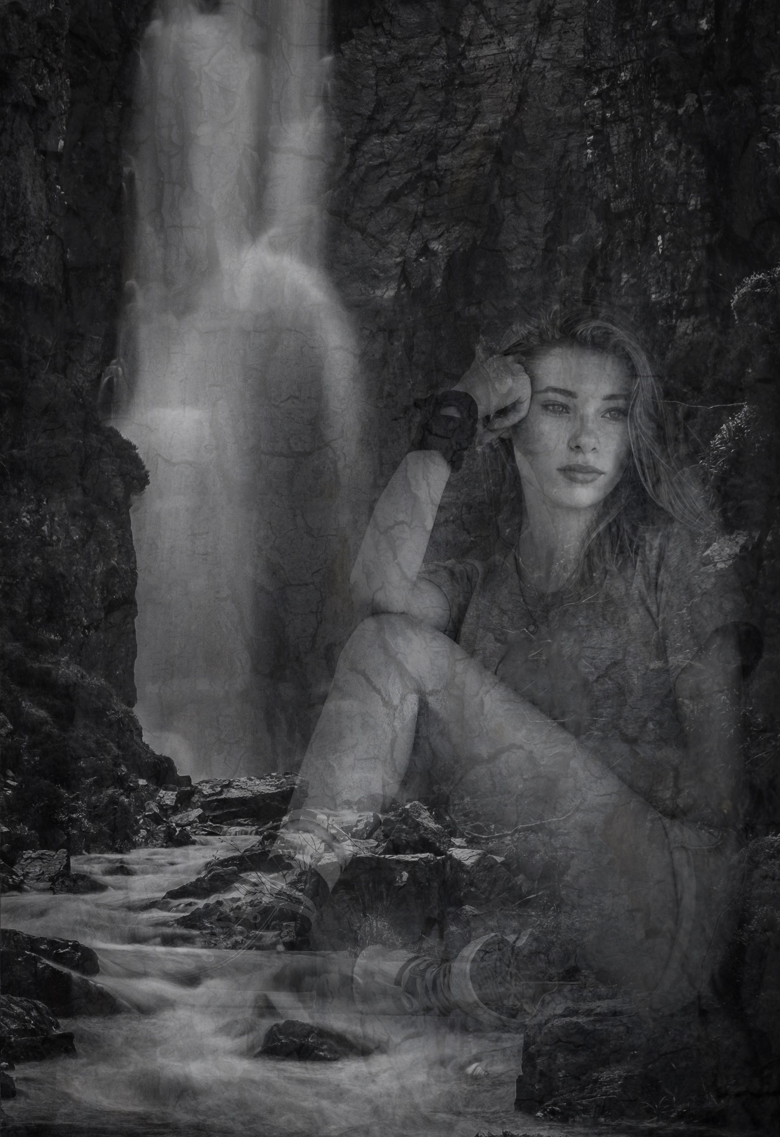
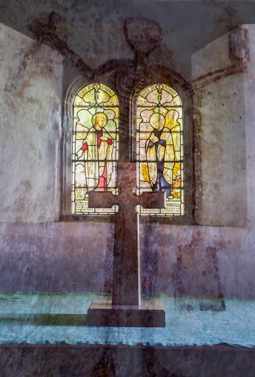
Are the icicles hanging from above a window frame Because it makes me think I am looking through a window at a colourful scene of tulips stretching into the distance. The red flowers contrast beautifully with the winter tree and create a stunning juxtaposition of the two images. |
Feb 20th |
| 21 |
Feb 22 |
Comment |
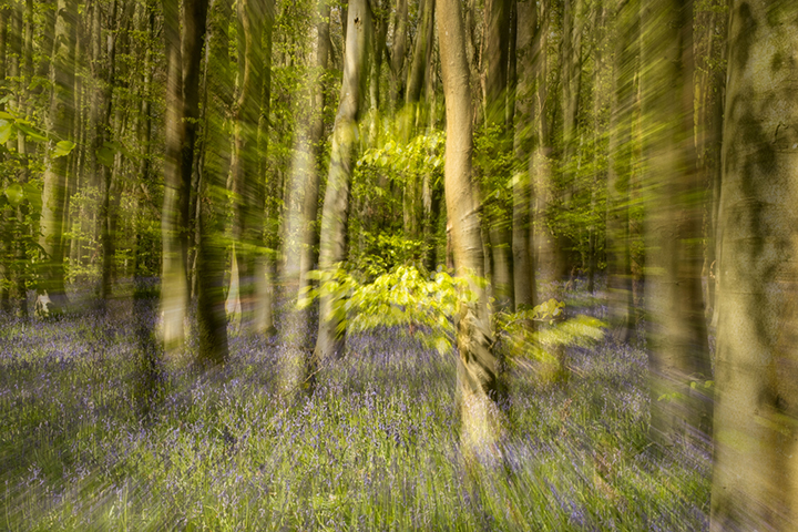
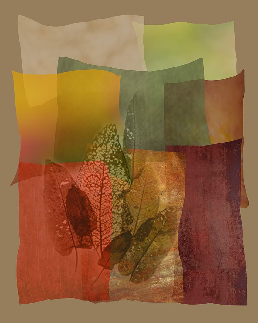
I too immediately thought of a yacht especially with the name Mayflower. The deconstructed parts all hang together well and create a pleasing composition which is what we always get from Brian.
I must admit I preferred your previous one but continue to admire the results of this novel technique. |
Feb 20th |
| 21 |
Feb 22 |
Comment |
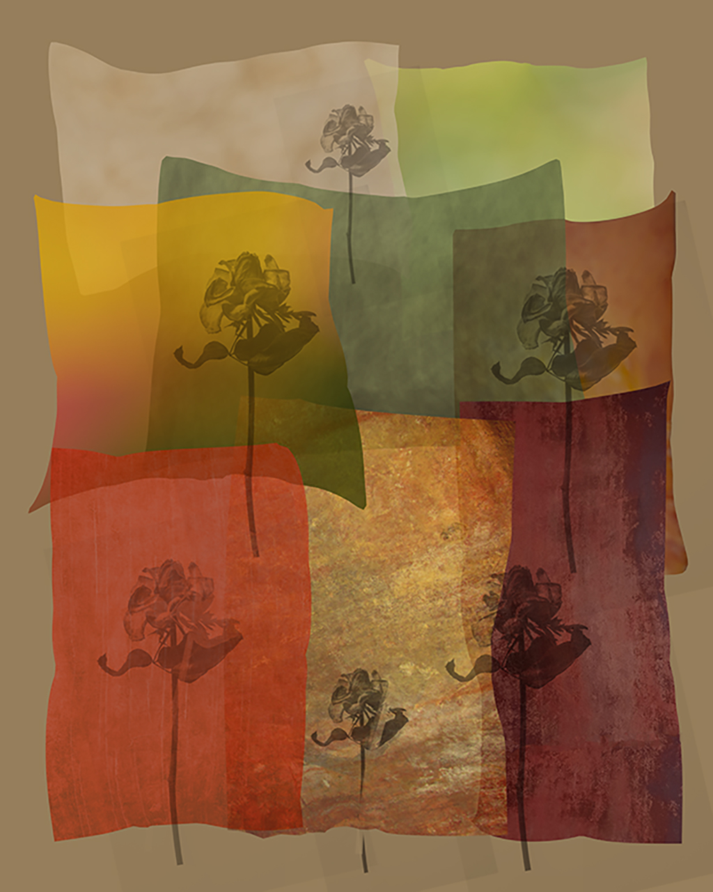
A creative and very pleasing image Joan. I appreciate the quality of the symmetry created by the techniques you have used. The shape of the central aperture has required the lions to be stretched a bit but I don't think this detracts from the overall success of the image The colours are complimentary and very appropriate to the subject. I like that the central shape is also sharper and brighter which makes it stand out nicely. A lovely image. |
Feb 20th |
4 comments - 1 reply for Group 21
|
4 comments - 1 reply Total
|