|
| Group |
Round |
C/R |
Comment |
Date |
Image |
| 26 |
Dec 20 |
Reply |
The more I think about it, the best bet might be to use the Edit>Transform>Warp in PS to pull the one side down slightly and eliminate the feeling of tilt. It should only take a very small amount. |
Dec 9th |
| 26 |
Dec 20 |
Reply |
Yes, like a lot of images we work on, I did not really "see" the sign, even with all the detail processing. Definitely the sign i# going. |
Dec 8th |
| 26 |
Dec 20 |
Reply |
The more I think about it, the best bet might be to use the Edit>Transform>Warp in PS to pull the one side down slightly and eliminate the feeling of tilt. It should only take a very small amount. |
Dec 7th |
| 26 |
Dec 20 |
Reply |
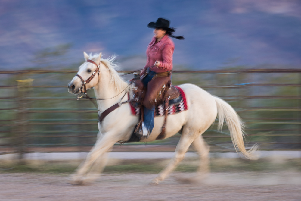
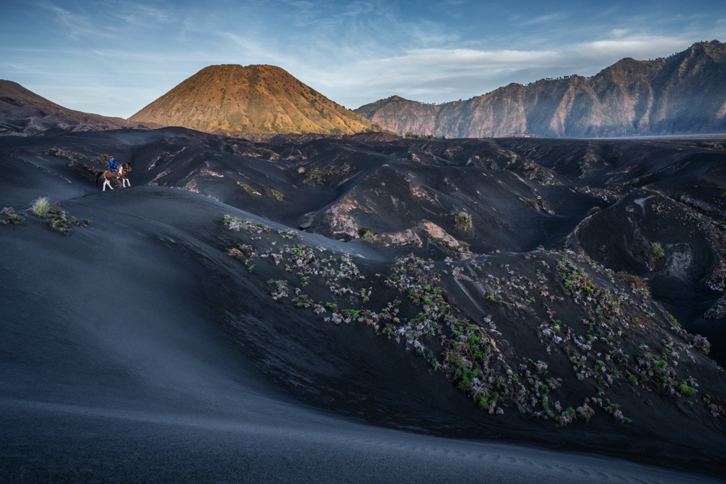
I think part of the problem is the size of the image we are reviewing (to see the rider). If this was a large print where we could see the details more easily, the rider could be seen more easily. Sometimes certain images shine better as a large display, because we see the details better. |
Dec 7th |
| 26 |
Dec 20 |
Comment |
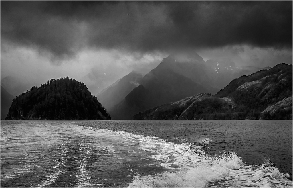
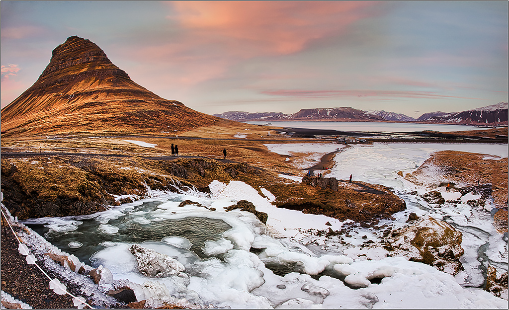
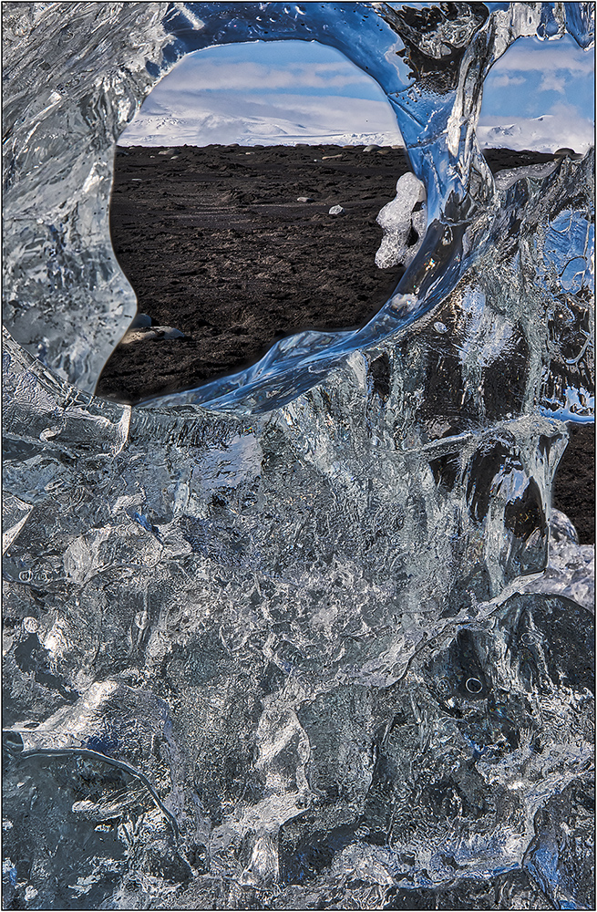
I like that you dodged the curve in the black sand to create this leading line. This is quite the dramatic landscape.
I think some more contrast will add more impact, either using curve in PS or the contrast slider in LR. (I think it just needs a stronger black.) While I was at it, I also tried to tone down the brighter rocks in the very center, as I wanted to have the horse and rider be more prominent,and the bright bush to the left of the rider. |
Dec 7th |
 |
| 26 |
Dec 20 |
Comment |
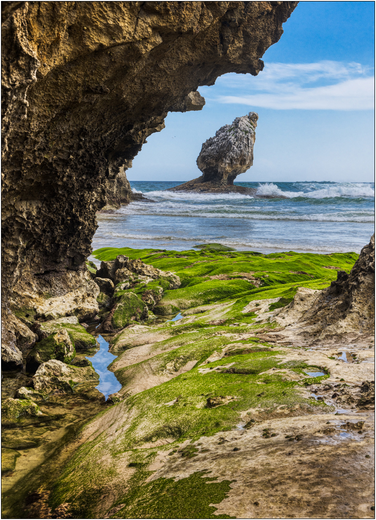
You might be able to darken the left side a little so that our attention is pushed into the center more. (I think the information there is important to the whole scene, but if slightly darkened has less interest.) While there are lots of ways to work, I tried an adjustment layer to darken the whole image, and then applied to the mask a gradient on left side to gradually bring back the brightness before the arch starts, so that the edge only had the full effect.
It is perhaps only an illusion due to the angle taken, but I feel it may be a little tilted, and I would try some straightening.
Great image. The colorful reflections make all the difference. |
Dec 7th |
| 26 |
Dec 20 |
Comment |
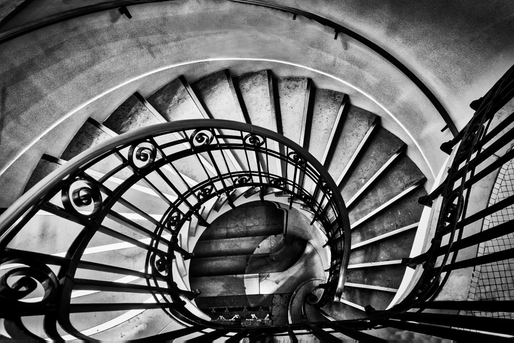
Very nice layering. I agree with Anges about the foreground darkening, as I also think it contributes to the depth. |
Dec 7th |
| 26 |
Dec 20 |
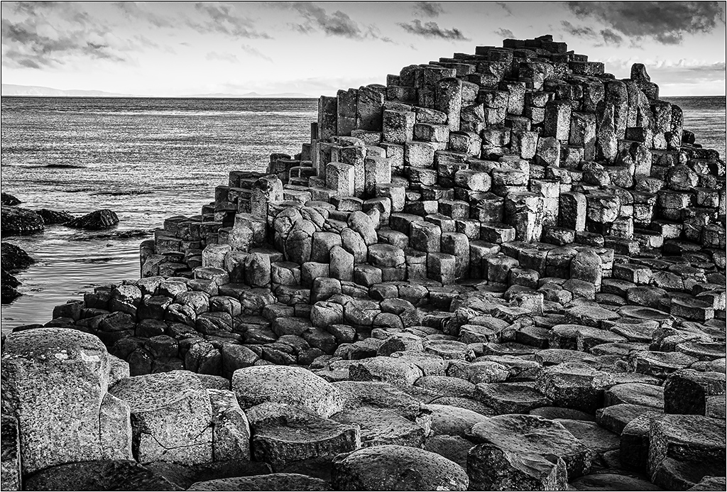
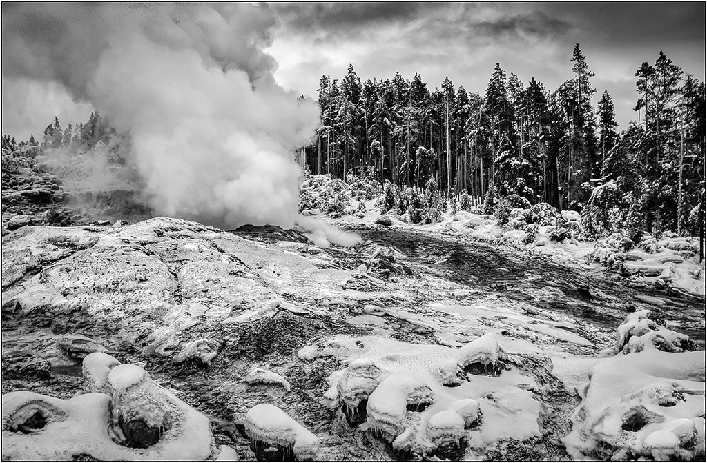
Comment |
The human element is a nice touch. Good contrast and effective use of black and white. I like the curves and lines. The only minor thing I see is perhaps you could tone down or eliminate the bright sun lit bright spot in the lower right.
I hope the others in the group got their images before the hiker spoiled it for the rest by leaving all those footprints! |
Dec 7th |
| 26 |
Dec 20 |
Comment |
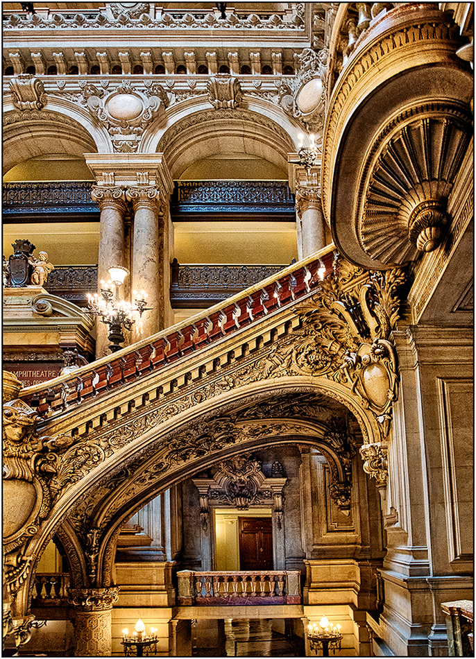
version 2 |
Dec 7th |
 |
| 26 |
Dec 20 |
Comment |
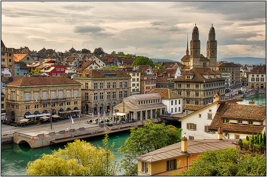
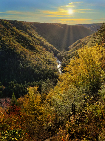
I actually prefer a lot of the elements of the original. I agree with Anges that there is a lot of sky information that you can use. To me, the final sky version lacks the pop and drama of the original sky, after modifying it.
I went to the original, and added a lot of warmth to the sky to bring out color in it, and cropped out the sun flare.
In the second version, I thought perhaps you preferred more of the darker drama of the final, so I added more contrast to the bottom and selectively added more color, which added even more to the sky (perhaps too much in this case). Since you liked the sun flare, I thought it was more appropriate coming from the bright area in the mid part of the sky, and I used Luminar to add the sunrays. (I know that Snapseed does not have the equivalent, but I think the other changes could happen in Snapseed.) |
Dec 7th |
 |
6 comments - 4 replies for Group 26
|
6 comments - 4 replies Total
|