|
| Group |
Round |
C/R |
Comment |
Date |
Image |
| 26 |
Jan 19 |
Comment |
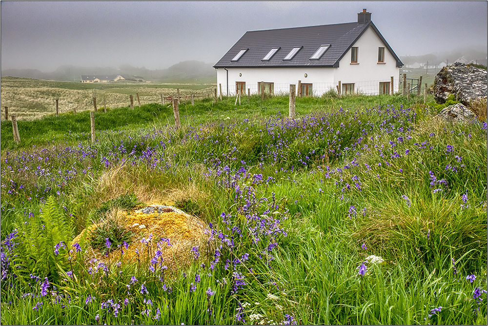
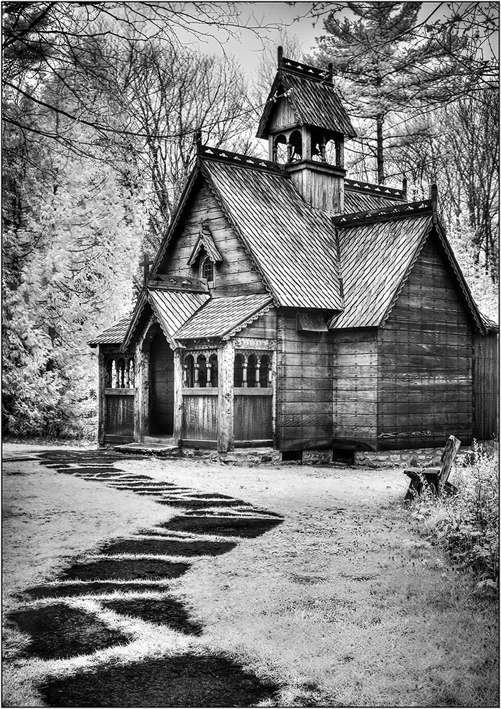
Amazing on how things slip by. I did not see that house tilt, and have fixed it now. |
Jan 16th |
| 26 |
Jan 19 |
Reply |
When I did this revision on my calibrated monitor at home, the added contrast looked good, but on my iPad, it looks too contrasts, so I guess the caveat is depending on how you are viewing |
Jan 16th |
| 26 |
Jan 19 |
Reply |
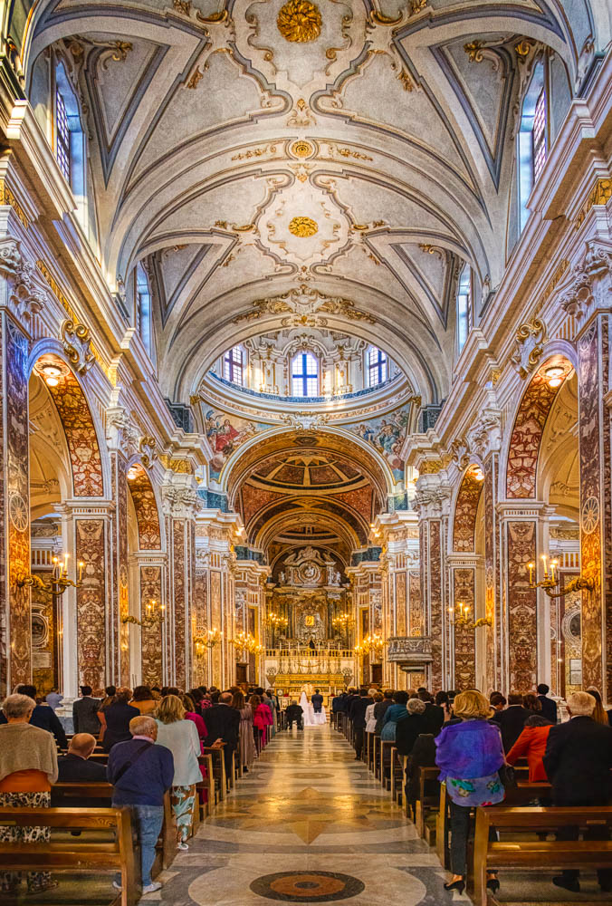
This image is also not tagged with a color profile. The Lumix camera should have a setting somewhere for you to assign it a color space. (For my Canon, I can choose sRGB or Adobe RGB. I chose Adobe RGB as it is a bigger color space.) With programs like Elements or Photoshop, it is easy to add the sRGB color space, but I don't recall this ability in Snapseed. My iPhone pics have a color space (usually DisplayP3 or sRGB) but I can't speak for the Galaxy. This may not be an issue for showing on the web, as long as the images appear to you as you see them on your phone. If so, you can continue to do what you have. It might be more of an issue if you enter these in competitions without an attached color profile, and certainly if you had it printed. |
Jan 9th |
| 26 |
Jan 19 |
Comment |
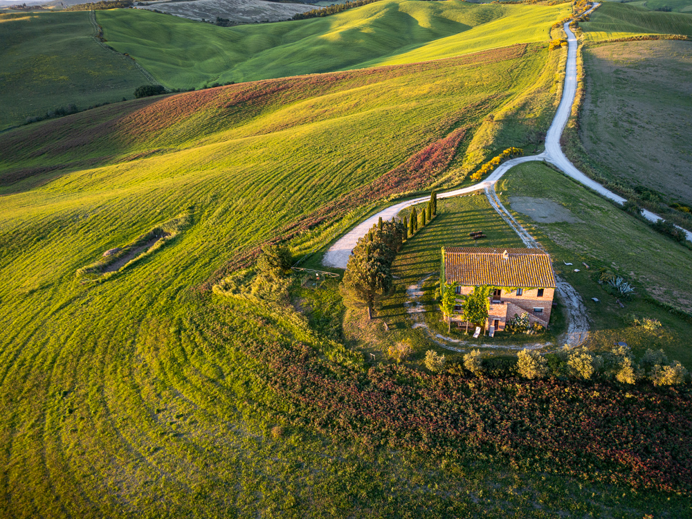
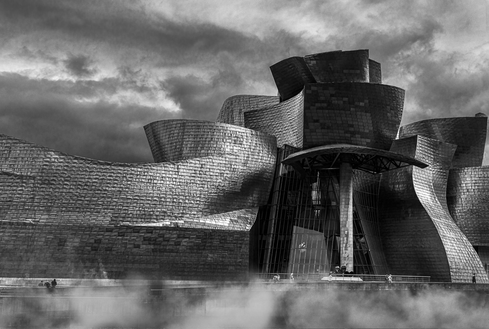
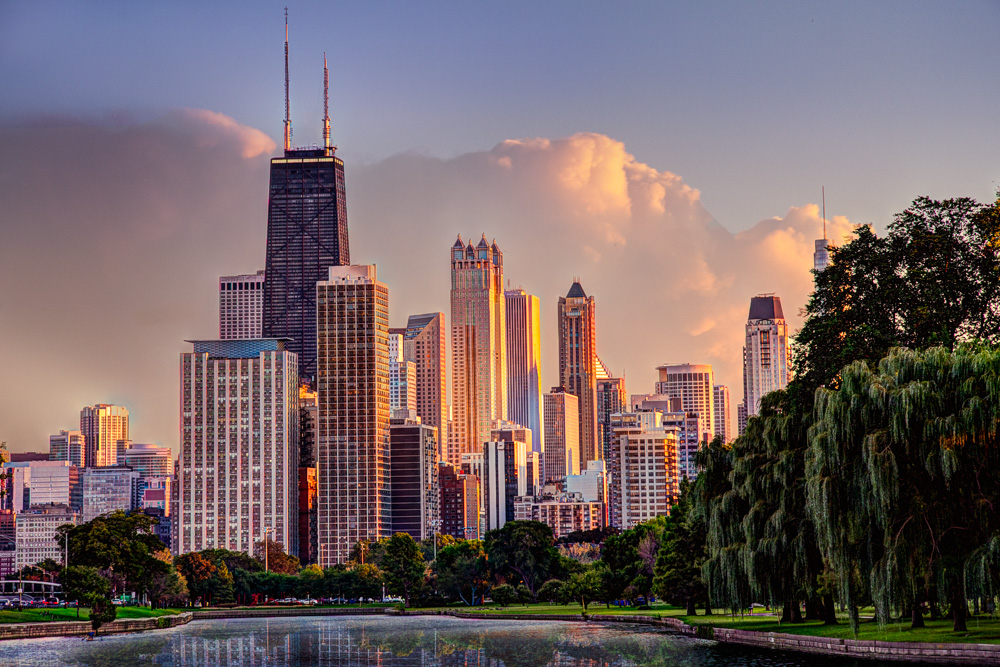
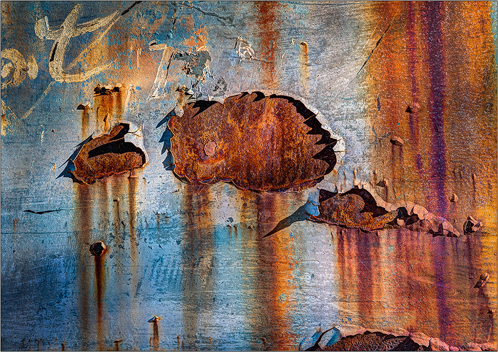
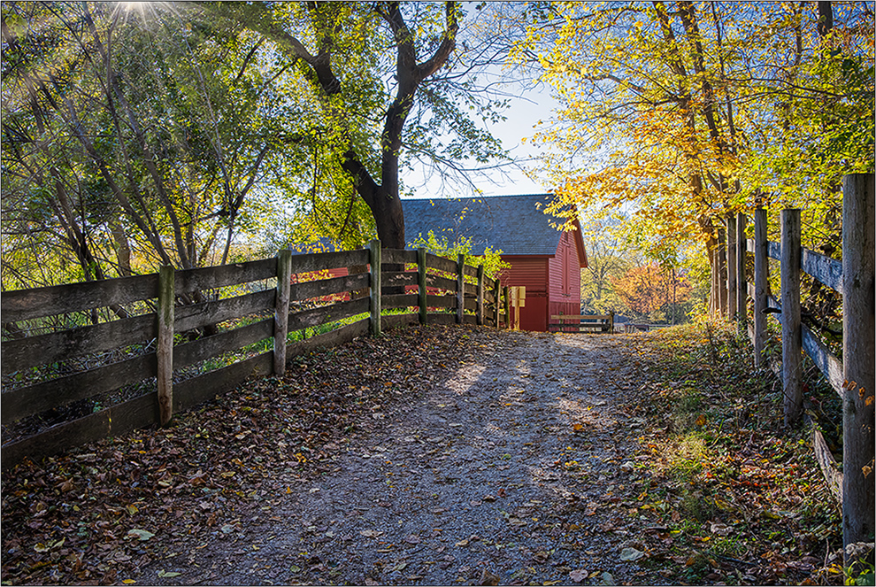
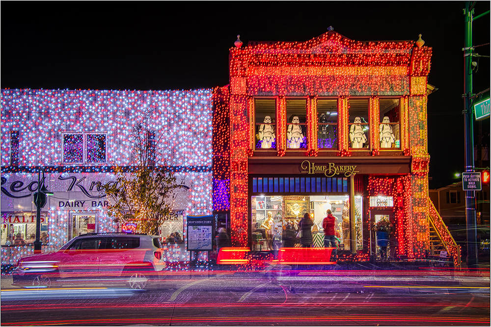
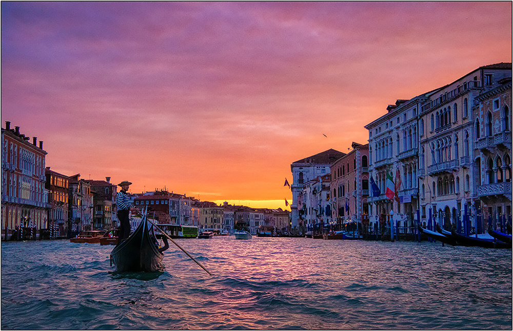
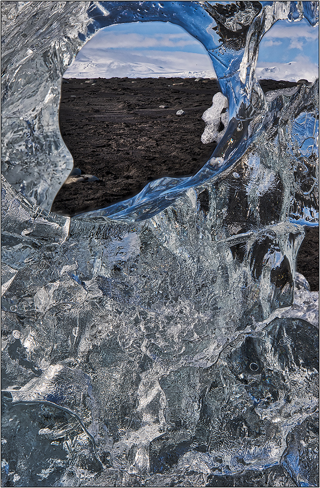
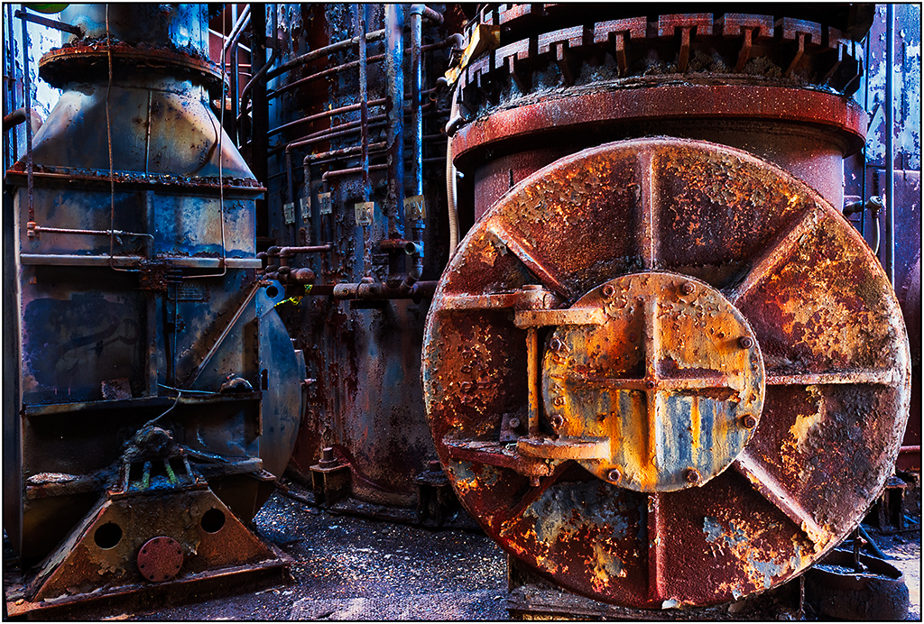
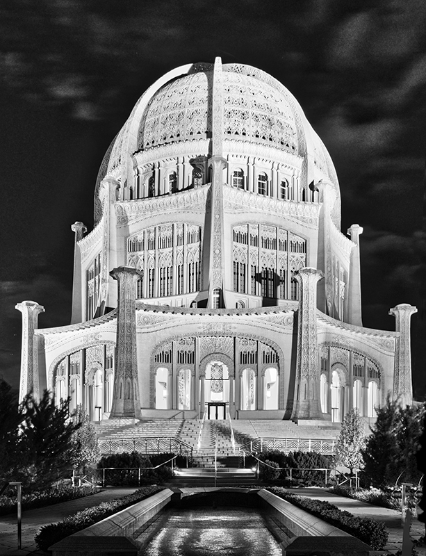
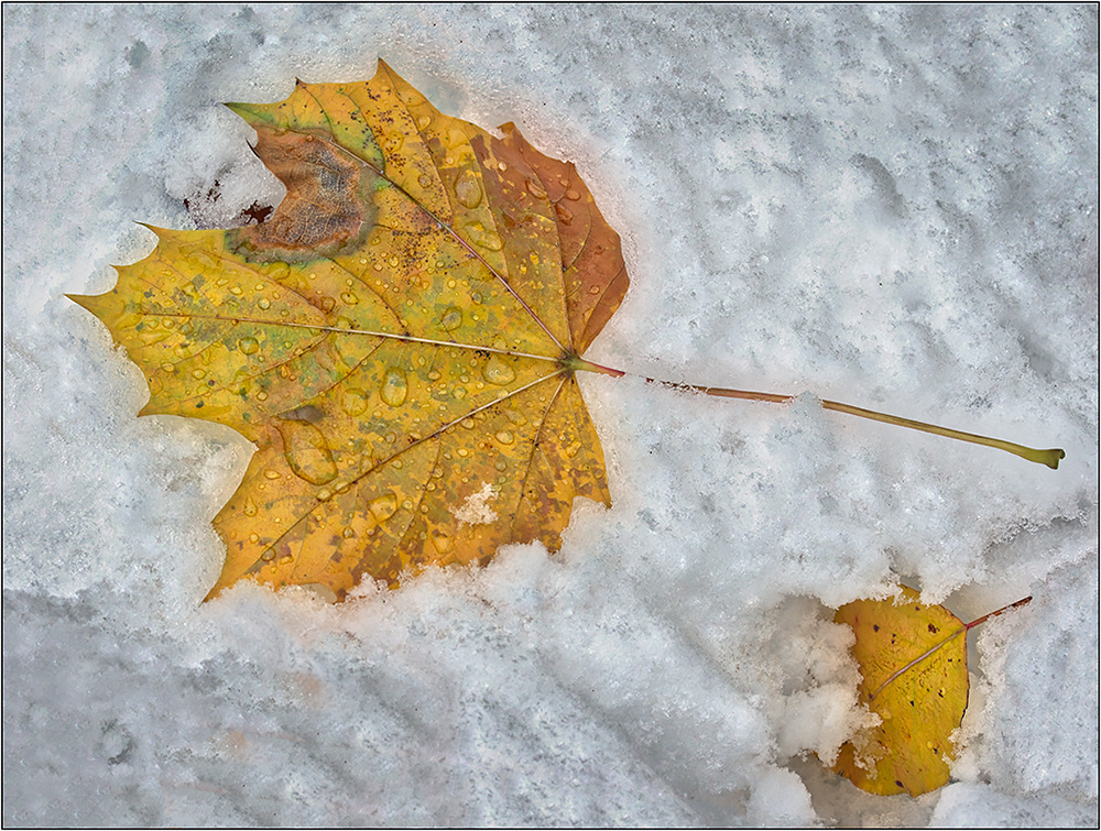
The blues and warms go together well. I like that small distant sun. Even though the horizon is in the middle, it does not matter as much here, with the subject matter, and importance of the foreground. There is a dark cloud (?) streak in the sky going up and down that does not seem to fit, and kind of stands out. I would suggest toning it down to blend in.
I think the building is almost lost due to color blending. I would like to see it have some more prominence. In camera raw, I brushed in more exposure, and yellow and green, to make it less blue and brighter. I may have gone too far here, but I do think toning it up will help.
It wold have been interesting to see the before scan to see what the Luminar preset does. |
Jan 8th |
 |
| 26 |
Jan 19 |
Comment |
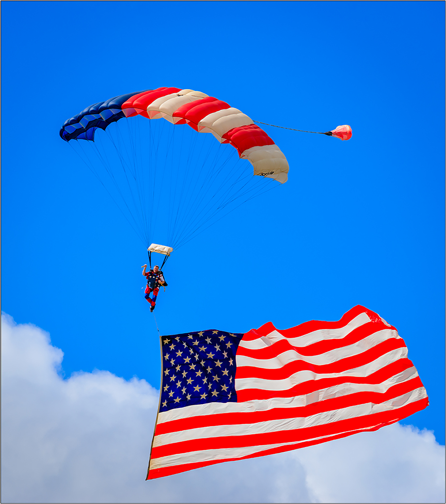
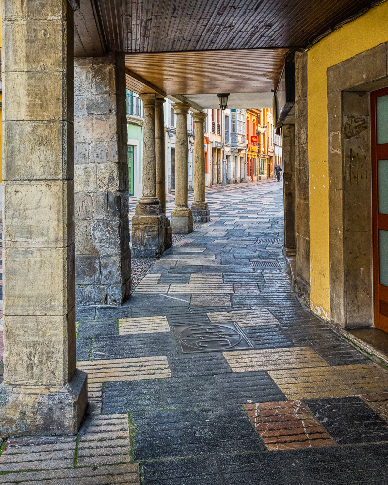
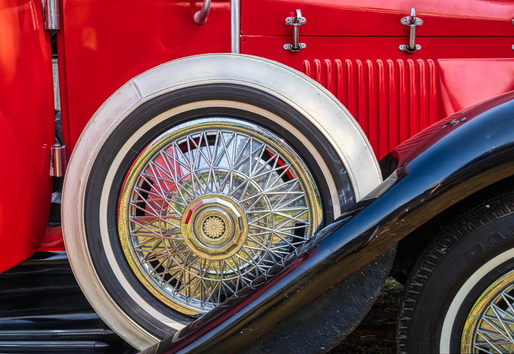
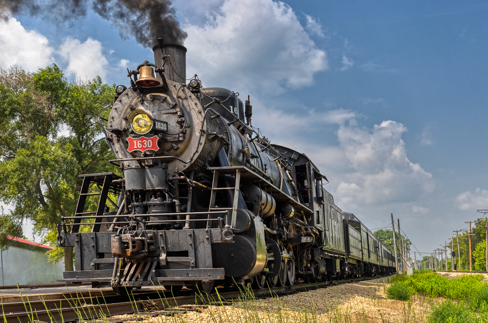
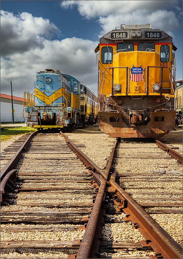
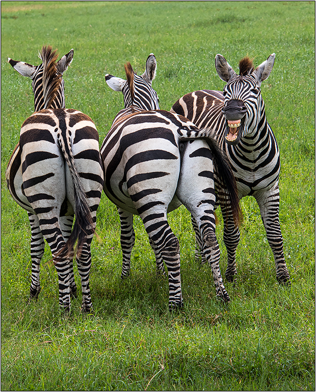
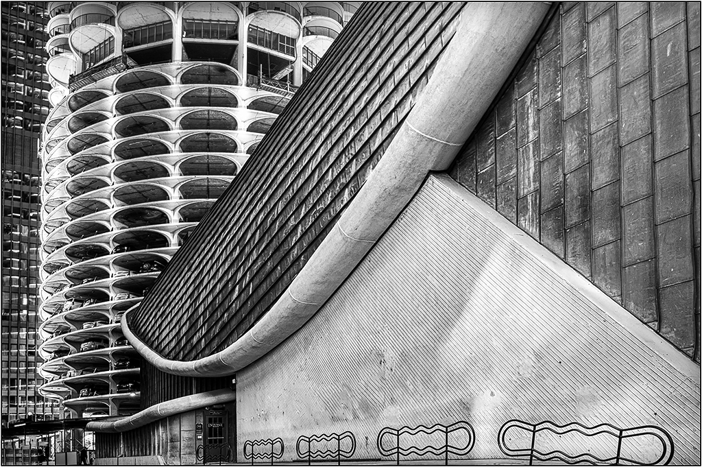
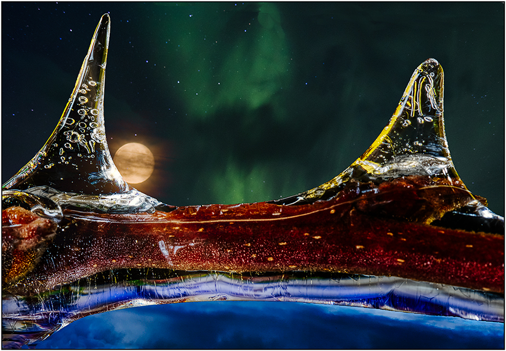
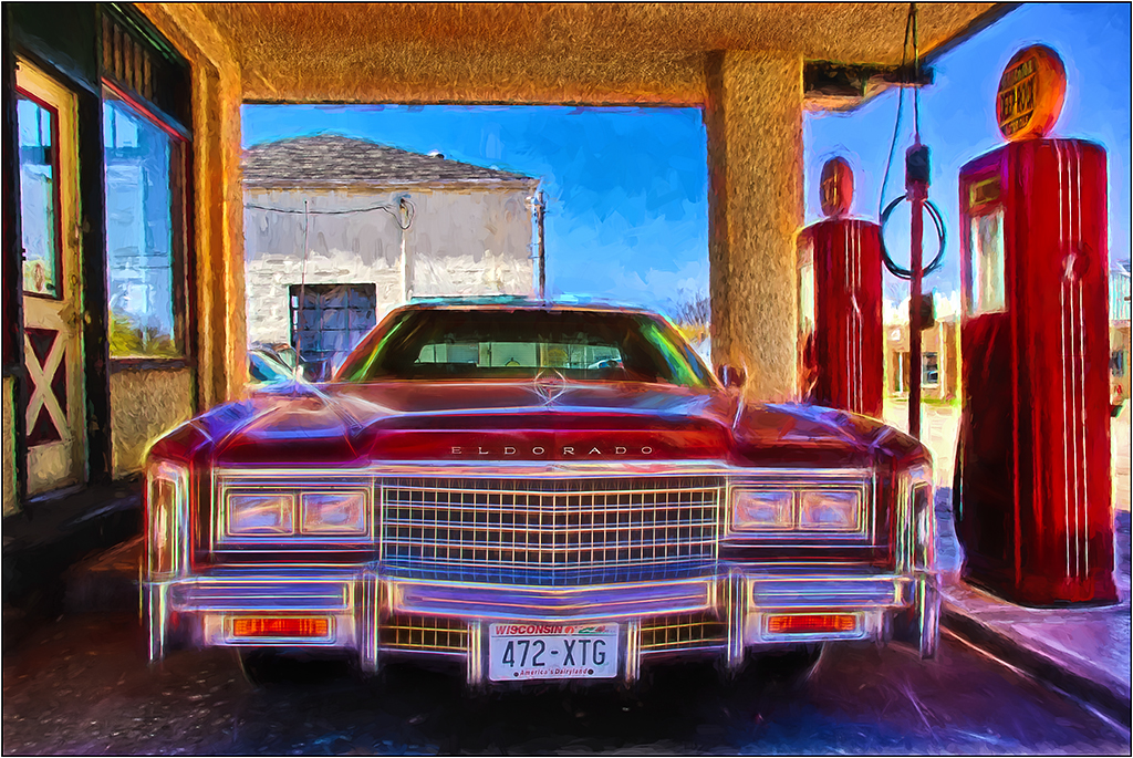
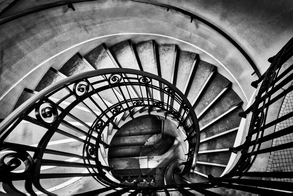
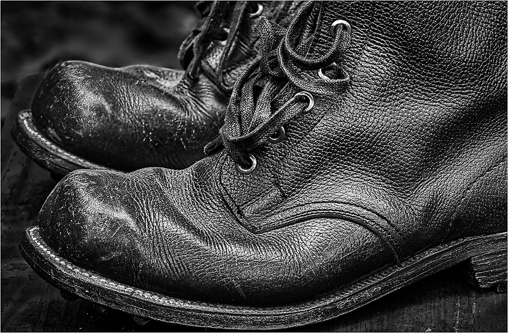
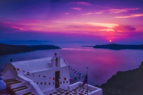
This is indeed very entertaining! The angle and composition are great.
Because the window reflection has less contrast (very normal), I did a rough selection of the right upper side, and increased the contrast. This seemed to make it more pleasing, with less distraction.
I noticed that there is no color profile attached to your image; the Galaxy does not create a profile? It is usually a good idea to assign a profile to be sRGB for the web to avoid over saturation of some colors like red. But in your case, the red saturation looks fairly under control, as I still see detail in the gloves. (And the crazy red is one of the elements that makes this image pop.) |
Jan 8th |
| 26 |
Jan 19 |
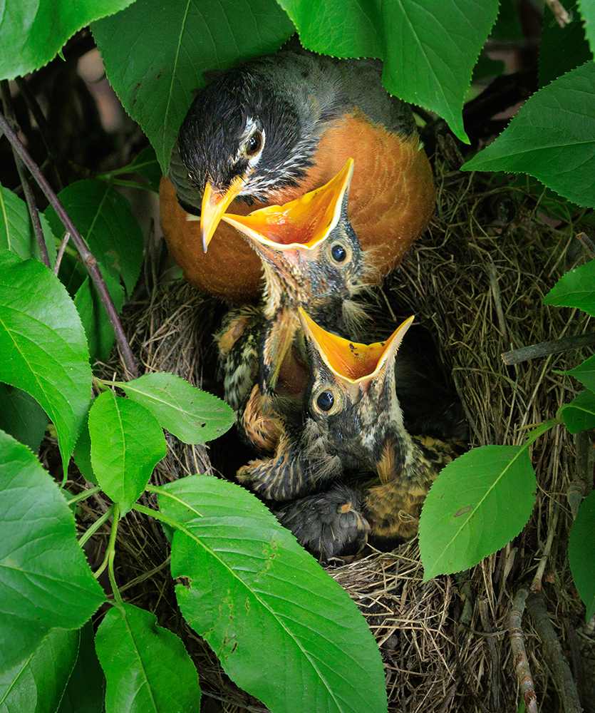
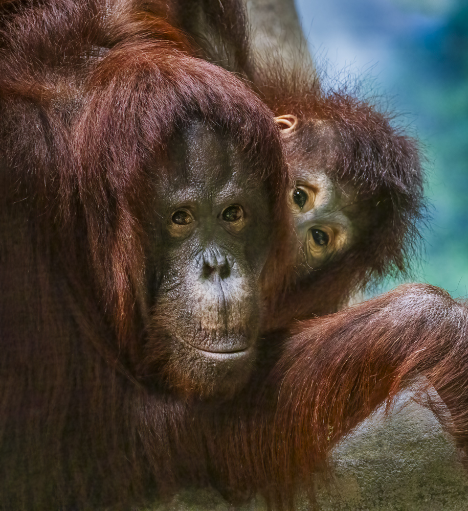
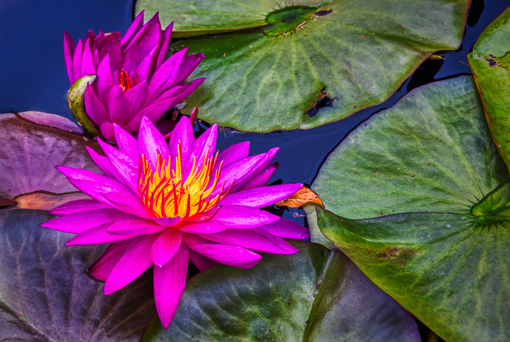
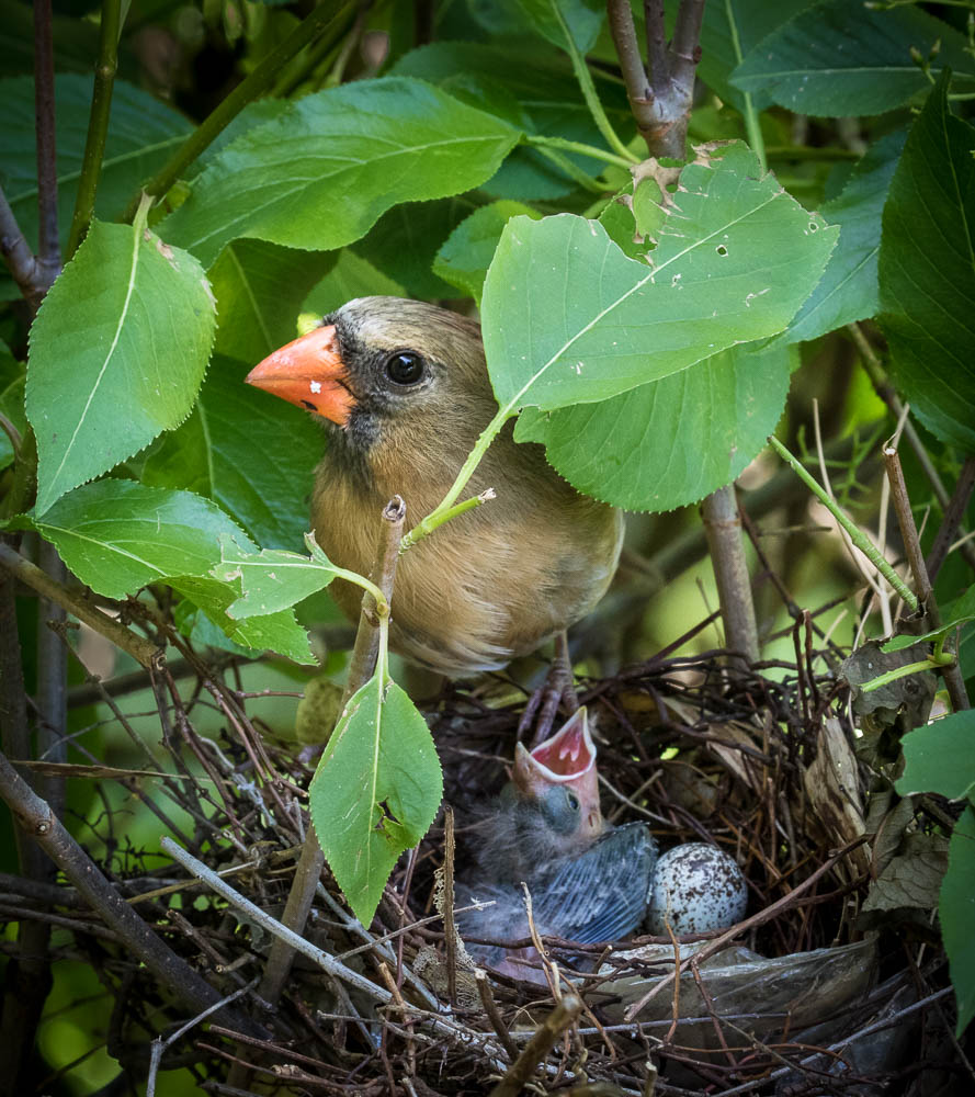
Comment |
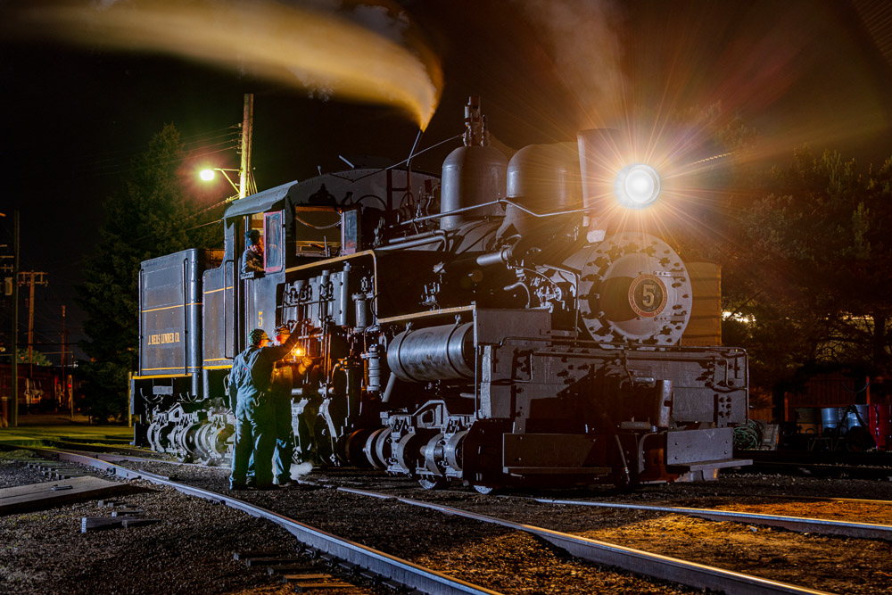
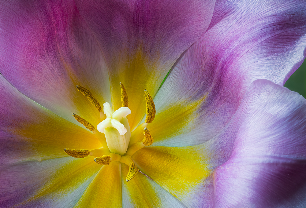
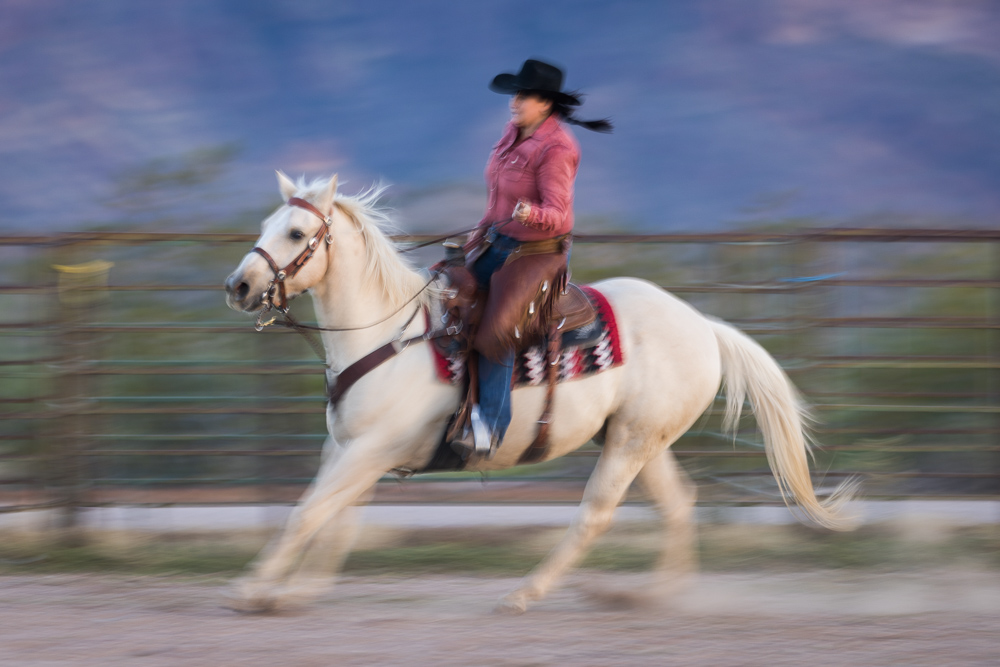
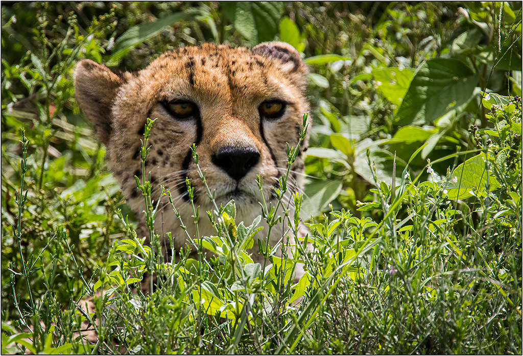
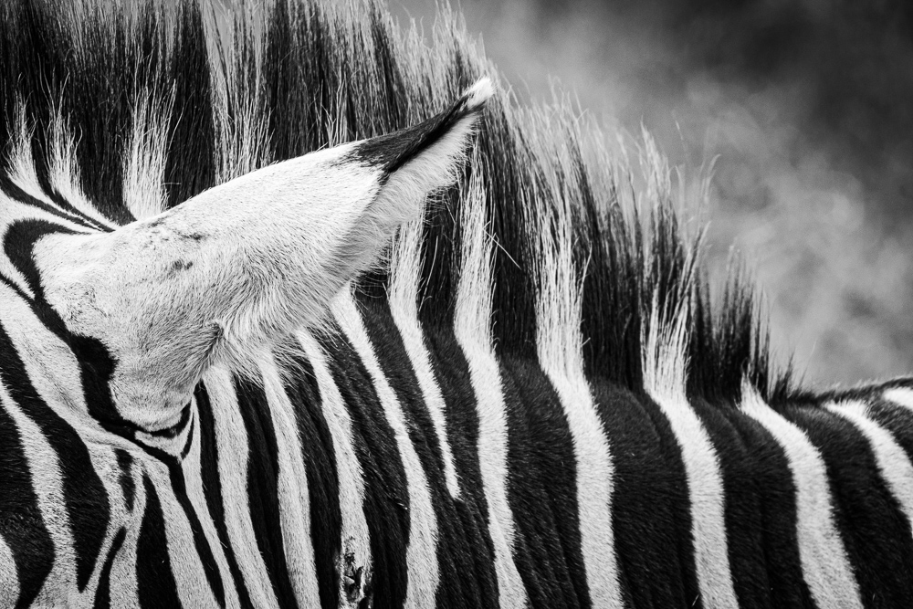
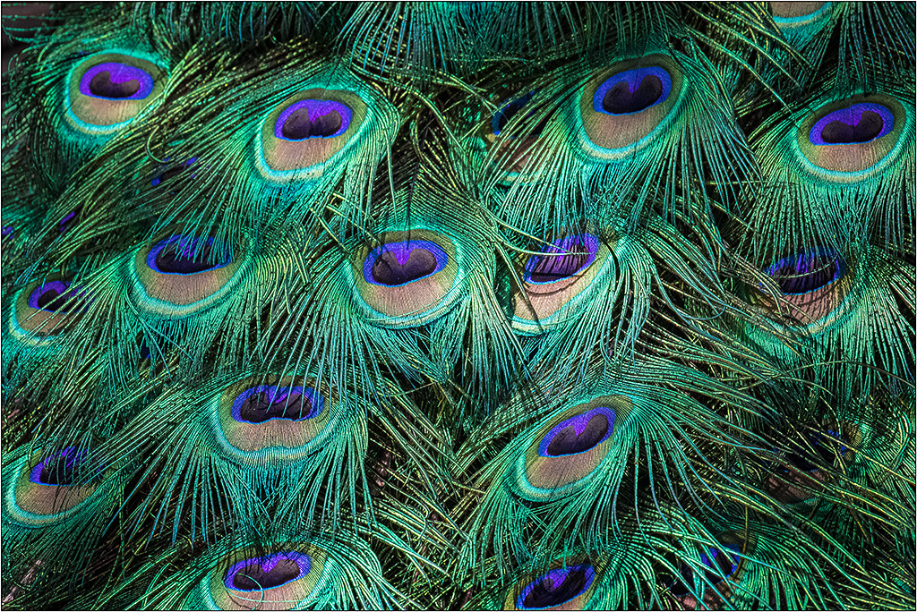
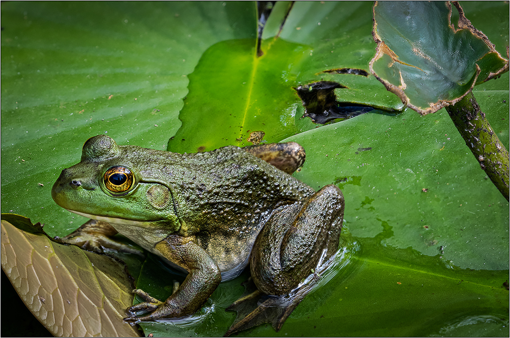
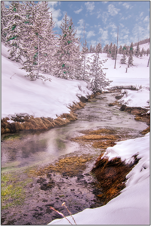
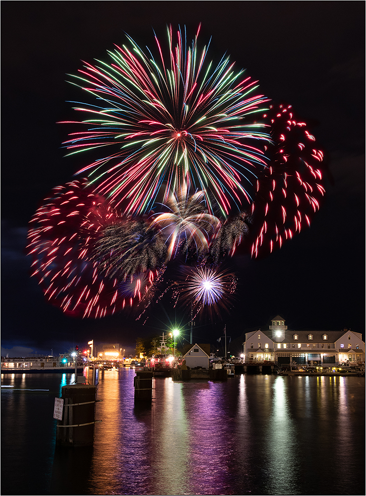
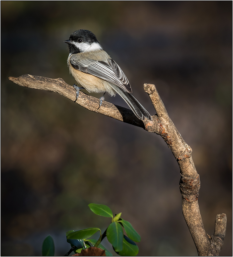
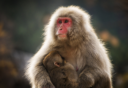
I like the moment that you captured. Nice out of focus background, and good rendering. This is really nice with the rim lighting. I might suggest a little more contrast for punch, and possibly some cropping, although cropping is not as important. |
Jan 5th |
 |
| 26 |
Jan 19 |
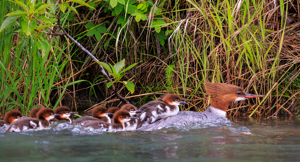
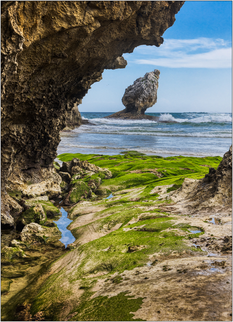
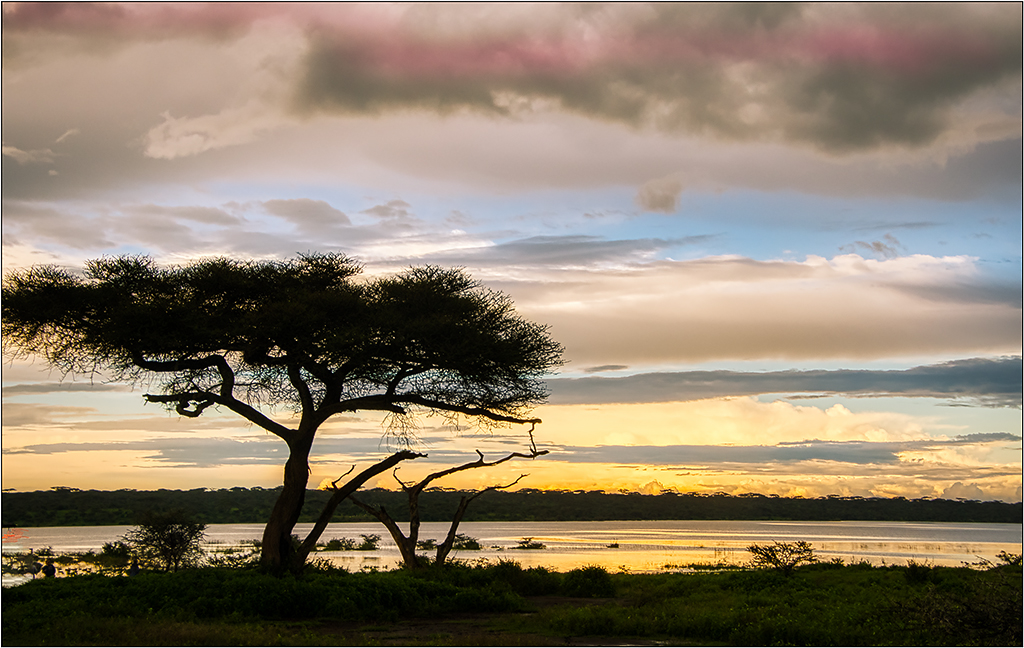
Comment |
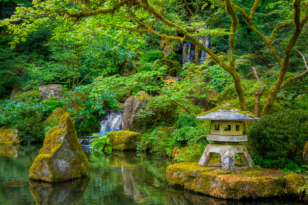
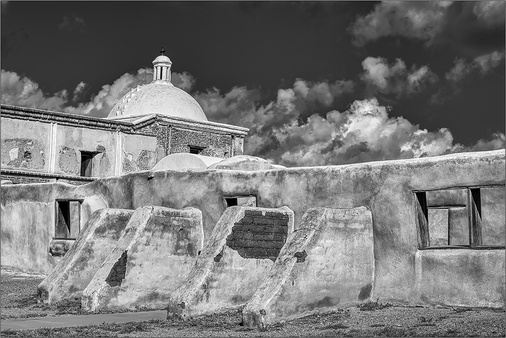
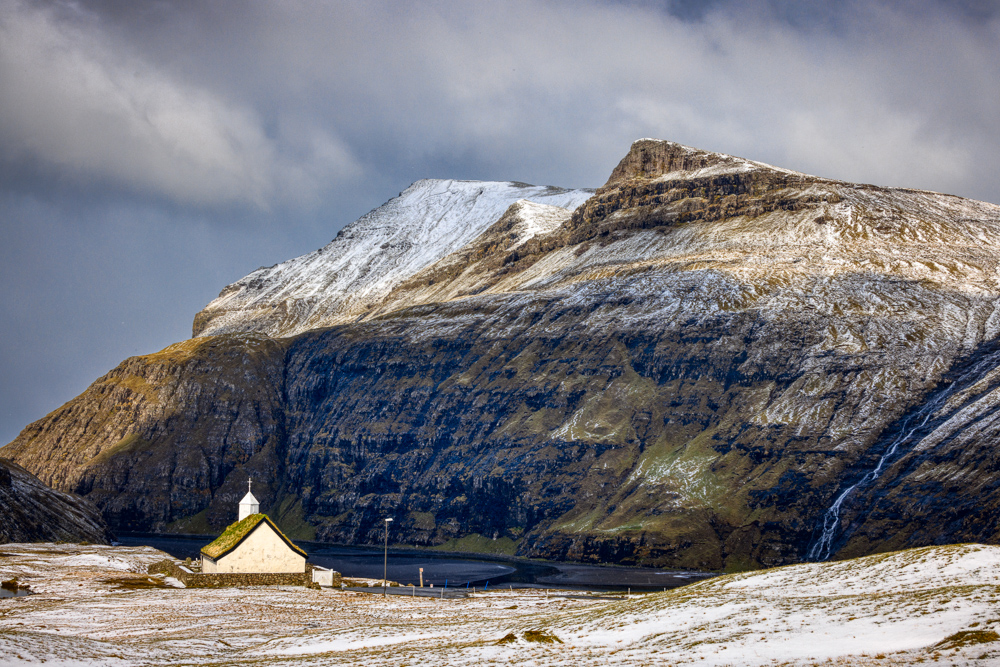
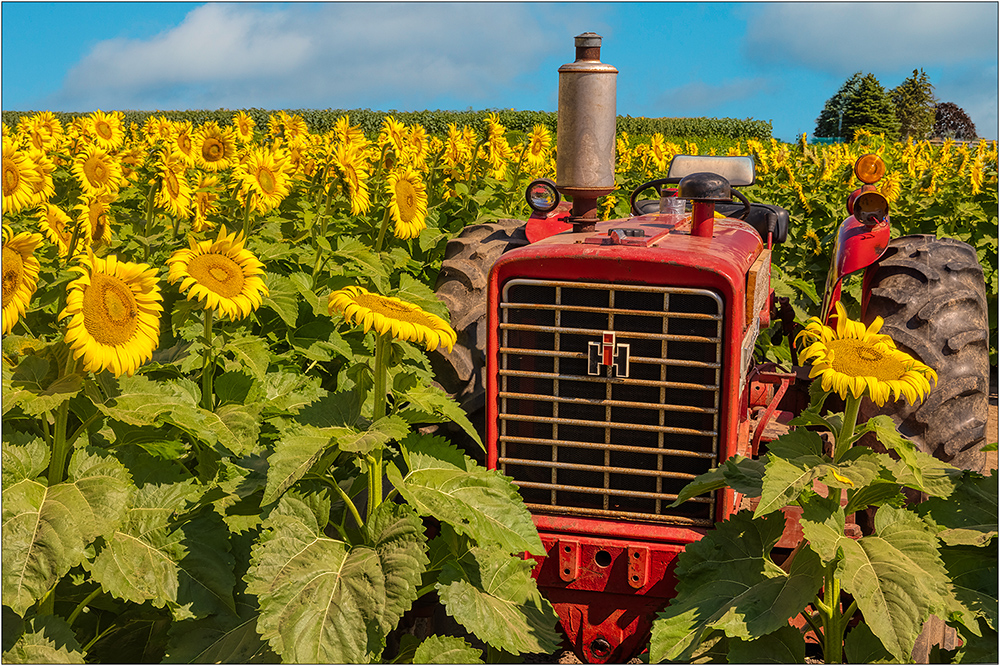
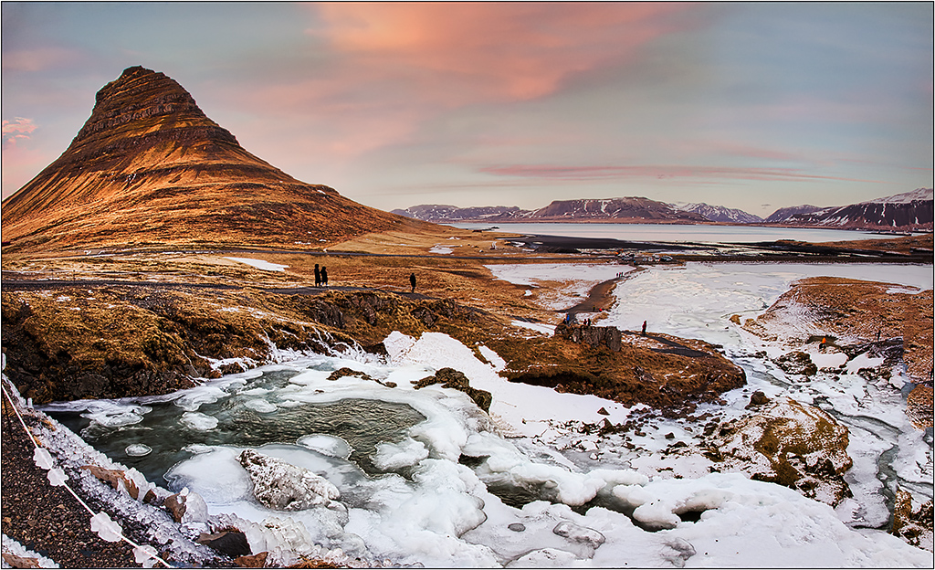
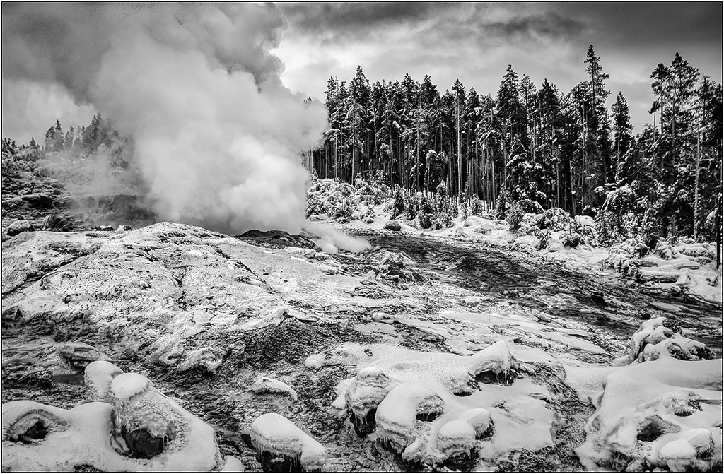
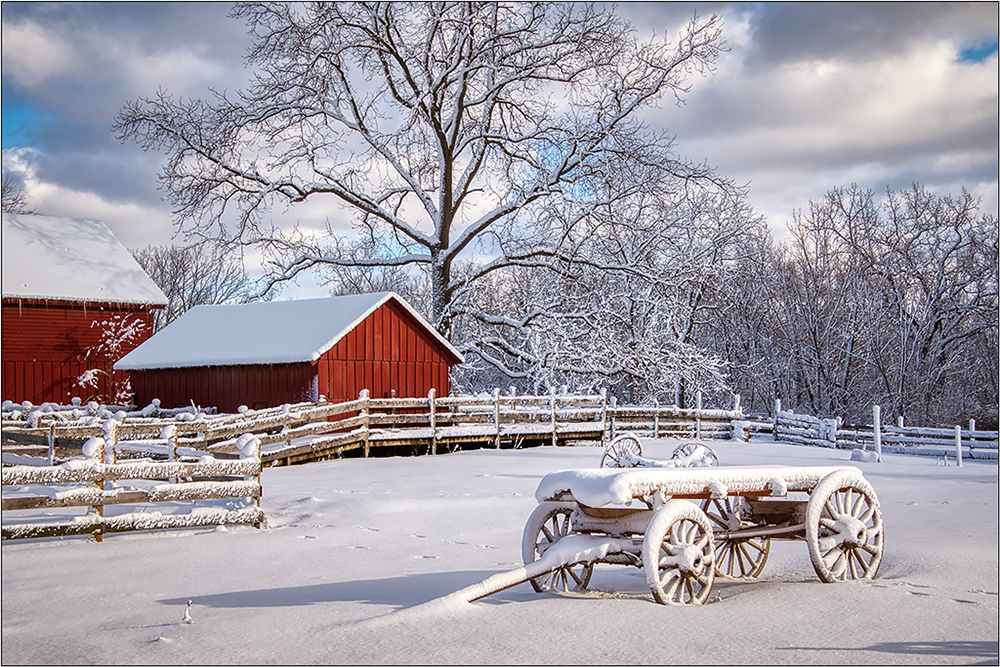
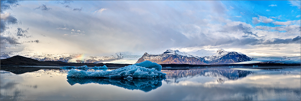
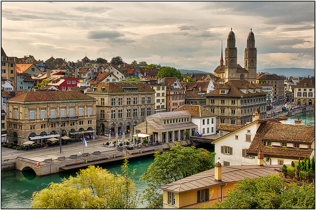
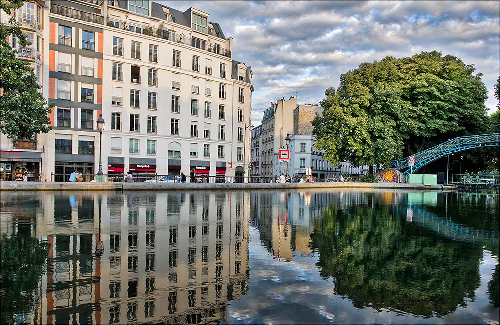
I agree with Belinda's suggestion for cropping the right slightly to take that one tree out of the center. Nice colors and detail.
You are correct with in that this image avoids being the "same old', which for this place is a real problem with the limited view of the subject. |
Jan 4th |
| 26 |
Jan 19 |
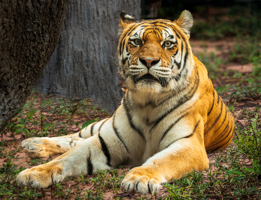
Comment |
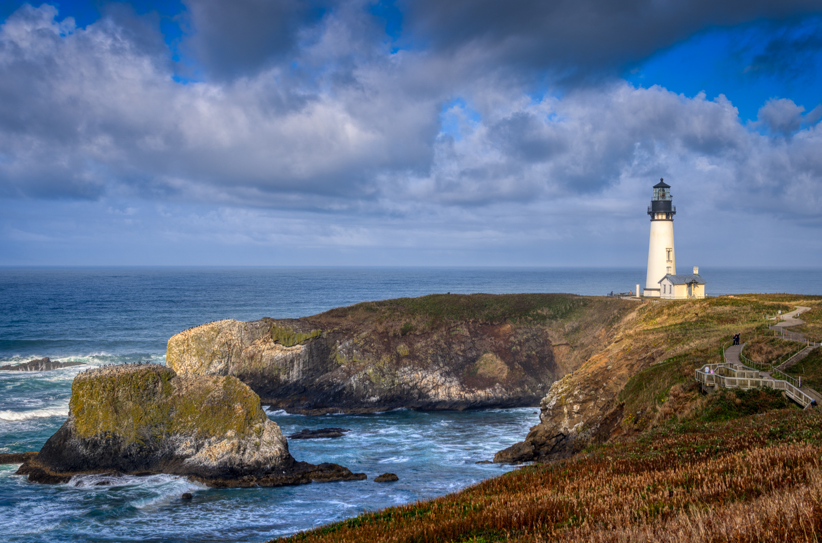
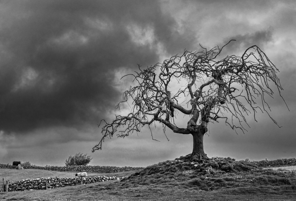
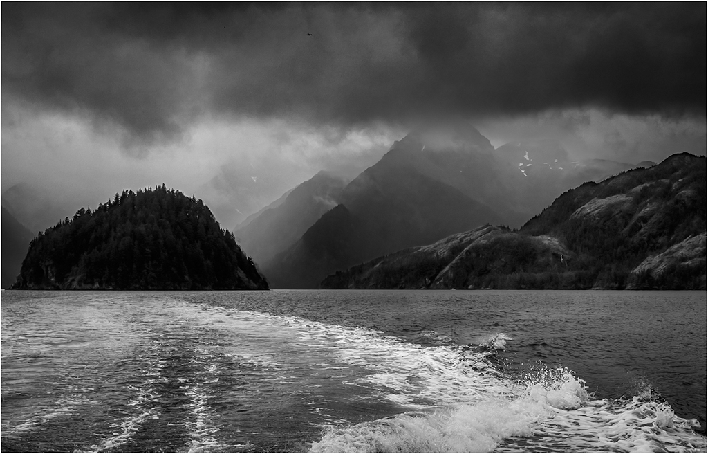
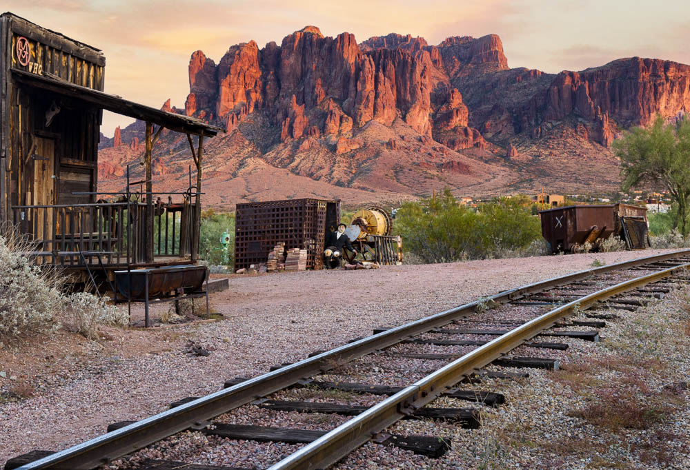
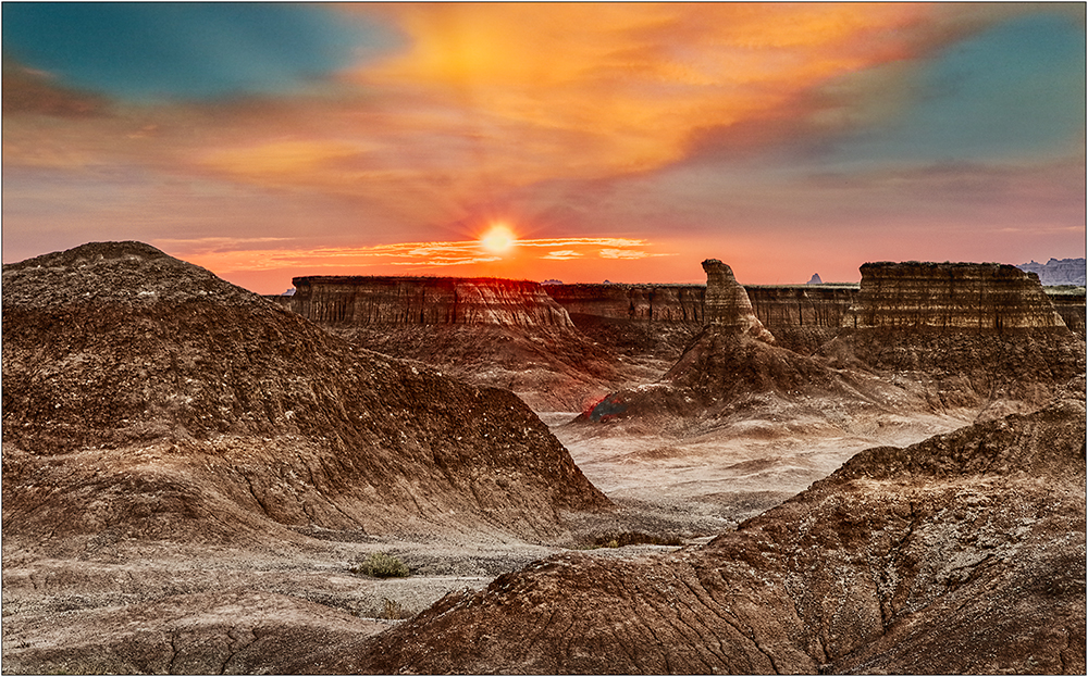
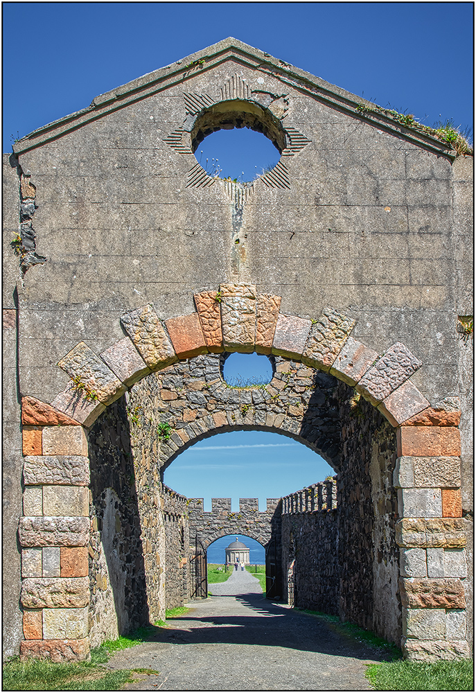
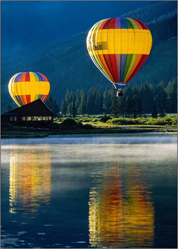
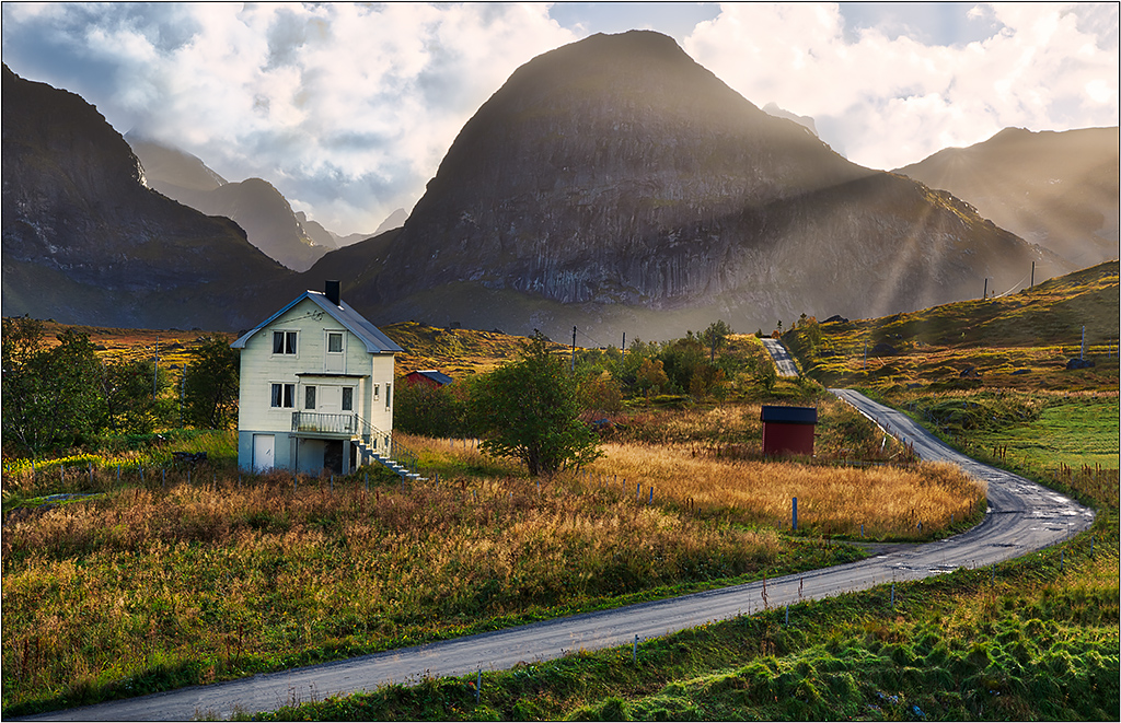
Very nice impact/color. You did not say what enhancements you did in post, but it looks like a little dehaze may help those gorgeously lit mountains. I agree with Belinda that trimming some of sky would help. |
Jan 4th |
6 comments - 2 replies for Group 26
|
6 comments - 2 replies Total
|