|
| Group |
Round |
C/R |
Comment |
Date |
Image |
| 18 |
Nov 18 |
Comment |
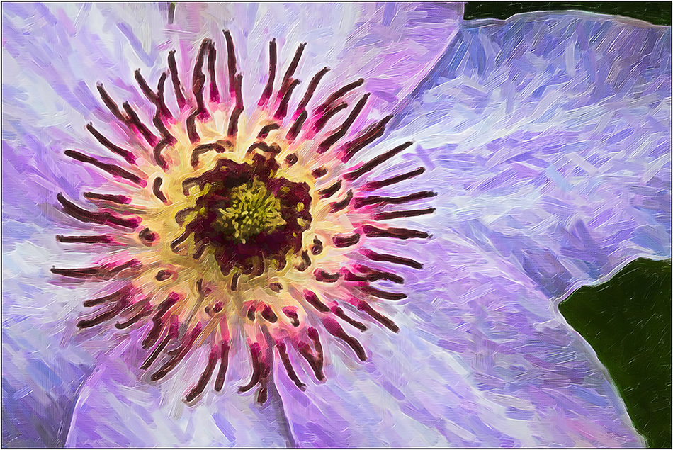
You have everyone intrigued as to what the original image was, including me! Very interesting! |
Nov 30th |
1 comment - 0 replies for Group 18
|
| 23 |
Nov 18 |
Comment |
Wow. Looks like the two of us were thinking along the same lines this month. I have a similar image on Group 26. I had another view that I liked too, but chose the one similar to what you have here, but just a little further back. |
Nov 30th |
1 comment - 0 replies for Group 23
|
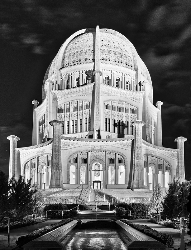
| 26 |
Nov 18 |
Comment |
Final image is really nice. |
Nov 13th |
| 26 |
Nov 18 |
Reply |
I agree about the sky. I had not noticed it at first, due to the interesting street colors. |
Nov 10th |
| 26 |
Nov 18 |
Reply |
Unfortunately, that is always an issue with super wides when straightening; you need a lot of extra real-estate. The lens went to 11mm, and I should have used that instead of 12 (even though curvature would have been more of a problem to start). Without moving the sides up a little when straightening, the inside gets "squatty" in perspective. It was a compromise to have to lose some of the top. Perhaps if I had framed it with a little less on the bottom....... |
Nov 10th |
| 26 |
Nov 18 |
Comment |
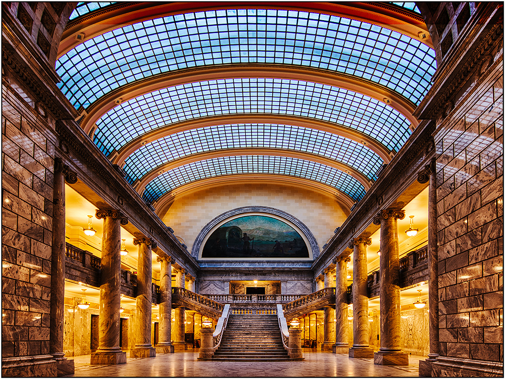
Have not been to that campus since my son was there 20+ years ago. The processing certainly improved it. As Mervyn suggested, perhaps a low shot might have eliminated the background buildings. One small thing you can do is in Photoshop, use the warp filter in transform, and pull the left bottom edge over on the path -or more accurately use Puppet Warp- so more symmetrical balance is achieved. |
Nov 9th |
| 26 |
Nov 18 |
Comment |
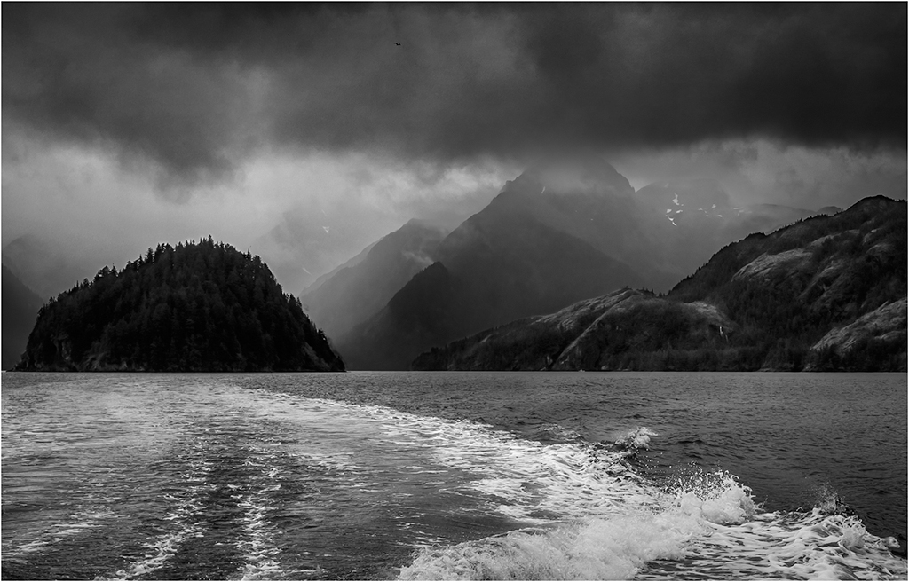
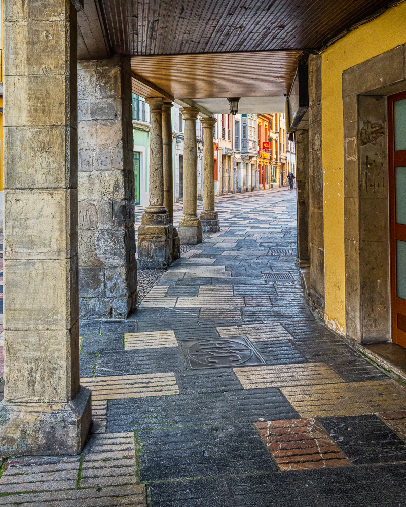
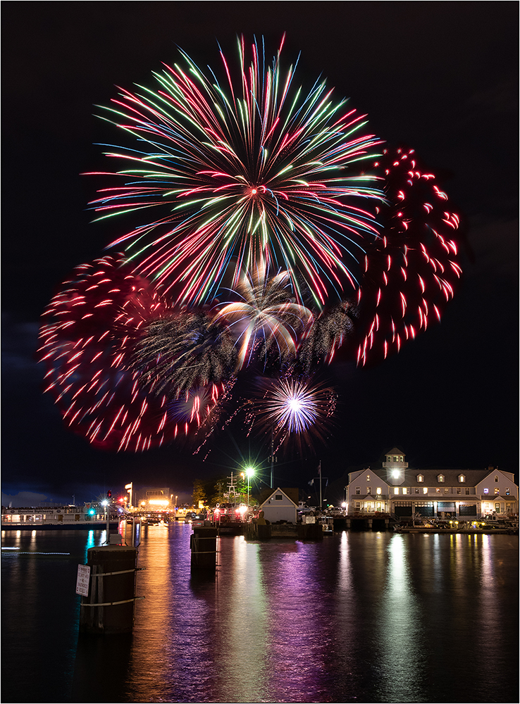
I like this perspective. The wet street adds a lot, and is probably much better than the duller less dark version on a dry day. (Proving that we should keep shooting, even in crappy whether.) |
Nov 6th |
| 26 |
Nov 18 |
Comment |
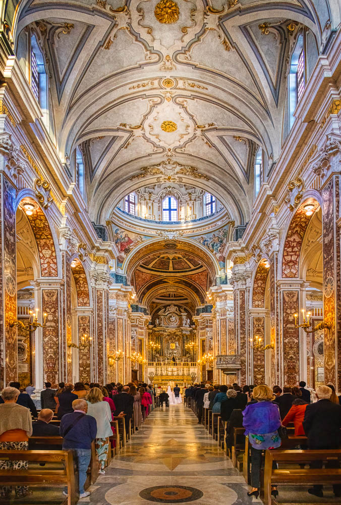
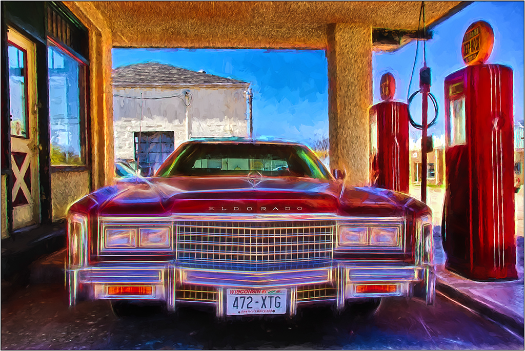
A gas station under a church!
The reflection is marvelous. It would be good if you could provide the "before" so we could see what your adjustments did. If it was not too much trouble, I might look at cloning out the pedestrian sign. |
Nov 6th |
| 26 |
Nov 18 |
Comment |
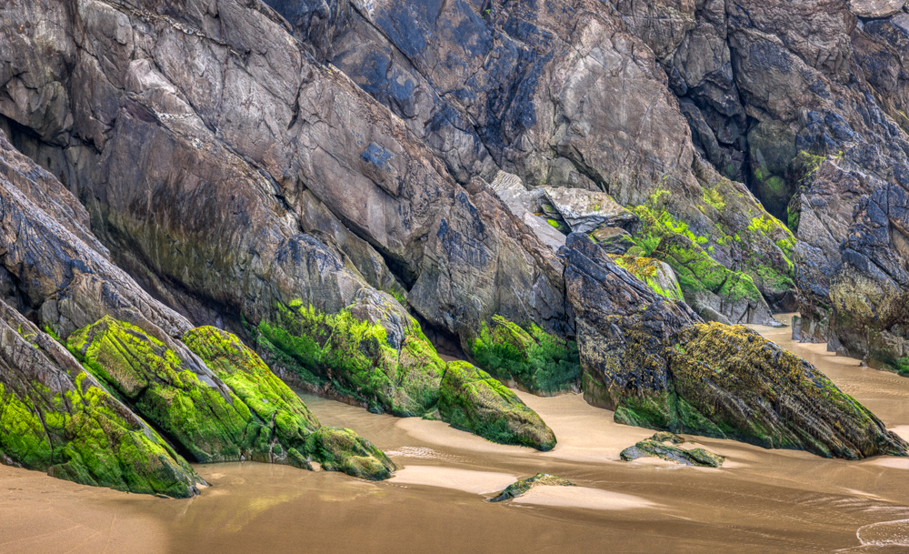
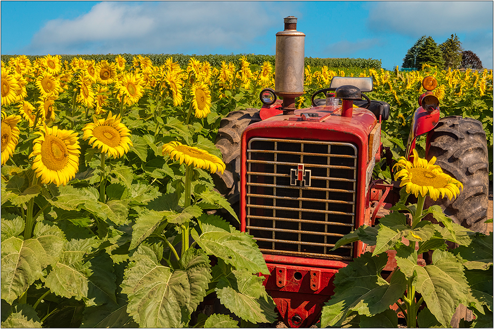
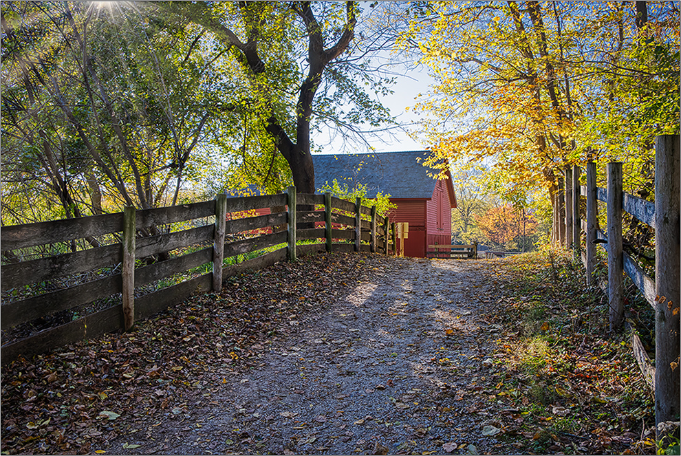
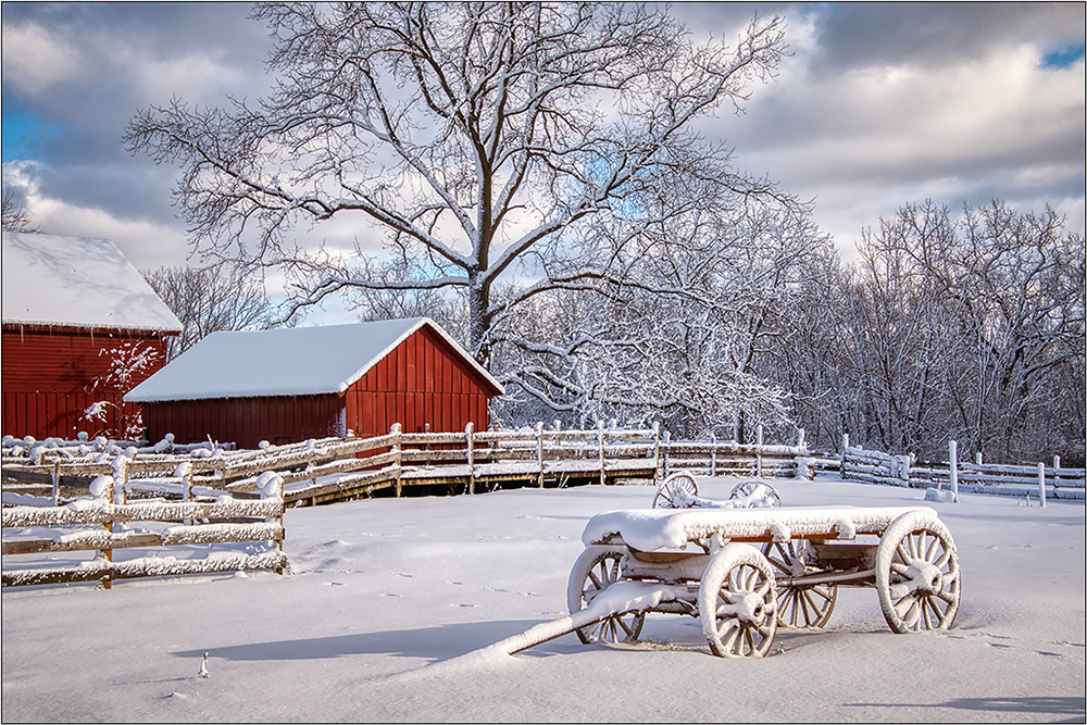
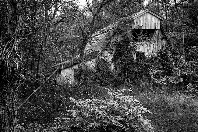
A great find. Looks like this would be spectacular with fall colors to give contrast to the grey barn. There is a lot of great detail here. I wonder though if darkening the left edge and other areas might help focus more on the barn. I tried burning in the foreground around the bush and tree, especially to give more dimension to the foreground. |
Nov 6th |
 |
| 26 |
Nov 18 |
Comment |
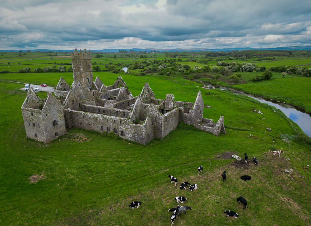
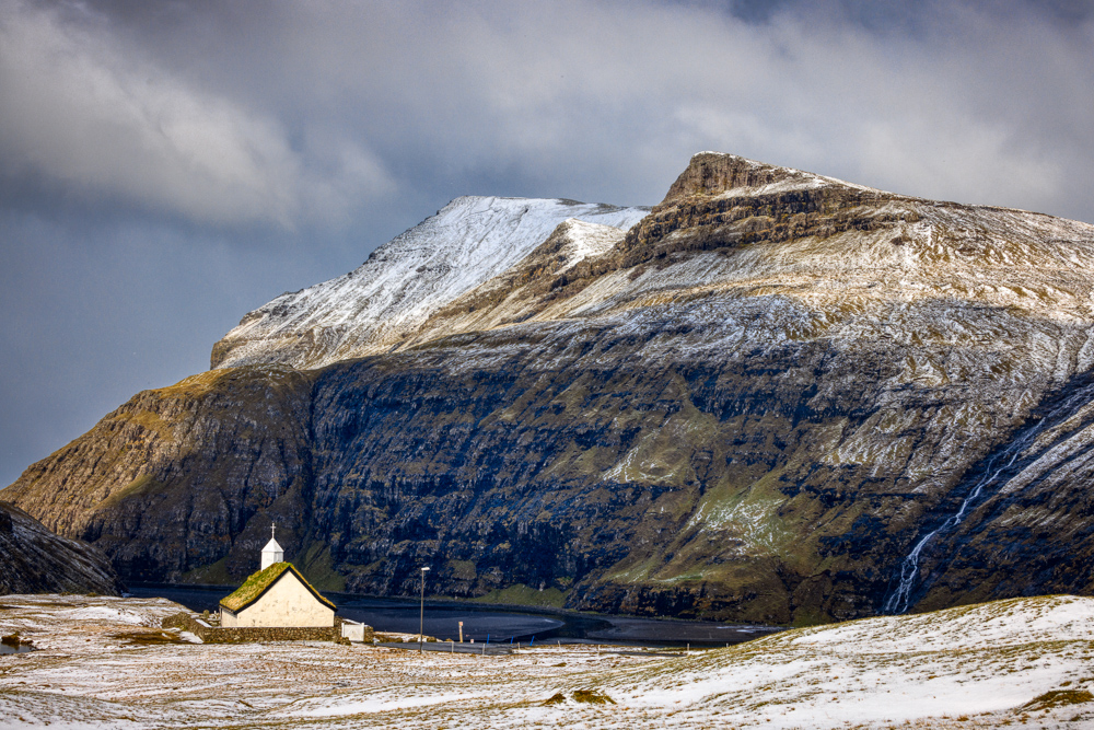
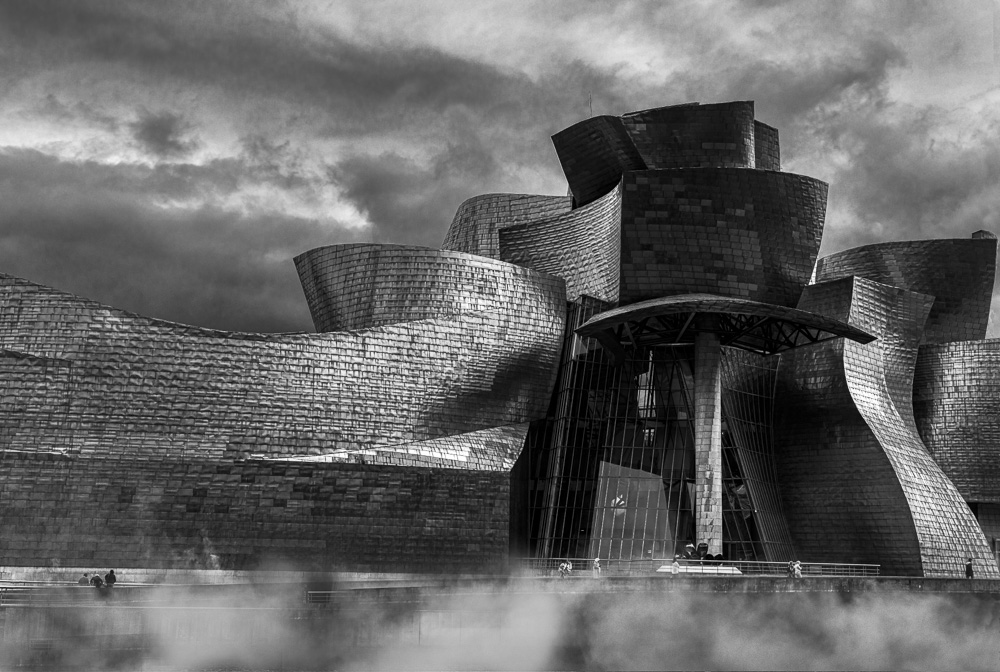
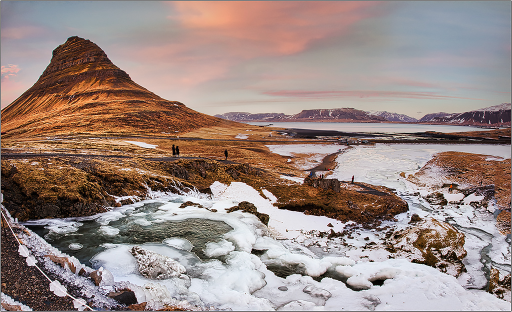
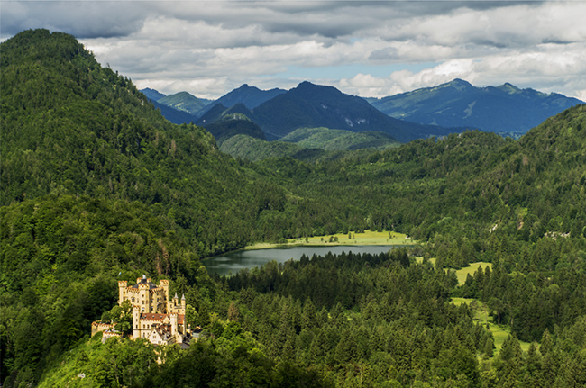
I like this perspective of a giant castle against the bigger landscape. Details, colors, etc are great. I tried adding a little more brightness/contrast to the midtones by using a luminosity mask of midtones. (Adding a curves midpoint is nearly identical.) The results I have included here may be too subtle to show in the lower res version, but I thought it gave just a little more "pop". |
Nov 3rd |
 |
| 26 |
Nov 18 |
Comment |
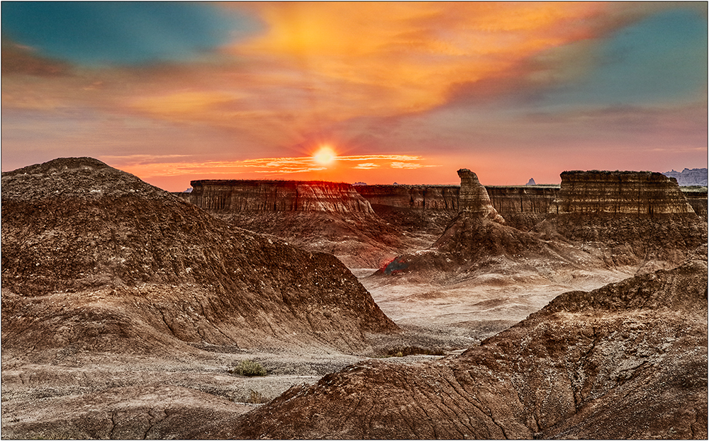
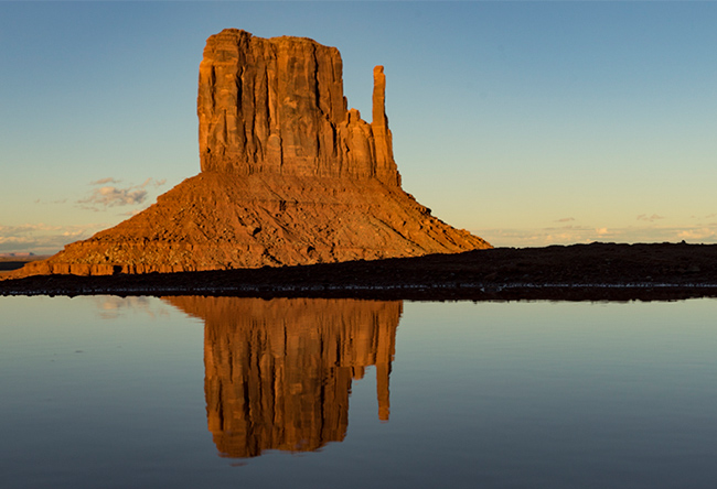
It was great to see you at the conference. Seeing this makes me wish I would have had the opportunities to travel after the conference. Getting all "down and dirty" paid off! It looks like the mitten is in front of a lake. The more I look at this, I wonder if it should be cropped on the right to eliminate the other mitten, which is only half there, and focus more on the main one. This allows a tighter crop. Although the black foreground silhouette works, is there any slight detail you could pull out of it? |
Nov 1st |
 |
7 comments - 2 replies for Group 26
|
| 35 |
Nov 18 |
Comment |
Well done, Sharon. I too prefer the revised image you created- much more powerful. |
Nov 30th |
1 comment - 0 replies for Group 35
|
10 comments - 2 replies Total
|