|
| Group |
Round |
C/R |
Comment |
Date |
Image |
| 26 |
Oct 17 |
Reply |
This really helps, as I can now see all the way to the bottom. |
Oct 19th |
| 26 |
Oct 17 |
Reply |
The difference is very minor. But I always believe that even minor fixes can help boost our images in subtle ways. If there are less "problems" that the viewer can fixate on, the more they pay attention to what counts. |
Oct 6th |
| 26 |
Oct 17 |
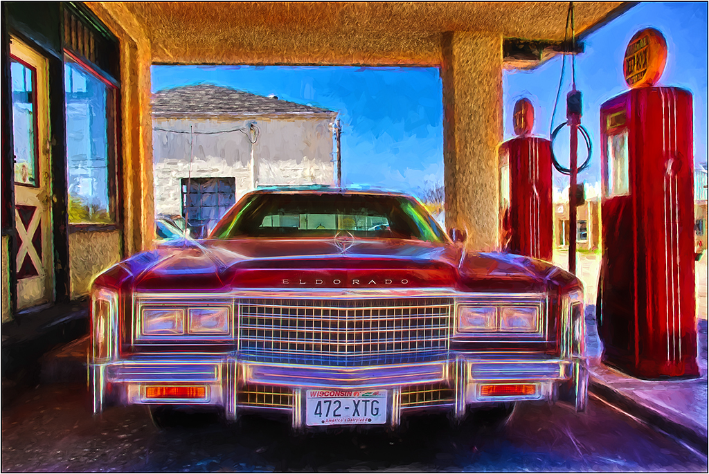
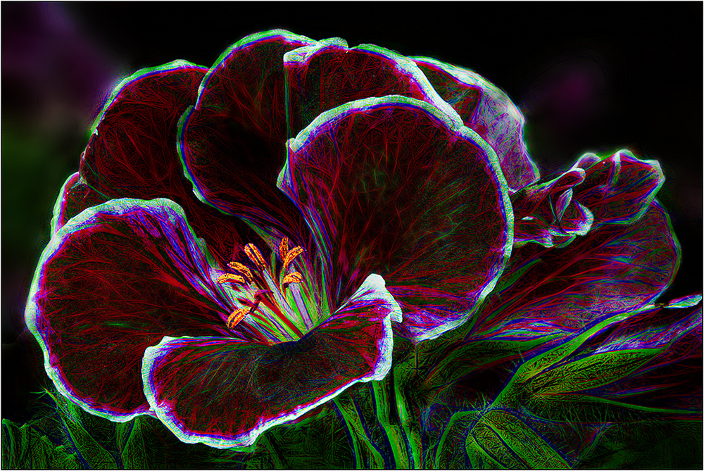
Comment |
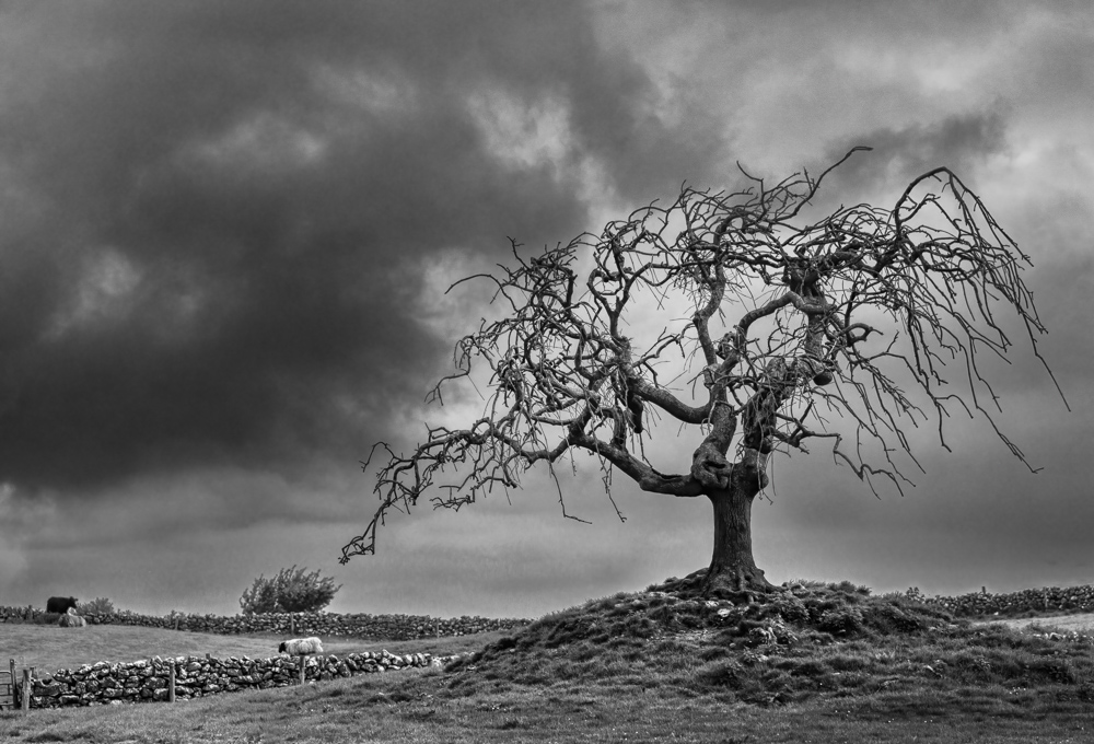
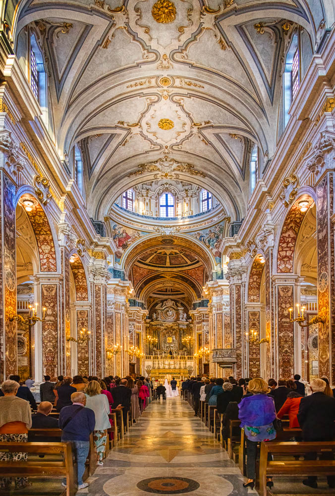
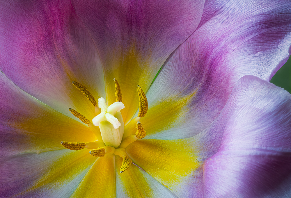
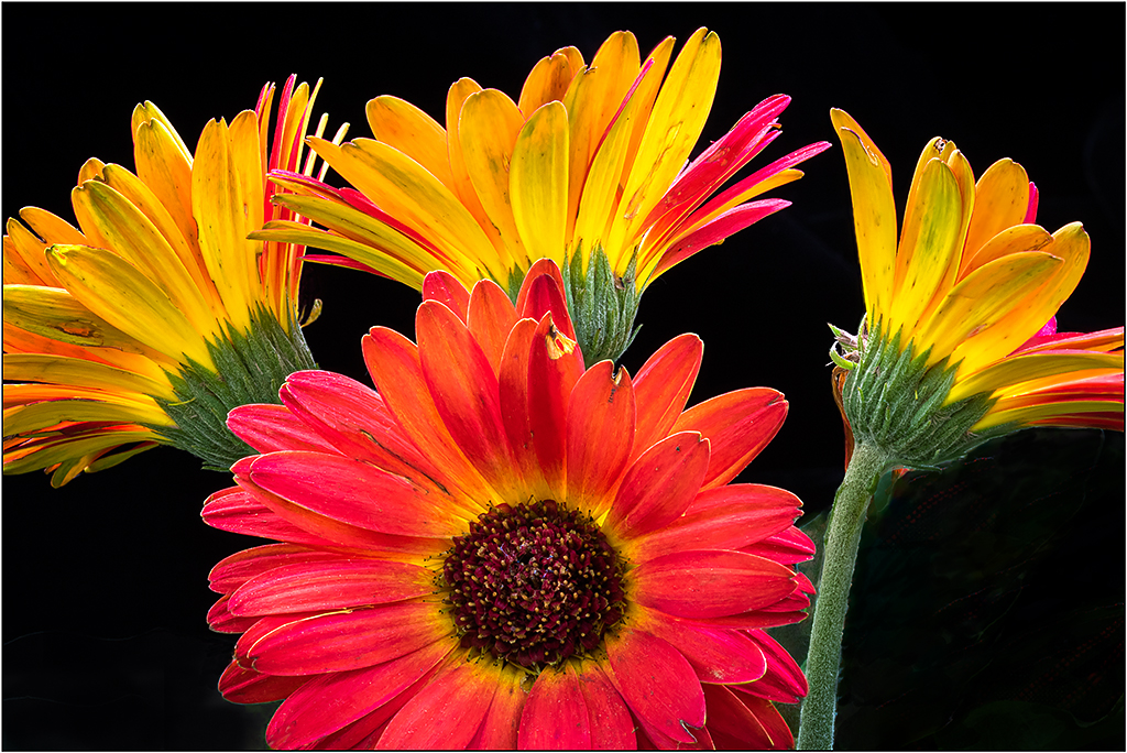
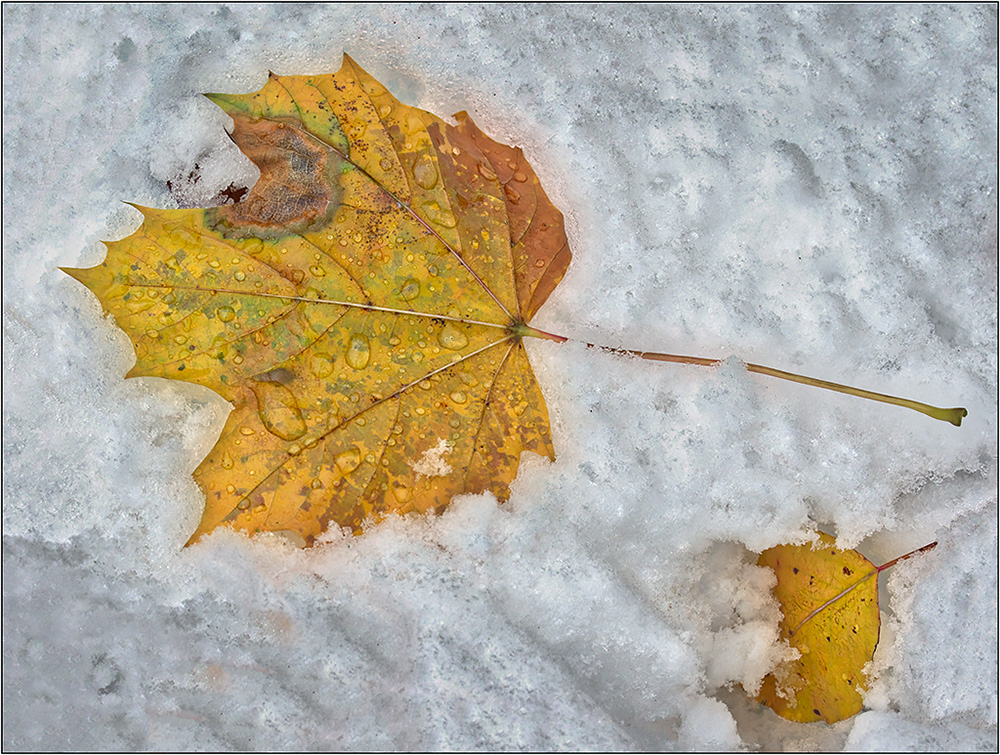
This is crazy colorful. I feel like you should have planted someone in the shot (maybe yourself!), so we could do a "Where's Waldo". I can see why you gave up on the idea of a seat! There is a very slight tilt as measured in Photoshop on the back balcony, but nothing significant. However, for some reason, perhaps due to the two top leading lines, I have the PERCEPTION of more tilt. I don't know if you are better keeping the "real" straightness or adjusting for the optical illusion. The 'Cure" to this would be to rotate slightly, or maybe just use Edit>Transform>Distort, and pull up the left side so the leading rail lines match in height. |
Oct 6th |
| 26 |
Oct 17 |
Comment |
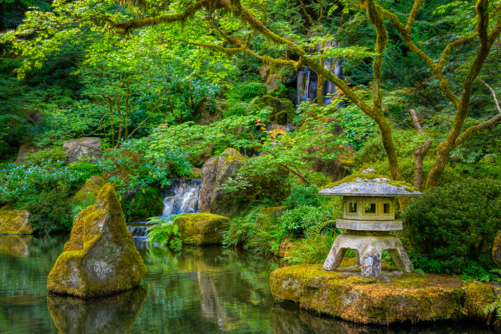
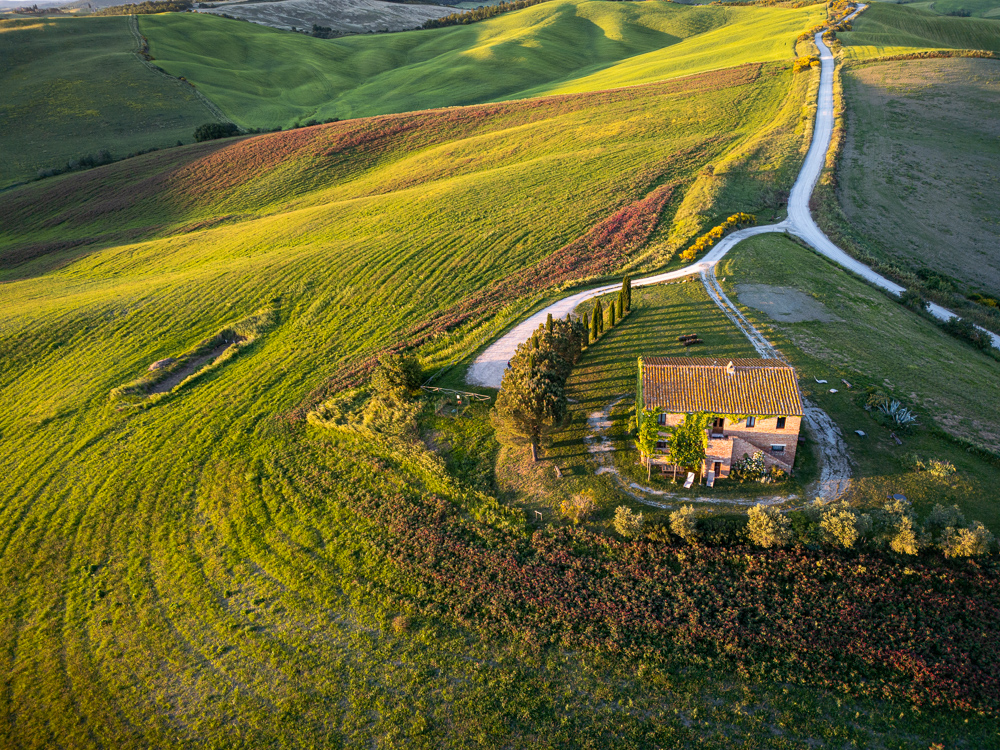
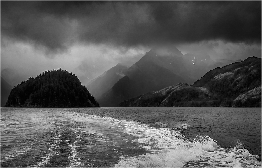
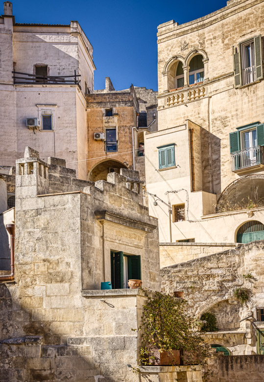
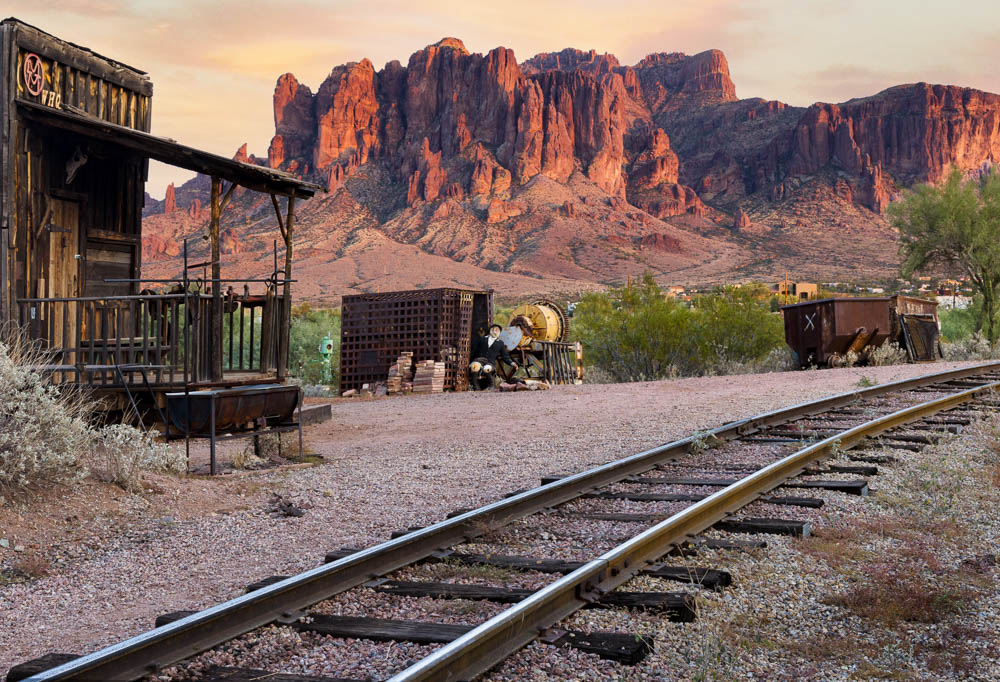
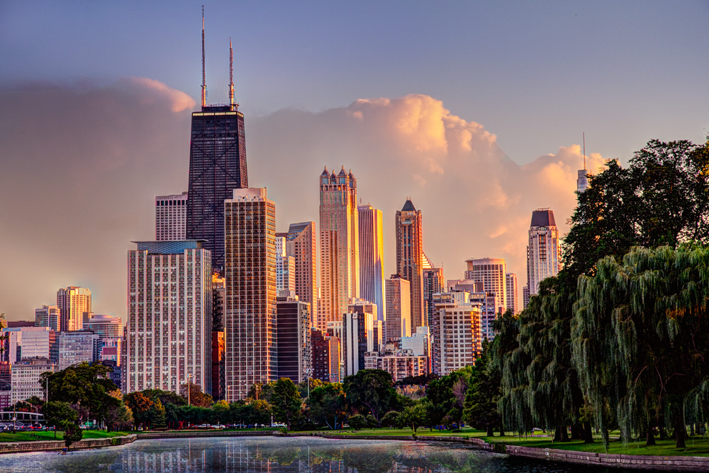
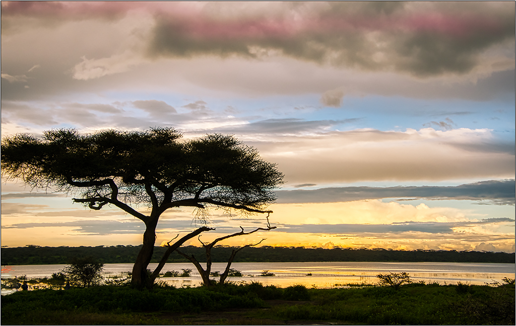
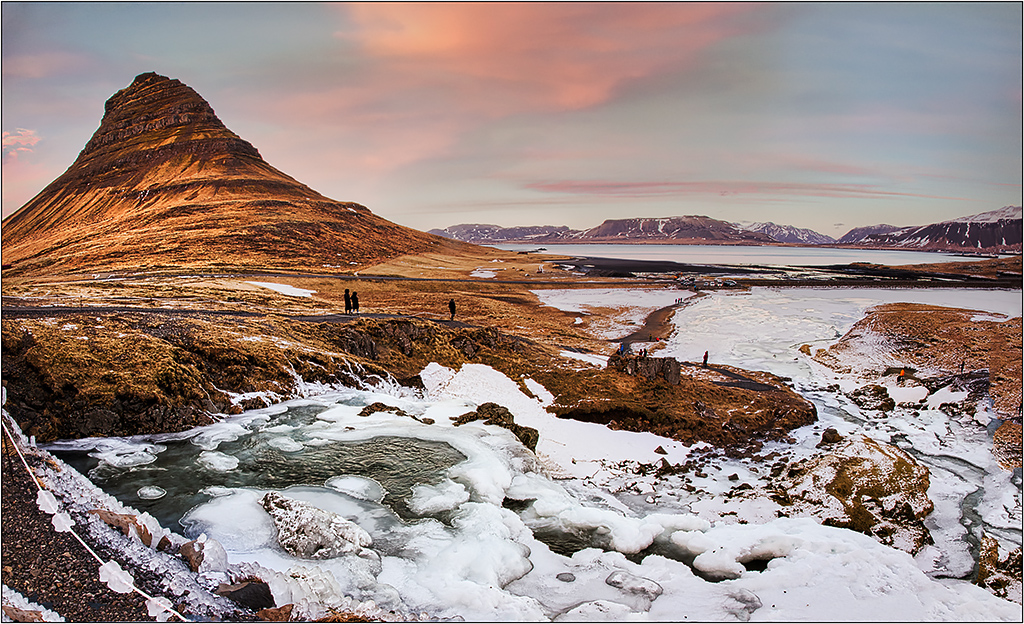
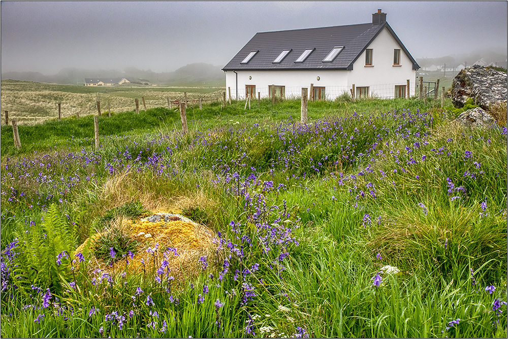
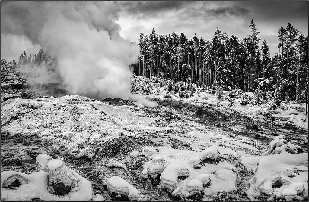
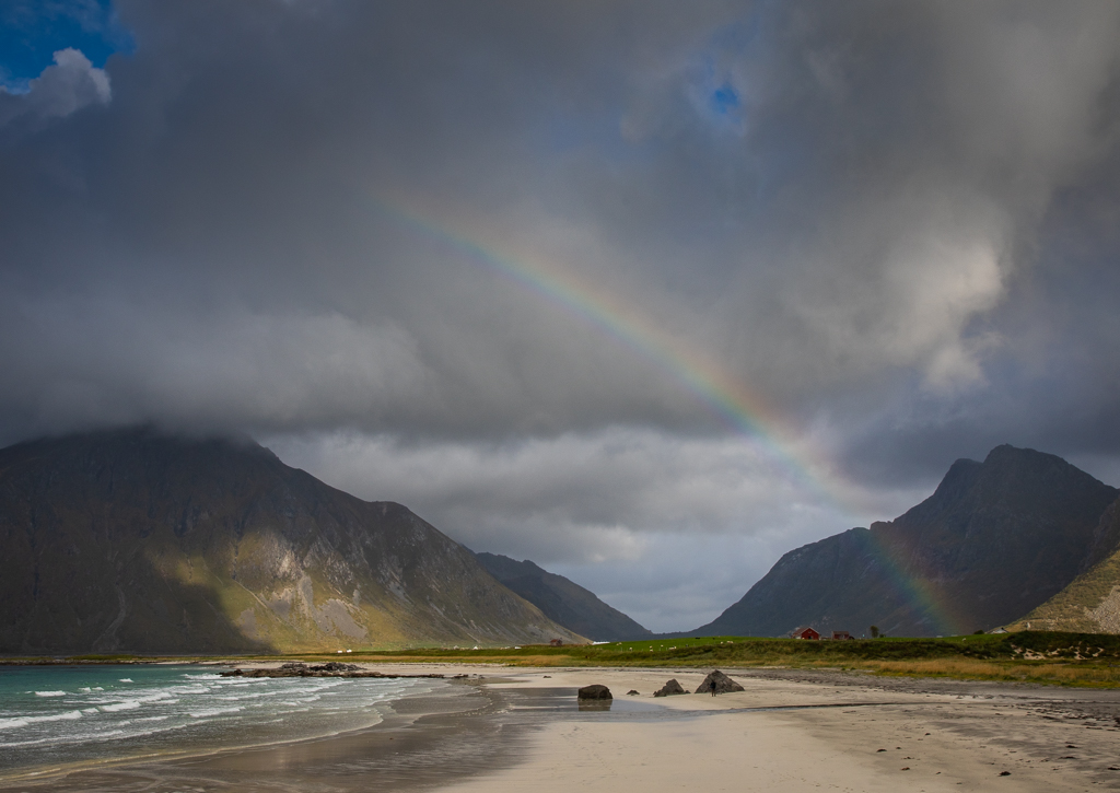
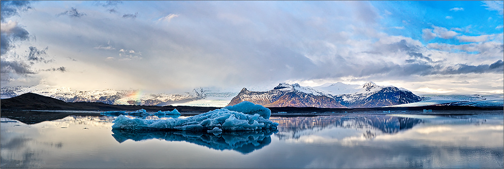
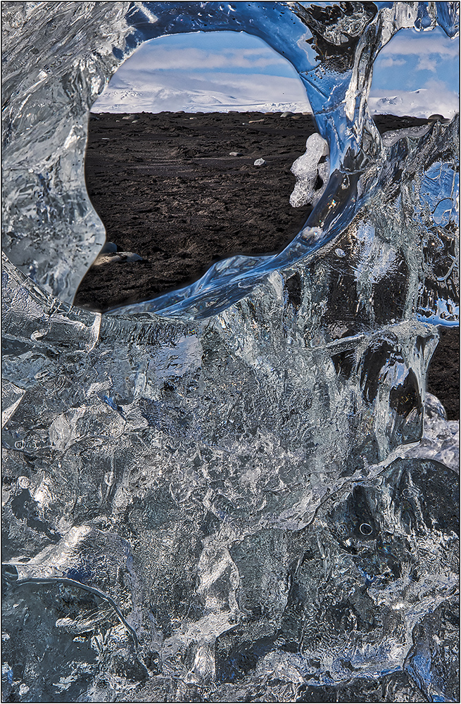
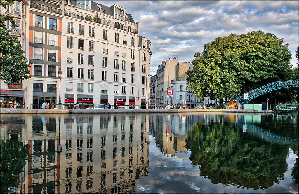
This immediately makes me think of places like Alaska or Norway; it conveys a sense of a lot of what is the typical weather/scenery. Certainly this would make a marvelous B&W- maybe even a better image, but I think there is a lot to be said for the color version too. I think you can either select in Photoshop, or use the paintbrush in Lightroom to add more drama/darkness to the sky for more impact. Also, I would consider cloning out the cropped bottom building that is on the edge of the frame. I do like the buildings, as they add dimension to the image. I would suggest trying to selectively lighten (with more contrast at the same time) that general area, or at least the one big main building. |
Oct 5th |
| 26 |
Oct 17 |
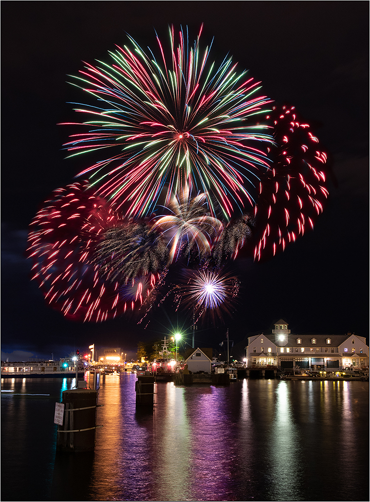
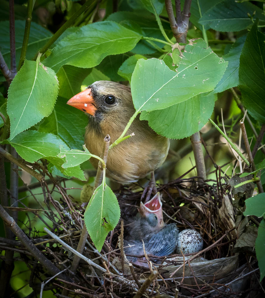
Comment |
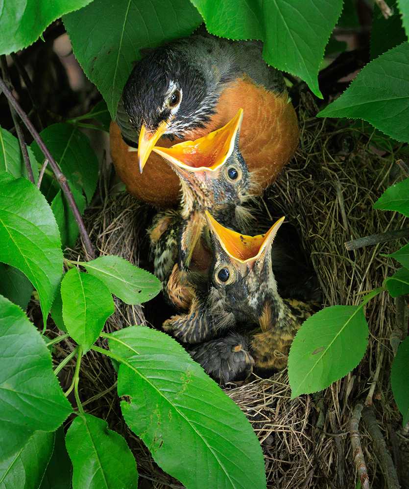
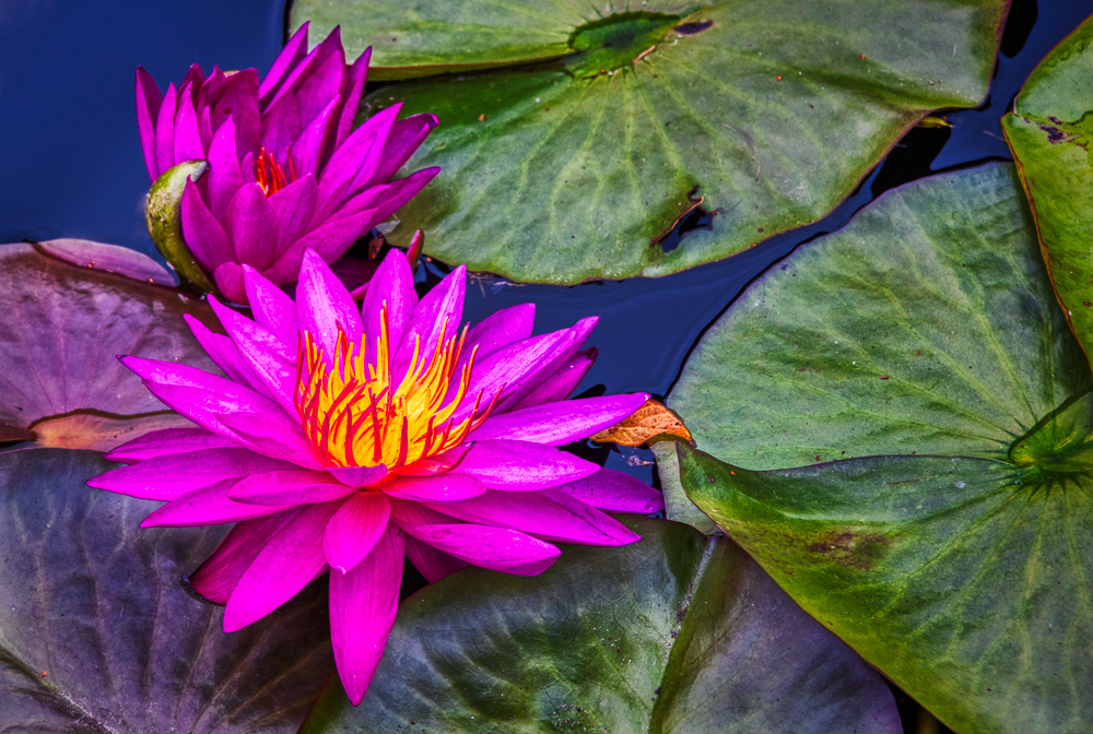
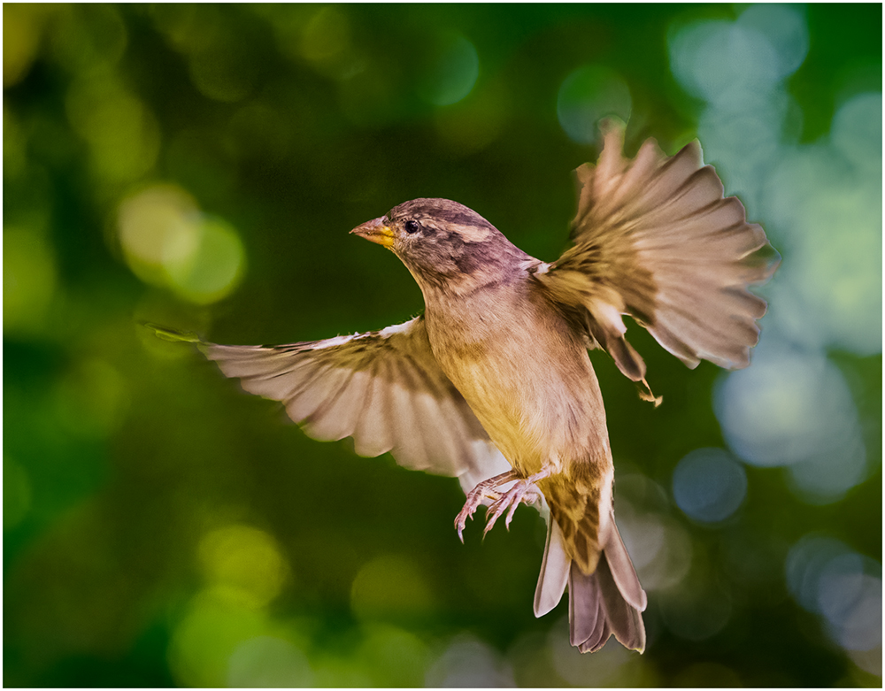
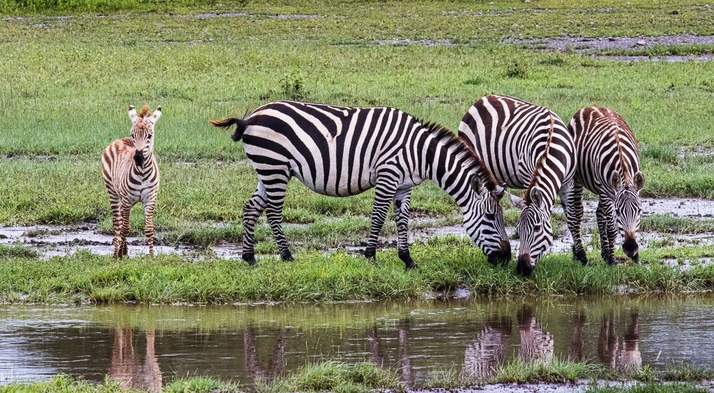
Looks like you witnessed the mating dance of some cranes. (I think Sandhill Cranes.) Around late November, there is a place in Indiana -1.5 hours from me-that is a stopping point in the migration, and there can be thousands in some years, although you cannot get close to them.
It is a good thing that you have a lot of pixels in that camera, so you could crop so much. Nice and sharp, and displays the dance quite well. |
Oct 5th |
| 26 |
Oct 17 |
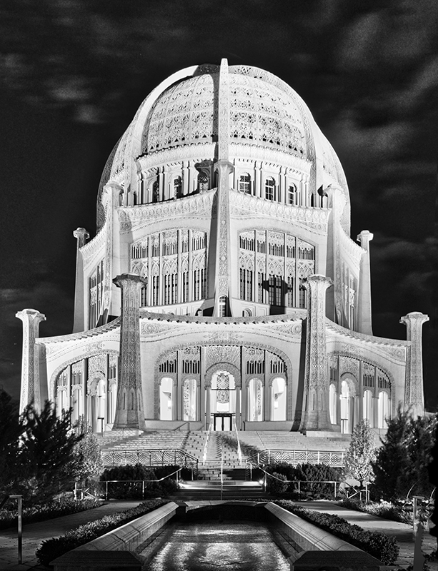
Comment |
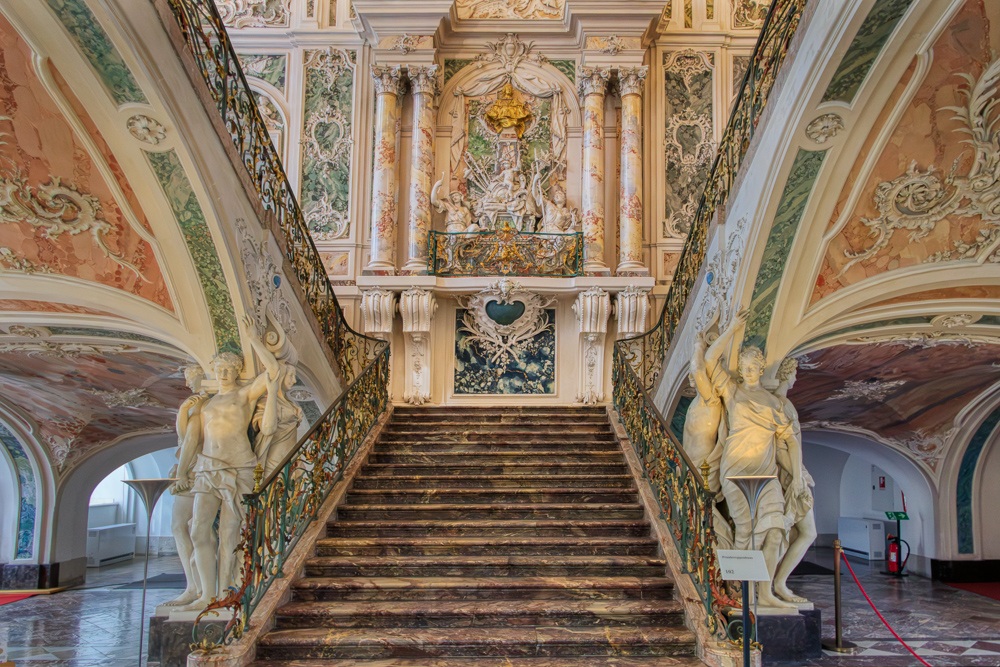
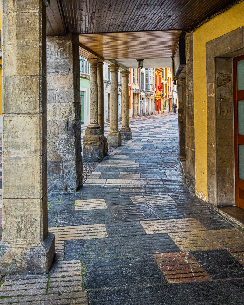
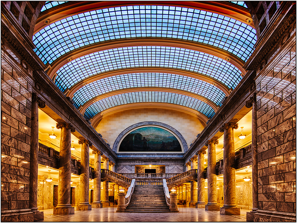
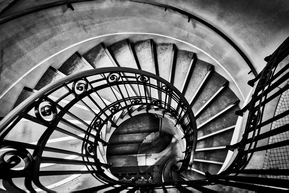
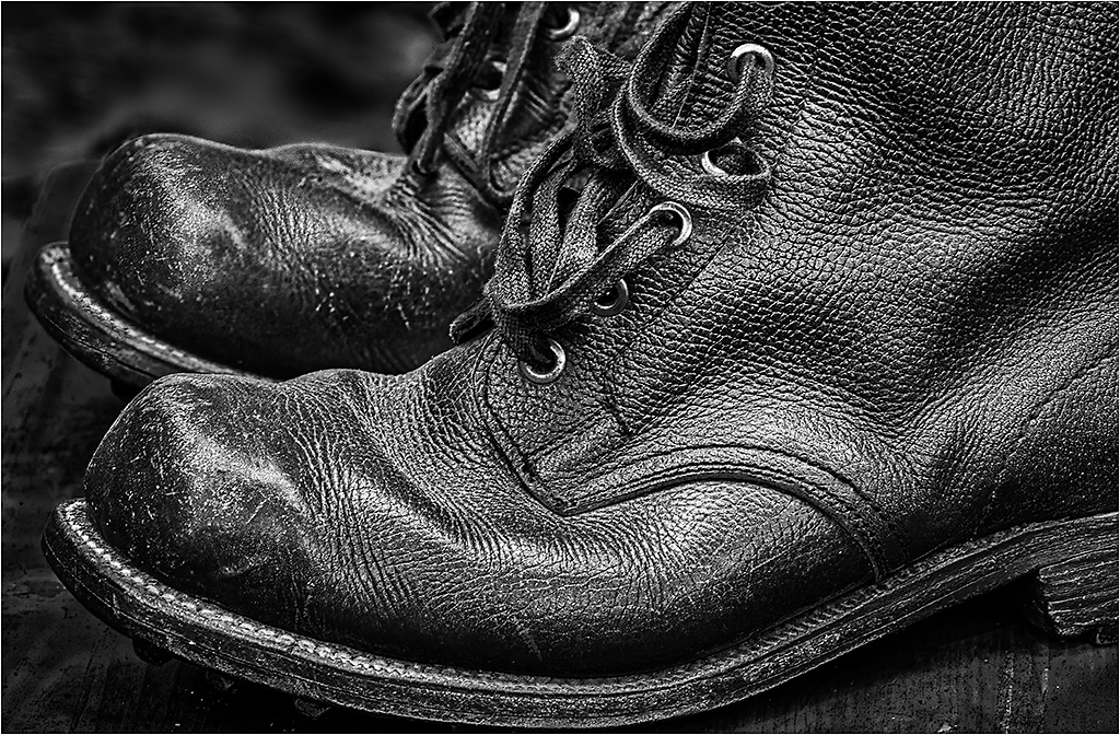
Great feel, and the stair rails act as good lines to draw you up. I would suggest that if you have a very dark image like this that you might consider a small white border, so it is easier for the viewer to discern the boundaries at the bottom without bleeding into the background (since the background used on the images is black). And while I like the concept of starting in very dark and gloom and working up, I wonder if just a tad more detail on the bottom would help? Or maybe just extending the lightness of the stair rails to reinforce the visual guides from top to bottom.
BTW, interesting movie trivia. |
Oct 5th |
| 26 |
Oct 17 |
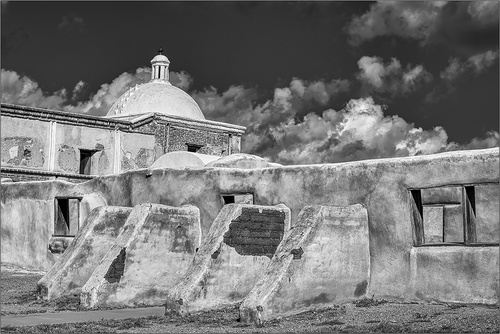
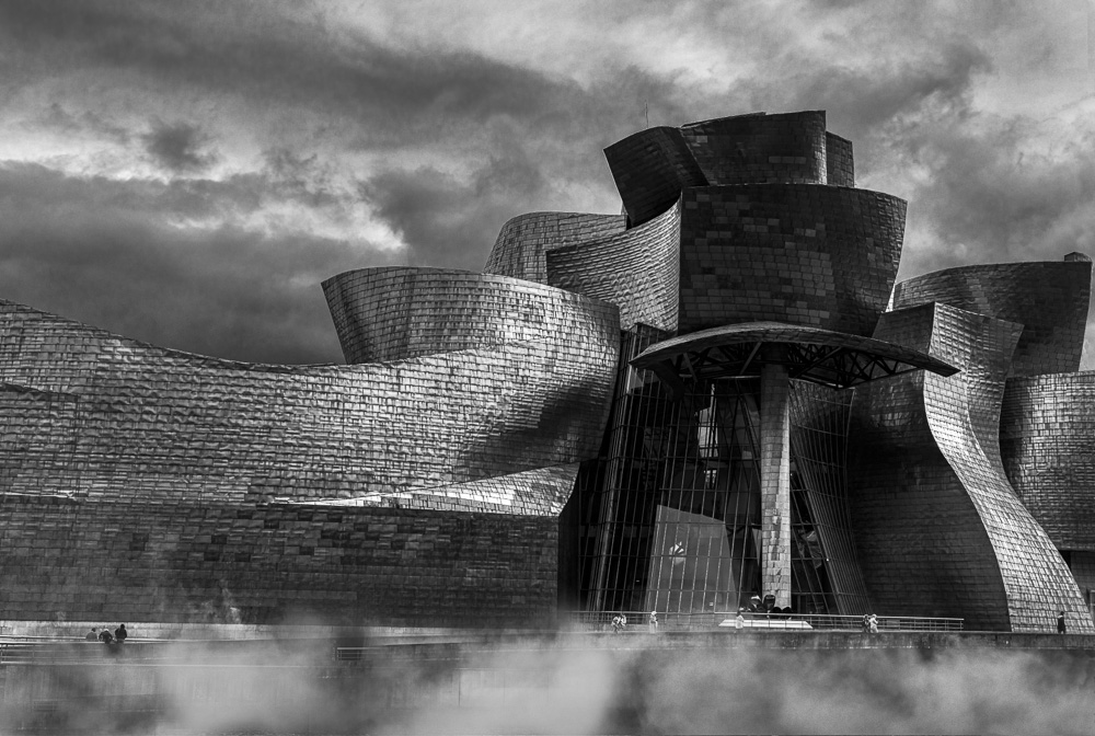
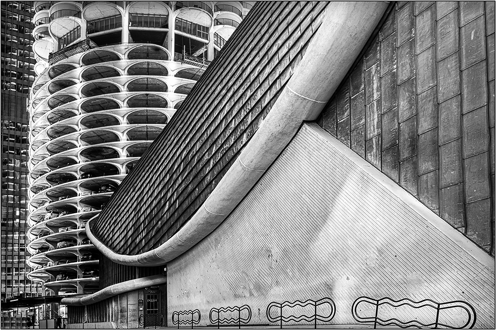
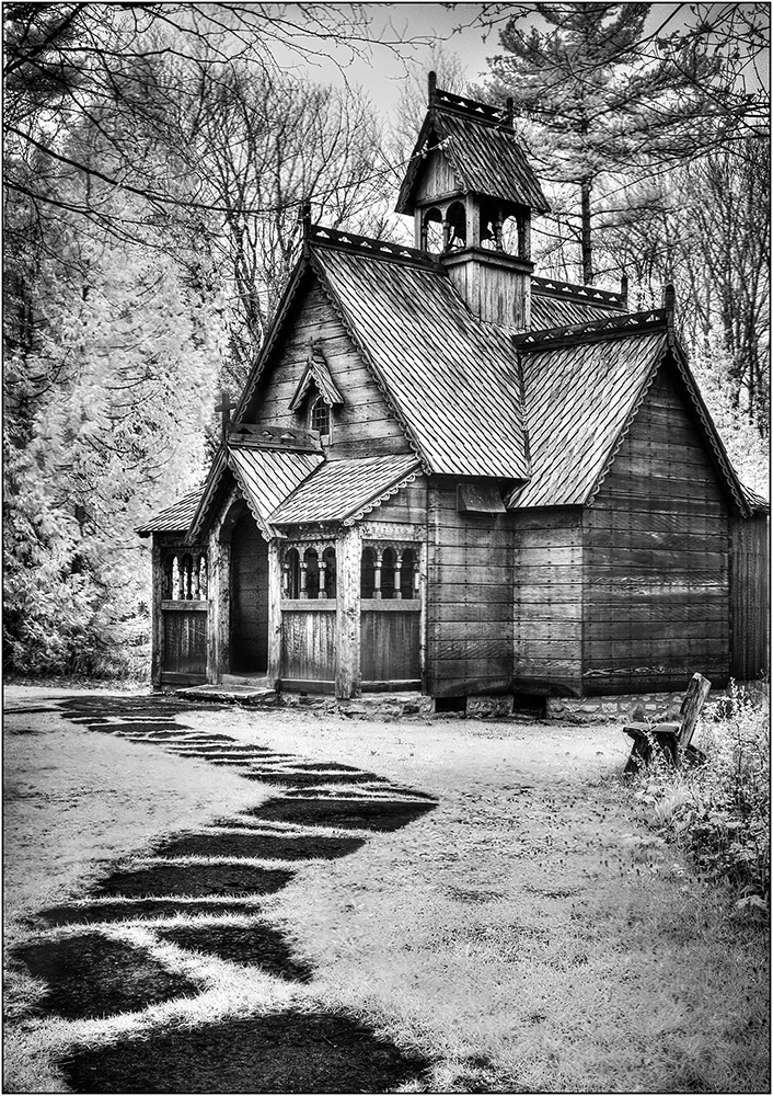
Comment |
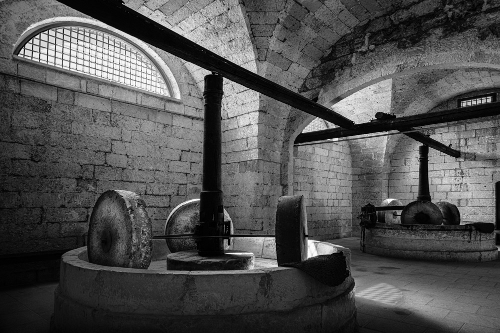
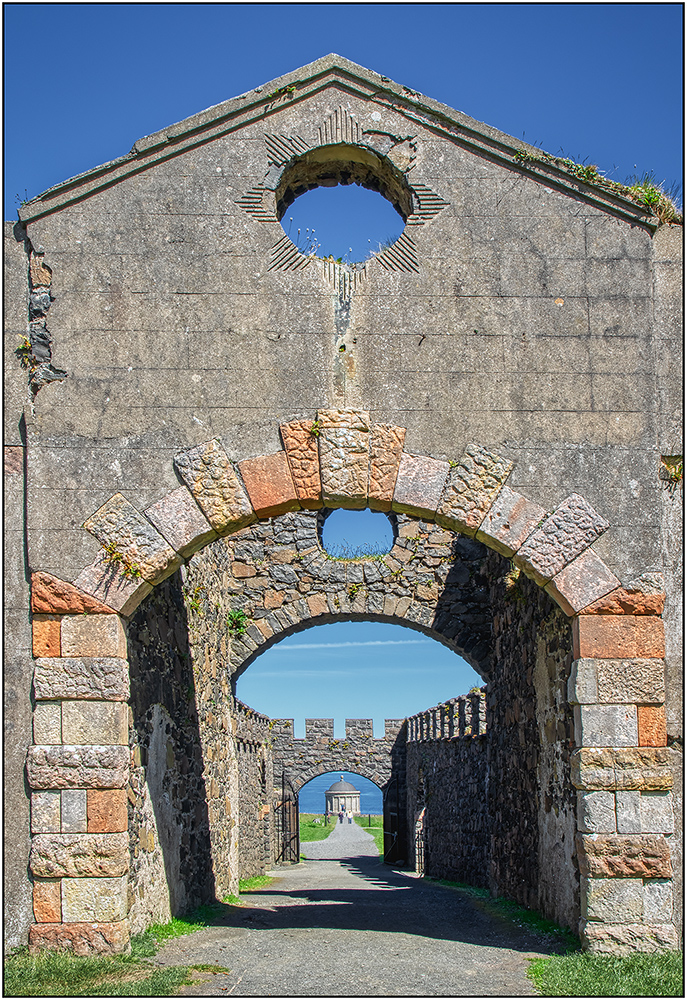
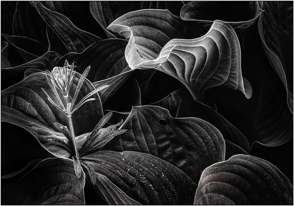
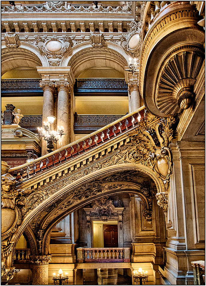
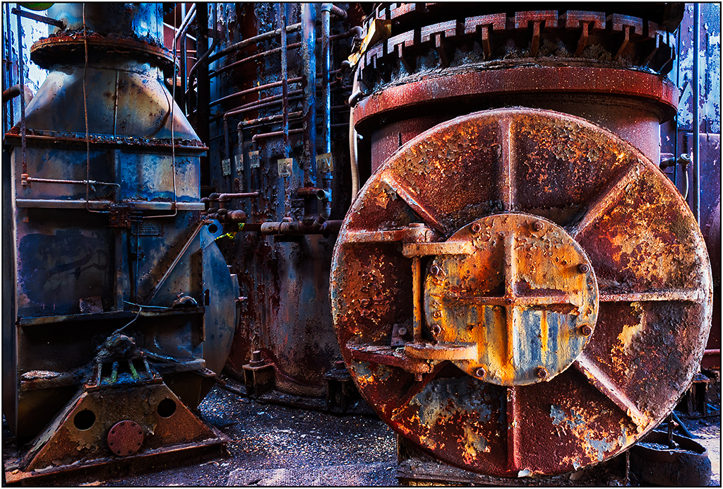
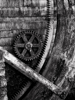
This is an amazing photo. I bet there are more pics in here. I like the textures and silvery feel. The only suggestion I have is to use in Photoshop, Edit>Transform>Distort, and pull the left edge of the building back to straighten it. And perhaps some burning on the bottom edge to draw the viewer in a little more. |
Oct 5th |
| 26 |
Oct 17 |
Reply |
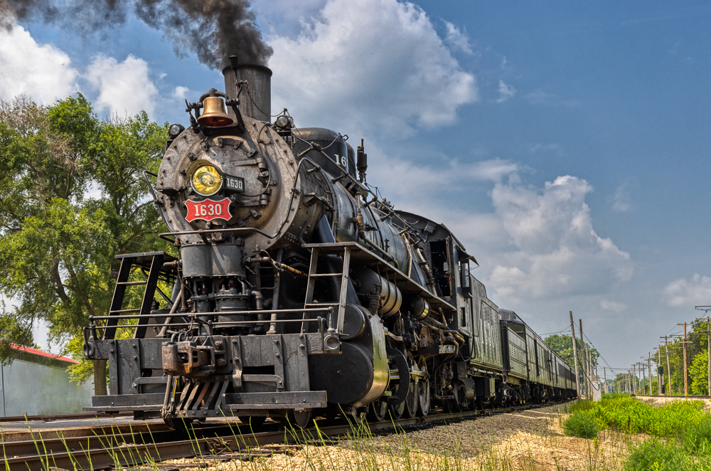
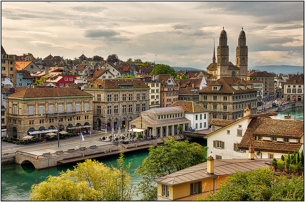
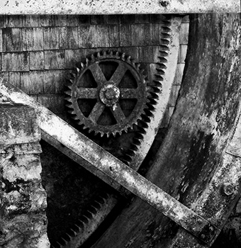
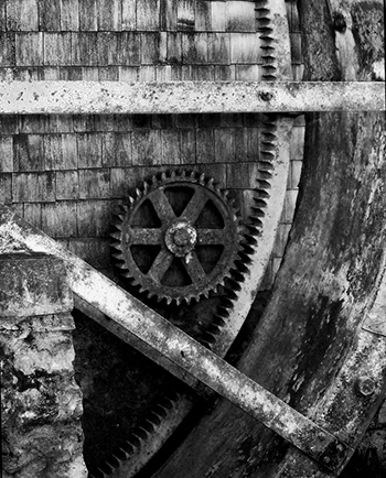
I know, I am getting a little over board with suggestions here, but you might also consider cloning out the bar, so you can crop it where the cog is not placed so much in the center (although I don't think that is so bad). I used a combination of the Content Aware Fill in PS and the Clone tool. (There are a few artifacts remaining that I did not take the time to fix.) |
Oct 5th |
 |
| 26 |
Oct 17 |
Reply |
I wish that bar/support was not where it is, as it cuts the image and adds a blocker, so I tried a crop to that point. |
Oct 5th |
 |
| 26 |
Oct 17 |
Comment |
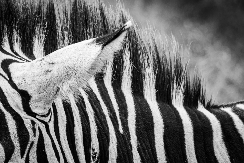
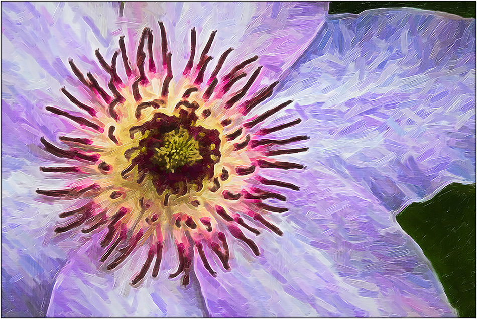
The original seems a little too saturated/ colors distorted. But actually that makes a better starting point for a B&W conversion, as it helps separate tones. Not sure what software you used for conversion, but either LR or PS have an excellent B&W converter that allows you move the color points around to get maximum contrast development. I like the treatment in mono, and I don't think it is too dark; I just think you need to spread out the tones for more contrast. I did some quick conversions. See what you think. |
Oct 5th |
 |
6 comments - 4 replies for Group 26
|
6 comments - 4 replies Total
|