|
| Group |
Round |
C/R |
Comment |
Date |
Image |
| 76 |
Aug 23 |
Reply |
To be frank, this image has been sitting on my hard drive all these years because I thought the image was flat plus I didn't have the post processing skills to make the image come to life as I would have wanted. So often I would bring an image as far as I could processing-wise but knowing that there was more I could do to make it better but didn't know how. This past year I have spent time improving my skills plus the members of our group have been very helpful in their suggestions...Gordon, I want to thank you for your positive comments...very helpful. |
Aug 30th |
| 76 |
Aug 23 |
Comment |
Thank you Jay for your comments and for the tip on lighten up the sky on the left a bit. I will try that. |
Aug 22nd |
| 76 |
Aug 23 |
Reply |
Thanks Trey for getting back to me. I had to laugh....you with your spelling and me with my eyesight as I visually put an "l" in your "buring" and took it as "blurring". My spelling is pretty good until I touch the keyboard, start to type and then those misspelled words start to appear out of nowhere! Anyways, thanks for the tip on how to blur in Lightroom.
|
Aug 22nd |
| 76 |
Aug 23 |
Reply |
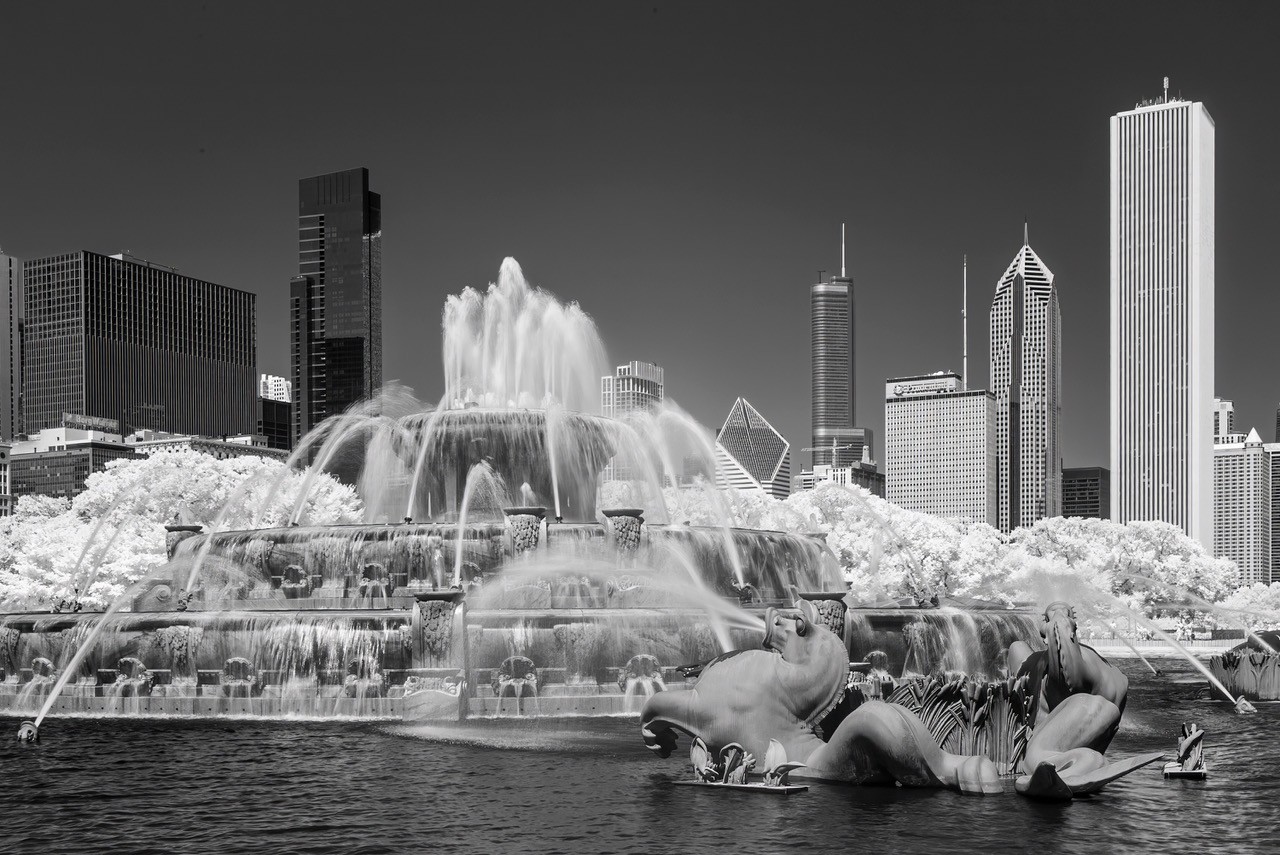
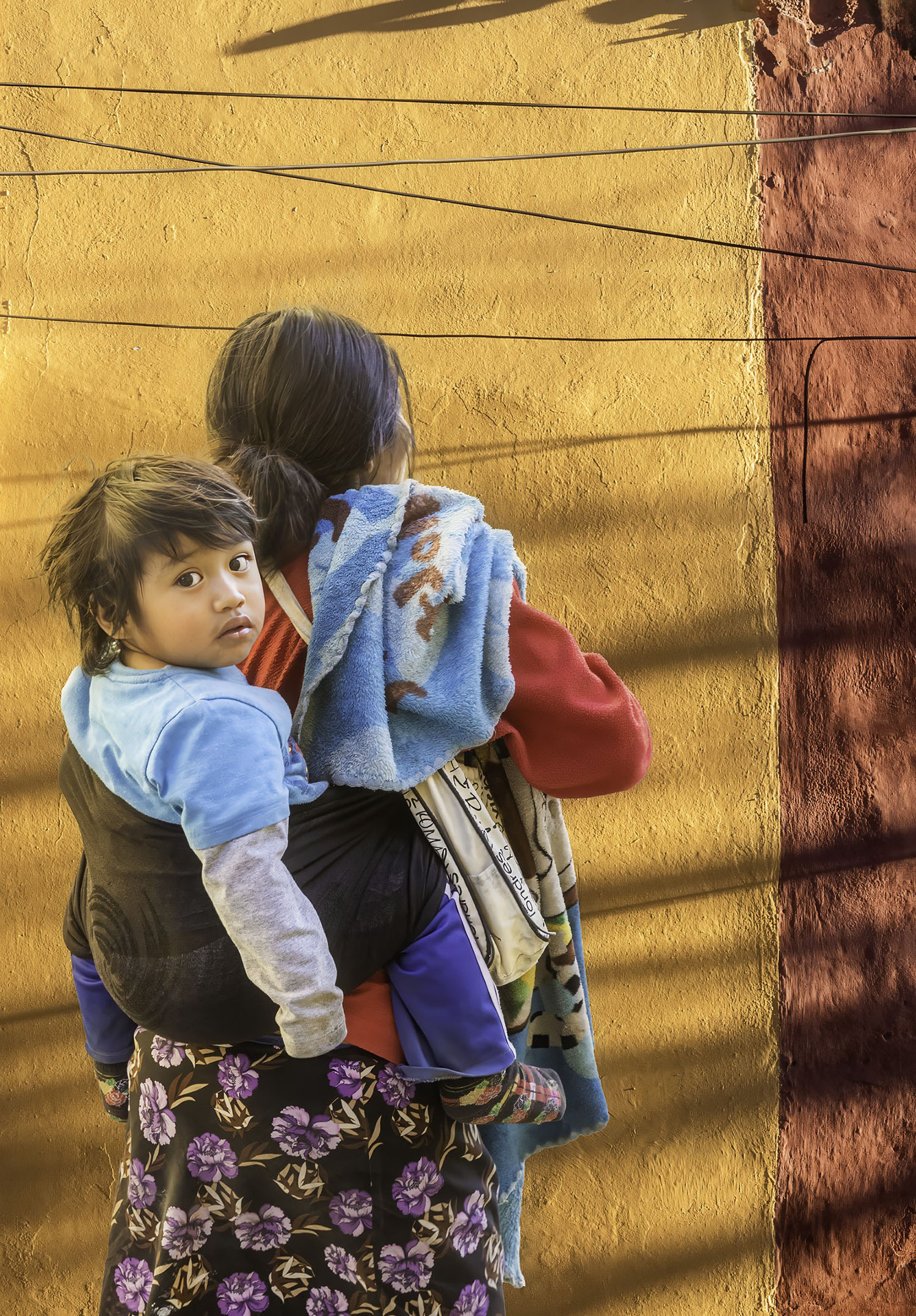
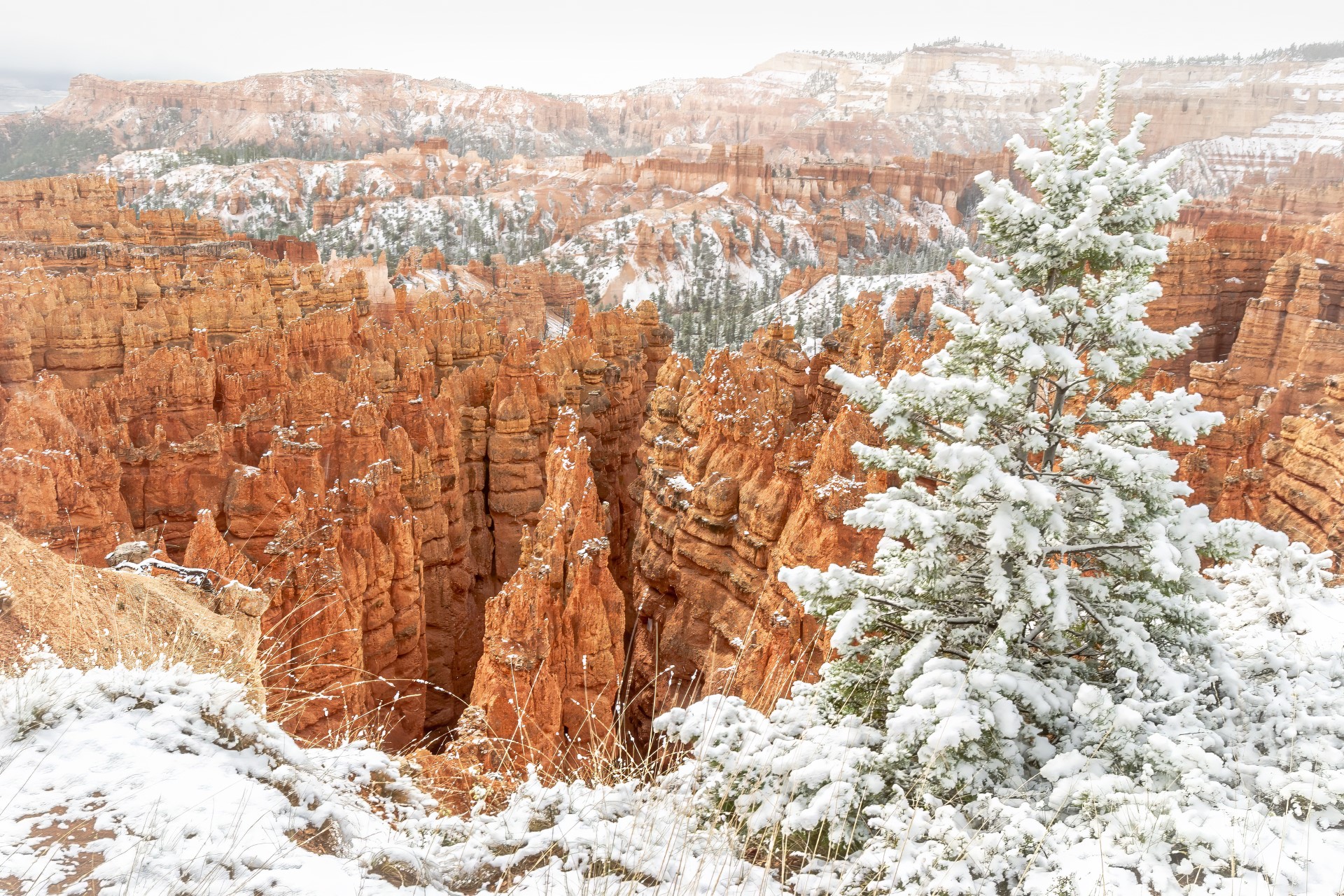
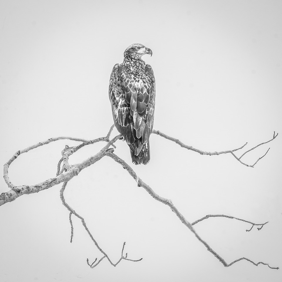
Thank you for your comments Ian. I went back and looked at the image and can't tell if those spots you mention are dust spots or something else. Either way, they are a noticeable and I will pay more attention to the details in an image that are distracting along with the small spots of snow. |
Aug 22nd |
| 76 |
Aug 23 |
Reply |
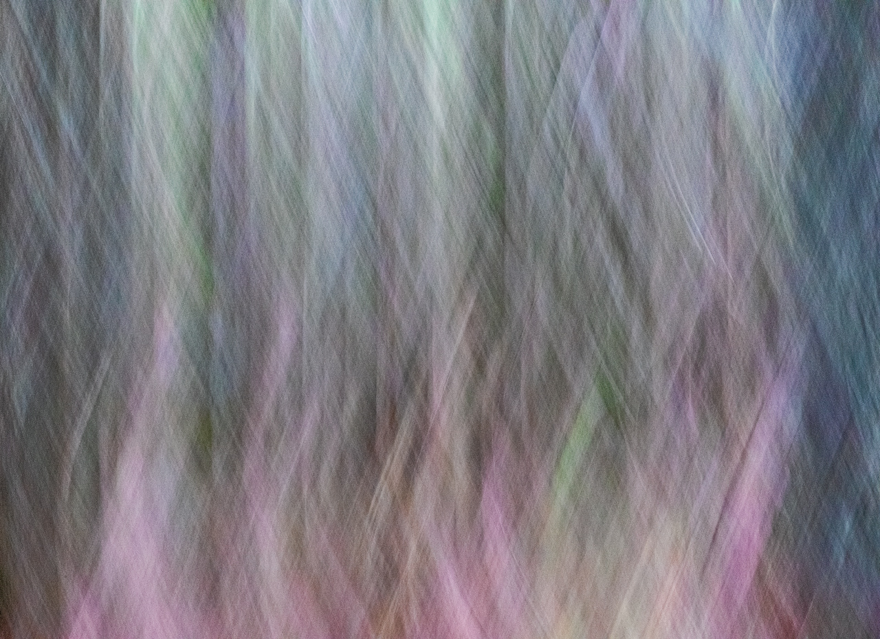
I tried what you suggested and do like the 16x9 crop but do have a question on blurring. I wasn't sure on how to best proceed with blurring so here is what I did. I created a duplicate copy of the image then went to Filter>Gaussian blur and chose a blur of about 3. Next I created a mask to hide the blur and then used a brush to paint in the blur. I then reduced the opacity to 29 because it looked too blurry at the bottom. Is the method I used to blur the best approach or is there an easier/better way to do the blurring. I never realized that adding blurring to the bottom would increase the contrast. Thank you for your suggestions...very helpful. |
Aug 20th |
| 76 |
Aug 23 |
Reply |
Sophie, I replied how to straighten out the lines in your image but think I forgot to reply to where you posed the question. Look at the bottom of the page and you will see how I explained straightening the vertical and horizontal lines. Hope this helps. |
Aug 20th |
| 76 |
Aug 23 |
Comment |
Bonjour Sophie, Attached is the image where I straightened both the vertical and horizontal lines. Here is what I did: In Photoshop go to Filter>Camera RAW. Go down to the heading "Geometry". Next to the word Upright, go to the fifth icon that looks like a hashtag (#). Next, start to draw a line on the vertical edge of the structure. Make sure you draw two lines, one on each side of the vertical structure. Do the same with the horizontal structure. Altogether you should have 4 lines (2 vertical and 2 horizontal lines). The lines will self correct by drawing the lines. You should now have your vertical and horizontal lines straightened. You do not need to click ok unless you are through processing the image in the RAW window. One last thing... when you start to draw the line a small circle will appear. Make sure that where you begin the circle that at the bottom of the structure that the circle is aligned in the same plane as when you first began drawing the line. |
Aug 20th |
 |
| 76 |
Aug 23 |
Reply |
Thank you Sophie for your comments. It is always helpful to me the comments that the viewer makes. |
Aug 14th |
| 76 |
Aug 23 |
Comment |
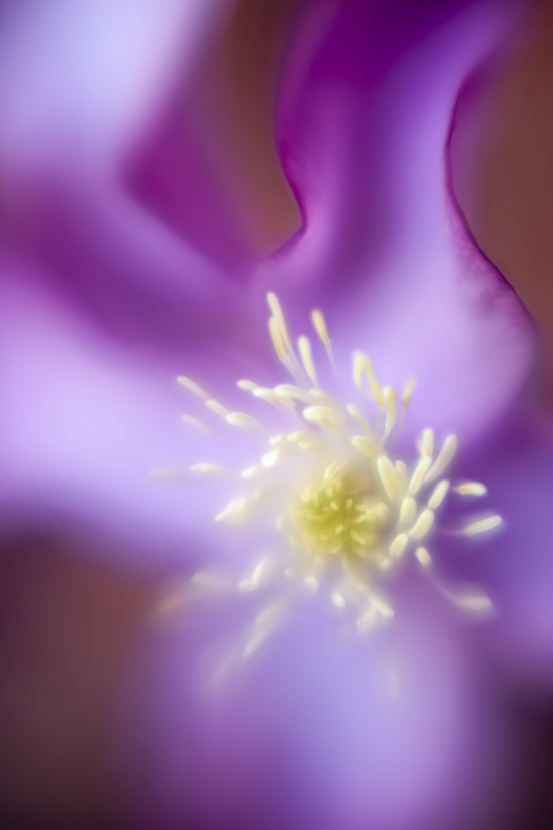
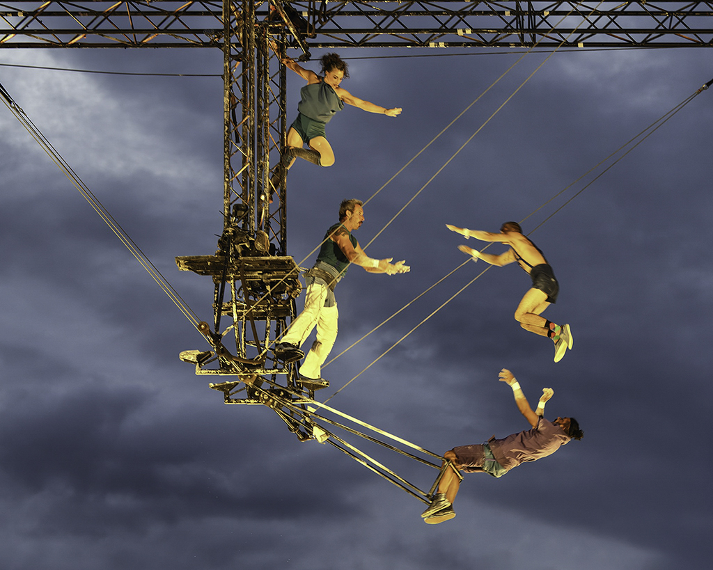
The use of lines, especially triangles, is very strong in this image. I can see triangles with the three artists on bottom and then another triangle with the three artist on top using the person on the top and bottom as the pivotal points thus creating two triangles. Also the use of the wires on the right and left connect to form triangles. As Sanford mentioned, the performers are in the right spot. The only suggestions I might make and they are minor would be to straighten out the horizontal rigging at the top and remove the trees at the bottom of the image. I don't know what your ISO was but you might want, with people moving (at nighttime) in an image, to have a higher ISO to capture movement but this might impinge on the quality of your image. Sophie, I feel that you are really talented at capturing the "right moment" in your images and this image is no exception. Great image Sophie. |
Aug 11th |
| 76 |
Aug 23 |
Comment |
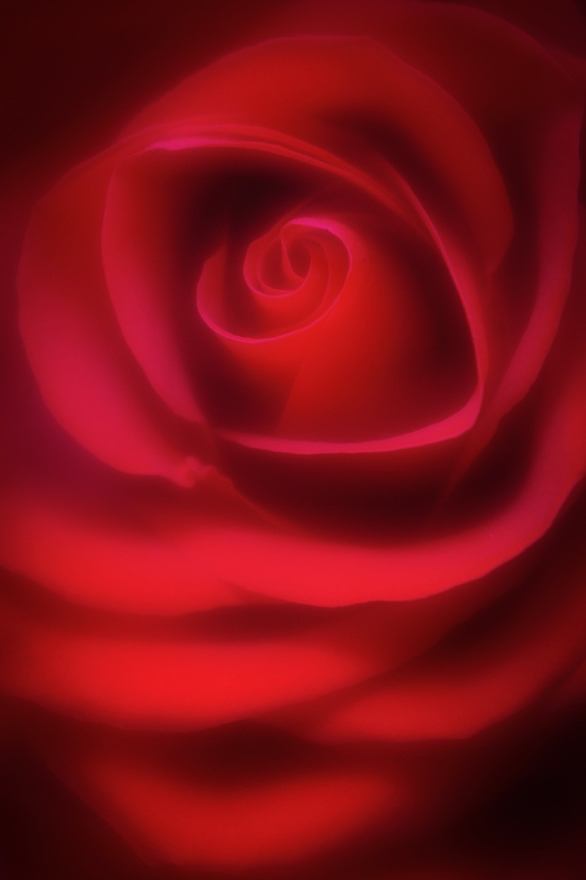
Gordon, you are a master at post processing details and creativity. Conversion to b/w creates a wonderful mood of the two tango dancers. Your use of lighting in the background and cloud effects on the dance floor are very effective. The lighting on the lady's arm with lighting up the shadows is spot-on. My thoughts on whether to hide the join between th floor and the rear wall is this: I think I would soften the line more so you can see it much less but evident that some sort of separation from wall to floor is there. Perhaps you could try and remove the line altogether, and with the reflection, the couple may appear to be dancing on clouds. Great image Gordon. |
Aug 11th |
| 76 |
Aug 23 |
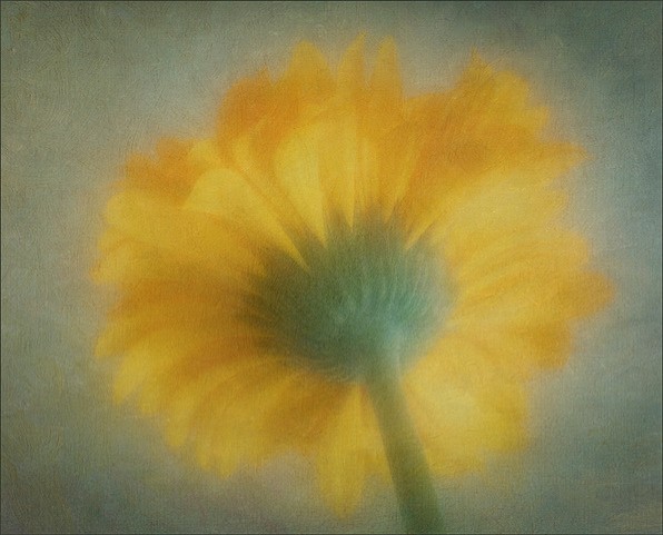
Comment |
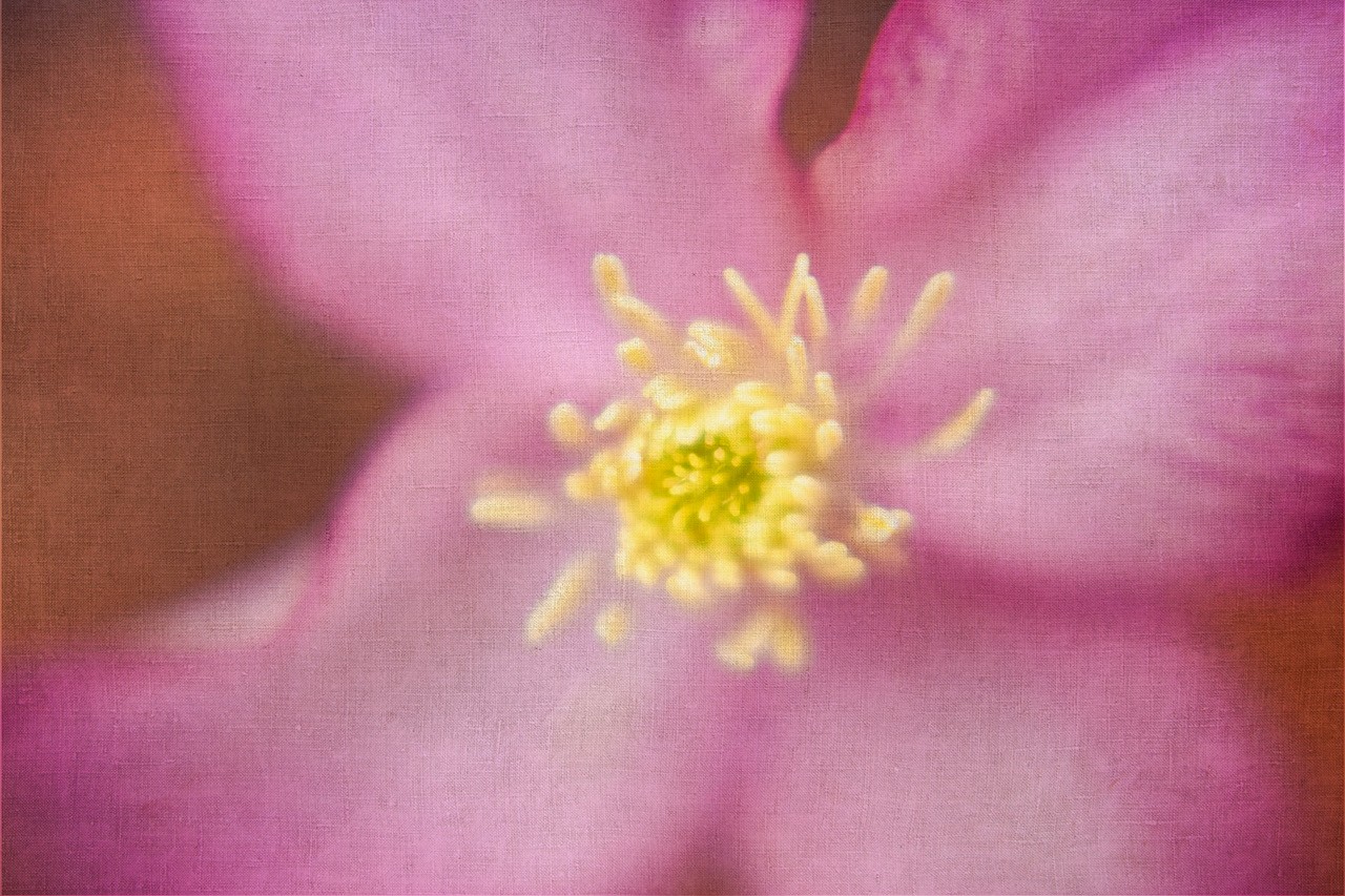
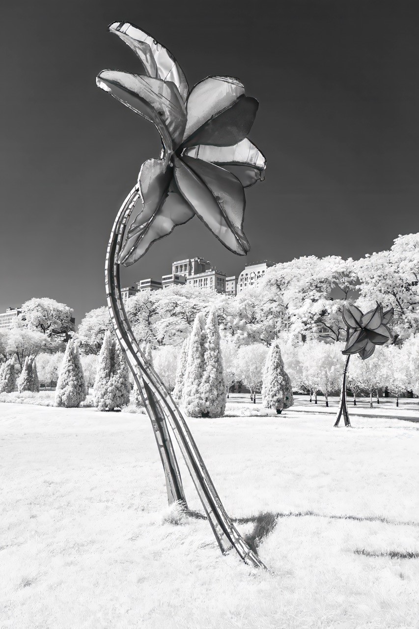
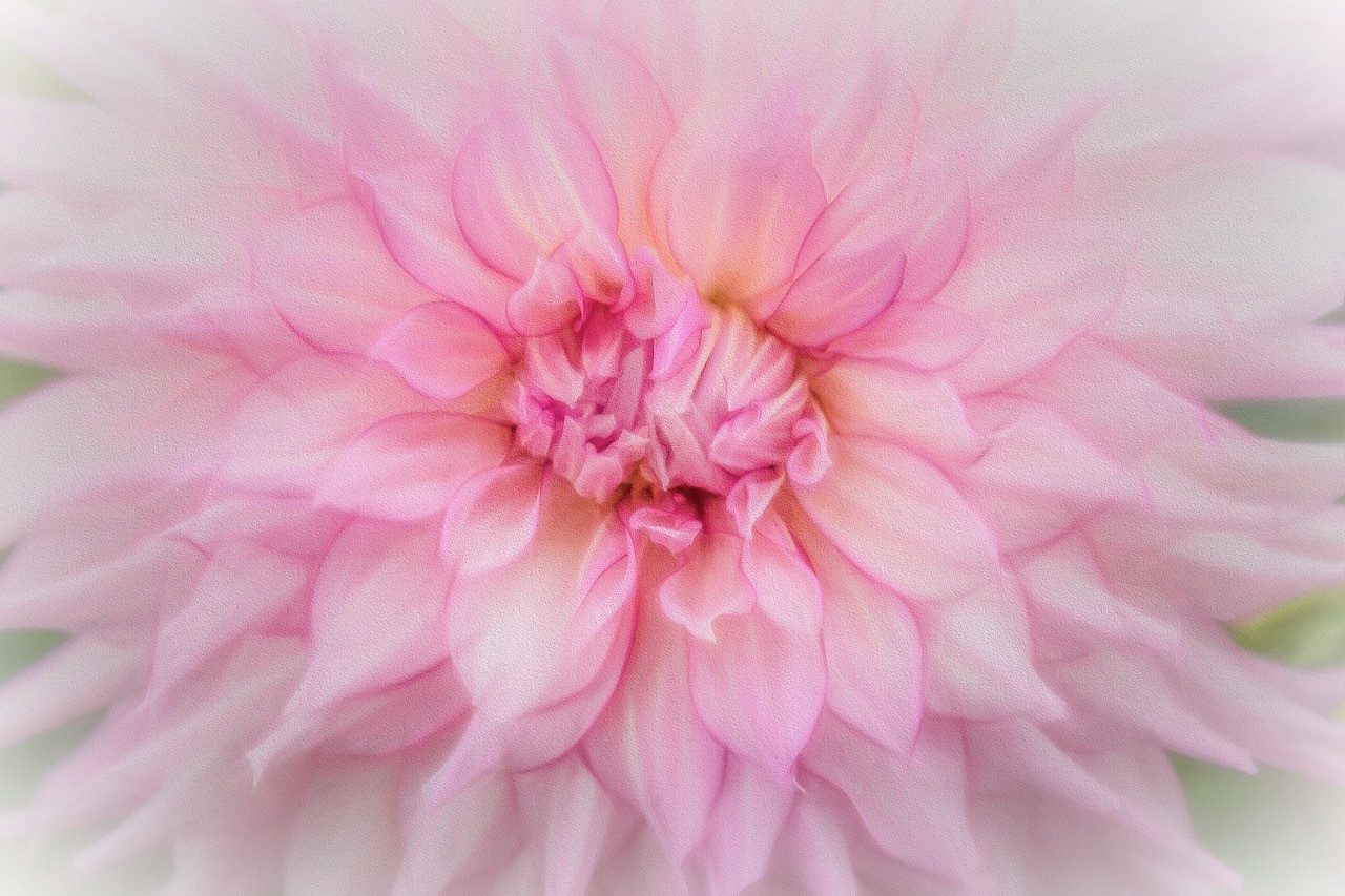
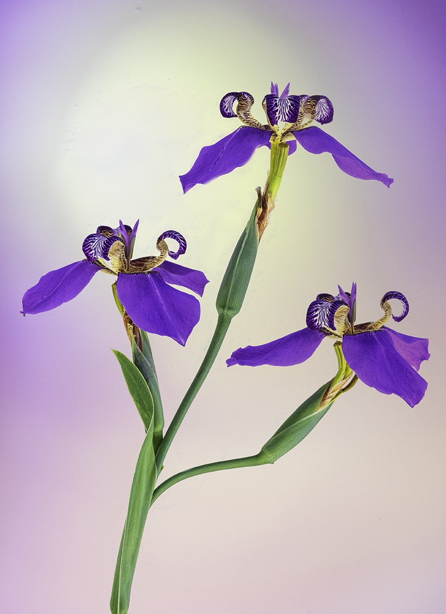
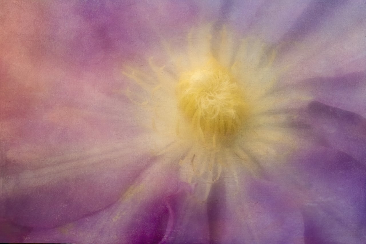
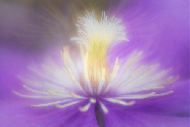
The implied triangle is strong in this image as well as the odd number of three coneflowers. Removal of distractions in this image makes for a stronger image as you have done. With focus stacking you still maintain a soft background so the viewer's concentration is on the flowers. You brought the image to life brightening up the image and also with your application of tones. |
Aug 11th |
| 76 |
Aug 23 |
Comment |
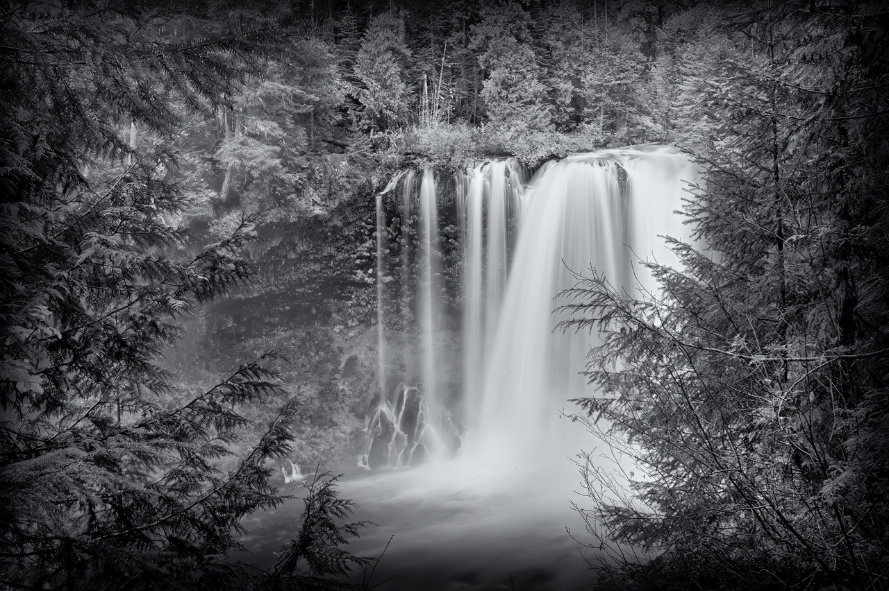
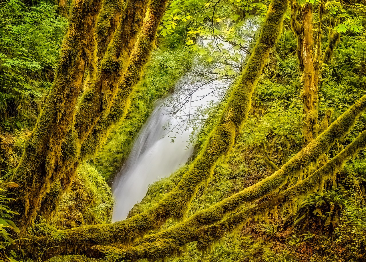
Stacking here really helps as everything is in sharp focus. You did a nice job with the shadows and lighting in the image. I like how you framed the image as my eye begins with the foreground rocks and goes directly along the rock faces to the trickling waterfall. This scene, for me, in Nelson Ledges State Park exudes peacefulness and is calming to the senses. Nicely done Jay. |
Aug 9th |
| 76 |
Aug 23 |
Comment |
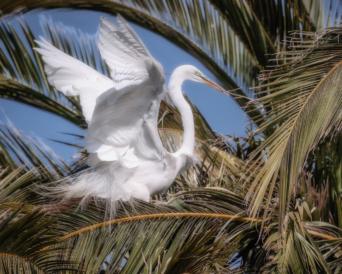
I'm just amazed by the detailed you maintained in the lion by reducing the image to just the lion's head. I can even see the back of the lion's tongue. You were even able to keep hair detail especially on the top left of the lion's head. The color enhancement of the lion's fur is nice. The only thing I might have done differently, and maybe this is cheating, I probably would have pulled (stretched) a few of the lions hairs (on right side) a do it doesn't look so cutoff. But hey, you stayed true to the original image and it is your vision of what you want the image to look like. The post processing is really nice and by reducing the subject to just his head brings the viewer to the most important element in the image with no distractions. Well done, Sanford. |
Aug 8th |
| 76 |
Aug 23 |
Comment |
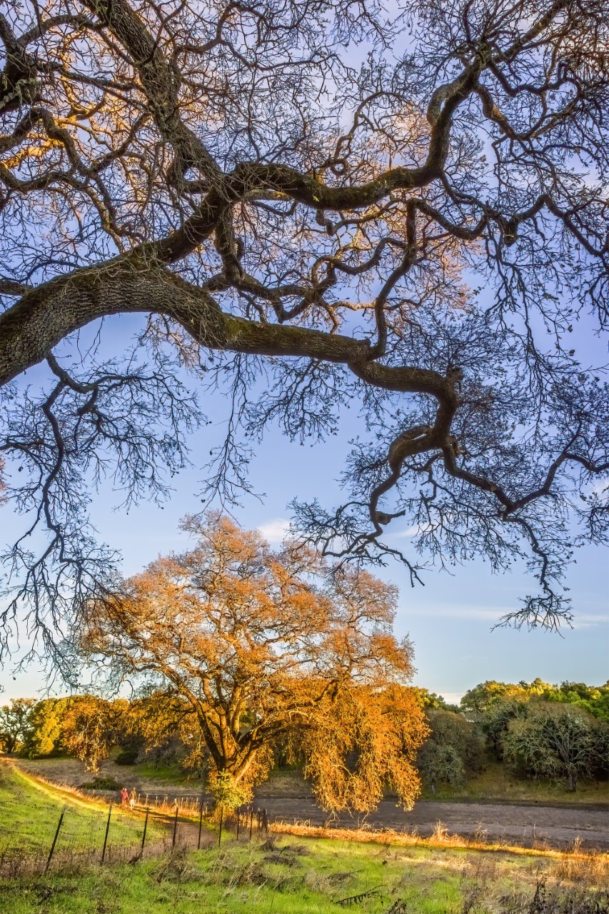
Your image looks very ethereal and has a nice dreamy quality. The quality of light in the sky is beautiful with the soft clouds. The mist surrounding the trees gives a feeling of peacefulness. I think it's important to go back often to a place that you like and look at it with fresh eyes and discovers something new. Whether its a change in the weather that affects the scene or a shape of a grove of trees that you never notice before, seeing something new in a familiar place must be gratifying. I like your interpretation of the scene...a nice image indeed. |
Aug 8th |
8 comments - 6 replies for Group 76
|
8 comments - 6 replies Total
|