|
| Group |
Round |
C/R |
Comment |
Date |
Image |
| 76 |
Jun 23 |
Comment |
This picture, for me, is all about shading, light and tones. The ladder is disruptive in the image, and other than the paint cans that show a connection to the woman's image, I don't see the reverence and placement of the ladder in the image. I would feel more of a connection if there was an old chair with paint spots on the chair with a few cans of paint a better connection then a ladder that covered part of the woman's face. The question I would ask is "where is the painter? Is he taking a cigarette break or perhaps having an aperitif?" Someone should tell him to move the ladder. |
Jun 22nd |
| 76 |
Jun 23 |
Comment |
Congratulations of getting shot and an image with such details considering what was cropped out of the original image. The tones in this image are very pleasing with sharp details on the yellow dung fly and its prey. The softness of the back ground is nice with nothing that detracts from the main subjects. Well done Gordon. |
Jun 22nd |
| 76 |
Jun 23 |
Comment |
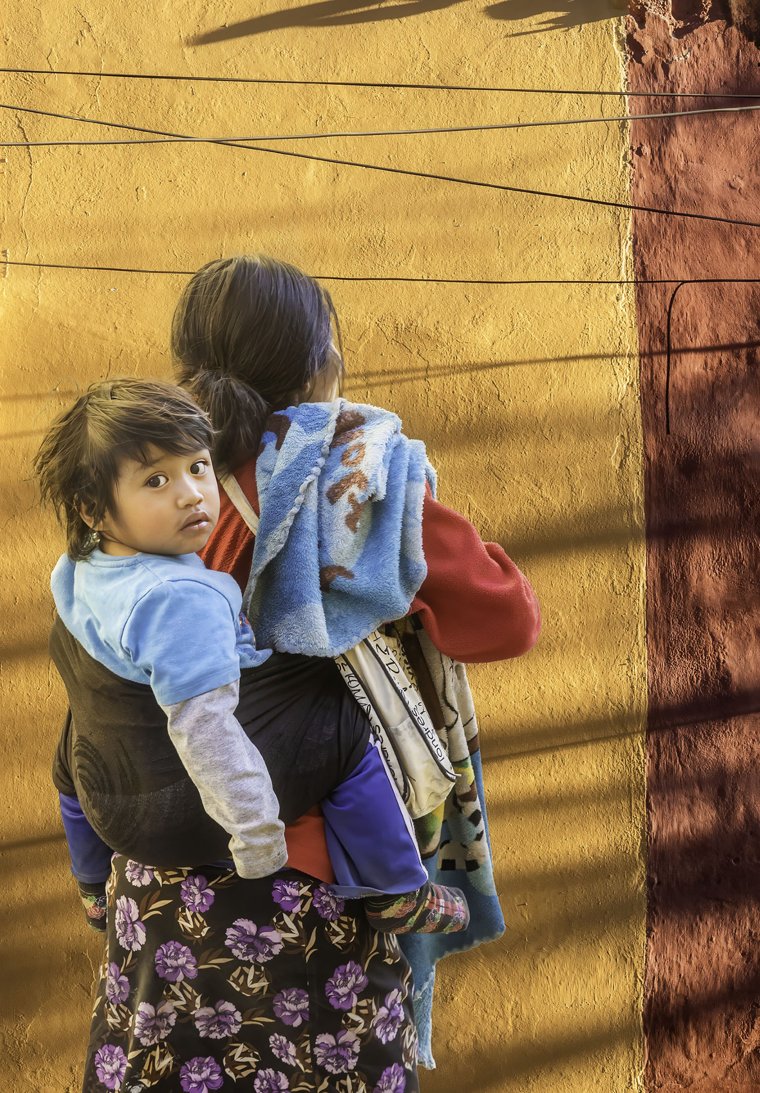
Occasionally I do street photography and I understand the background is not always the best for your subject but you take the shot and hope to come away with an image that tells a story. You can't always compare an image of a landscape against "street photography"...entirely different genres but you post-process the image as best you can to bring out details the you want to emphasize. I like the small details that are brought out in this image such as the writing on the back fender which was very sobering, the lighting up of the chrome in the wheels, the man's expression, etc. Given the circumstances and time of day. I think you image does indeed tell a story. The only thing I could add would be to lighten up the man's face a bit. Do you do masking in Lightroom Classic or PS? If so, click on masking icon, and you could just select the man's face a lighten up the face a little to open up the shadows on his face. Well done, Jay. |
Jun 22nd |
| 76 |
Jun 23 |
Comment |
You brought the image to life with your post-processing skills that reveals the terrain and oppressive heat that the lions live with. I like the white vignetting because it leads us right to the main subjects. The images that you have shown previously, including this one, really reveals you story telling skills about life on the African savannah. Well done, Sanford. |
Jun 22nd |
| 76 |
Jun 23 |
Comment |
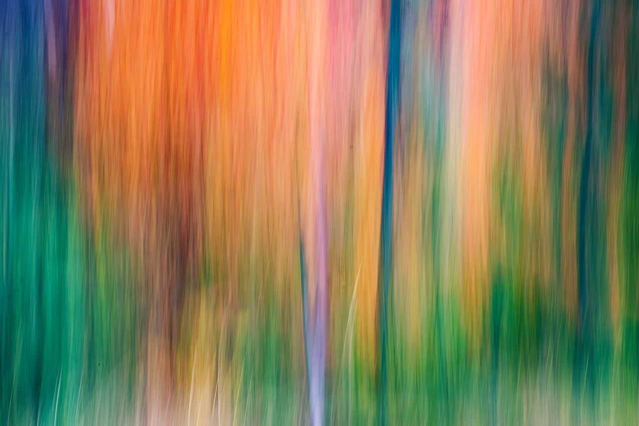
Trey, this abstract image tickles the imagination and is mesmerizing with its ebbs and flows that capture out attention. The gradation of tones, depth and wavy lines and your post-process made this image really come alive. Well done. |
Jun 22nd |
| 76 |
Jun 23 |
Comment |
For a small section of the car you managed to get in triangles, curves and lines along with shades of darker and lighter tones. Well done Ian. |
Jun 22nd |
| 76 |
Jun 23 |
Reply |
Thank you Jay for mentioning the things you like about the image. Recently I started focusing on old images that previously I wasn't sure how to process. With improved technology and concentrating on getting better at post-processing, some of my old images are being given a do-over. I do appreciate your comments as it tells me that perhaps I'm on the right track though I have a long ways to go. |
Jun 22nd |
| 76 |
Jun 23 |
Reply |
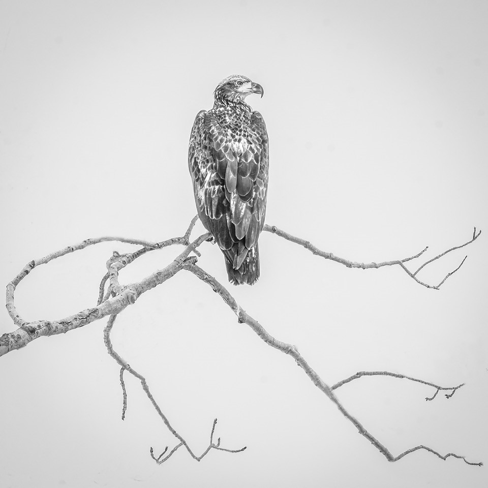
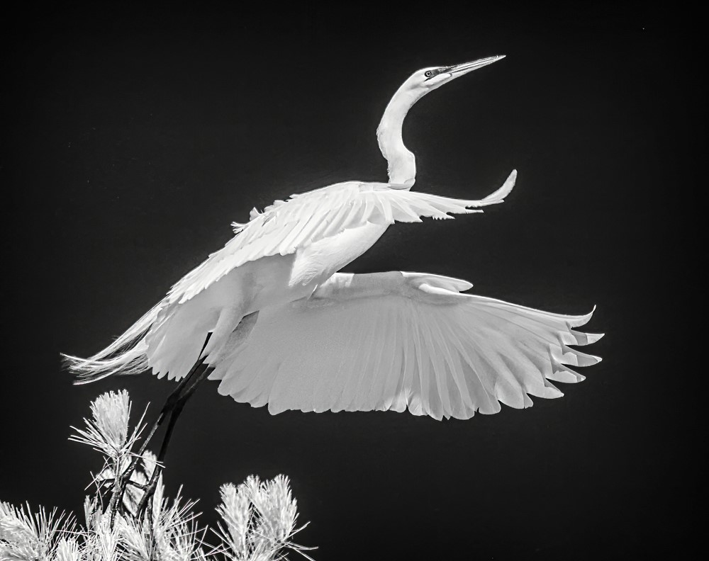
Gordon, thank you for the time to evaluate my image and give me tips on how to improve the image. I'm inclined to start from the beginning using the tips you suggested on how to better improve the Golden Eagle image in b/w while keeping the square format. Also, I appreciate you mentioning on the things you liked about the image. My goal for the last several months is to become better at processing my images and I have been working on that so your tips will really help me in that regard. |
Jun 20th |
| 76 |
Jun 23 |
Reply |
My eye didn't pick up any dust spots until Iwent over my image again and used a curves layer to darken the sky and then I saw them. With the lighter sky my eye didn't pick up on the spots....lesson learned. |
Jun 15th |
| 76 |
Jun 23 |
Reply |
On the golden-toned image of the bird I darken the bird and also added contrast but not to the b/w image. The reason I chose a square format was because in my original image (not any shown here) there was a lot of empty space on the right plus once I removed a lot of the cluttered branches I liked the simplicity and curving branches. On the golden toned image I did sharpen the bird but never thought of doing a high pass application on the bird. That's a great idea. I shall try that and also practice doing a similar placement of the bird as you did in your reply. I really appreciate the time you took to show me another way to process the image so it has more impact. |
Jun 11th |
| 76 |
Jun 23 |
Reply |
Sanford, Thank you for taking the time to give me your input on the Golden Eagle image. Usually I don't put a subject right in the middle but made an exception this time because I liked the curving branches but I do value other's opinions on how to improve the image. I will try what you suggested to see what I come up with. Think I'll try coming in from the left and down from the top a bit & up from the bottom putting the bird on the left a bit more to start with. |
Jun 11th |
6 comments - 5 replies for Group 76
|
6 comments - 5 replies Total
|