|
| Group |
Round |
C/R |
Comment |
Date |
Image |
| 76 |
Jan 23 |
Reply |
Thank you for your comments Sophie. I should do this more often as the results are unpredictable but satisfying when you get an image that you are happy with. |
Jan 27th |
| 76 |
Jan 23 |
Reply |
I am happy with this image though I will admit it takes several tries to get an image that one is satisfied with. I appreciate your comments Trey. |
Jan 27th |
| 76 |
Jan 23 |
Reply |
I completely missed looking for dust spots in my image...forgot to do it. Guess I was overcome with the color in the image. Lesson learned....I will pay more attention next time. Thank for your comments. |
Jan 14th |
| 76 |
Jan 23 |
Reply |
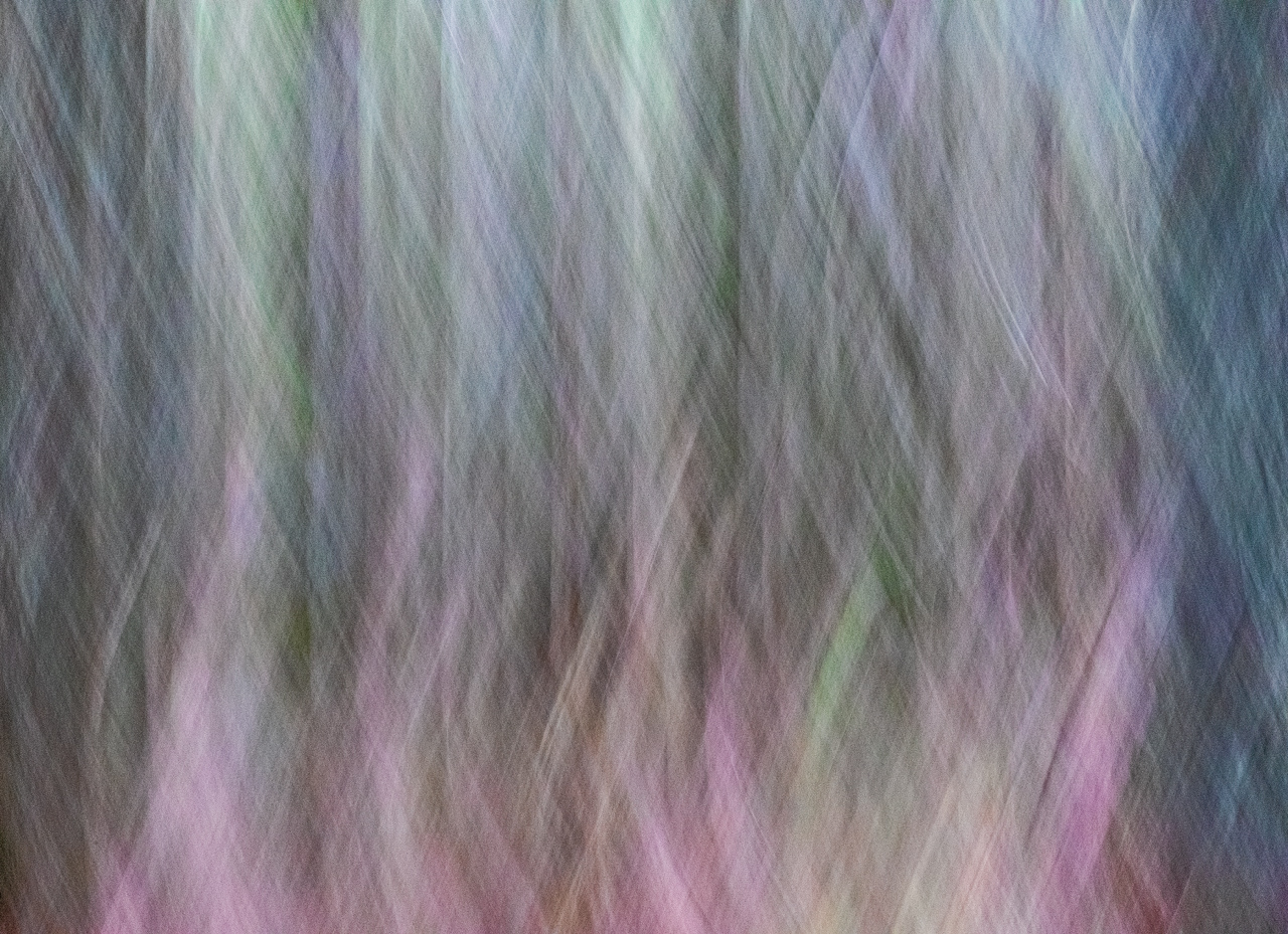
Your assumption is correct that you have to take several icm images to get one that you like as there are so many variables when you do icm. I completely missed the dust spots in the image. Usually I see them and correct them but this time I did not....lesson learned. Thanks for your comments, Gordon. |
Jan 14th |
| 76 |
Jan 23 |
Reply |
Thanks Jay. I'm looking forward to seeing some of your icm images in the future. |
Jan 14th |
| 76 |
Jan 23 |
Reply |
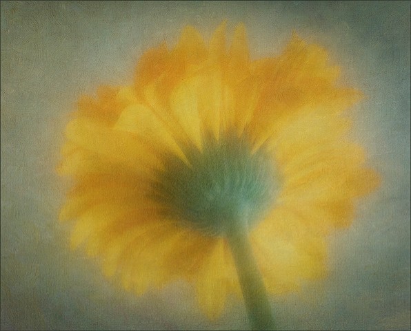
Just continue making icm images to please yourself. I find that I have to take a lot of images just to get a good one that I like but it is so much fun and rewarding when you get an image that you are pleased with. Thank you for your comments. |
Jan 14th |
| 76 |
Jan 23 |
Comment |
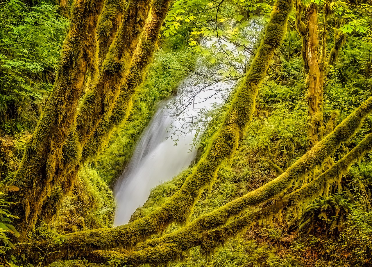
I've heard that if you want to convert an image to black and white a colorful image is best. I have been going back and forth between the cyanotype image the the colored image and in this case think the cyanotype stands out a bit better. The tree trunks seem lighter and provide contrast to the bushes. I like the implied triangle in your image starting with the big bush on the right, going back at an angle and then the eye moves to the right along the bushes. The tree on the left front along with the large bush on the right front keep the eye anchored into the image. Keep up with trying different genres of photography. I really like what you are doing....a very pleasing image. |
Jan 7th |
| 76 |
Jan 23 |
Comment |
A Christmas card picture for sure. I am most impressed with your use of lighting/gradient techniques in places where it counts with just the right application...not too much nor too little lighting. Even though the snowy trees were lightened, the show on the school's roof was a bit lighter which makes the school stand out even more with its' red building. Cropping also made a great impact on what's most important in this image. Love this image...well done. |
Jan 7th |
| 76 |
Jan 23 |
Comment |
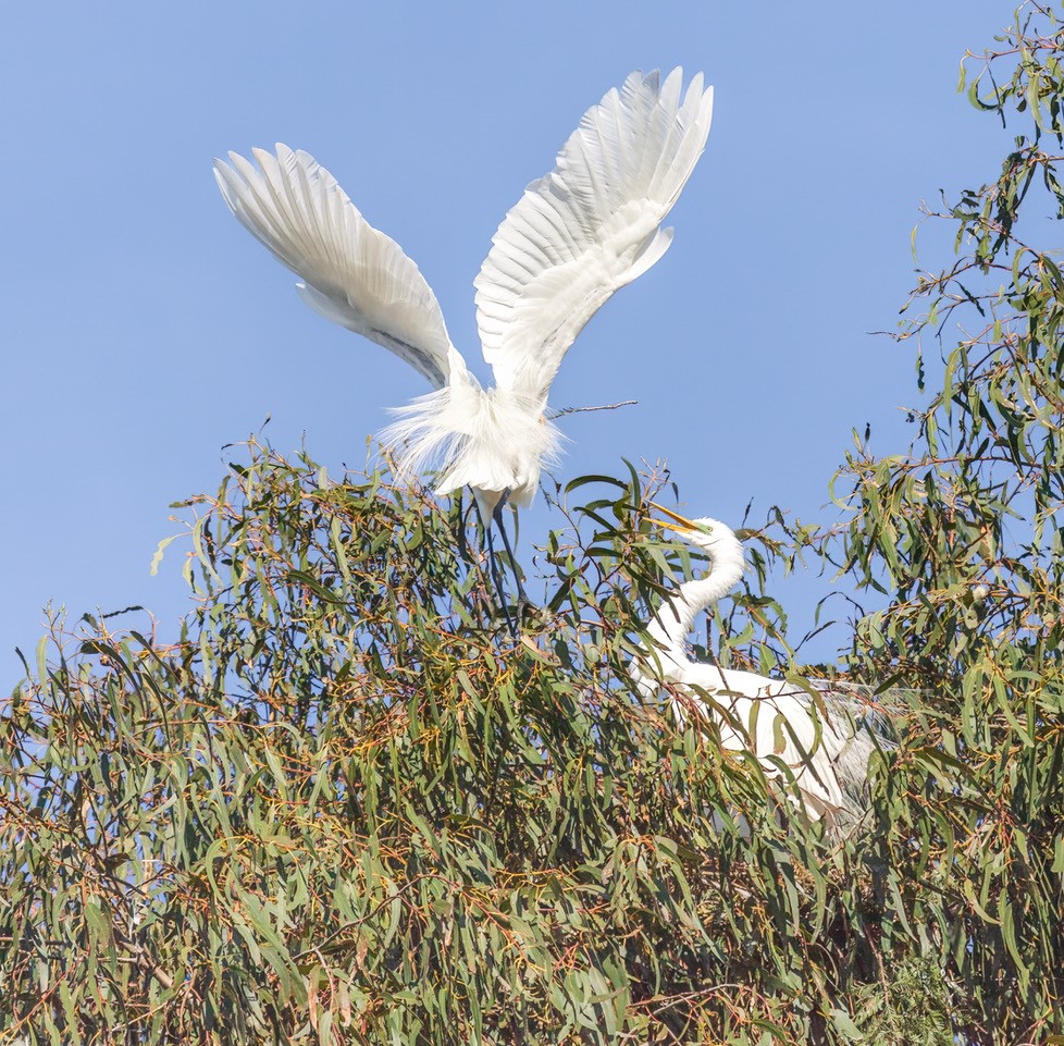
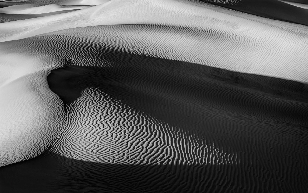
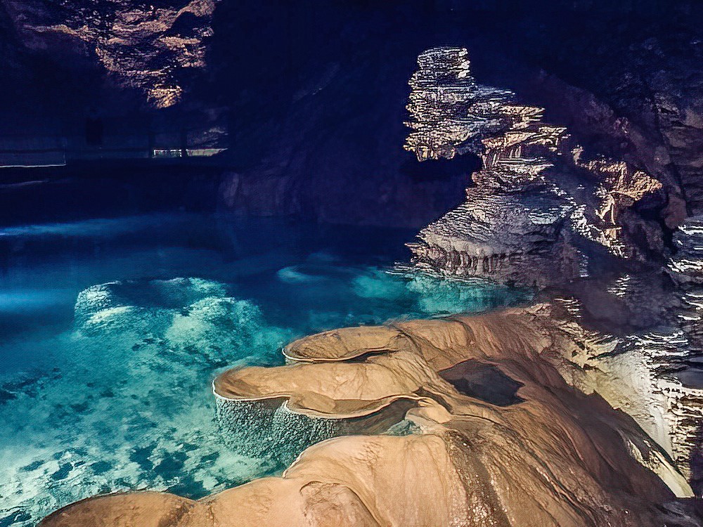
In the processed image you have added a lot more contrast and the golden color on these side-lit sand dunes are really nice and even. Reducing the noise in the image really adds to the quality of the image. I almost missed the camel rider in the image as he shows up better in the original image (lighter). Is there a way that you can go back in LRC masking, select + sign for new layer, selecting a brush, open up the exposure a bit and paint over the camel/rider to make him stand out a bit more? I think this is a great image, well processed and cropped. Well done...look forward to seeing more of your images from the Gobi desert. It's always one place that I've wanted to visit. |
Jan 7th |
| 76 |
Jan 23 |
Comment |
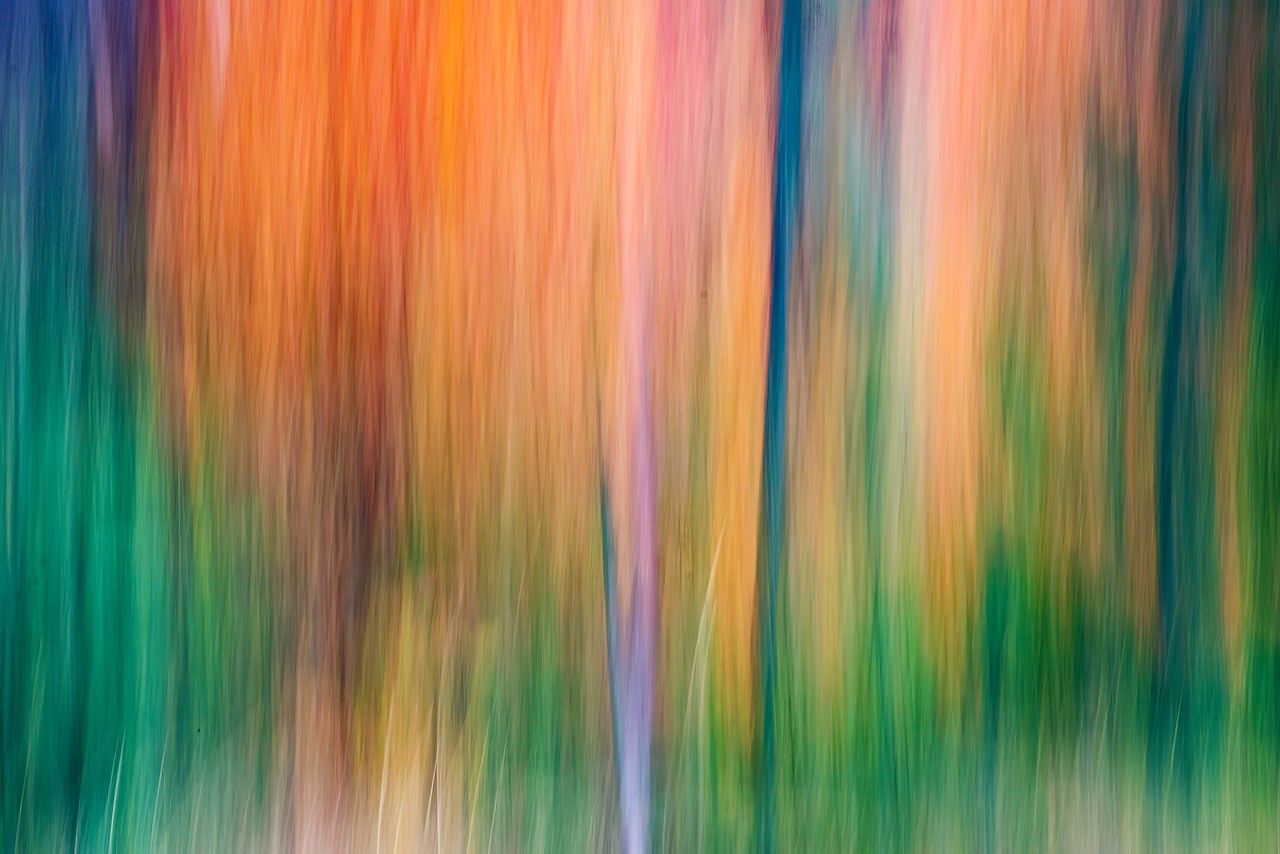
I like the starburst effect and the setting of f16 is good. I've tried both f16 and f22 and sometimes the setting of f22 makes the spreading of the sunburst a bit unrealistic as sometimes the light spreads a little too much on the sunburst at times. Cropping is good but I may have come down just a little more down from the top but leaving in a bit of the darker green to contrast with the orangish color. The processed image looks much better than the original as the colors of the leaves really stand out a lot more and one is not distracted by the open pace on the right in the original image. It is difficult to even out a blue sky when the lighting is uneven. The only thing I can think of, and not sure if this idea would work out, would be in Lightroom Classic under masking, to select sky and do a linear gradient with a bit of saturation and a bit of exposure darkening. There is also color range option in LRC that might be worth looking into that might be helpful. I think the latter suggestion might be more helpful than the linear gradient in this case. Julianne Kost on YouTube has a video on masking and one of the many things she covers is color range. I feel you are making positive strides in your post processing skills. |
Jan 7th |
| 76 |
Jan 23 |
Comment |
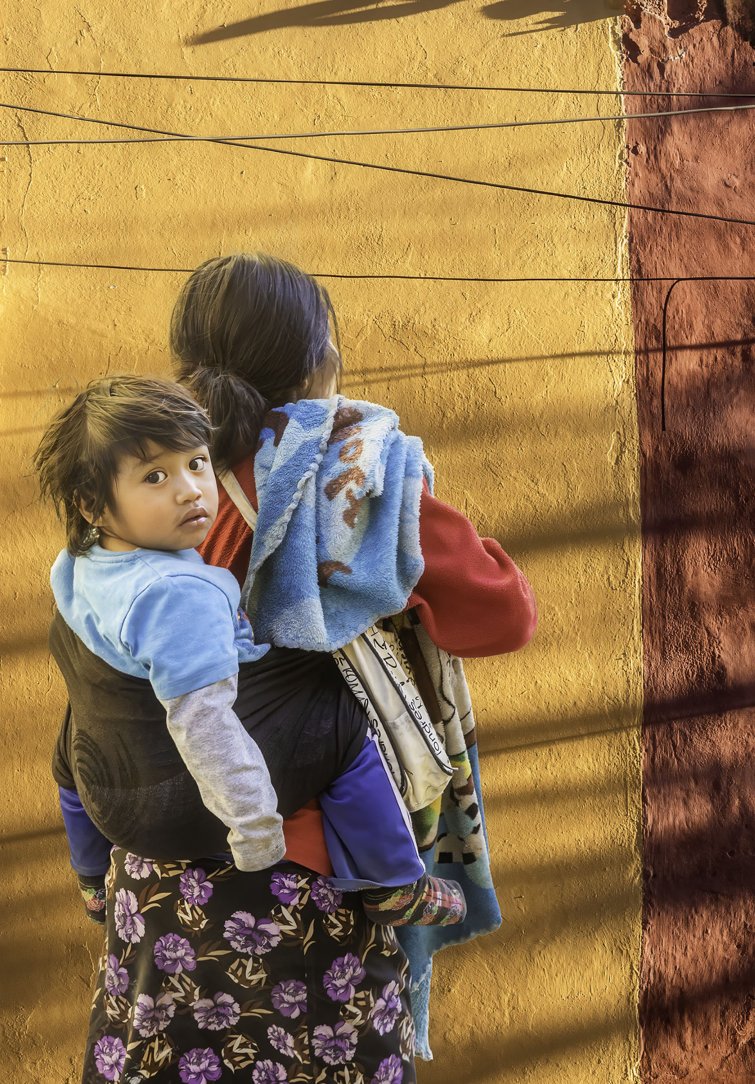
On how the picture should have been cropped or not depends on your intentions as to how you want to portray the subject. First I must say that you set a nice somber mode with your post processing of the image...both in compositing and setting of mood. If I had to pick wether to have the upper of the image (window and painting) I would have cropped the image down 1/3 to the upper steps because then my eye goes directly to the subject and the mood you created in the image. Saying this, I am big proponent of compositing an image in different ways and seeing which one appeals to me most. If I step back from the image I like it as a whole as you have rendered it but if I look at it more closely, I prefer the image without the window. Either way, I think you did a fantastic job with your post processing skills in making this an image you should be very proud of |
Jan 7th |
| 76 |
Jan 23 |
Comment |
First I like the angle of your image as my eye follows both riders and then circles around left to the back. The image is not static because of the blurred movement of the rider in the front. The repetition of light on the walls (horseshoe-shaped)are eye catching and draw the viewer into the image. So, all in all, you have captured light, shapes, lines, color...all elements of a good image. It's a shame that the 2nd bicyclist was wearing a black helmet that is against a dark background though you could go into photoshop and change the color of the helmet. Very nice image, Sophie. |
Jan 7th |
6 comments - 6 replies for Group 76
|
6 comments - 6 replies Total
|