|
| Group |
Round |
C/R |
Comment |
Date |
Image |
| 76 |
Aug 21 |
Reply |
Hi Trey, You rendition is really nice and I do like it better than how I processed my image. There is more definition (contrast) in the image as you processed it. I shall work on my original image and look forward to seeing what I can come up with. Thank you so much for taking the time to work on the image. |
Aug 19th |
| 76 |
Aug 21 |
Comment |
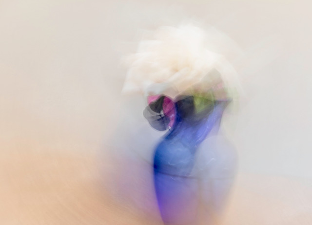
There are many positive elements in this image. I like the way that the woman's body is posed angled to the left while the upper hand is vertical above her head and the other hand at an angle to the corner. The red cloth that is draped around her upper hand and lower hand, then drops at an angles to the lower corner of the image, creates a nice balance in the image. The background looks like it would be difficult to remove but maybe you could lighten the girl against the darker background to make her stand out more. Nice capture, Sophie. |
Aug 7th |
| 76 |
Aug 21 |
Comment |
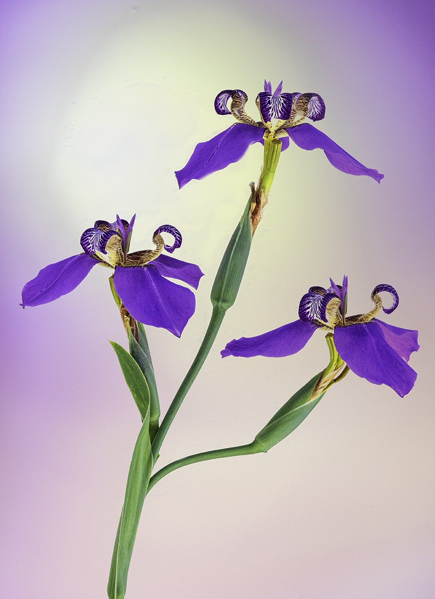
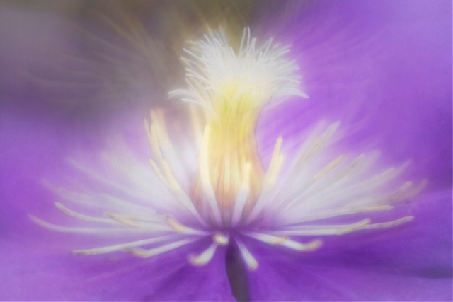
I like the element of three flower petals. The flower converted nicely to b/w most likely because the flower itself had nice bright colors. The contrast is really nice in the bw image. I like the fact that the out of focus area is dark because than the eye is not distracted and then concentrates solely on the flower itself. Well done Heidi. |
Aug 7th |
| 76 |
Aug 21 |
Comment |
I agree with Ian that the image looks much better removing distract details so now the eye goes directly to the two boats and continues down the river to the interstate bridge and two draw bridges. Just a suggestion, I think if you crop in from the bottom to the bottom of the white stand that would bring the viewer into the image first then to the boat beyond. This looks like an interesting place to photograph and you probably have many photographic opportunities to capture scenes in this area. Nice captured image, Jay. |
Aug 7th |
| 76 |
Aug 21 |
Comment |
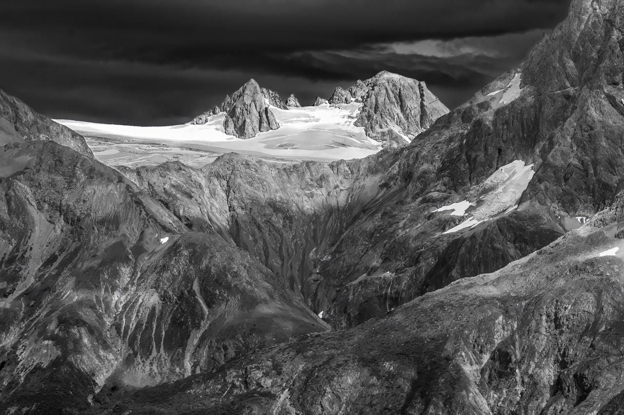
Looks like you had nice even lighting on the water, clouds and terrain. There are so many options in post processing like do you crop or not, how much to enhance color, etc. but the good thing is you can always go back to the original image and interpret the image anyway you like. You captured this scene very well. The lighter area in the water on the left side of the image leads your eye into the image, past the glacier and back to the far mountain and around the image which leads me to explore the image in detail. Nice capture. |
Aug 7th |
| 76 |
Aug 21 |
Comment |
This picture is all about texture, lines and shapes. The detail you brought out of the car's texture is really nice as well as bringing down the bright areas on the chrome rim around the main headlight. I like the way you toned down the the car's body to a nice golden brown as this really emphasizes the texture. The repetition of lines in the image really catches the eye and is an important element in the image....well done. |
Aug 7th |
| 76 |
Aug 21 |
Comment |
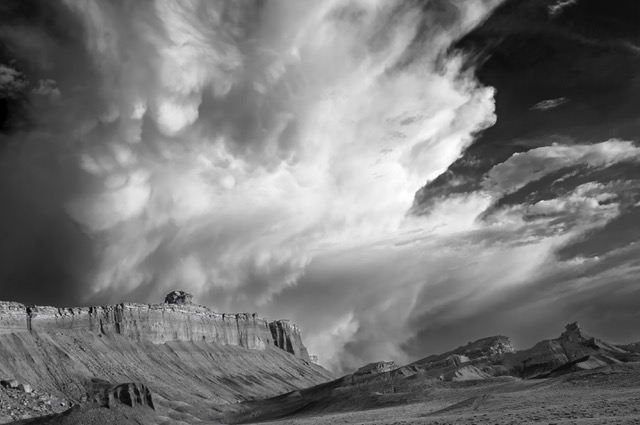
The contrast is much better in the final image...subtle but just right in the mountains. I like the visual line of the mountains on the left and how it creates a diagonal going to the right side and then my eye continues down the mountains in the background. The direction of the foreground clouds going from the right-hand corner flowing at an angle to the mountains on the left side creates a nice balance as your eye is drawn into the image and then continues down the mountain range and then into the background of clouds. |
Aug 7th |
6 comments - 1 reply for Group 76
|
6 comments - 1 reply Total
|