|
| Group |
Round |
C/R |
Comment |
Date |
Image |
| 76 |
Jul 21 |
Reply |
Hi Sophie, It really feels good to hear comments like yours on my image. I am definitely left-brained and becoming more creative has been a challenge for me. I really appreciate your positive comments. |
Jul 19th |
| 76 |
Jul 21 |
Reply |
Hi Sophie, It really feels good to hear comments like yours on my image. I am definitely left-brained and becoming more creative has been a challenge for me. I really appreciate your positive comments. |
Jul 19th |
| 76 |
Jul 21 |
Reply |
Thank you Jay. I have been working hard on becoming more creative in my images these past few years....getting better... it has been a struggle as I am so left-brained. Your comments are very encouraging. |
Jul 19th |
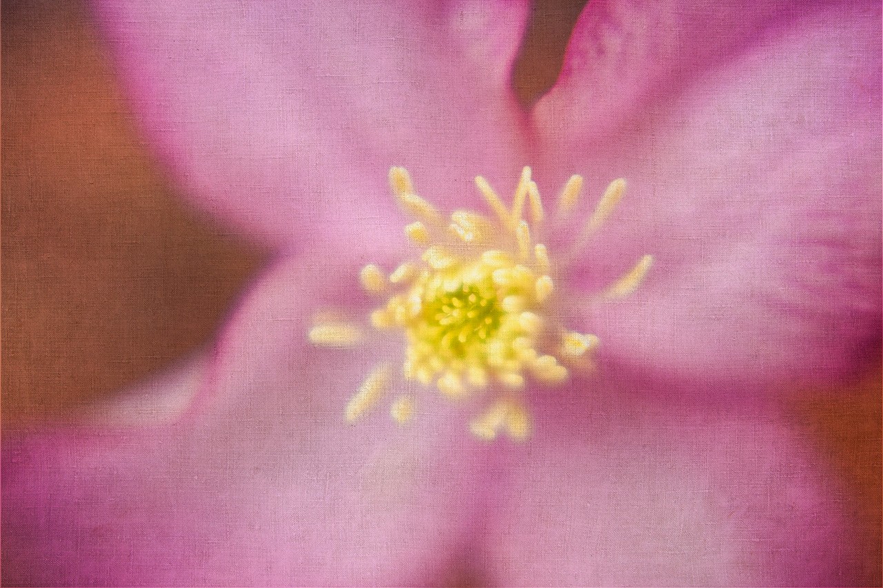
| 76 |
Jul 21 |
Reply |
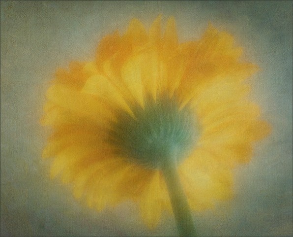
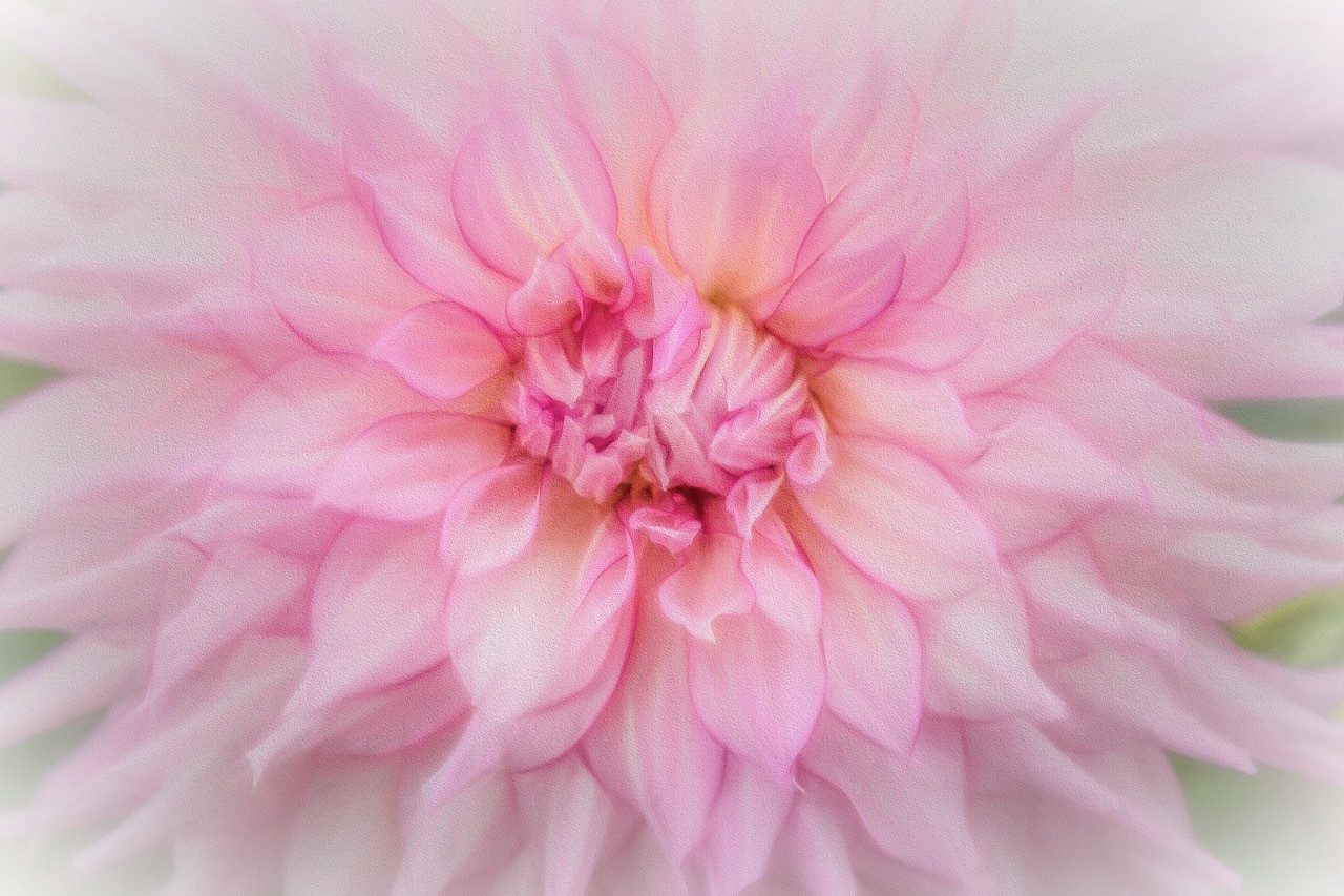
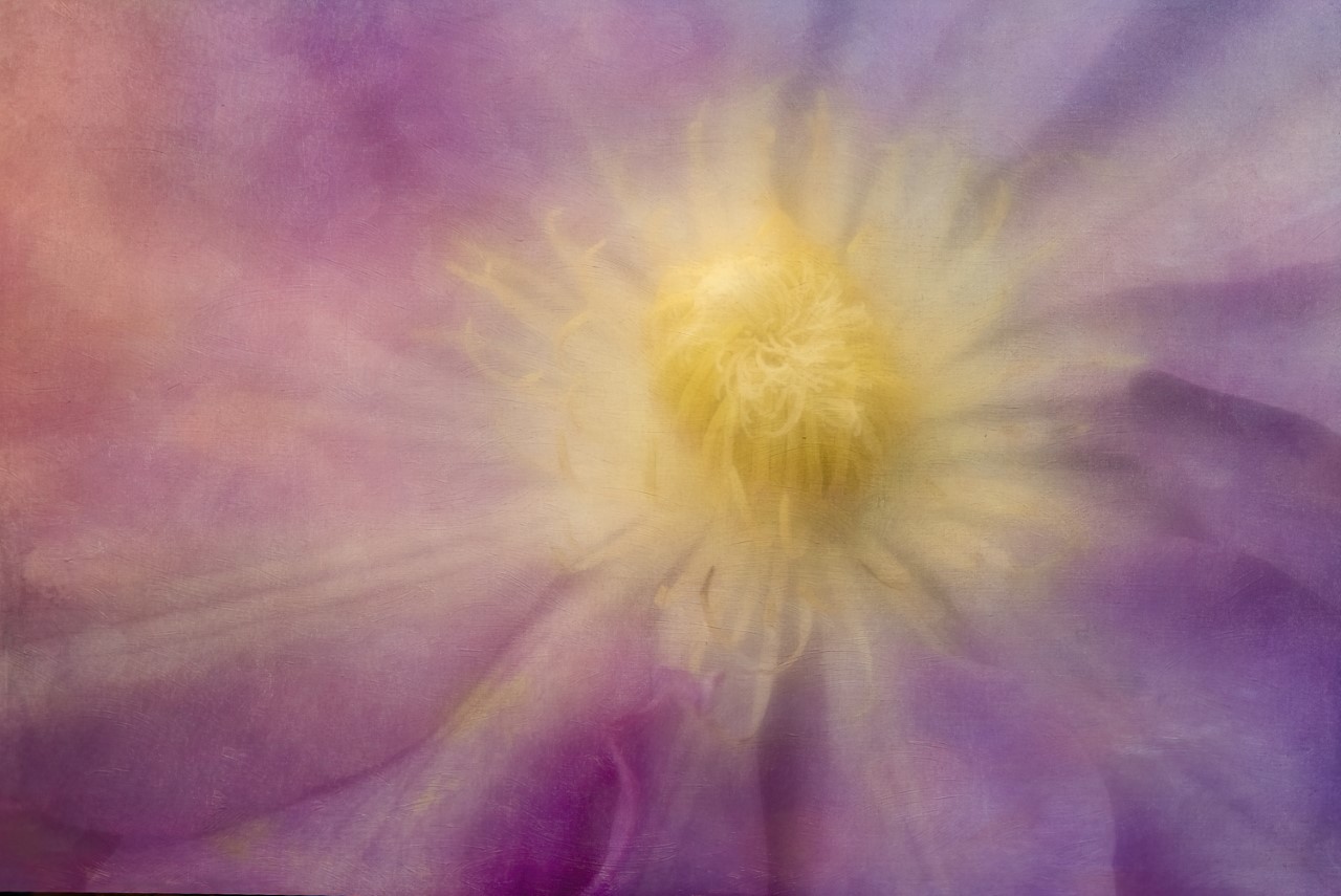
The Lensbaby 56 lens that I used for this image at low apertures makes the image look soft even though the focus was on the yellow detail in the middle. I shall go back to the image in photoshop, go to the mask on the textured layer with a brush and paint out some of the texture at a low opacity on just that one area to see what happens. Thank you for you nice comments. I like getting feedback on different viewpoints as it is very helpful. |
Jul 19th |
| 76 |
Jul 21 |
Reply |
Thanks Trey for your positive comments. The feed back is ever so helpful and much appreciated. |
Jul 19th |
| 76 |
Jul 21 |
Comment |
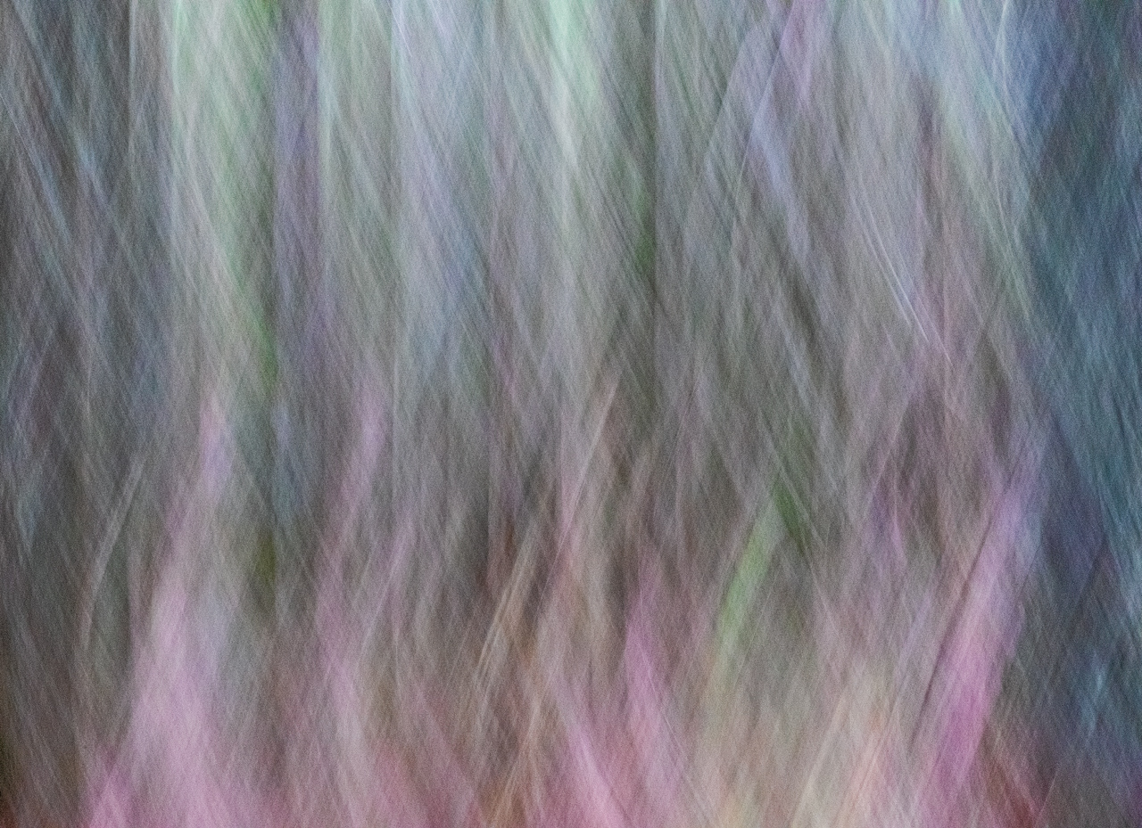
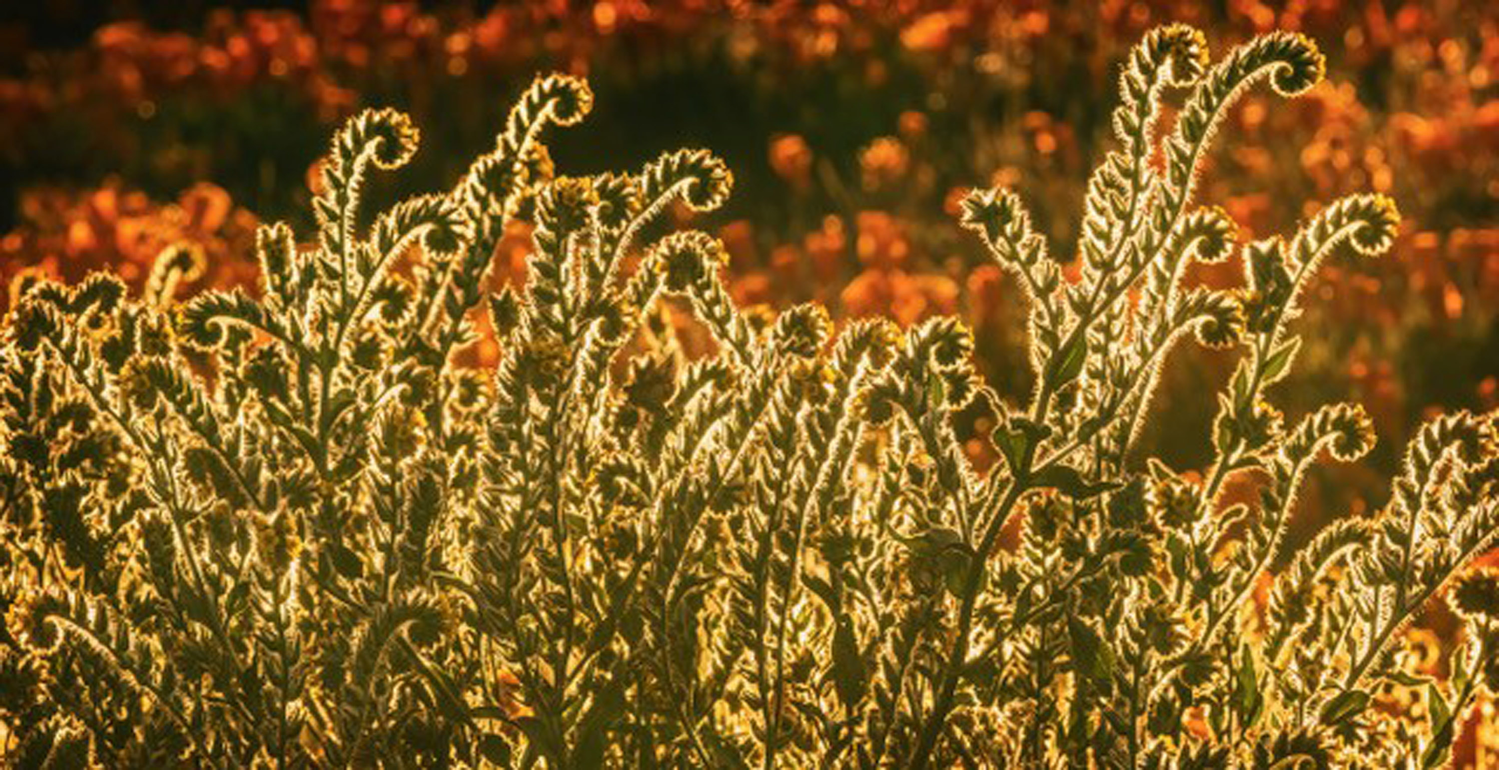
I like the movement in the image as they replicate the movement of the dancers. The addition of bokeh adds to the flow of the image. If you don't want the bokeh in the image to be so strong, you can always reduce the opacity on that layer or you can paint out the bokeh texture on a mask on the textured layer from areas that you don't want it on. The hues and tones in the image blend very nicely with the blue dresses of the dancers. The image now has a certain quality of of softness that adds to the appeal of the image. And, since you have a feeling and impression that this image is not quite finished, try different things...maybe you want to add extra canvas to the right, add a darker vignette to the image...nice image as is, though. |
Jul 6th |
| 76 |
Jul 21 |
Comment |
Wow...to go from flat to dramatic ... from original image to finished image..your processing skills in making this an outstanding image really stand out. The way you molded the light and shadows are to be admired as my eyes stay in the image. In addition I like the design elements of the cabbage itself so my eyes, while kept in the image, wander around the beautiful design elements of the leaves. Beautiful image and well composed. |
Jul 6th |
| 76 |
Jul 21 |
Comment |
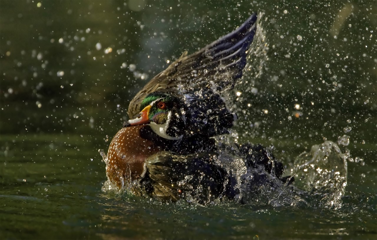
I wonder if you took this image with a very wide aperture (ex: 2.8, 3.5) and focused directly on the dragon fly, if the background could have even been more out of focus because of its cluttered background. As to placing the dragonfly on a different background, I think the selection would have been difficult because of the lighting (shadows and bright light) but I admire you for thinking about doing so as an option. I do admire your persistence at taking so many images of the dragon fly in order to get the pose you wanted. I do this myself when taking images of flowers. A suggestion.. maybe you did but if you didn't, an addition of a teleconverter with the 100 macro lens might bring the dragonfly closer in the image and then you wouldn't have to cut into the image so much... taking the image in softer light and if you want to spend $$$, a longer macro lens might be helpful to have the dragonfly closer. Hope these suggestions are helpful...really like being able to see this dragonfly and all its colors and design elements. |
Jul 6th |
| 76 |
Jul 21 |
Comment |
Great capture of Asali's expression...catch light in the eyes very nice addition. The orange color on the dog matches that of the background river. The spacing on the left of the image as the dog is facing in that direction. |
Jul 6th |
| 76 |
Jul 21 |
Comment |
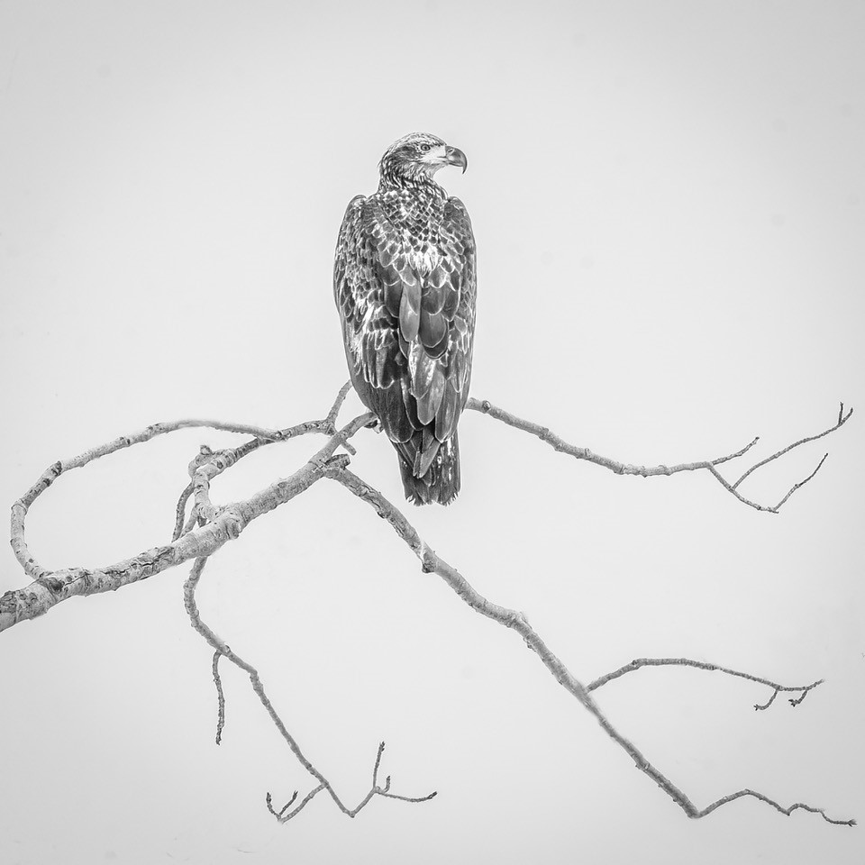
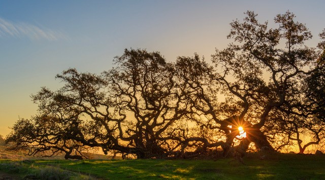
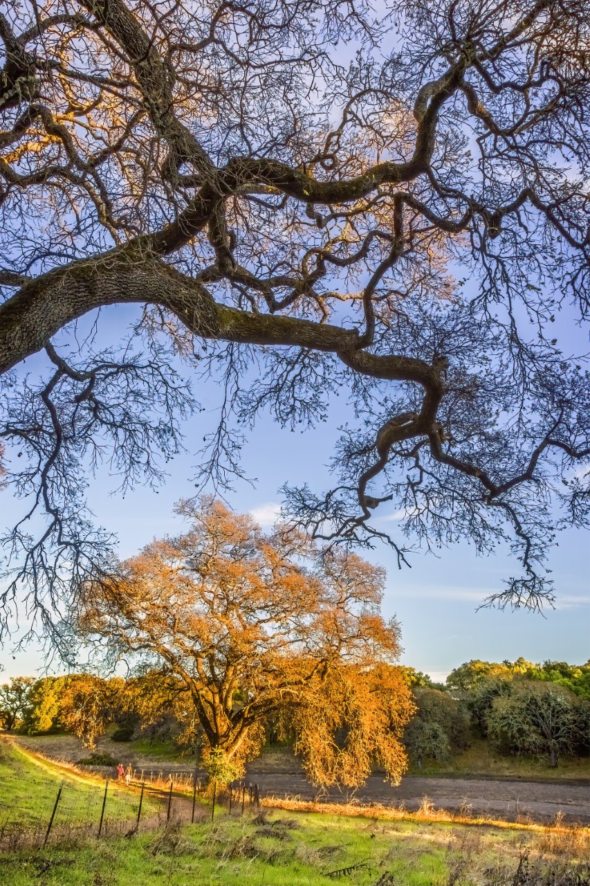
The added bit of light on the tuffs of leaves is really important to this images because of the darker background. The design elements of the tuffs and trunk outline/branches really add to the impact of this image. The darkness in the background, for me, add a bit of mystery and I like that..I want to know what's lives in the darkness (deer, rabbits, mice, etc.). I'm fond of trees with beautiful shapes. I have several types of oak trees in my backyard, and in the wintertime, I photograph the shapes of the branches without leaves. Looking at the original image, you did a great job replacing the sandy soil with grasses and I do like the darker background as it makes the large tree in the foreground stand out. Great photo.
|
Jul 6th |
| 76 |
Jul 21 |
Comment |
I appreciate the explanation of how you achieved the intricate details of the flames. The isolation of colors, red against black, really shows the "dancing flames" and the diagonal of the flames makes for a strong image...guess the flames were a bit much to stick some hot dogs in? I could look at this image for a long time...maybe it's the
symmetry of the flames. |
Jul 6th |
7 comments - 5 replies for Group 76
|
7 comments - 5 replies Total
|