|
| Group |
Round |
C/R |
Comment |
Date |
Image |
| 66 |
Jul 23 |
Reply |
Thank you. I like your version. The area behind the seat doesn't contribute to the image.
|
Jul 10th |
| 66 |
Jul 23 |
Reply |
Thank you.
|
Jul 5th |
| 66 |
Jul 23 |
Reply |
Thank you. |
Jul 5th |
| 66 |
Jul 23 |
Reply |
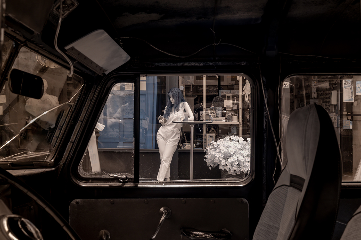
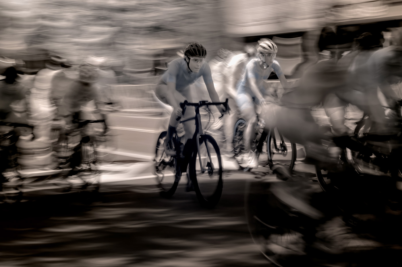
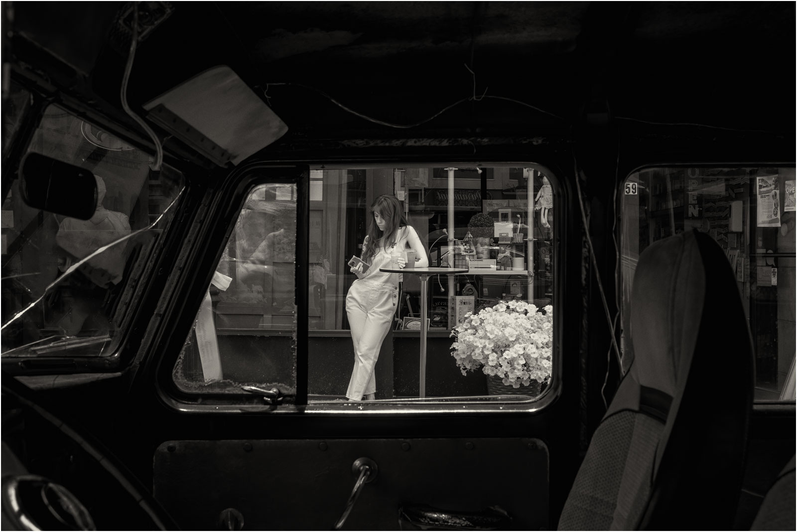
Thank you. I took another shot that is much tighter, but I like the old car. It's a candid shot, not staged, so that's what people do on their breaks. I don't see any attachment with your version. |
Jul 5th |
| 66 |
Jul 23 |
Reply |
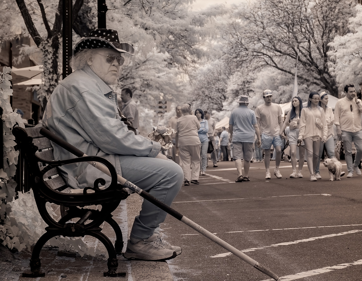
Thank you. This is a candid street shot. People look at their phones on breaks. |
Jul 5th |
| 66 |
Jul 23 |
Comment |
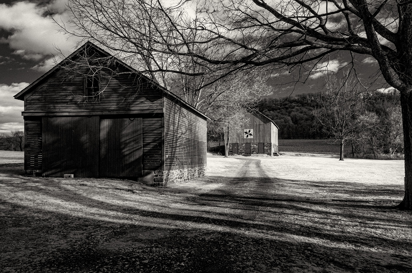
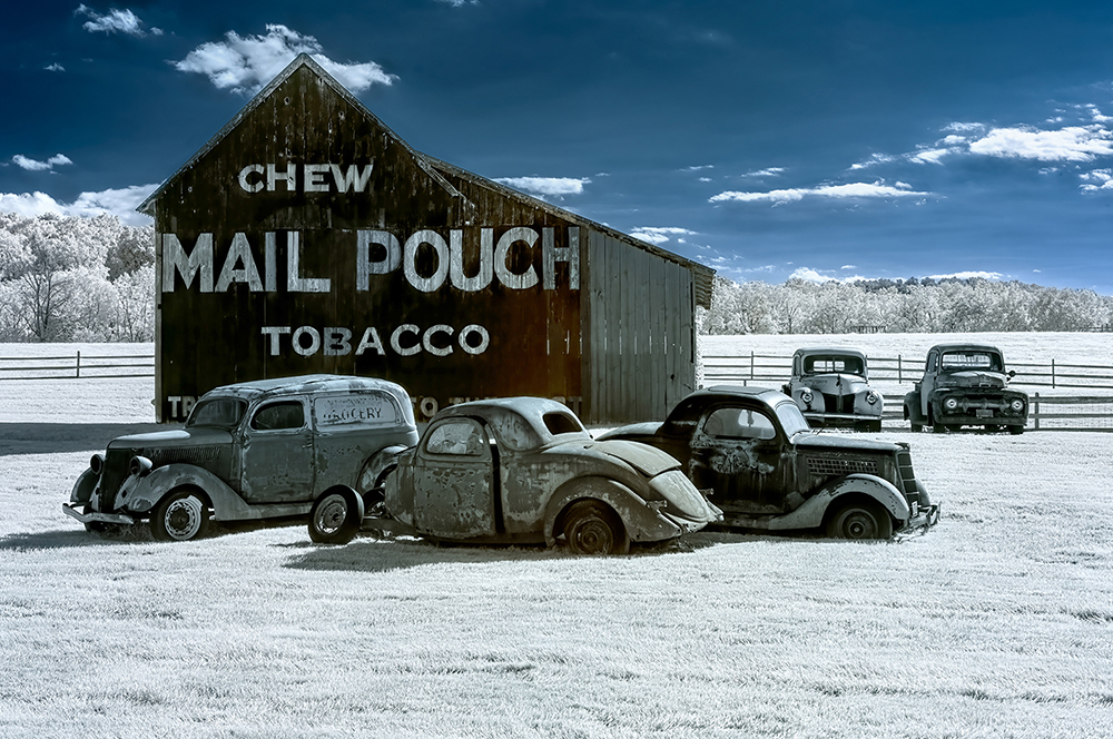
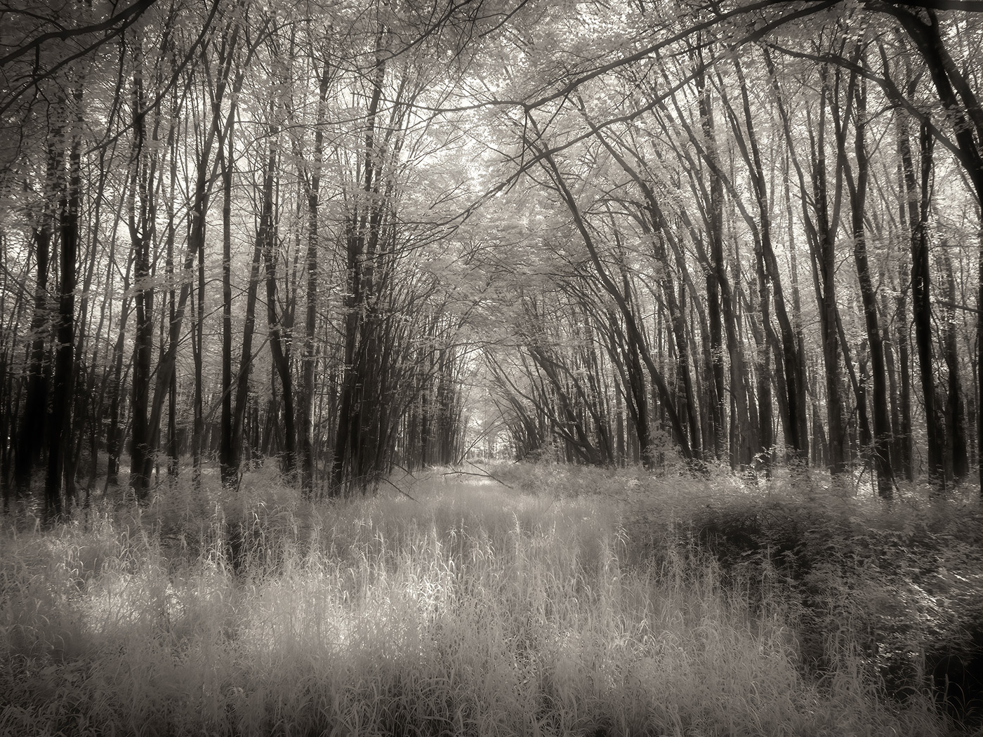
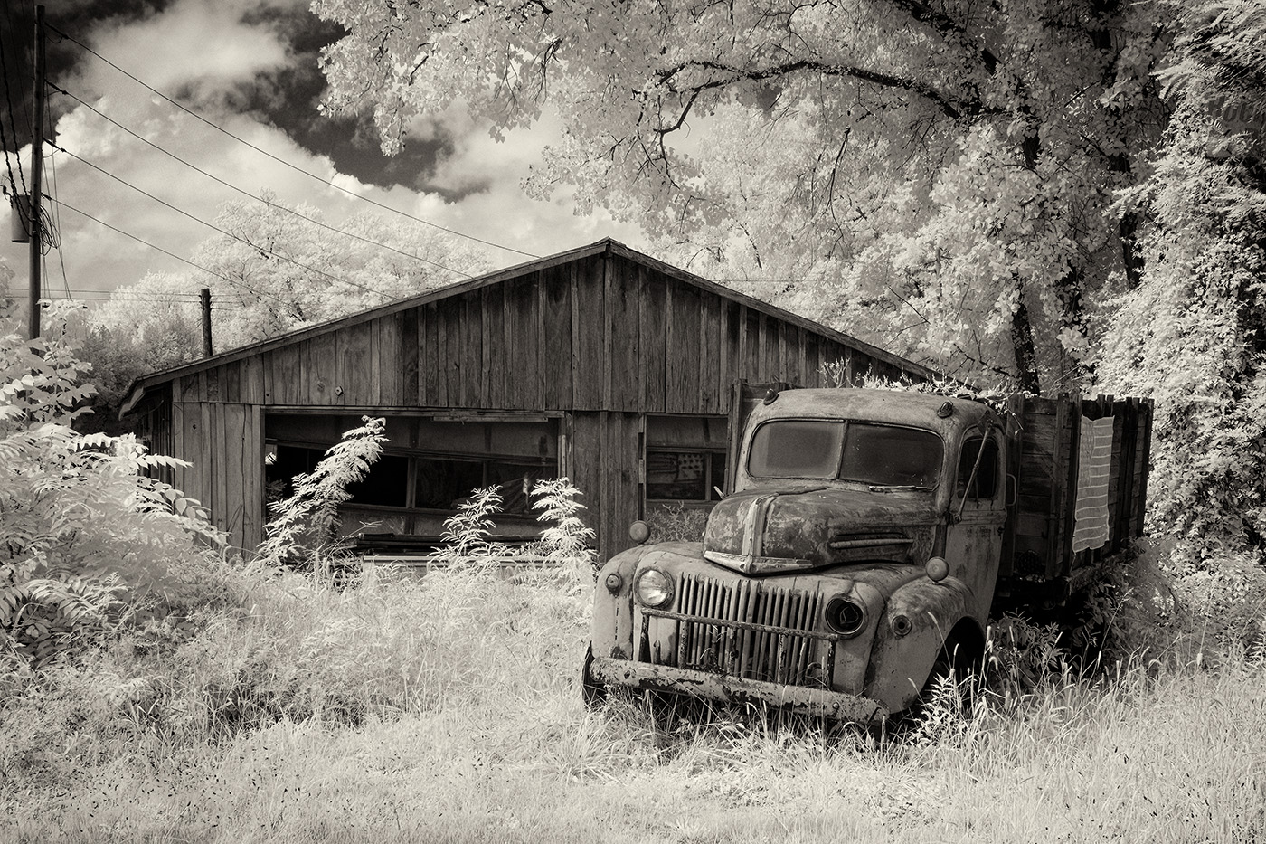
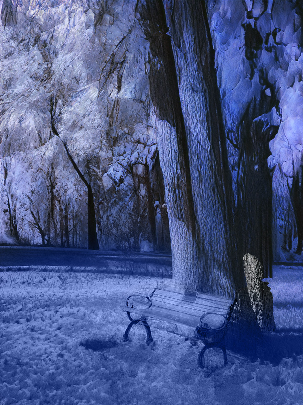
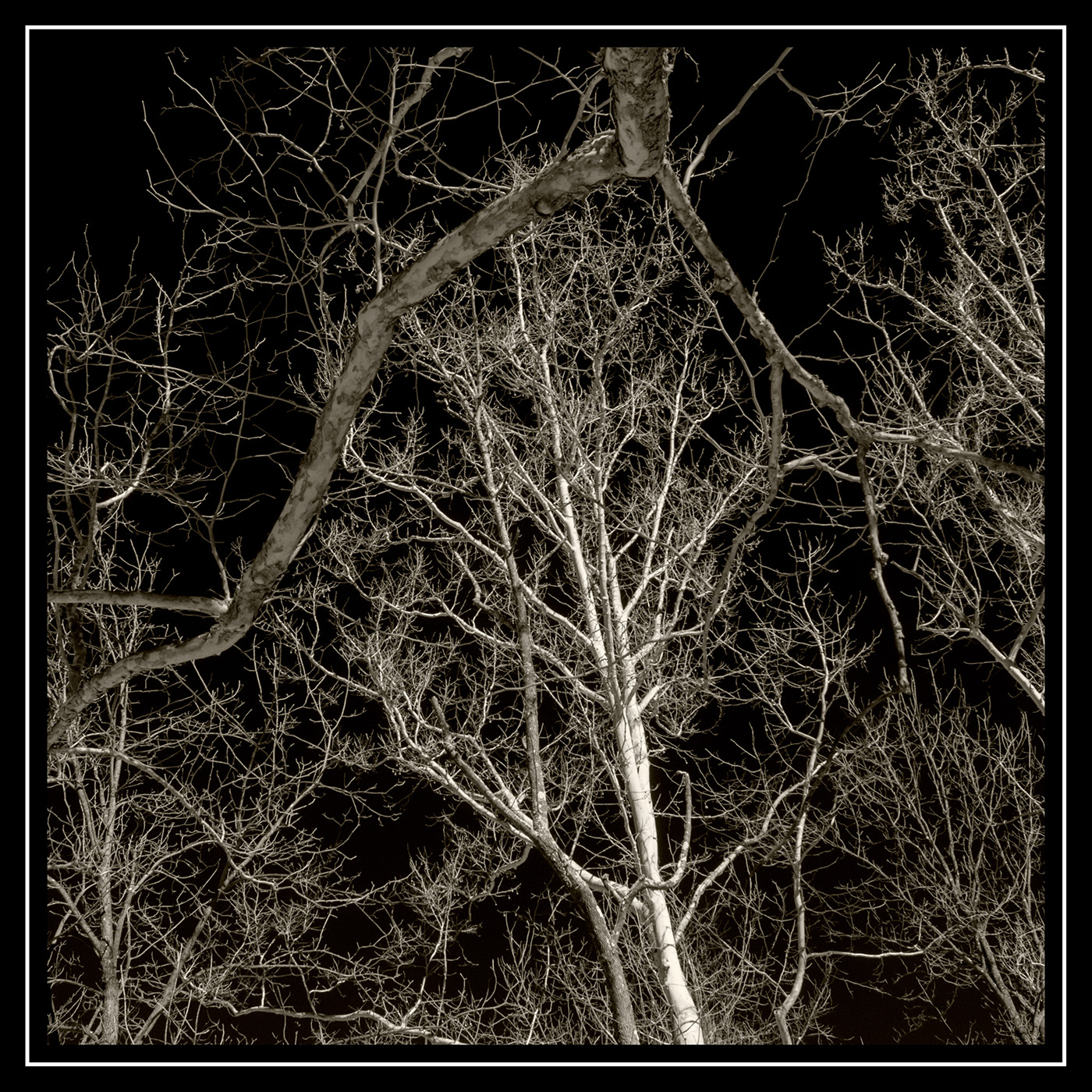
Wow. What a great find and an interesting well composed and handled picture. Yes, there's something about these old trucks that engages the viewer. The IR processing works nicely for this scene.
|
Jul 3rd |
| 66 |
Jul 23 |
Comment |
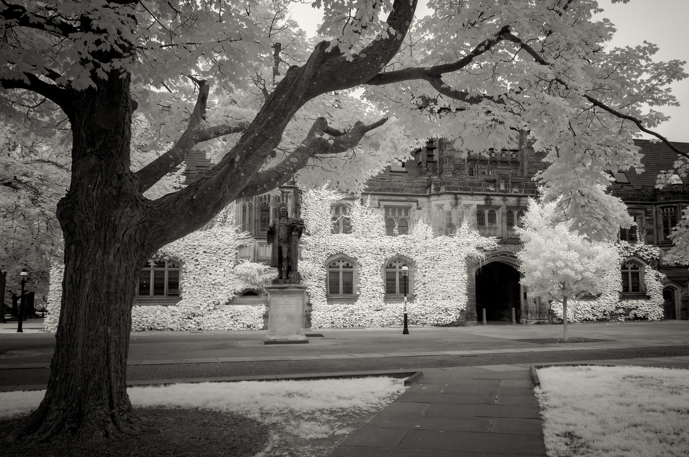
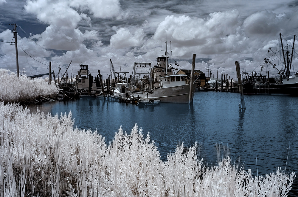
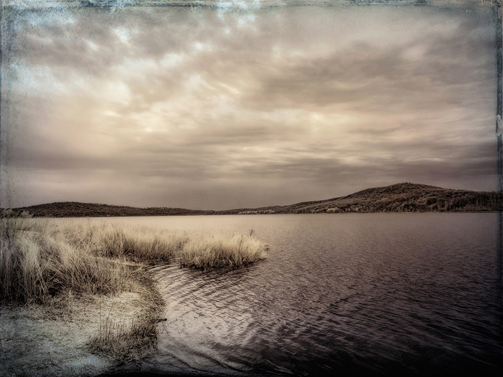
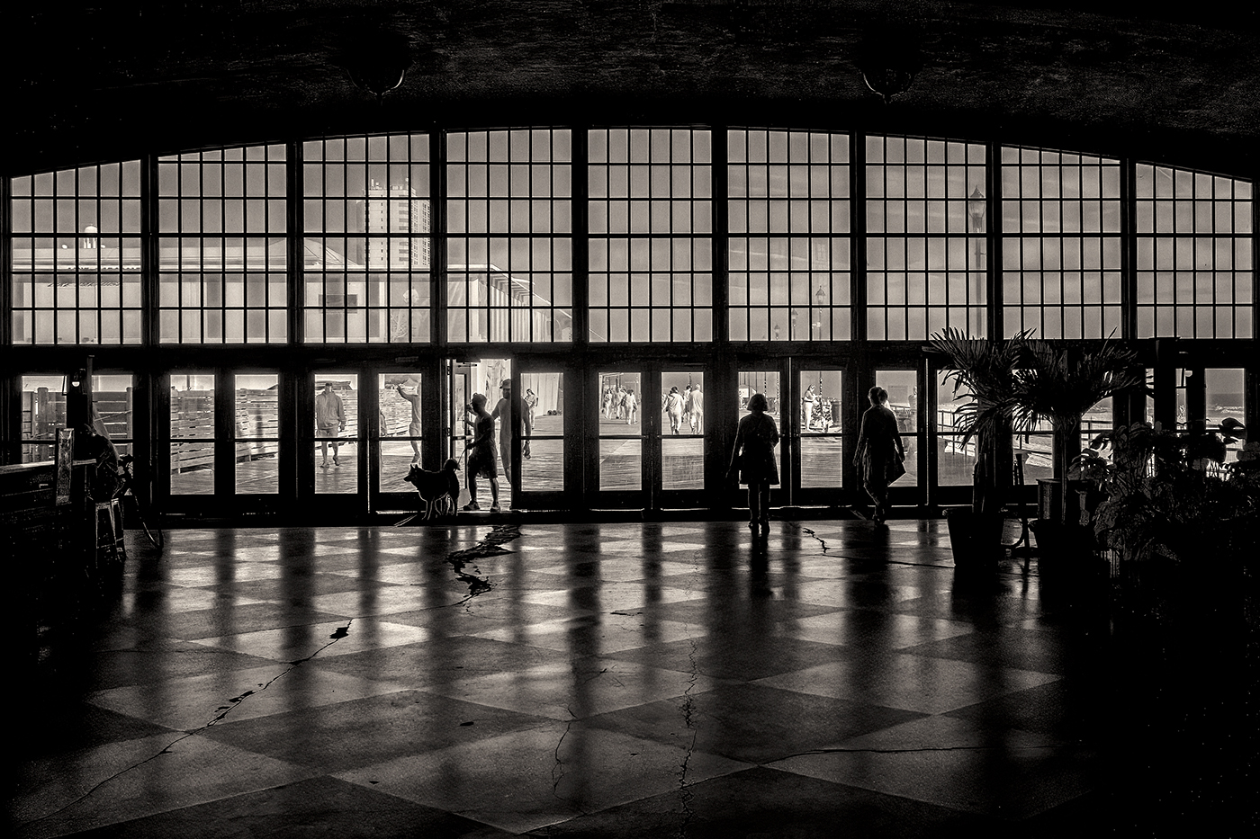
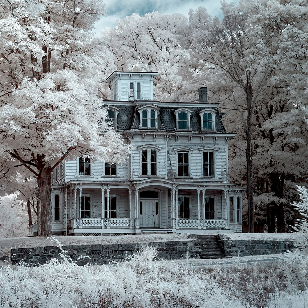
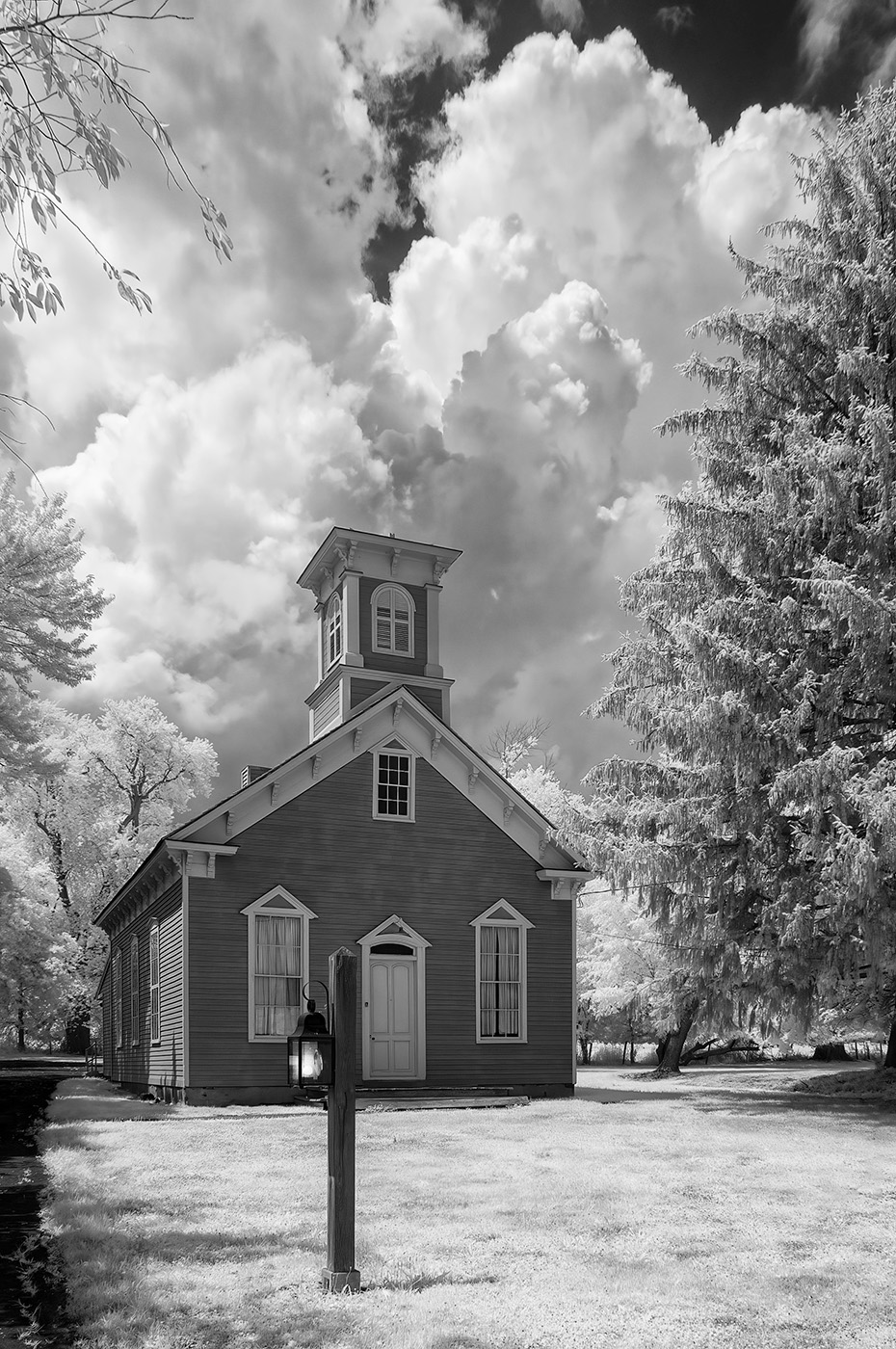
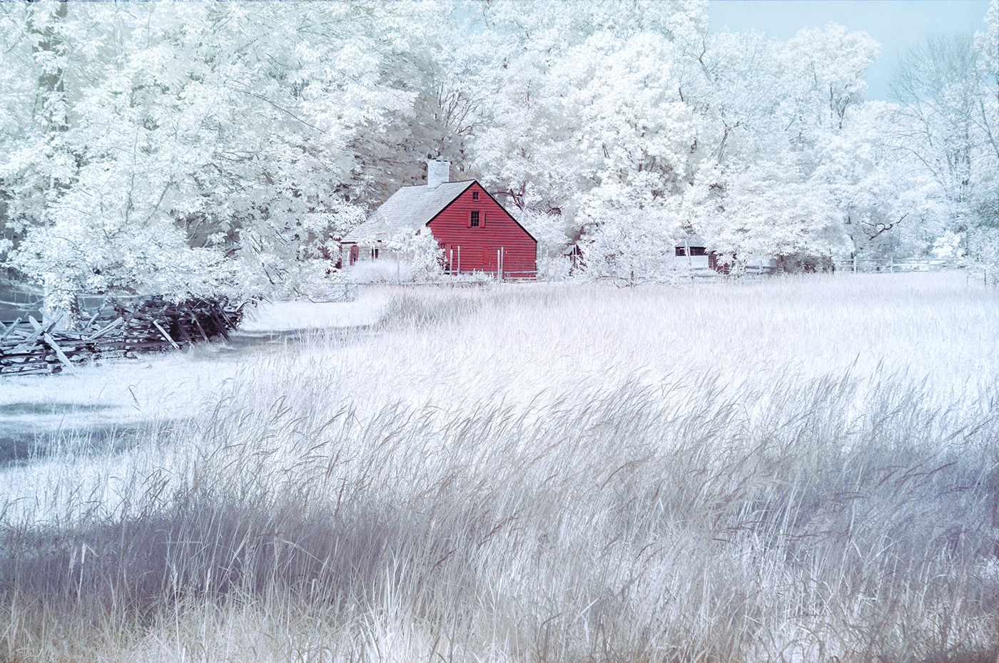
Beautiful scene that works well for IR. The centered composition fits the images. I also included fences in some images. I considered removing them, but then decided to leave the scene as is. I find the sky to be a bit over processed. I like the clouds to be softer with no hard edges. |
Jul 3rd |
| 66 |
Jul 23 |
Comment |
Your final IR image is beautiful and nicely handled. I sometimes use the same border. This is a subjective creative touch that I'm fine with. The textures are great, and the brown tones work well for this picture. |
Jul 3rd |
| 66 |
Jul 23 |
Comment |
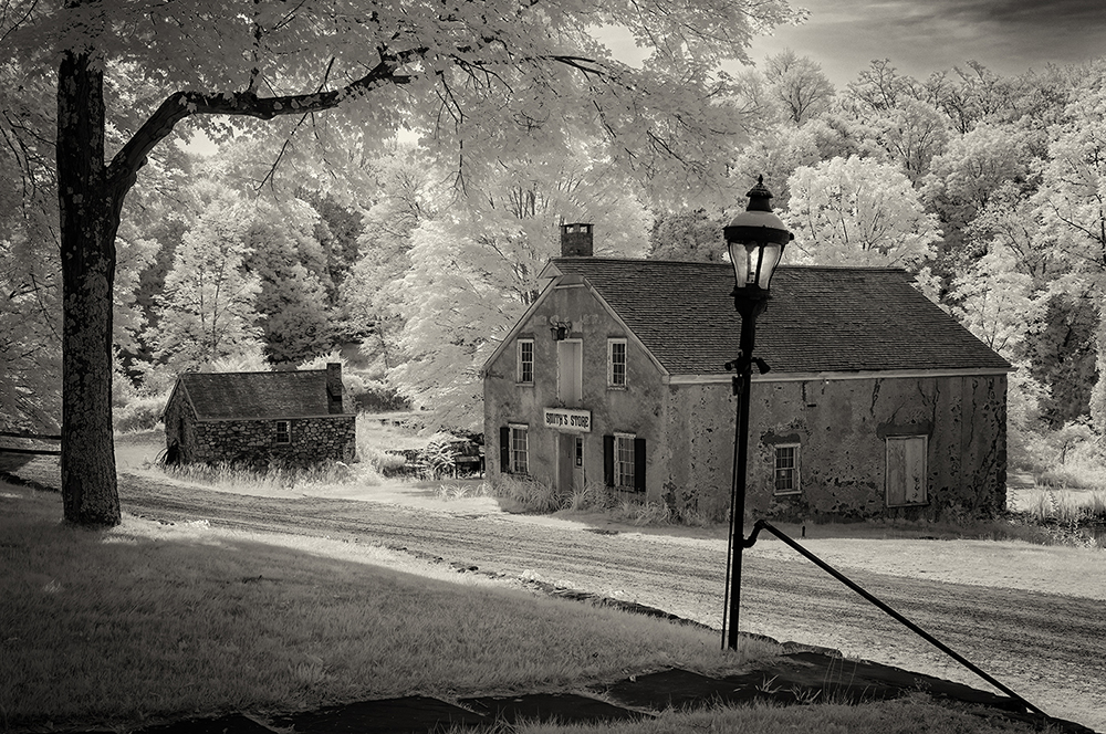
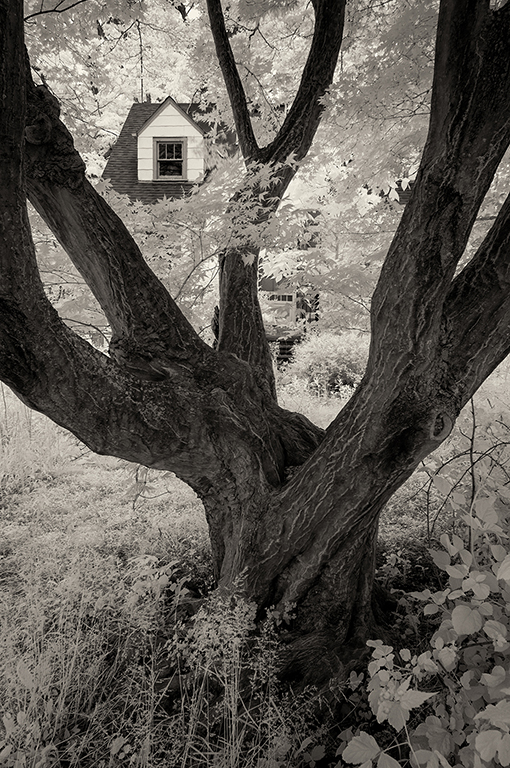
Nicely reworked image. My D300 has the same guts as the D90. I don't see an issue with that. I also like to reprocess old images using newer tools, techniques, and skills. I like the way you composed the image and created an interesting foreground that lets us explore the details all the way to the lighthouse. The only spot that lost some details, due to the darker blacks, is the top of the lighthouse.
|
Jul 3rd |
| 66 |
Jul 23 |
Comment |
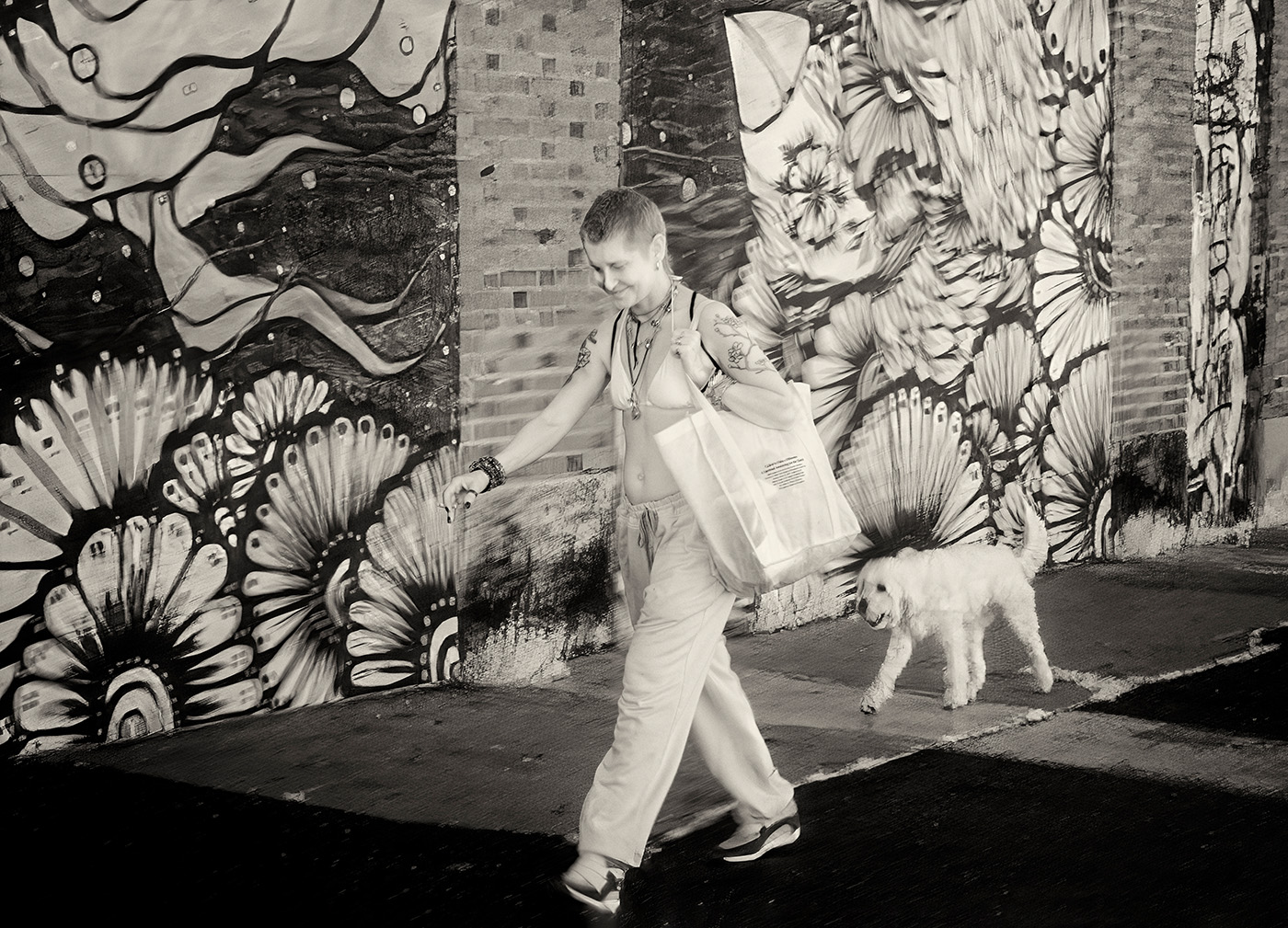
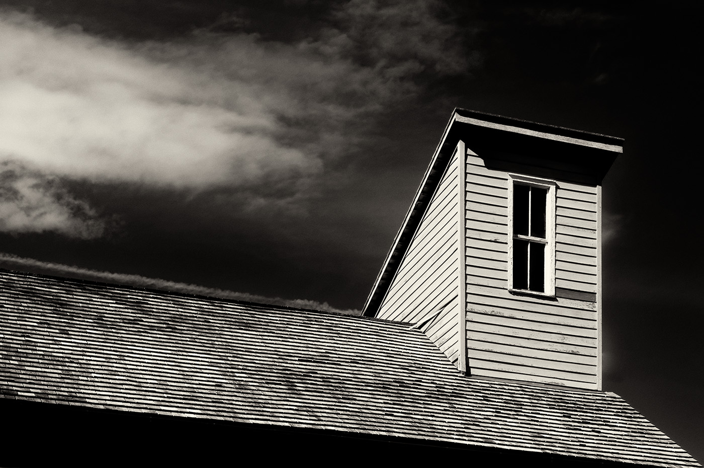
Nicely done. I agree with Palli and Gary. The color works well for this image. It looks like a drawing. The contrast is good on the screen, but you may need to adjust the black point to get enough contrast in a printed version. |
Jul 3rd |
| 66 |
Jul 23 |
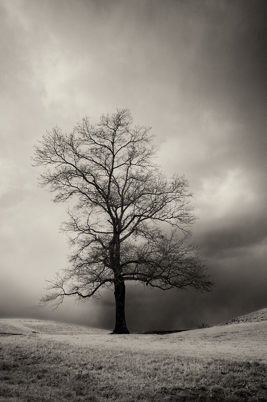
Comment |
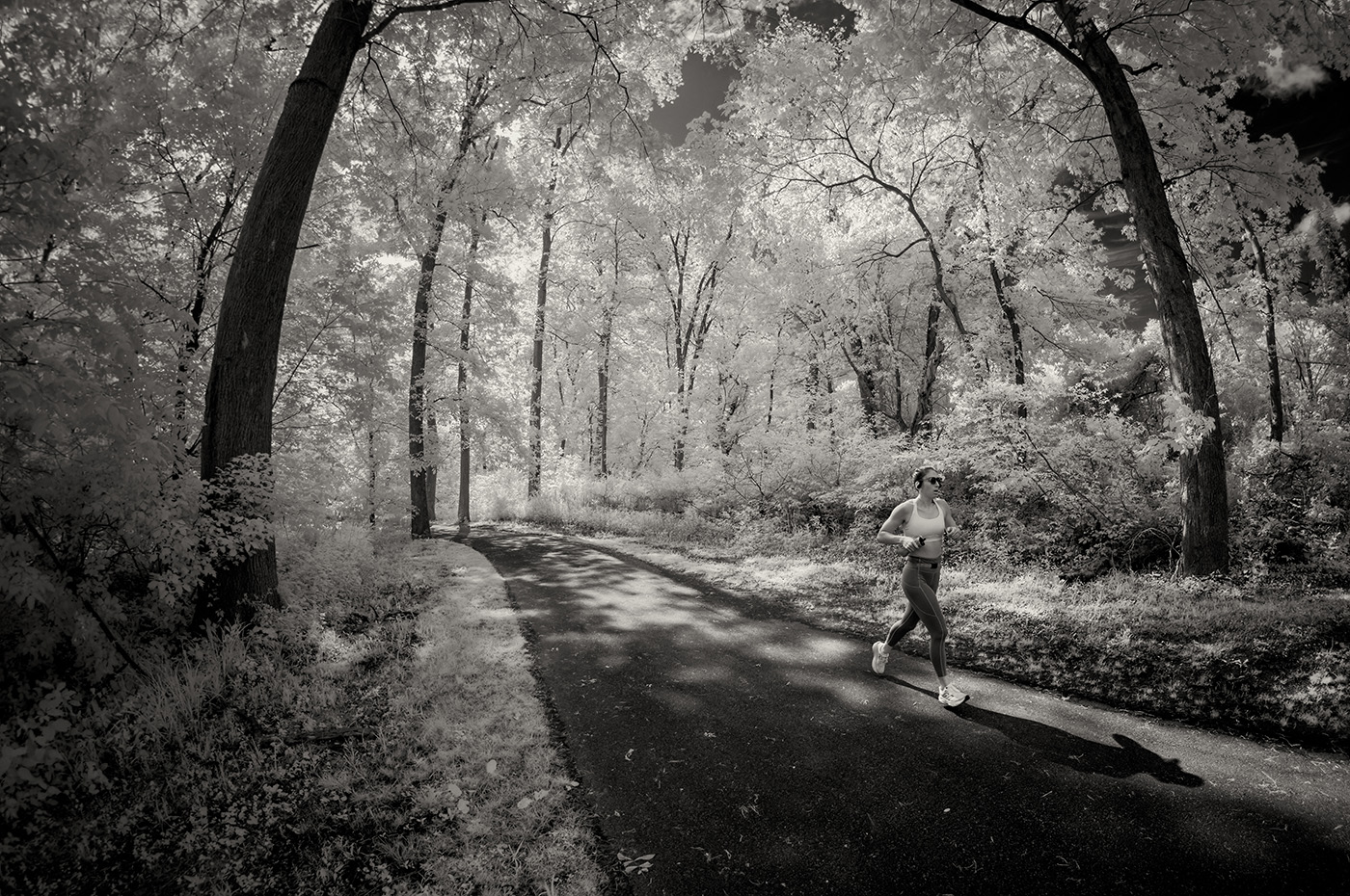
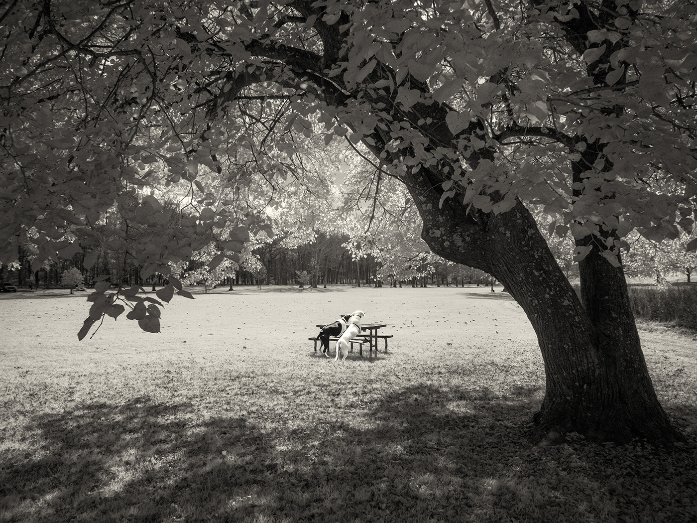
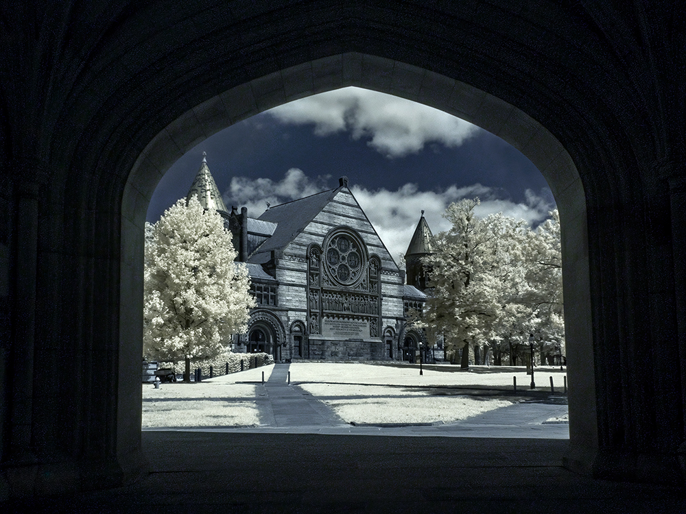
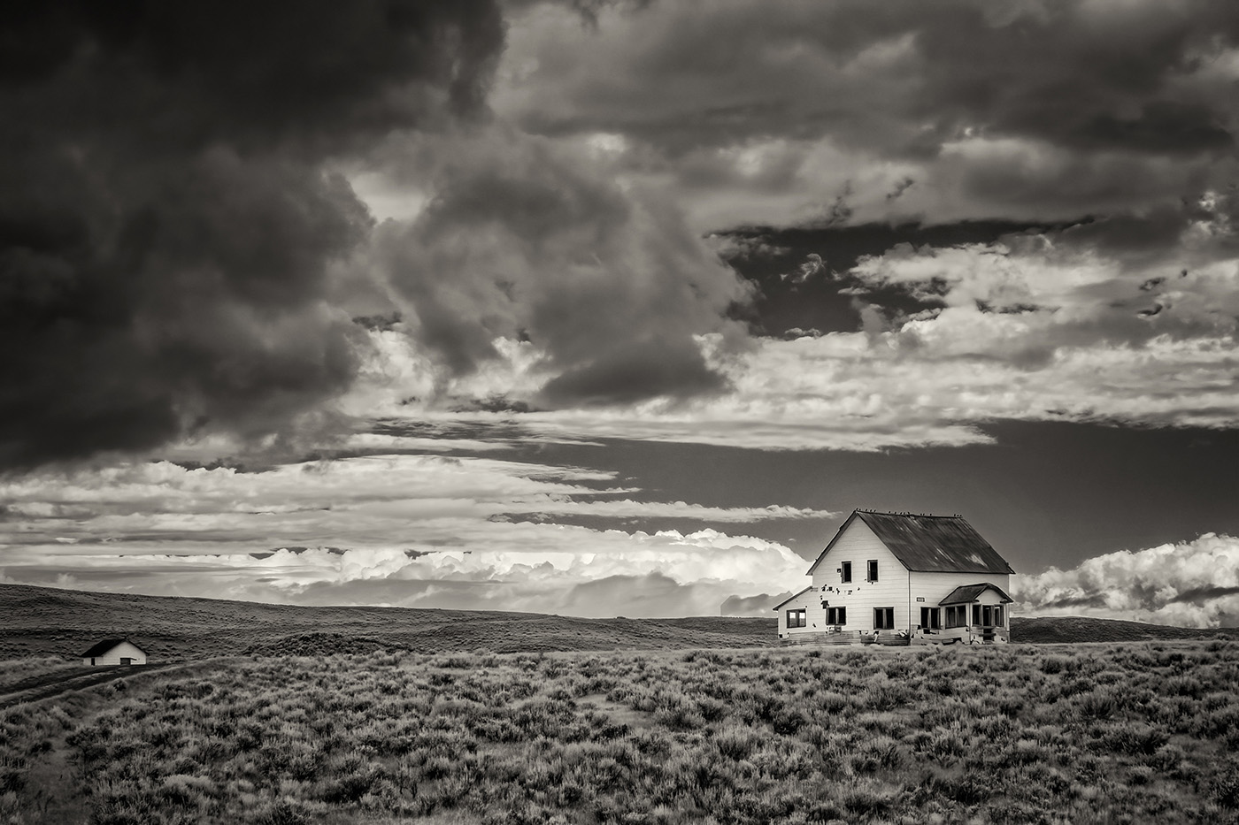
The scene works well for a monochrome IR picture. The contrast is fine. I do find the bright grass in the foreground to stand out too much. You could either go with Palli's version or crop some of it. |
Jul 3rd |
| 66 |
Jul 23 |
Comment |
I like the way the white foliage frames and creates a vignette around the falls. Nicely handled scene and a beautiful picture. I would remove the few leaves in the top left corner. |
Jul 3rd |
| 66 |
Jul 23 |
Reply |
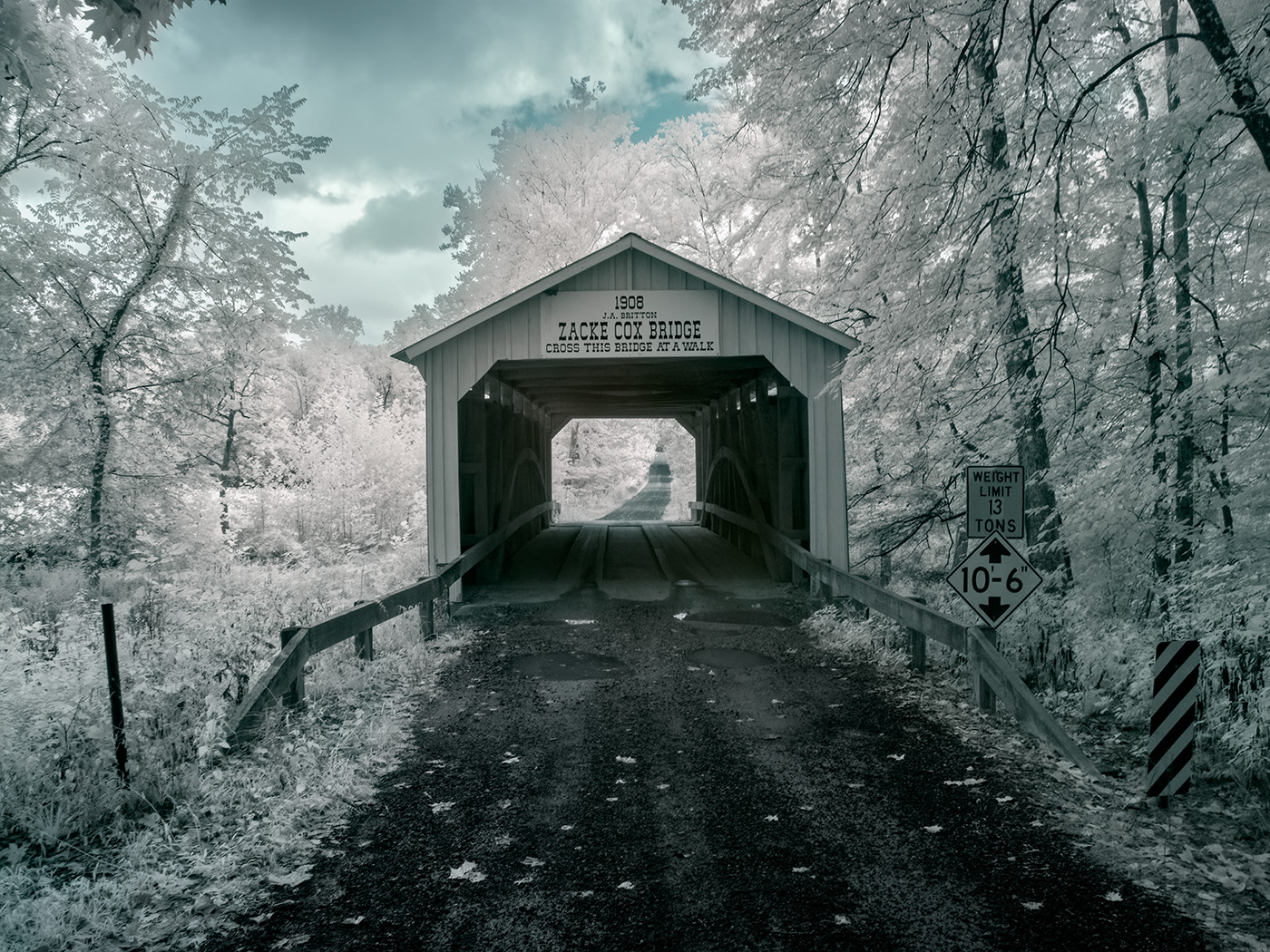
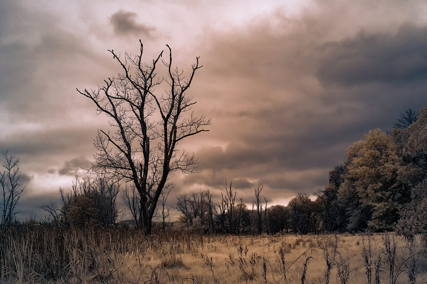
Thank you. The blue and brown colors are created by the camera with the custom WB that LifePixel set in my cameras. I didn't apply any technique, besides Dehazing and increasing the contrast. I also have a B&W version of this picture, but I like the additional colors. |
Jul 3rd |
 |
| 66 |
Jul 23 |
Reply |
Thank you. |
Jul 3rd |
7 comments - 7 replies for Group 66
|
7 comments - 7 replies Total
|