|
| Group |
Round |
C/R |
Comment |
Date |
Image |
| 66 |
Mar 23 |
Reply |
Thank you, Melanie. |
Mar 9th |
| 66 |
Mar 23 |
Reply |
Thanks. Henry's tighter version looks a bit cleaner. I may try to crop the foreground but leave the rest. |
Mar 8th |
| 66 |
Mar 23 |
Reply |
Thank you, Emil. |
Mar 8th |
| 66 |
Mar 23 |
Reply |
Thanks, Gary. I like it.
|
Mar 2nd |
| 66 |
Mar 23 |
Comment |
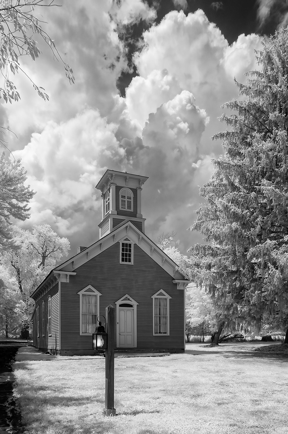
Hi. Beautiful picture. I like everything about it. Your processing, keeping the scene light and airy is excellent. Nicely done.
|
Mar 2nd |
| 66 |
Mar 23 |
Comment |
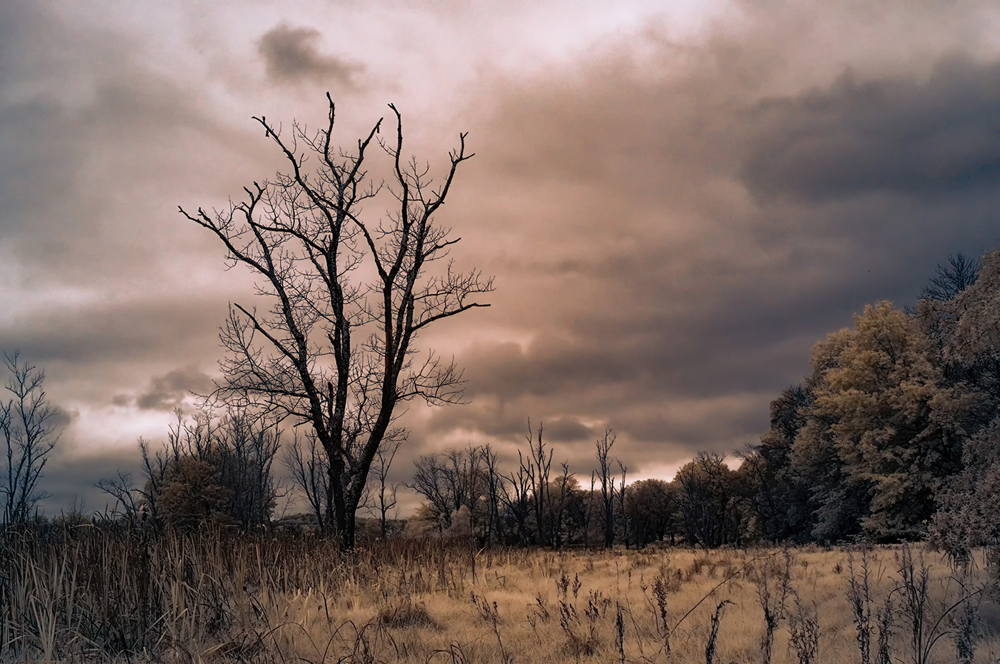
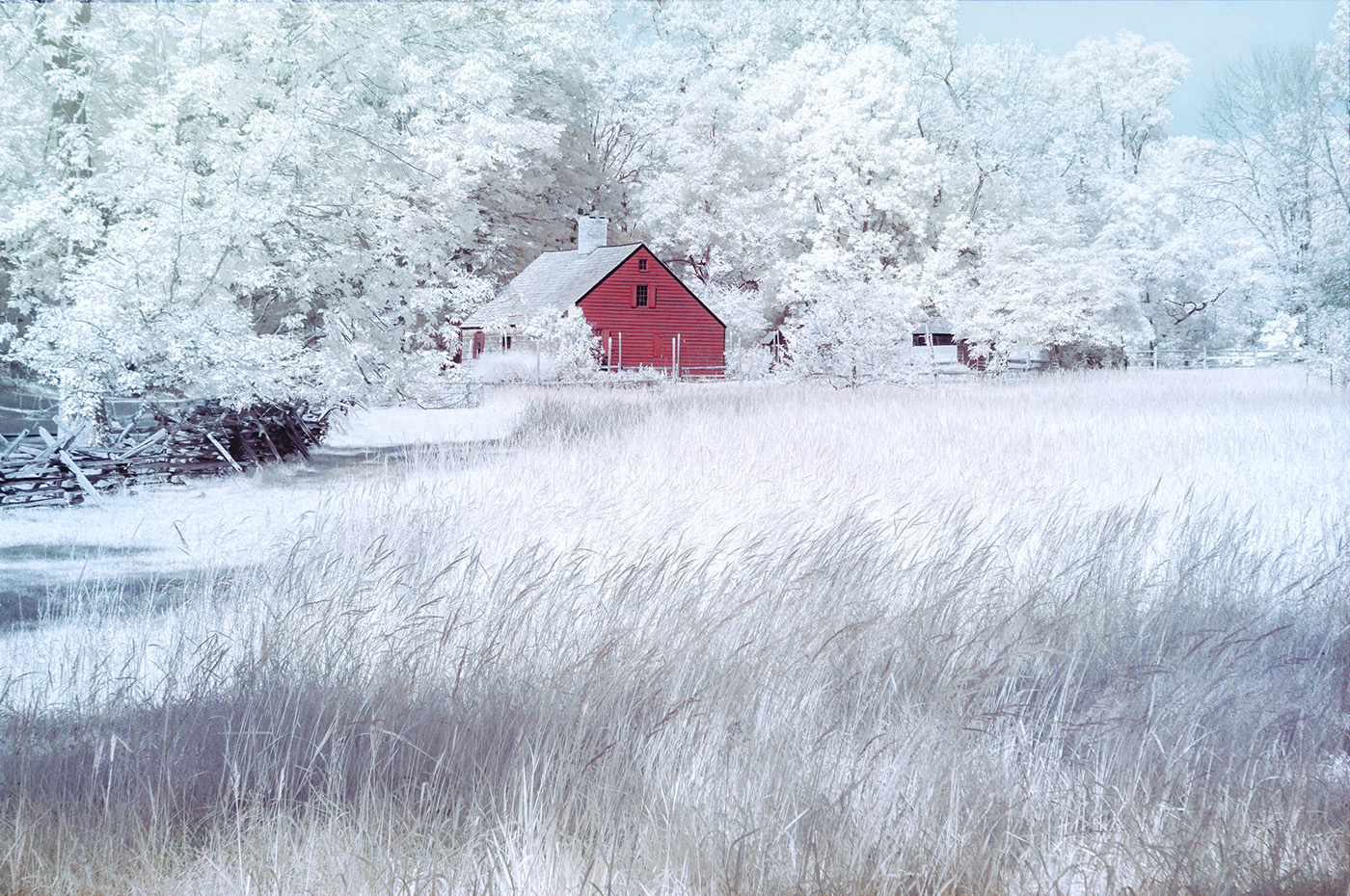
Hi. Great find and an interesting picture. I like the processing with the higher contrast. I may open up the shadows and show some details. The grasses add a lot to the scene in IR. Considering that I grew up in Israel, where things go from right to left and live in the US, I'm fine with either direction. |
Mar 2nd |
| 66 |
Mar 23 |
Comment |
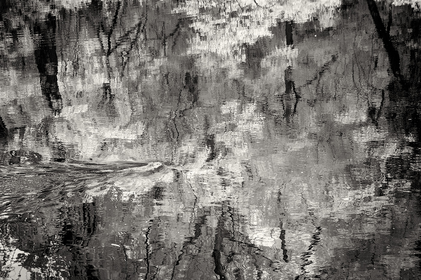
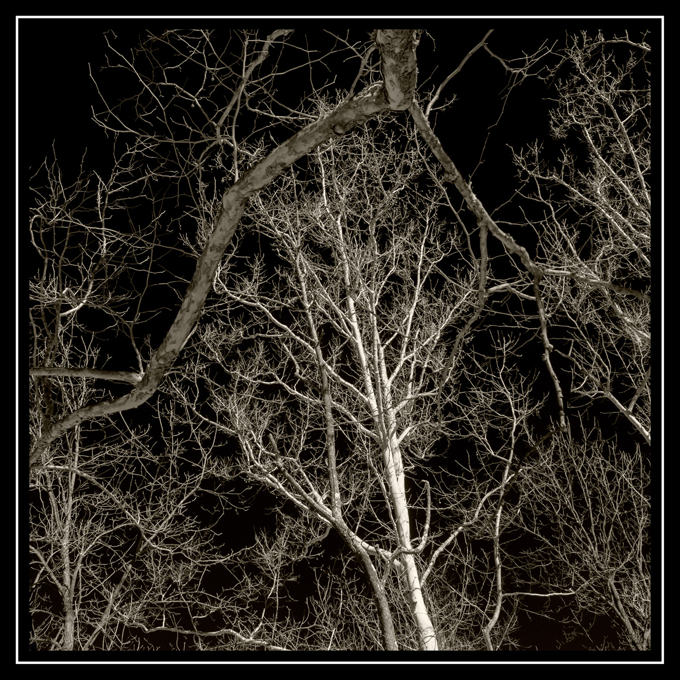
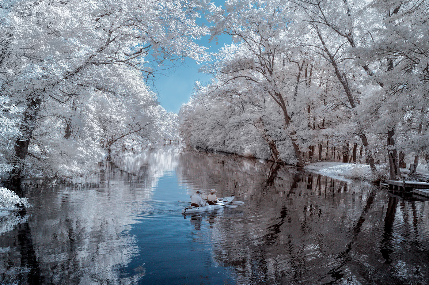
Hi. I find the lighting to be perfect here. The added contrast helped by creating depth and making a flat scene more interesting. I prefer Original 2 in B&W. The green color doesn't add to a picture of shapes and textures.
|
Mar 2nd |
| 66 |
Mar 23 |
Comment |
Hi. Artists create art out of the mundane. You've done that here. Nicely seen, captured, and processed picture. |
Mar 2nd |
| 66 |
Mar 23 |
Comment |
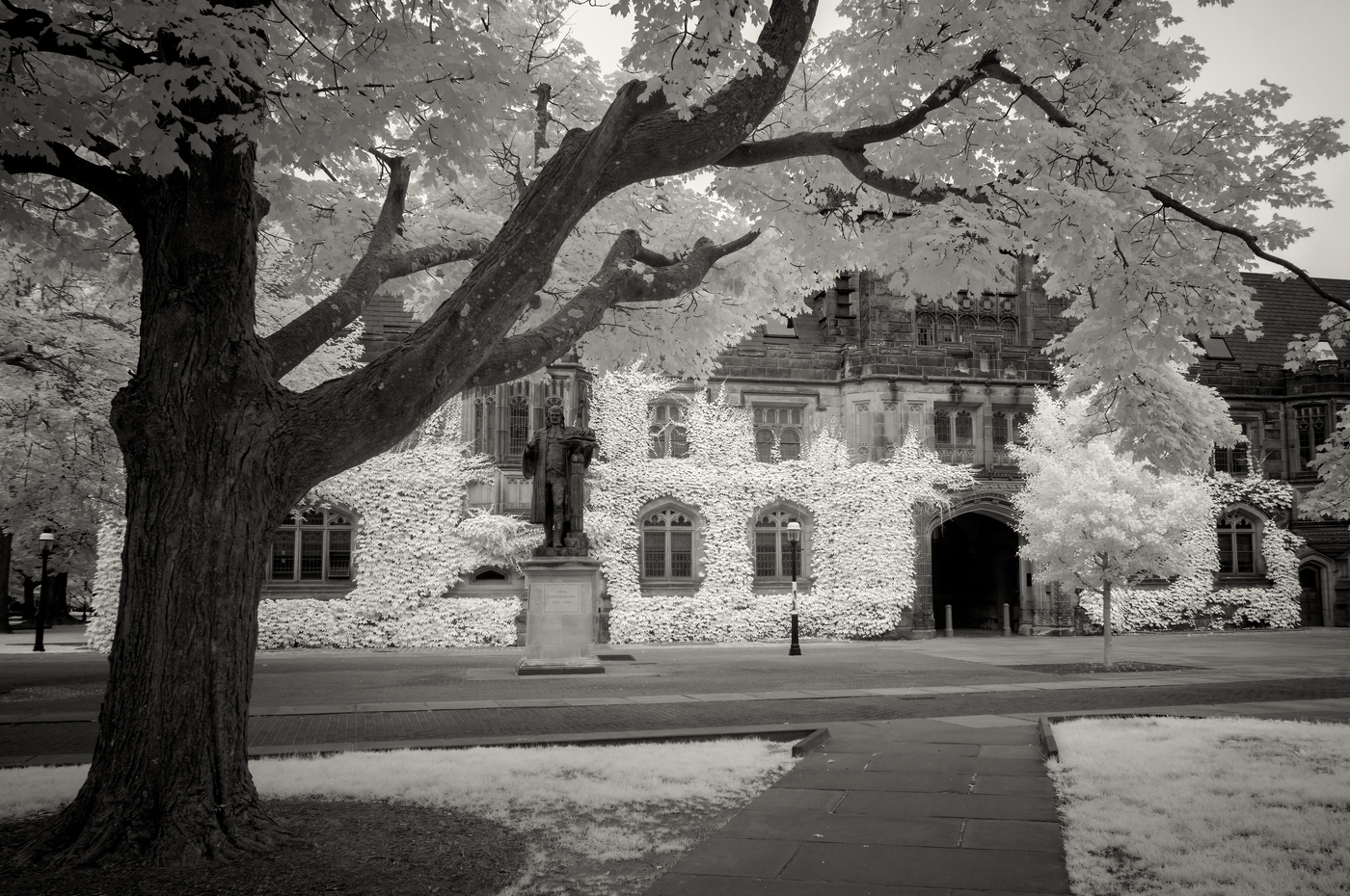
Hi. When it comes to tall buildings, I prefer the keystoning effect and even some tilting of the building. Here, I like Henry's version, but also didn't find the original to be a problem. I understand Stephen's preference and often agree with it. |
Mar 2nd |
| 66 |
Mar 23 |
Comment |
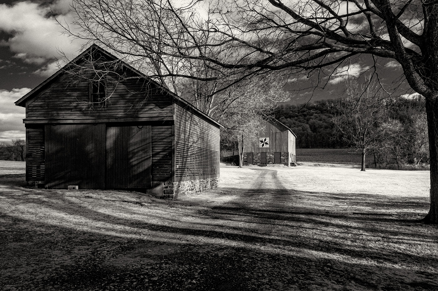
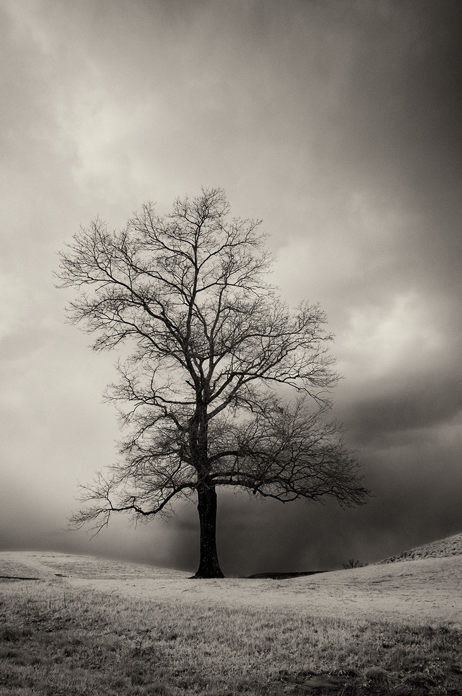
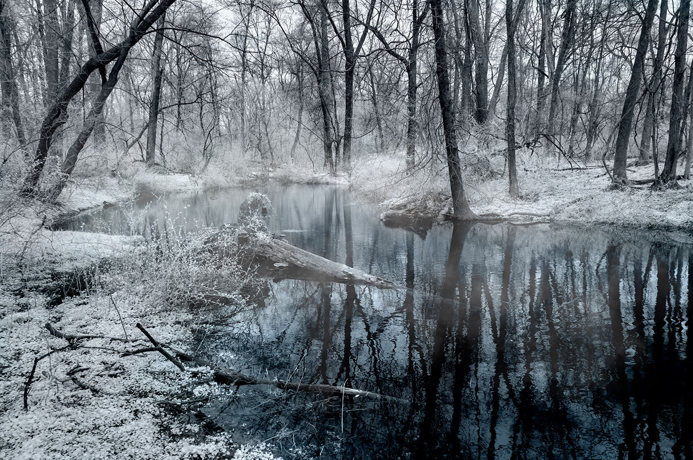
Hi. Nicely seen and captured abstract of lines, shapes, and textures. I'm okay with the toning. You may have taken the Tonal Contrast a bit far, creating a lighter halo around the tree branches. It's noticeable, but not distracting in this case. |
Mar 2nd |
| 66 |
Mar 23 |
Reply |
Thank you, Palli. I often flip images to make a left-to-right flow. I don't do it when the scene is a recognizable location, as in this case. Rialto Beach is a national park.
|
Mar 2nd |
| 66 |
Mar 23 |
Reply |
Thanks Henry for reworking the picture. Your version provides a cleaner composition. I wanted to include the dead trees that are still standing and more of the fog along the beach, which was the main story here, but I see your point about the distraction. I would make your version a bit brighter and make the fog whiter.
|
Mar 2nd |
6 comments - 6 replies for Group 66
|
6 comments - 6 replies Total
|