|
| Group |
Round |
C/R |
Comment |
Date |
Image |
| 66 |
Sep 22 |
Comment |
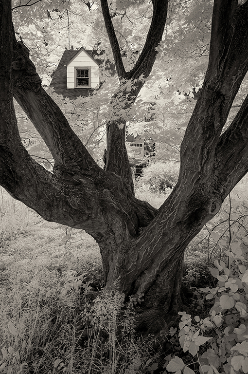
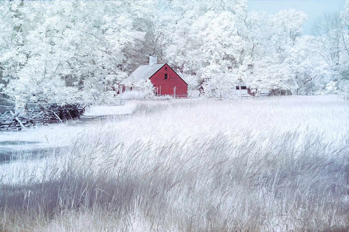
Hi Henry. The palm trees really make the scene special. I often process false color IR images. I would probably darken the house a little to create more contrast and reduce the brightness of the reds, but I know that darkening the main subject doesn't always work, especially if you lose the details. Nicely done.
|
Sep 6th |
| 66 |
Sep 22 |
Reply |
Thank you, Emil. |
Sep 6th |
| 66 |
Sep 22 |
Reply |
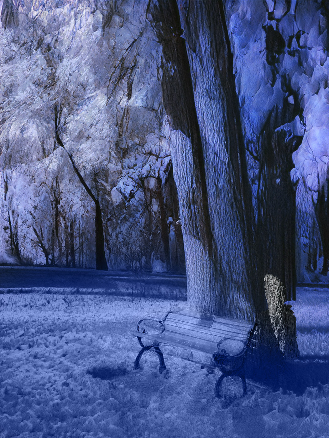
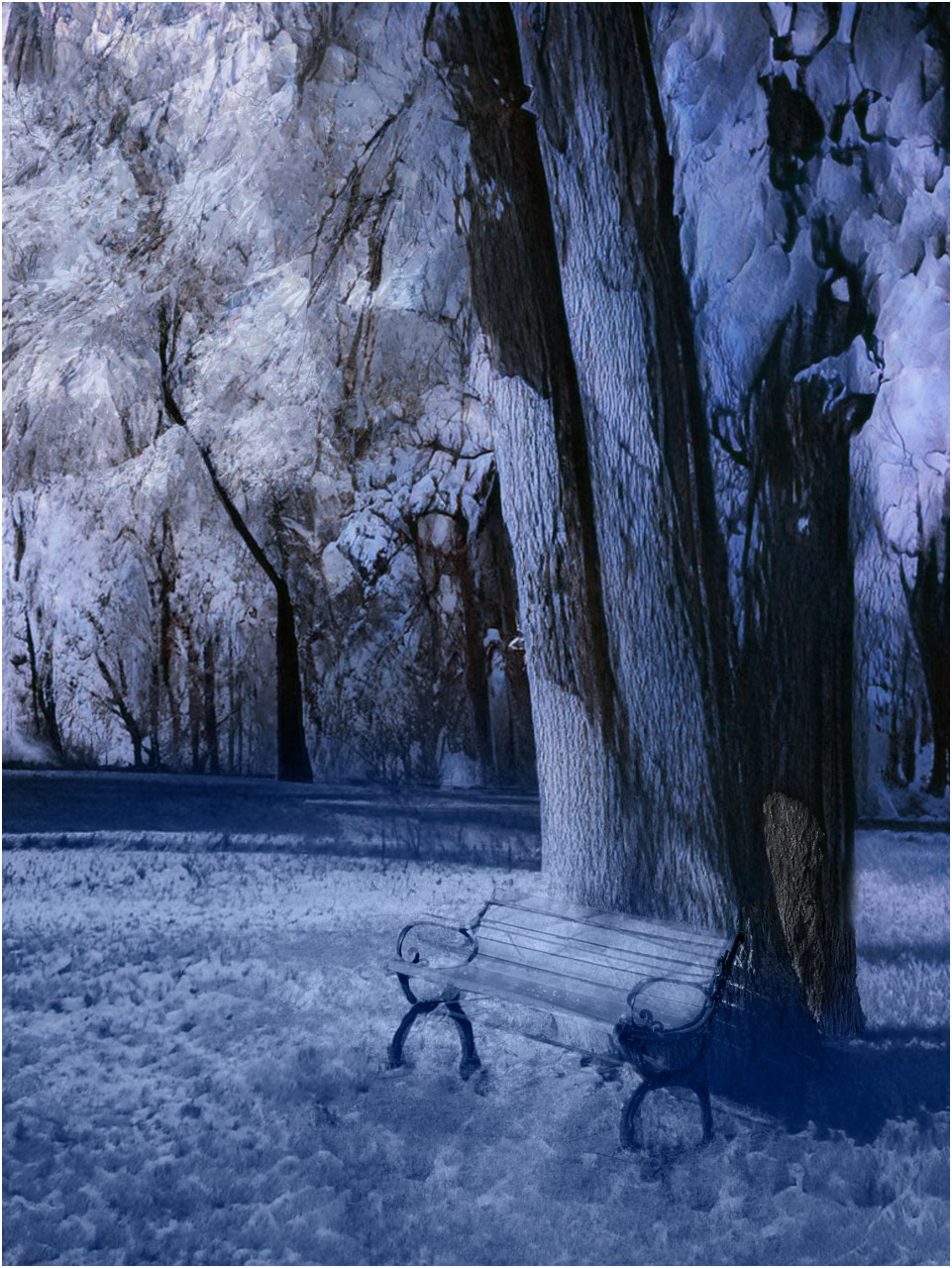
Thank you, Henry. I have many park bench pictures too. |
Sep 5th |
| 66 |
Sep 22 |
Reply |
I just posted a revision. |
Sep 4th |
| 66 |
Sep 22 |
Reply |
Thank you. I'm posting a revision. |
Sep 4th |
| 66 |
Sep 22 |
Reply |
Thank you. I'm posting a revision. |
Sep 4th |
| 66 |
Sep 22 |
Reply |
Thank you. I'm posting a revision. |
Sep 4th |
| 66 |
Sep 22 |
Comment |
Here is a reworked image.
|
Sep 4th |
 |
| 66 |
Sep 22 |
Reply |
Thank you. I'm posting a revision. |
Sep 4th |
| 66 |
Sep 22 |
Comment |
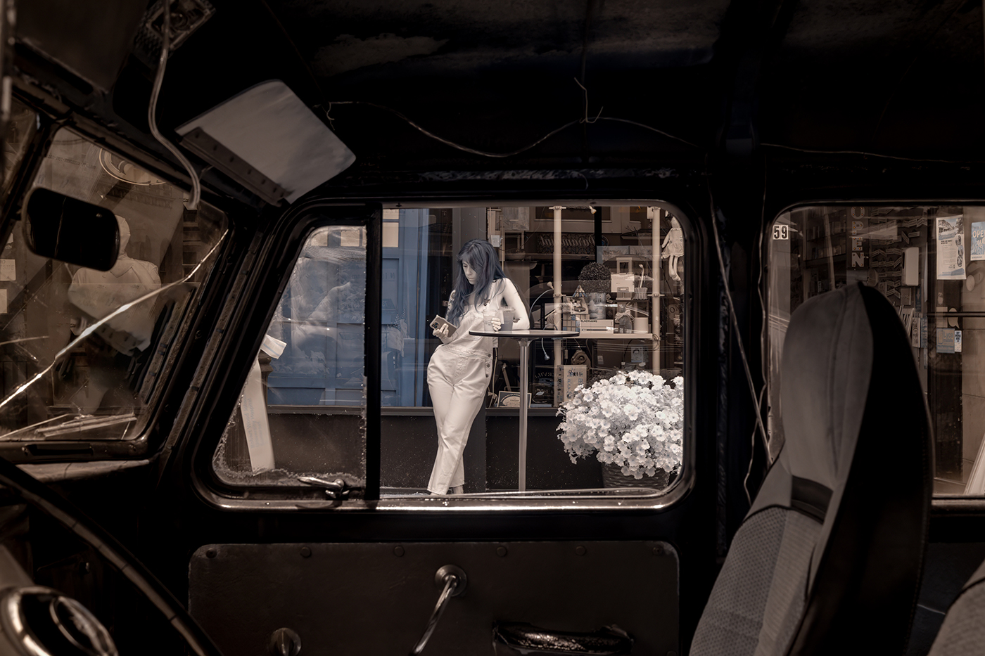
Hi Emil. I very much like your version and Gary's interpretation of the scene. Gary simplified the image by cropping the top part and eliminating the different patterns. I think that both work well. Your offers more to explore. Nicely done.
|
Sep 1st |
| 66 |
Sep 22 |
Comment |
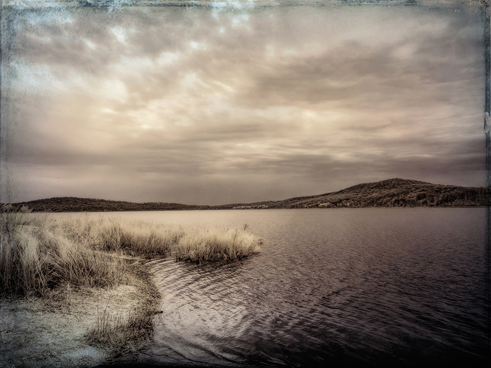
Hi Palli. You found interesting lines in the fence, bridge, and the reflections in the water. I agree with Gary that the focus should be on these elements. I would try even a tighter compositions without the sky. The technical handling of the tones and the sky replacement is excellent, but I'm not sure that the background above the bridge adds to the picture. While the sky is dramatic and handled well, the bright light on the scene doesn't match the sky. I would stay with all the patterns in the lower half of the image, but it's your picture. |
Sep 1st |
| 66 |
Sep 22 |
Comment |
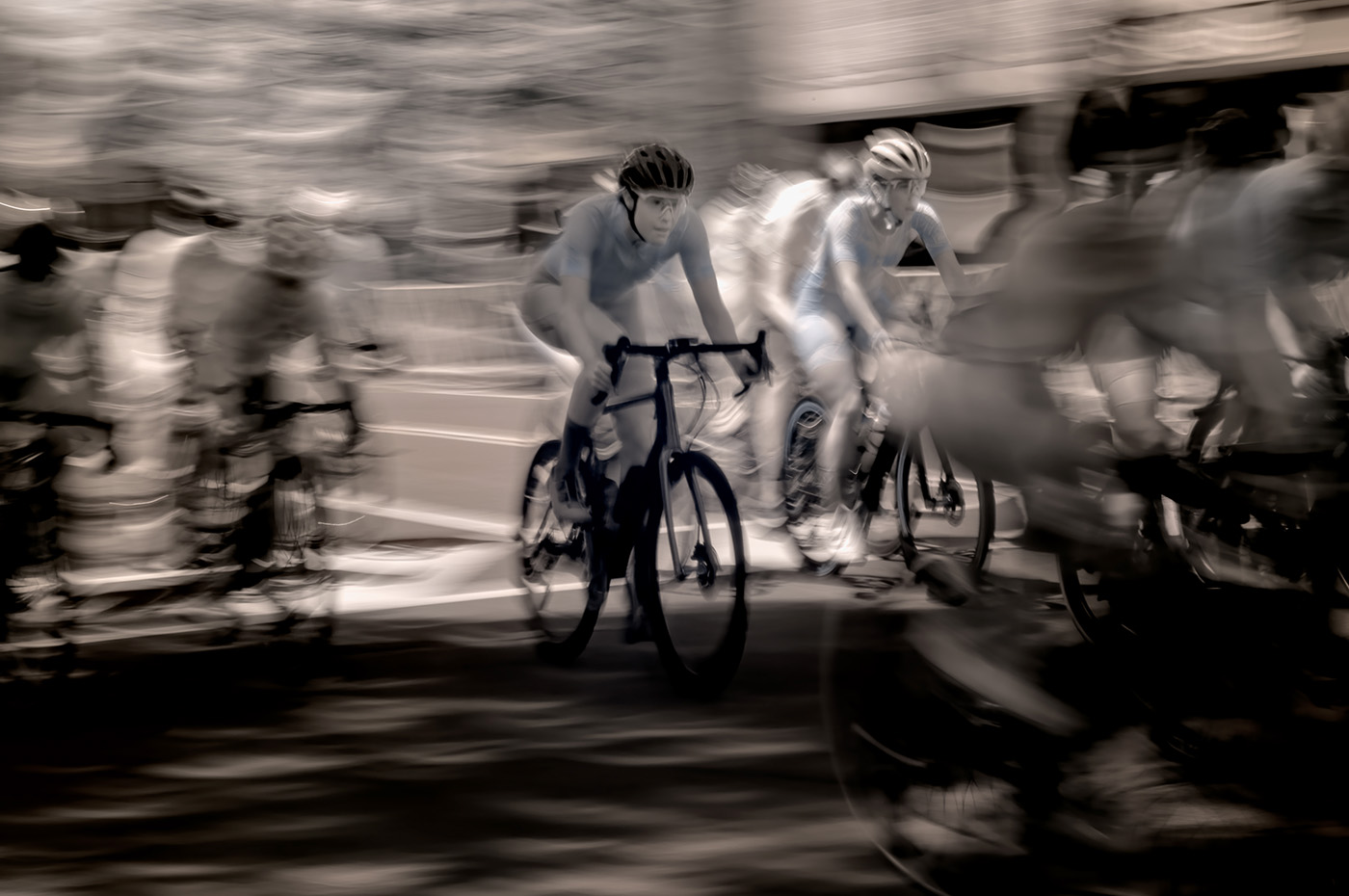
Hi Gary. I'm glad you are ready for getting out and taking new pictures. I like work with relatively mundane scenes, where the photographer created a unique image, using his/her interpretation, techniques, and tools. You like to create impact with high contrast and dark tones. You've done it successfully here. I would've liked lighter blurring, but it's your interpretation. Nicely done. |
Sep 1st |
| 66 |
Sep 22 |
Comment |
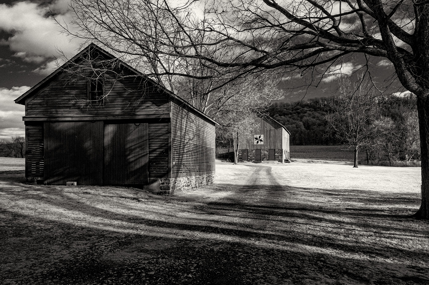
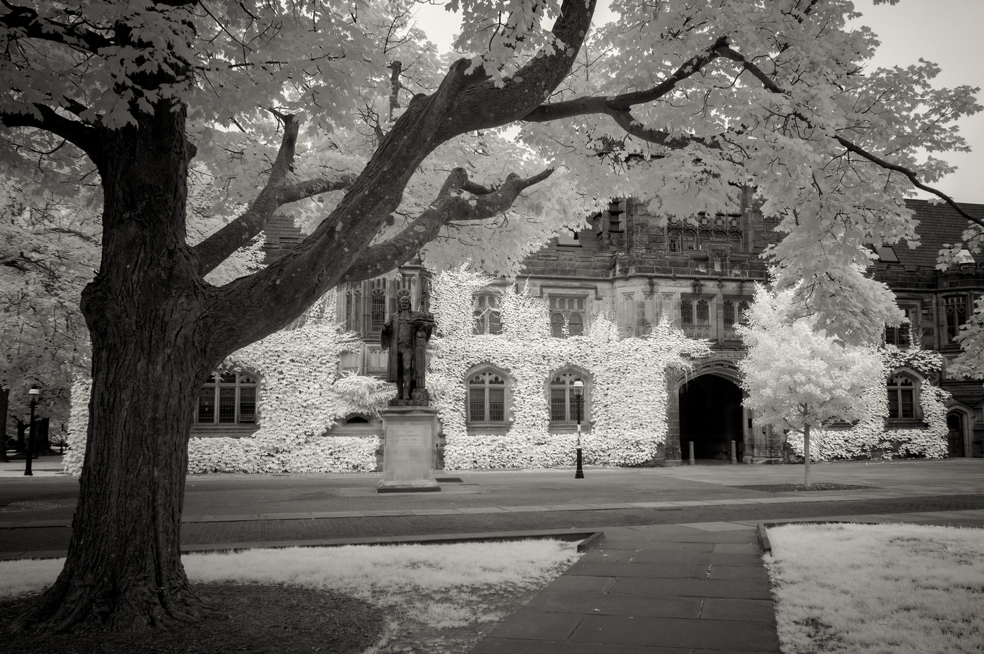
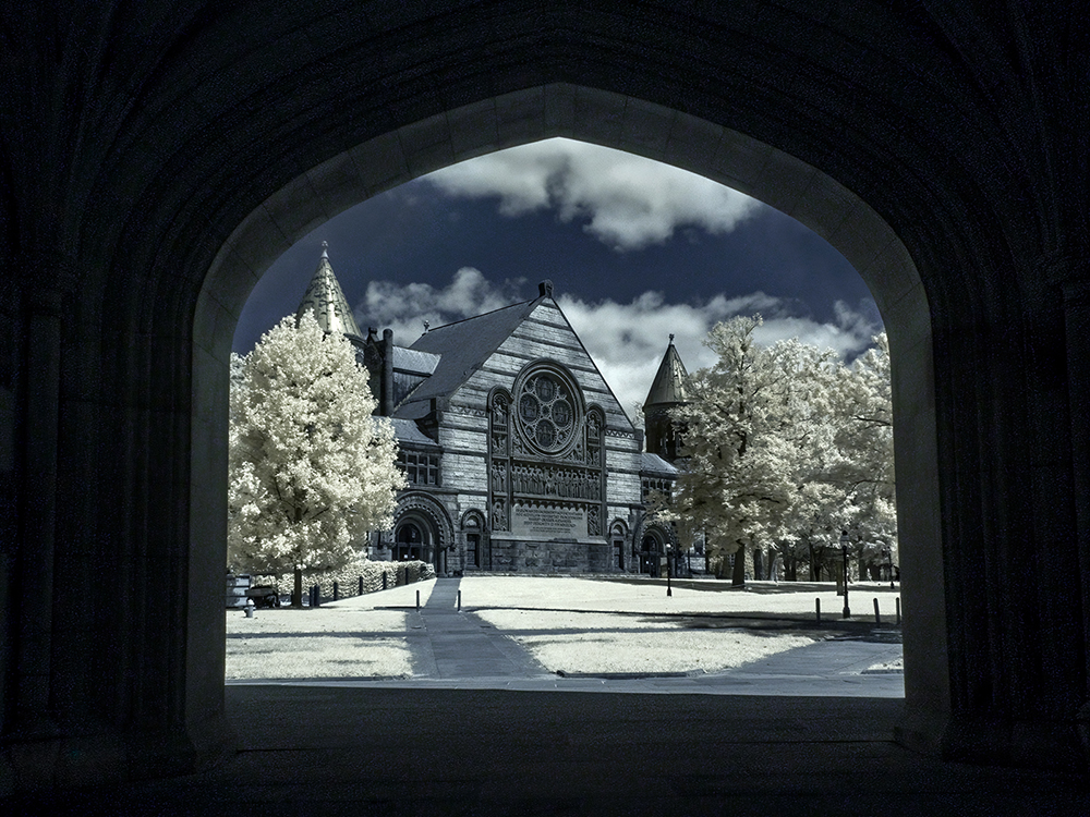
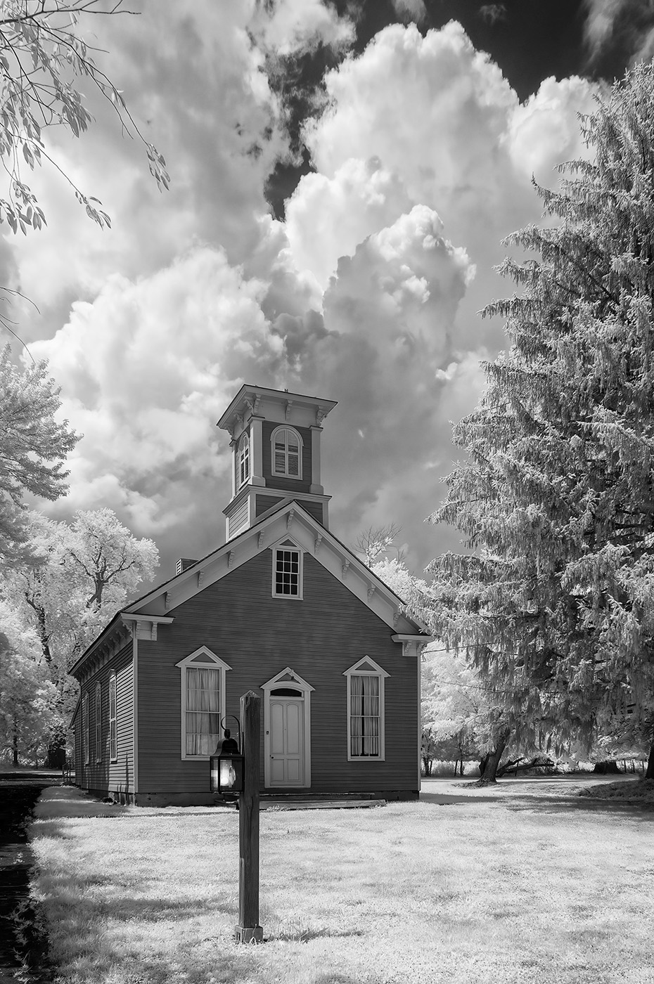
Hi Charles. I find your unique composition creative and beautiful. The false colors are handled well too. There's still some keystoning with the building tilting inwards, but it's not a major issue. Nicely done.
|
Sep 1st |
| 66 |
Sep 22 |
Comment |
Hi Jack. Yes, it comes together beautifully. The scene is dramatic to begin with, and your composition and processing captured it. I like Gary's version too, but to me they look like two different interpretations that work equally well. Nicely done.
|
Sep 1st |
| 66 |
Sep 22 |
Comment |
Hi Melanie. I like everything about the scene, composition, and processing. I'm usually in favor of the softer tones, so I like your interpretation here. I agree with Gary about the frogs. One of the reasons that I joined this group was that I didn't see portraits of animals and birds. I enjoy photographing them too, but I was looking for more artistic images as we see here in our monthly posts.
|
Sep 1st |
| 66 |
Sep 22 |
Reply |
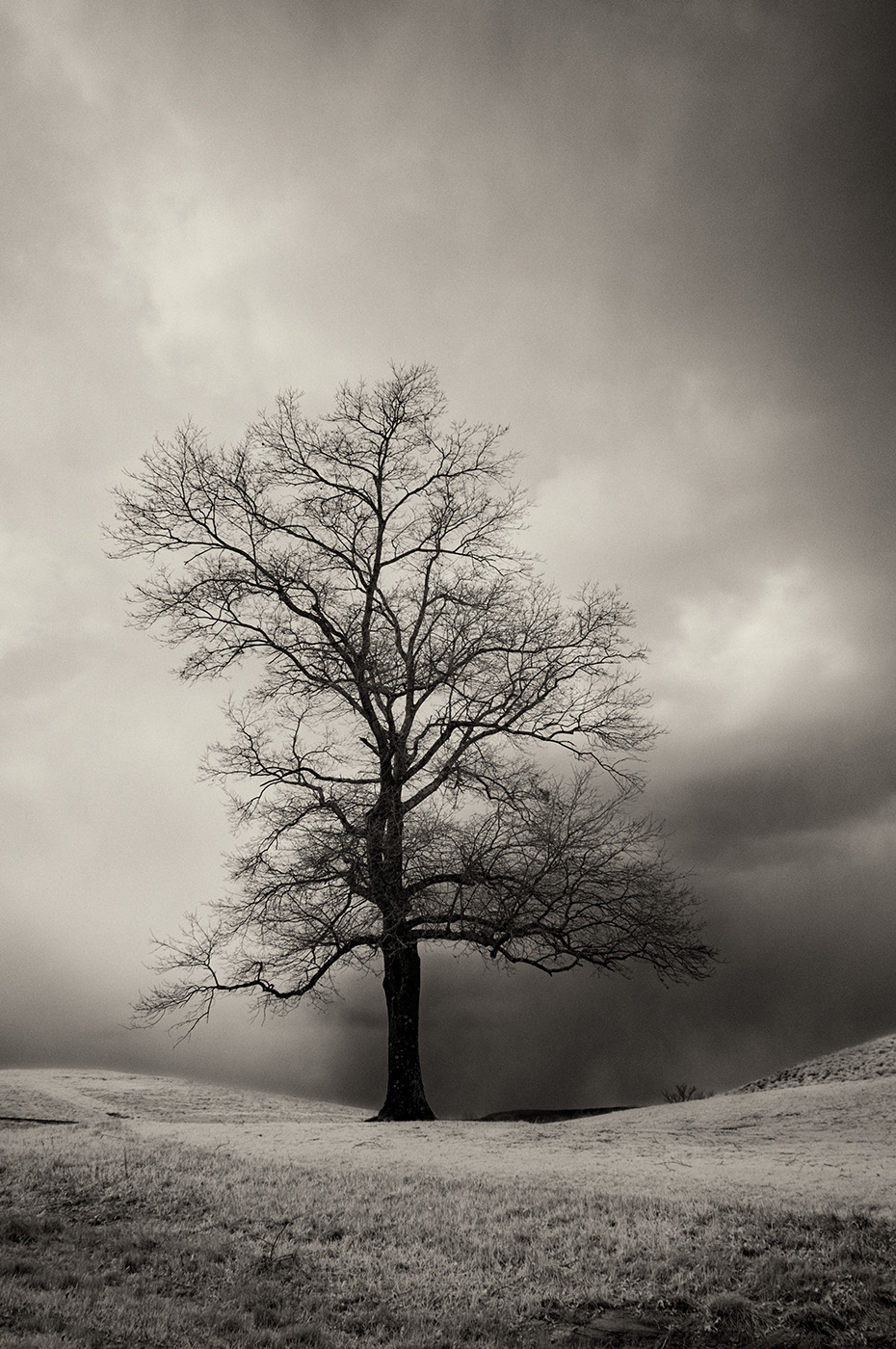
Thanks, Gary. The path in the background, which looks like a horizon line, was at a diagonal and gave the impression of a tilted horizon. The trees may look as the camera was tilted the other way. The blue tone and the circle were created by the Neural filters. The blue is too much. They also chopped off some pieces of the tree trunk (right edge). I should've corrected these issues. Thanks for noticing. |
Sep 1st |
8 comments - 8 replies for Group 66
|
8 comments - 8 replies Total
|