|
| Group |
Round |
C/R |
Comment |
Date |
Image |
| 16 |
Dec 22 |
Comment |
Very nice. I liked your cropping. The post processing looks good. I prefer the B/W image. I would have removed the text at right bottom and the little bug above the left wing. For the black screen of the website, the white border was essential to limit the frame. |
Dec 15th |
| 16 |
Dec 22 |
Comment |
Nice composition. I liked the colors, sharpness and lighting. Eventhough the details of the stones in the front wall of the building is visible, I think a little burning of that area can be made to increase its texture. No other suggestions |
Dec 15th |
| 16 |
Dec 22 |
Comment |
Nice shot. I liked your post processing. You were able to bring out the details required in the shadow areas. Cropping looks good. The B/W image looks better. Did you use any filter in post processing? |
Dec 15th |
| 16 |
Dec 22 |
Comment |
Excellent photo of bird in flight. Cropping and resulting composition looks good to me. The image is sharp. I think this image needs no further processing. |
Dec 15th |
| 16 |
Dec 22 |
Comment |
Nice shot. I liked the composition, colors and sharpness. Your cropping is good and the texture looks natural for the old vehicle. I don't have any suggestion for further improvement. Well done. |
Dec 15th |
| 16 |
Dec 22 |
Comment |
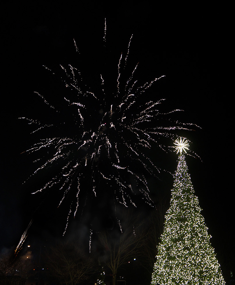
Nice shot. The composition with Burst of light and X-mas tree looks good. The lamp post is a distraction. I tried copying the top portion of the burst of light and then copied it at the lamp post area by flipping it vertically. Used erase option at very low % near the trees. It is quick trial. |
Dec 10th |
 |
6 comments - 0 replies for Group 16
|
| 68 |
Dec 22 |
Comment |
Some trouble in seeing the image fully. The image looks better in 2D. I think there is some 2 to 3 degree CW shfit between the two images. May be if it corrected, it may look better. Is there any specific reason for keeping the background statue in out-of-focus in a 3D image? |
Dec 16th |
| 68 |
Dec 22 |
Comment |
Excellent phantogram. I liked the expression of the cat. The image is sharp and has nice colors. A little more saturation and adjustment of highlights may be useful. Nice work. |
Dec 16th |
| 68 |
Dec 22 |
Comment |
Interesting composite. I liked the colors and composition. The position of the clouds need further adjustments. I find one more defect. It is about the shadows. The grass is having shadows, but the child, Avatar and dragon are not having any shadows!!!! |
Dec 15th |
| 68 |
Dec 22 |
Comment |
A good stereo image of a field. The actual centre of interest is lost as it merges with the trees behind. A shot from a lower angle would have shown the airplane in the sky. Better luck next time. |
Dec 15th |
| 68 |
Dec 22 |
Comment |
Interesting stereo view of the green fields. The image is sharp and the depth of the green fields are clear. The tractor trails look interesting. Still I miss the feel a centre of attraction. |
Dec 15th |
| 68 |
Dec 22 |
Comment |
Funny semi-abstract image. I liked the tunnel view of the background and the suspended face coming towards me. Very colorful image. Excellent work. |
Dec 15th |
| 68 |
Dec 22 |
Reply |
Thank you for the critical observation. |
Dec 15th |
| 68 |
Dec 22 |
Reply |
Thank you for the explanation about disparity in small and big screen. |
Dec 15th |
6 comments - 2 replies for Group 68
|
12 comments - 2 replies Total
|