|
| Group |
Round |
C/R |
Comment |
Date |
Image |
| 16 |
Nov 22 |
Comment |
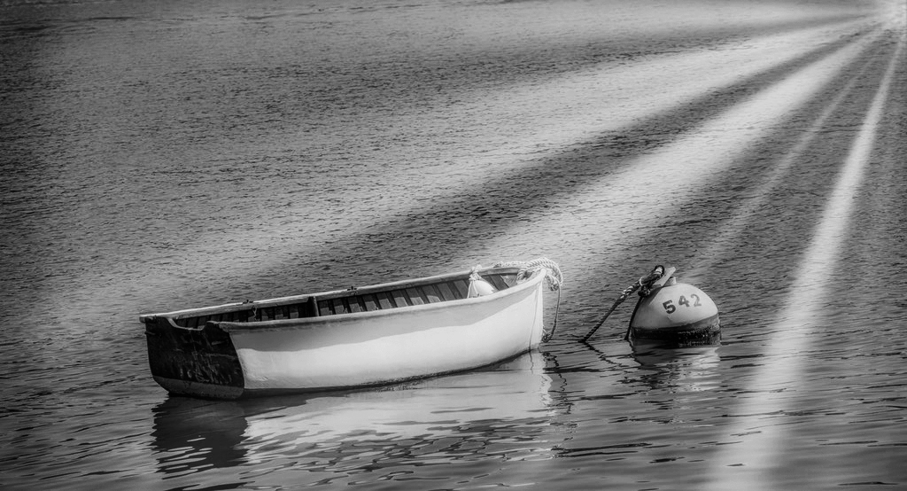
Beautiful image. I liked your post processing. Composition looks good to me. I think, if you want to make it color image, the vibrance and saturation need to be increased. Otherwise make it fully B/W. I prefer a B/W image. I think image is good for other artistic filter experiments. |
Nov 22nd |
 |
| 16 |
Nov 22 |
Comment |
Excellent action shot. I liked the composition and lighting. Your post processing is the best for the image. I have no suggestions to make. Well done. |
Nov 22nd |
| 16 |
Nov 22 |
Comment |
Very nice painterly composite image. The image has a story to tell. I liked your post processing. The change of background is blending nicely with the image. To me the color of the fish looks unnatural. It is more like pinkish red. What about making it brownish red? Vignette is a little harsh. Anyway, nice work. |
Nov 22nd |
| 16 |
Nov 22 |
Comment |
Interesting subject and the angle of shot. You were unlucky that the bottom portion of the balloon color was black. Otherwise it would have been a wounderful shot. I liked Terry's suggestion of replacing the sky. It works well with the image. A shot at the time of firing from basket would give an extra value to the image. |
Nov 20th |
| 16 |
Nov 22 |
Comment |
Beautiful image of playfull Zoey. The composition looks good and a little more crop will be better. Left upper side is bright and hence suggest a vignette to overcome this which will emphasis the subject. Yes, sharpening may be useful, but need not be that strong as given Terry's suggestion. Over all a good image with options for improvement. |
Nov 20th |
5 comments - 0 replies for Group 16
|
| 68 |
Nov 22 |
Comment |
Nice phantogram. The image is sharp and has nice depth. I too like to have the bud sticking out more. Since the frame is too tight, it may lead to window violation. Anyway, nice image. |
Nov 24th |
| 68 |
Nov 22 |
Comment |
Interesting image. The image is sharp and well exposed. I too think that this landscape image needs a wider stereo base. The clouds behind the rainbow area looks distorted. I find similar effects whereever the rainbow is there. Can somebody explain the reason for this? |
Nov 24th |
| 68 |
Nov 22 |
Comment |
Nice stereo image of the old tractor. The image is sharp. Regarding composition, I feel the image is too tight. A little more space on top & bottom would look better. May be, a shadows adjustment in photoshop can bring more details on shadow areas. |
Nov 24th |
| 68 |
Nov 22 |
Comment |
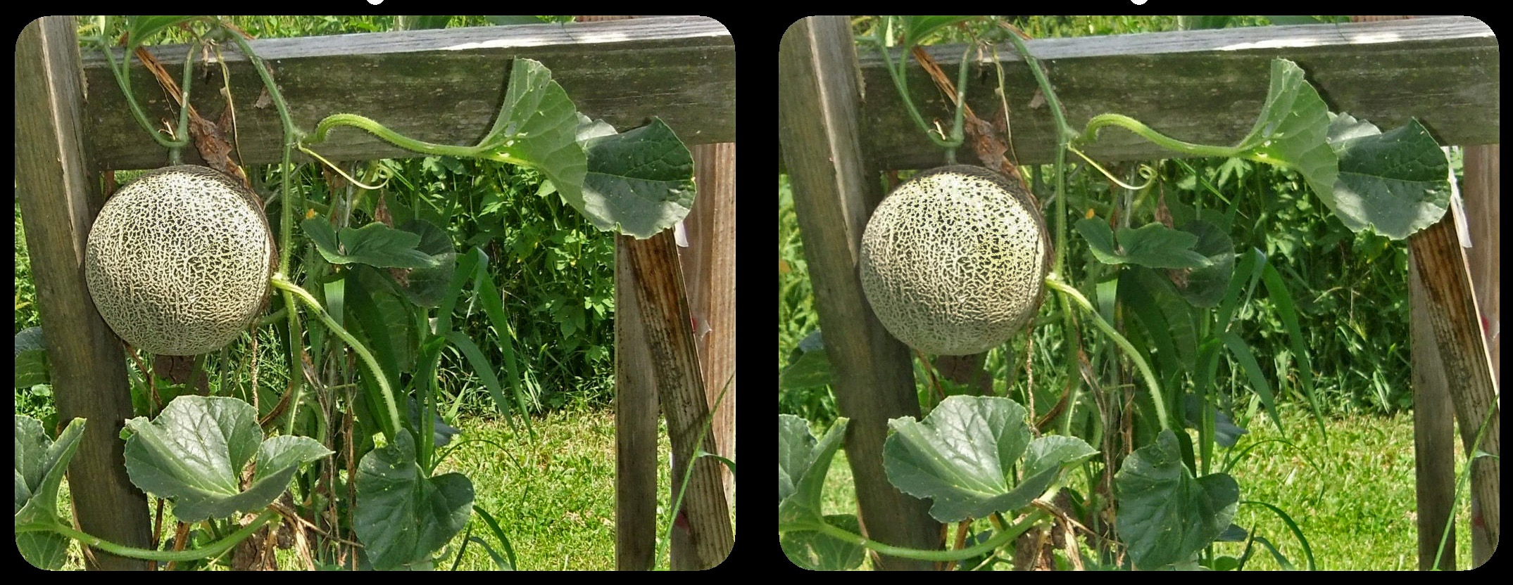
Interesting image. The image is sharp and has nice depth. I feel there is a little window violation at bottom and left side near the leaves. A little shadows adjustment will correct the overexposure on melon top portion. A quick trial is attached. |
Nov 24th |
 |
| 68 |
Nov 22 |
Comment |
Very good stereo image. The image has nice depth. I liked the composition too. The color correction on left and right images looks good. I think, an yellow filter about 25% in photoshop would make the sky more beautiful. |
Nov 24th |
| 68 |
Nov 22 |
Comment |
Interesting image. 2/3 portion of the image is flat. Hence, I prefer a tight cropping. The visible background through 'eye' is not sharp. What about replacing the background with some sharp image? |
Nov 24th |
| 68 |
Nov 22 |
Reply |
Yes, the pattern and colors change each day. On the 10th day it will be the largest and most beautiful. |
Nov 24th |
6 comments - 1 reply for Group 68
|
11 comments - 1 reply Total
|