|
| Group |
Round |
C/R |
Comment |
Date |
Image |
| 1 |
Aug 20 |
Comment |
Nice flower image. The image is sharp and you could get all the details of the white petal surface. Lighting appears good to me.
Regarding the settings, you did not lose the settings. It is available in the image itself. See the exif details from the properties of the image. I could see the following details:
Camera : Panasonic DMC-FZ300, F-stop f/6.3; Exposure time 1/640; ISO 400; Exposure bias +0.3 step; Focal length 32mm; Max aperture 2.97; Metering mode - Pattern, No flash ; Aperture priority; taken on 01-08-2019 at 14.14 hrs |
Aug 4th |
1 comment - 0 replies for Group 1
|
| 2 |
Aug 20 |
Comment |
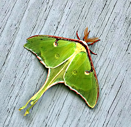
Interesting image of the Moth. To me, the trimming is a little tight. I think there should be more breathing space in front of the Moth. Further a little rotation will make it a diagonal composition. I tried a quick one with the original provided. (Since it is already compressed, some details are missing in the output) |
Aug 4th |
 |
1 comment - 0 replies for Group 2
|
| 6 |
Aug 20 |
Comment |
Very nice images. The bright contrasting colors add to the image. The first image without stamens and pistil looks stronger to me with the green leaves following the red flower. |
Aug 1st |
1 comment - 0 replies for Group 6
|
| 16 |
Aug 20 |
Comment |
Excellent shot. I liked the composition. The different layers with different colors add to the image. The lighting looks very nice to me. I think you can trim a little on the right side to avoid the white buildings and burn a little more on the white building in the foreground to concentrate on the chruch. This is an example of 'Right time at right place'. Well done |
Aug 17th |
| 16 |
Aug 20 |
Reply |
Congrats |
Aug 17th |
| 16 |
Aug 20 |
Reply |
Yes, a mild slope is there in horizon.
You are welcome to visit Andaman too. You have to take special permission to visit this Island. When you apply for visa make a special request. |
Aug 7th |
| 16 |
Aug 20 |
Comment |
Excellent table top image. I liked the composition. The mild shadows only on the right side only gives a 3D effect. I think you can add a similar shadow the right side of the bottle to give a uniform look. Nice work. |
Aug 1st |
| 16 |
Aug 20 |
Comment |
Beautiful chicks. Your trimming looks good to me. I liked the colors of the chicks in the original photo. It has more details of patterns on the feathers. The strong vignette appears good. The processing changed the black color of the eyes of lower two birds. |
Aug 1st |
| 16 |
Aug 20 |
Comment |
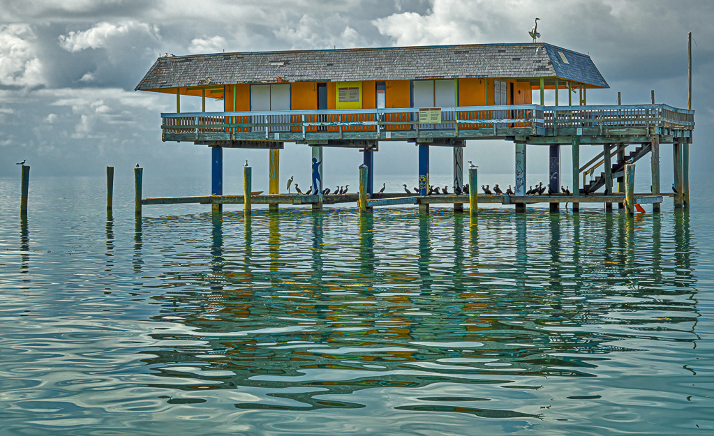
Very nice image. Your post processing is excellent. It has brought out the colors of the building. The waves and reflection add to the image. The action of the bird on the roof top looks nice to me. I think a little correction on highlights can make the sky more interesting. A quick trial attached. |
Aug 1st |
 |
| 16 |
Aug 20 |
Reply |
Yes, I could have trimmed the ground more, but I want to keep the sky only to 1/3 portion of the image, that is why I kept more foreground which is not much of interest. |
Aug 1st |
| 16 |
Aug 20 |
Comment |
Interesting image. A nice travel photo subject. Your adjustments are excellent. The materials kept inside the shop also clearly visible after processing. I think almost similar effect can be achieved using Shadows/Highlight option in photoshop. |
Aug 1st |
5 comments - 3 replies for Group 16
|
| 36 |
Aug 20 |
Reply |
When straight strutures are not available, I use grids view in photoshop to correct horizon, that is easier. |
Aug 1st |
| 36 |
Aug 20 |
Comment |
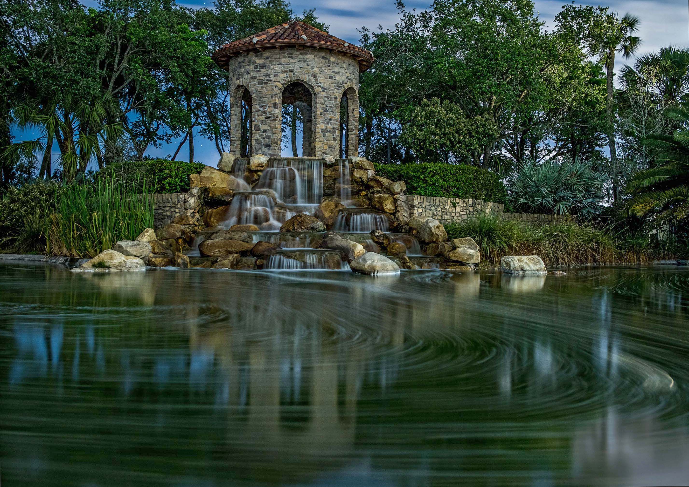
Beautiful image. The low shutter speed has given a nice pattern on the foreground. To me, the image needs a minor horizon adjustment. I tried a quick one with 0.8 degree CCW and a little shadows adjustment to give details on the tree leaves. |
Aug 1st |
 |
1 comment - 1 reply for Group 36
|
| 68 |
Aug 20 |
Reply |
We are uploading anaglyph images for those who are not familiar with viewing the parallel or cross eye view. Those who have simple red-cyan glass can view the images. The DD groups can be viewed by public too.
My suggestion for half color is when red color is predominant only. |
Aug 19th |
| 68 |
Aug 20 |
Comment |
Excellent conversion of a TV image. The separation of each element in the image looks very good to me. I would have removed the 'SCI' and 'LIVE' from the image. Nice work. |
Aug 17th |
| 68 |
Aug 20 |
Comment |
Nice conversion of 2D to 3D. There is nice separation of space between the car and the building. Some patches of ground looks suspended, specifically left-bottom to back of the car and just in front of the car. Otherwise nice conversion. |
Aug 17th |
| 68 |
Aug 20 |
Comment |
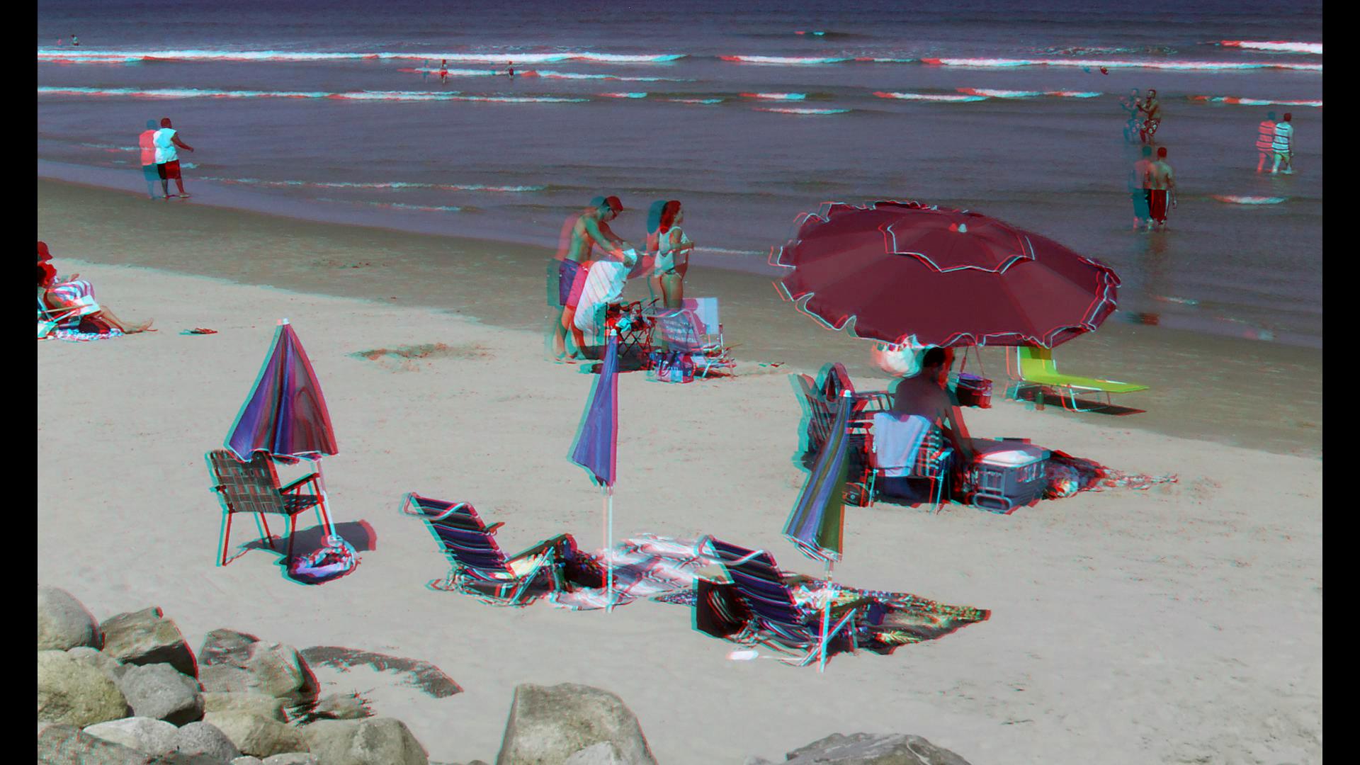
Ghost-reduced anaglyph |
Aug 17th |
 |
| 68 |
Aug 20 |
Comment |
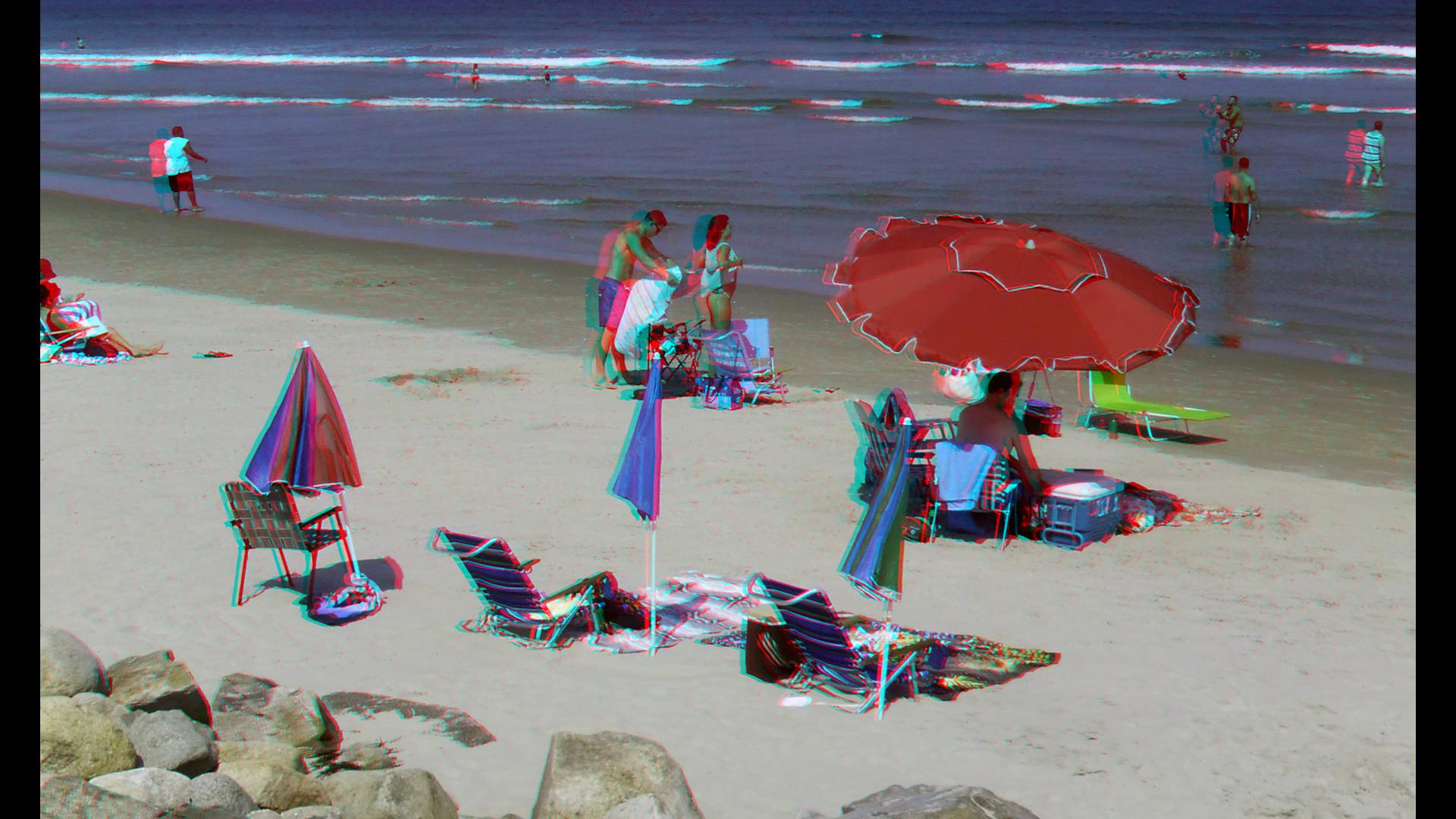
Nice image. The image is colorful with good depth. The image has nice actions too. The bright red color looks good in pairs. My suggestion is that when you make an anaglyph of images with bright red color use the option of 'Half color or Ghost-reduced anaglyph' so that the anaglyph images looks better. I am giving below the two examples.
Half color anaglyph |
Aug 17th |
 |
| 68 |
Aug 20 |
Reply |
It is in front of the Lake Yellowstone Hotel. |
Aug 17th |
| 68 |
Aug 20 |
Comment |
Very nice image. The 3D effect is good. The image is sharp and lighting as well as composition look good to me. There appears to be a mild window violation on the right bottom side, which can be avoided by a mild trim. |
Aug 1st |
| 68 |
Aug 20 |
Comment |
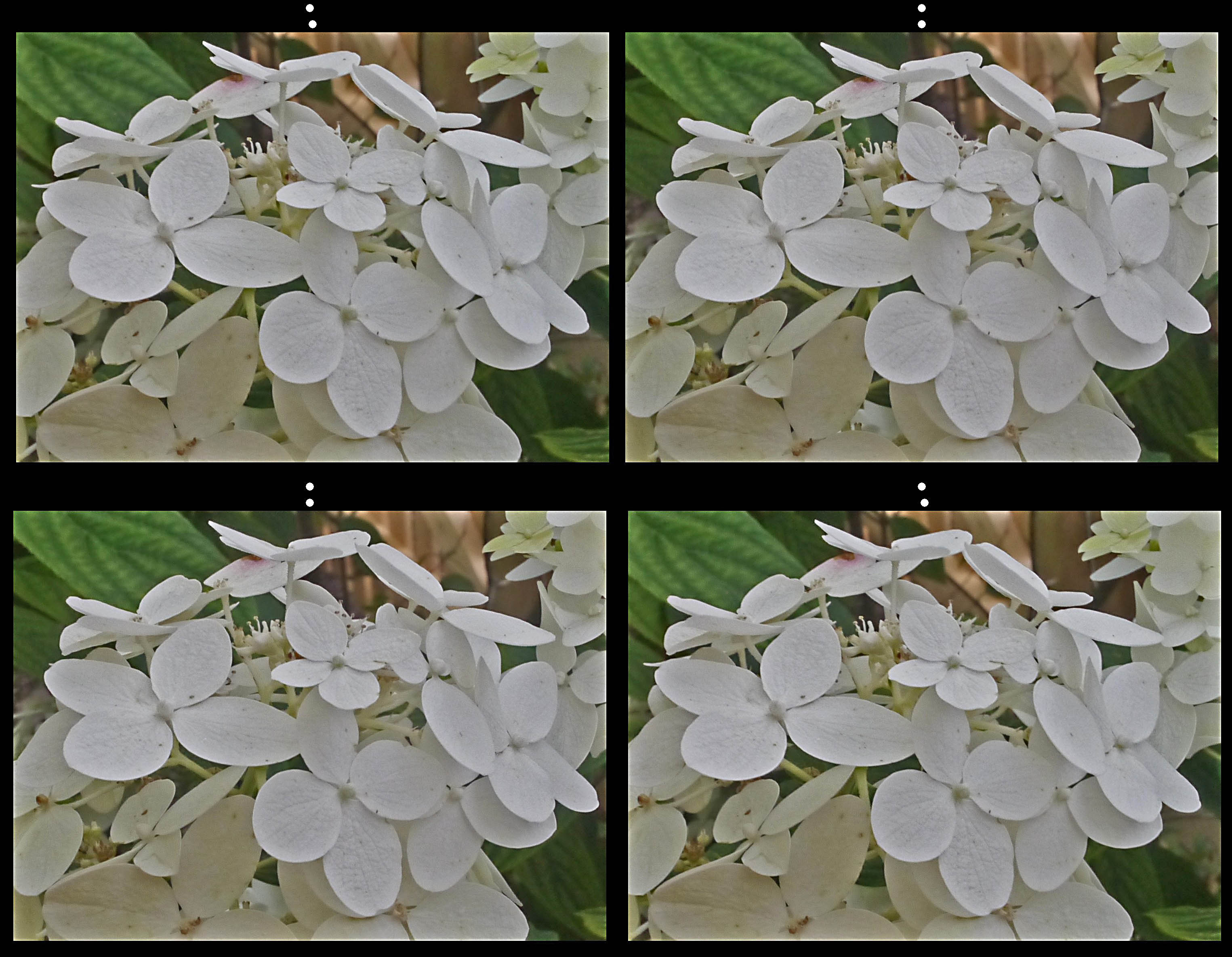
Interesting 3D image. It has nice depth. It is difficult to take images of white objects with surface details. May be a little adjustments on highlights using photoshop can bring more details of the petal surface. I tried a quick one and resulting image is given below. I did not see any window violation. |
Aug 1st |
 |
6 comments - 2 replies for Group 68
|
15 comments - 6 replies Total
|