|
| Group |
Round |
C/R |
Comment |
Date |
Image |
| 16 |
Jul 20 |
Comment |
Thanks for the suggestions. Yes, the green is a little over saturated. Removal of the red chair in the foreground looks better. Will do the necessary corrections. |
Jul 19th |
| 16 |
Jul 20 |
Comment |
Beautiful composition. Your trimming and removal of the bird in the front looks good to me. The right side needs further improvement. I too fell that the mirroing of the left side would look better. The side lighting is excellent. Vignette can be a little stronger. I sometimes use 4% burning asymmetrical vignette. |
Jul 19th |
| 16 |
Jul 20 |
Comment |
Beautiful shot. I liked the nice DOF. The subject is sharp with good lighting. The rotation resulted in a nice composition. The white area in the background can be burned to avoid distraction. I liked Terry's background correction. |
Jul 19th |
| 16 |
Jul 20 |
Comment |
Nice idea of cloning to complete the picture. The shape of the tree is interesting. I don't understand the color variation on the left side. The right side still looks better. The top sky adjustment needs further correction. Otherwise nice work. |
Jul 19th |
| 16 |
Jul 20 |
Comment |
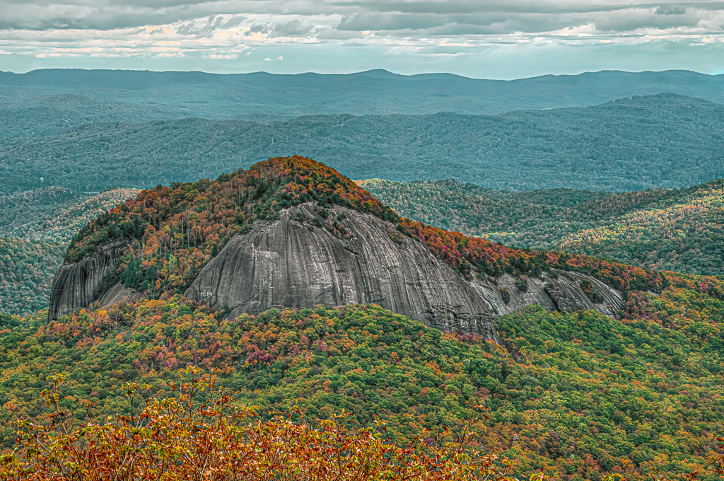
Interesting landscape. The rock, layers of mountains and the dramatic sky are giving a nice composition. To me, there blue color is strong. May be a little hue adjustment will be better. Tried a quick one with hue and saturation of blue. |
Jul 19th |
 |
| 16 |
Jul 20 |
Comment |
Beautiful. I liked the composition. The image is sharp, with good lighting. The colors compliment. I liked the background correction using liquefy. The glass jar is a mild distraction. The flower inside the jar, to me, is not adding anything special to the composition. If it was outside, could have covered the jar. Good work. |
Jul 19th |
| 16 |
Jul 20 |
Reply |
Problem corrected now by Webmaster. |
Jul 14th |
| 16 |
Jul 20 |
Reply |
It appears that the shape of original file is changed due to thumbnail conversion by web site. Please click on the image to see it properly in a new window. |
Jul 8th |
| 16 |
Jul 20 |
Reply |
Sorry, a mistake from my side. The original sent by Bogdan is different. I think I posted the edited one in original too. Will replace it within 20 minutes. |
Jul 8th |
6 comments - 3 replies for Group 16
|
| 68 |
Jul 20 |
Comment |
Nice 3D image. The image has nice depth. I liked the composition. Lighting looks good. Colorful sharp image. |
Jul 22nd |
| 68 |
Jul 20 |
Comment |
Very nice 3D composite. All items fit well in the image and gives a nice depth. Wingtip vortices and jetwash might have given horrifying wake-turbulence to the planes. |
Jul 22nd |
| 68 |
Jul 20 |
Comment |
Nice 2D to 3D conversion. I can see nice depth. The image is sharp with nice colors. Yes, some of the heads seem to be far back from the person's body when the image is enlarged. Your technique works well. |
Jul 22nd |
| 68 |
Jul 20 |
Comment |
The stereo image with the new camera looks OK to me. The image is sharp. Lighting is a little harsh. There is no window violation. |
Jul 22nd |
| 68 |
Jul 20 |
Reply |
Please see the following two videos regarding monitor callibration. Hope your monitor color temperature is set to D65 (6500 K).
https://www.youtube.com/watch?v=vcjmWlSsAKQ
https://www.youtube.com/watch?v=1FVHrh2gL4Q |
Jul 22nd |
| 68 |
Jul 20 |
Reply |
There was much variation in lighting. It was almost noon time and the Sun was at the top. The trees were a little dark in the original. So I used shadows correction to bring more details in the tree area. This gives a feeling of over exposure. |
Jul 6th |
4 comments - 2 replies for Group 68
|
10 comments - 5 replies Total
|