|
| Group |
Round |
C/R |
Comment |
Date |
Image |
| 16 |
Jan 20 |
Comment |
Beautiful story telling image. Your editing looks great. I too prefer to crop a large portion from the right side. It is unfortunate that you missed the complete picture of the bike. Was there any distracting objects on left side near the bike? |
Jan 16th |
| 16 |
Jan 20 |
Comment |
Great image. The image looks colorful and sharp with nice lighting. The reflections look nice. I would have cropped from bottom and right side of the image. The saturation of blue color of the sky, to me, is over saturated. |
Jan 16th |
| 16 |
Jan 20 |
Comment |
Good pose. I liked the composition. Lighting is Ok. Just missed the catch light, what about adding it? The image looks sharp to me. If you have selected the blue background of the original image, the color distractions on the edge of the animal body could have been avoided. The given original seems to be from the series of images taken and not the altered one. |
Jan 16th |
| 16 |
Jan 20 |
Comment |
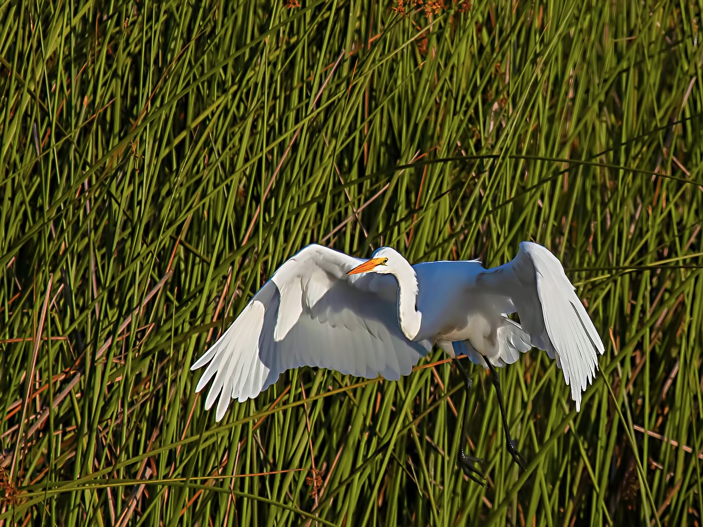
Nice image of bird in flight. I think you got a nice shape of the bird. To me it appears that some more correction on levels and saturation is required. There is a foggy appearance on the background. I tried some adjustments in level, saturation and hue. The resulting image is given below |
Jan 8th |
 |
| 16 |
Jan 20 |
Comment |
Interesting image. I liked the angle of the shooting. This composition is good for a 3D image too. The image is sharp with nice lighting. I have no suggestions. Good work. |
Jan 8th |
| 16 |
Jan 20 |
Comment |
Nice shot. I liked the composition. The image looks sharp to me. The denoise and sharpening has improved the image. It is good that you included the branches and I agree to Joan's comment. |
Jan 8th |
6 comments - 0 replies for Group 16
|
| 68 |
Jan 20 |
Reply |
Thank you for explaining about the depth map creation. |
Jan 22nd |
| 68 |
Jan 20 |
Comment |
Interesting image. There is a lot to observe. Image is sharp. Lighting looks good. The 3D separation of the pillars are good. To me, something is missing in the image, may be a center of attraction? or is it due to over crowding of objects? |
Jan 16th |
| 68 |
Jan 20 |
Comment |
Great 3D conversion. The image has nice 3D separation of the objects at different levels. The image is sharp. Nice to see young David. |
Jan 16th |
| 68 |
Jan 20 |
Comment |
very nice landscape view. Nice leading line which takes our eyes to the horizon. The picture is sharp and composition look good to me. The glare is visible to me even in stereo view, but is not a big distraction. |
Jan 16th |
| 68 |
Jan 20 |
Comment |
Very nice creative image. The close, middle and far objects are well placed and have nice 3D effect. The composition, lighting and sharpness are good. I have no suggestions. |
Jan 16th |
4 comments - 1 reply for Group 68
|
10 comments - 1 reply Total
|