|
| Group |
Round |
C/R |
Comment |
Date |
Image |
| 2 |
Aug 19 |
Comment |
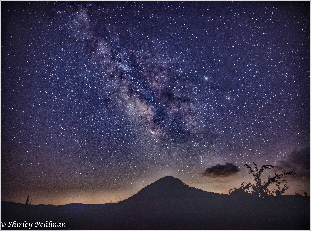
Interesting image. I think a little more adjustments of shadows may be needed. (I tried it in my mobile using Snapseed and also 25% HDR, resulting image is given below) |
Aug 4th |
 |
1 comment - 0 replies for Group 2
|
| 5 |
Aug 19 |
Comment |
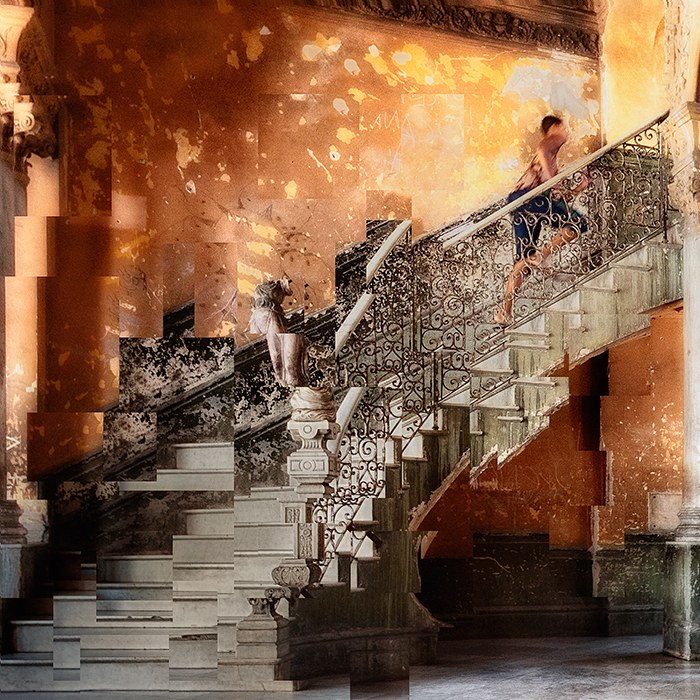
Very interesting. I liked the way you transformed the parts of the stairs. However, I prefer to see the image flipped horizontally. |
Aug 1st |
 |
1 comment - 0 replies for Group 5
|
| 16 |
Aug 19 |
Reply |
Good |
Aug 17th |
| 16 |
Aug 19 |
Comment |
Good action shot. I liked the composition, your cropping is good. Lighting is not bad. The low shutter speed has blurred the face of Kayaker. You could achieve the milky-water effect. I think you can adjust the skin color in photoshop. |
Aug 17th |
| 16 |
Aug 19 |
Comment |
Nice story telling image. The chicken's pose looks good. The use of selective color on chicken looks good, but do not fit with the background. The blurring the background looks OK to me. I too prefer desaturating the background to some extend and giving a vignette to the image will make the chicken stand out. The cropping, to me, appears good for the composition. |
Aug 16th |
| 16 |
Aug 19 |
Reply |
Yes, it looks better. |
Aug 16th |
| 16 |
Aug 19 |
Comment |
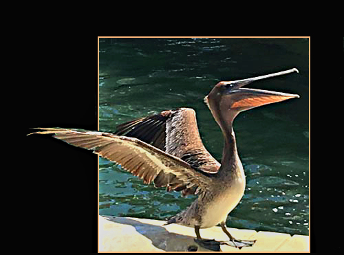
Beautiful bird and nice pose. The side lighting is good and gives the specific character of the head and beak.To me it looks like the post processing was done in a hurry, specifically at the left corner. I have another suggestion to avoid the distraction on the left side. Kathleen may be remembering Charles Blume, who was a member in this group during 2009. In March 2009 he used a method called 'leaning out' to put some portion of the image outside a frame. This can be used here. I just tried a quick one with the original you supplied. The original file was small hence the quality is not that good for further processing. Still tried. (I forgot to add more space at bottom and an outer frame)
(I kept a record of Charles' instruction and if anybody is interested, I can copy the file by mail.) |
Aug 16th |
 |
| 16 |
Aug 19 |
Comment |
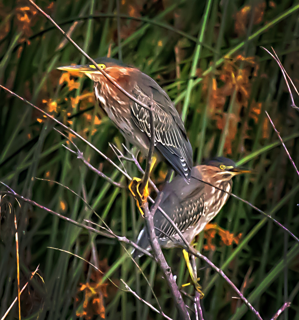
Nice pose of the birds. It is difficult to shoot images of birds in bush. You are successful in capturing the birds without much distraction. To me, the background is a little distracting. Your cropping is tight, but I still want more to emphasis the birds from the background. After cropping, i did some minor adjustments in levels and burning of the sides. |
Aug 16th |
 |
| 16 |
Aug 19 |
Reply |
I used blue filter at 25% too |
Aug 16th |
 |
| 16 |
Aug 19 |
Comment |
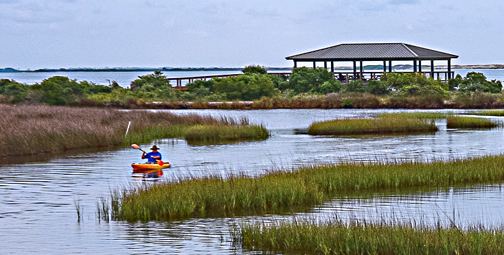
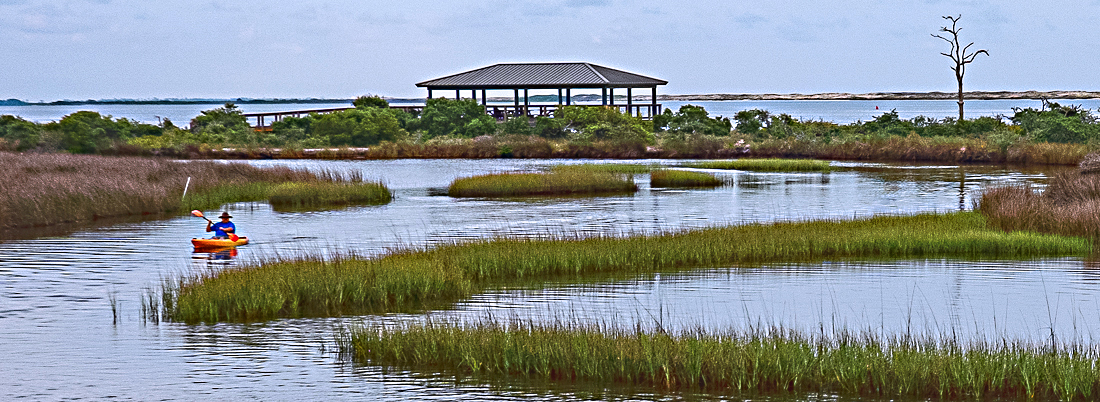
I liked the 'Z' composition. The image says a story. I think you missed a good lighting and contrast in the sky on the day. I think you can trim the dull sky more. I have two cropping suggestions. One is a panoramic view and other more tight one with building and Kayaker at 1/3 positions. |
Aug 16th |
 |
| 16 |
Aug 19 |
Comment |
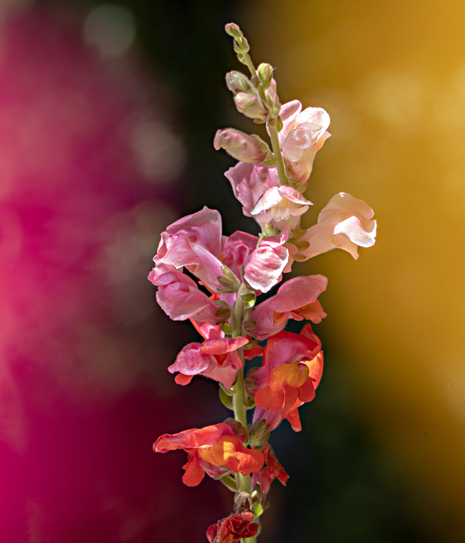
Great shot of a flower. The image is sharp with nice colors. There is lot of negative space in the image. I think a vertical composition may look better and give importance to the flower. I tried to crop the left side and positioned the flower in the center. |
Aug 16th |
 |
| 16 |
Aug 19 |
Reply |
I have to drop this preliminary draft as the drama director did not like the colors and given some other suggestions and concepts!! |
Aug 15th |
6 comments - 4 replies for Group 16
|
| 48 |
Aug 19 |
Comment |
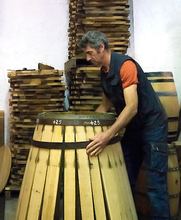
Interesting story telling image. The high ISO has resulted in grains, specifically on the body of the worker. I think, it can be corrected in PS. I tried a quick one with denoice option in photoshop. The result is given. |
Aug 16th |
 |
1 comment - 0 replies for Group 48
|
| 67 |
Aug 19 |
Comment |
Excellent. I liked the perfect reflection. Your post processing is very nice. Good work. |
Aug 1st |
1 comment - 0 replies for Group 67
|
| 68 |
Aug 19 |
Reply |
It is the head of the person sitting just in front of me. I will try to trim that portion. |
Aug 22nd |
| 68 |
Aug 19 |
Reply |
Yes, I also first thought of trimming the top portion, but liked the colors in the area. Hence didn't do it. |
Aug 17th |
| 68 |
Aug 19 |
Comment |
I liked the composition. Nice lighting on the flower. There is good depth. Good natural colors too. The anaglyph looks better. |
Aug 17th |
| 68 |
Aug 19 |
Comment |
Good stereo image. Lighting looks good. I too feel a little red color cast in the image. |
Aug 17th |
| 68 |
Aug 19 |
Comment |
Nice image. The image has good stereo effect and I liked the way bowl coming out of the window. The background is a little brighter, I think this can be darkened in photoshop. |
Aug 17th |
| 68 |
Aug 19 |
Comment |
Excellent creative work. Nice 3D effect and good lighting. I would have pushed the image a little more inside the window as the hand is touching the frame. I too feel that the model should have a little more distinct. |
Aug 17th |
| 68 |
Aug 19 |
Comment |
Nice arcade view. I find good depth, life and colors. The left side is a little brighter and details missing. I think you can correct in photoshop 'Highlight/shadows' option. |
Aug 17th |
| 68 |
Aug 19 |
Comment |
Your concept looks good, but I think this works better in 2D than in 3D. I too find it difficult to view in parallel or cross-eye view. It looks a little better in anaglyph. |
Aug 17th |
6 comments - 2 replies for Group 68
|
| 83 |
Aug 19 |
Reply |
Ok. Thank you for a detailed explanation.
Today is world photography day. Best wishes. |
Aug 19th |
| 83 |
Aug 19 |
Comment |
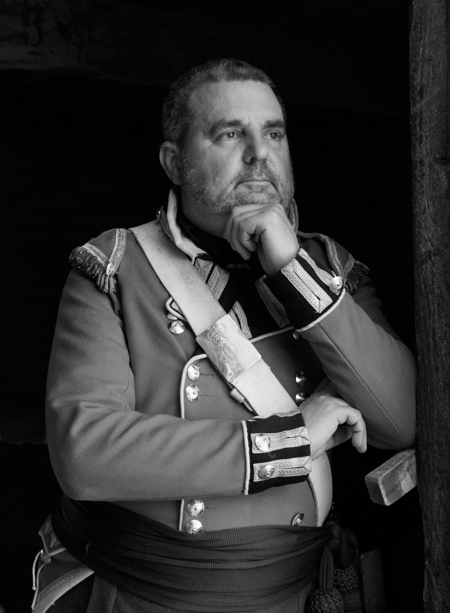
Is the texture alteration on forehead due to noise? I tried in PS using your B/W image. I think, there is some change. |
Aug 18th |
 |
1 comment - 1 reply for Group 83
|
17 comments - 7 replies Total
|