|
| Group |
Round |
C/R |
Comment |
Date |
Image |
| 1 |
Jul 19 |
Comment |
I liked the composition. The image is sharp and has good lighting. A little correction on levels and an yellow filter can make this more vibrant. |
Jul 5th |
1 comment - 0 replies for Group 1
|
| 5 |
Jul 19 |
Comment |
Excellent composite. All four items are perfectly matched. The motion blur on wheels is a 'Plus' to the image. Good work, well done. |
Jul 5th |
1 comment - 0 replies for Group 5
|
| 16 |
Jul 19 |
Reply |
Yes, now it looks far better. Well done. All the best. |
Jul 24th |
| 16 |
Jul 19 |
Comment |
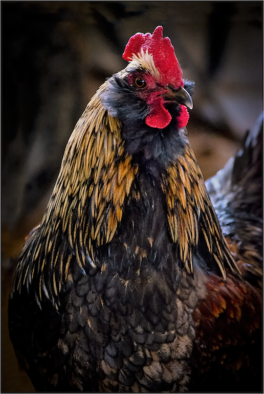
Beautiful image of a Rooster. The catch light on the eye looks good and you can enhance it more. I think you have to darken bright feathers on the middle portion of the bird. You can also try to give more details on face. (I am unable to open the file in Photoshop, hence tried with Windows10 photo software to clarify the face) |
Jul 23rd |
 |
| 16 |
Jul 19 |
Comment |
Colorful image. The lighting from right side looks good. The left side is a little dark and details are missing. I think trimming more from left side and addition of a little more space on right side may look better like Joan's suggestion ( but I may trim more from left side) |
Jul 23rd |
| 16 |
Jul 19 |
Comment |
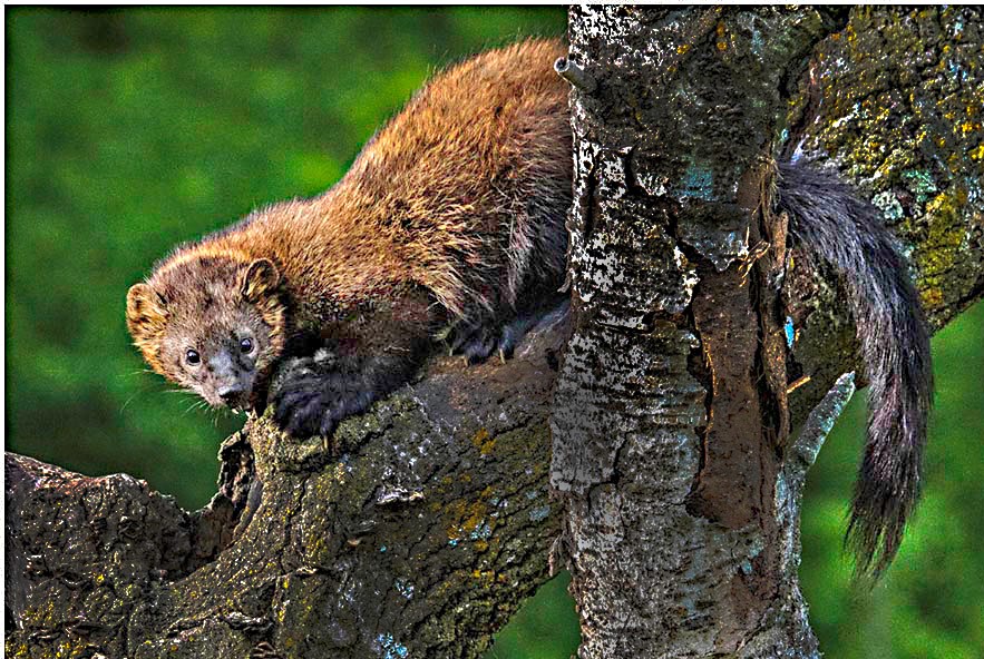
Nice capture of marmot. The image is sharp and marmot's face has nice lighting. The blurred background looks good. The center branch is bright and I think it can be darkened. I tried a quick one and used dodge option to lighten the dark areas on the animal body. I also trimmed a little from top and right. |
Jul 23rd |
 |
| 16 |
Jul 19 |
Reply |
There was a display board in front of this. To avoid that I did not include the flooring and feet. Further, I wanted a 3D picture of this so did not change the angle. |
Jul 11th |
| 16 |
Jul 19 |
Comment |
Good execution of Clone stamp and content aware. The smaller aperture has kept the full length of bones in good sharpness. I think you have isolated the 100% of the bones from the background. It is nice to see the flipped image. The only suggestion is that the color of the bones may be modified to more near to white. I think you should have decreased the blue tone and adjusted levels in the original before processing the clone stamp and content aware. |
Jul 4th |
| 16 |
Jul 19 |
Comment |
A nice nature shot. I liked the composition. Lighting, to me, looks good. The image is sharp and the details in the cliff rock are very clear. Yes, a vertical shot would have been better. Your post processing is excellent. |
Jul 4th |
| 16 |
Jul 19 |
Comment |
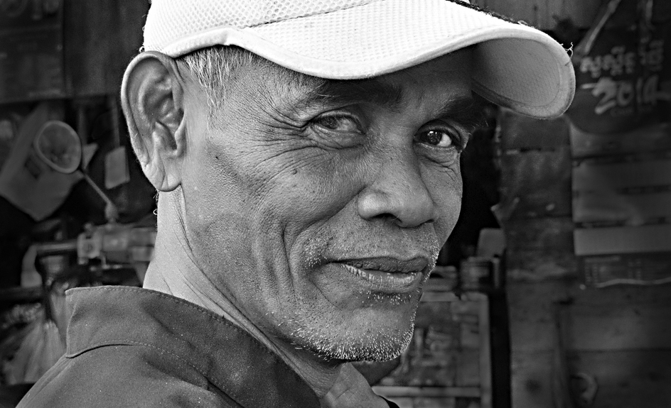
Nice character study. I liked the expression on the face. It is good that you converted the image to monochrome. The vignetting looks good. The bright area in front of the face is a distraction. Try to burn it down. A quick trial is attached with a little trim on right side. |
Jul 3rd |
 |
6 comments - 2 replies for Group 16
|
| 28 |
Jul 19 |
Comment |
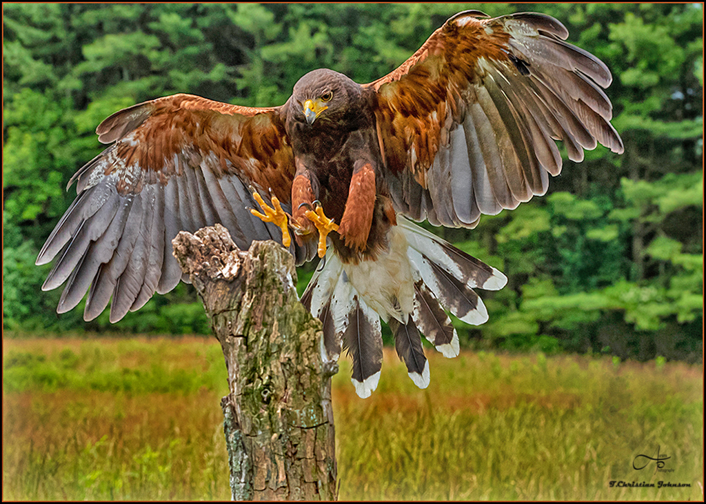
Beautiful image of the landing Hawk. The image is sharp and composition look good to me. The body of the bird is a little dark, but this can be corrected by Shadows option in PS or other software. (I tried a quick one and the resulting image is given) |
Jul 3rd |
 |
1 comment - 0 replies for Group 28
|
| 29 |
Jul 19 |
Comment |
Nice Patterns. The image is sharp and has nice colors. A small green leaf at one-third position on left pointing to right top corner will add interest to the image. |
Jul 3rd |
1 comment - 0 replies for Group 29
|
| 68 |
Jul 19 |
Comment |
The image has nice depth. I liked the lighting at the background. The image is less sharp. I think addition of a center of interest may be good idea. |
Jul 23rd |
| 68 |
Jul 19 |
Comment |
Yes. The building is made of stone bricks. The bells are made of bronze. Old bronze bells have changed color due to corrosion and now look almost like bricks. Some new bells have the golden color |
Jul 19th |
| 68 |
Jul 19 |
Comment |
Excellent creative 3D. I liked your composition. Colors and sharpness look nice. Good work. No suggestions
|
Jul 10th |
| 68 |
Jul 19 |
Comment |
Yes, the Pineapple fruit pops out. There is good 3D effect. The leaves of the same plant, which pop out looks OK. Whereas the two leaves towards in front of the plant which is touching window frame have window violation. You could have avoided it. |
Jul 10th |
| 68 |
Jul 19 |
Comment |
Nice 3D image. Beautiful colors and composition. Lighting lokks good to me. I feel, you can think of cloning out of the two wires on right side above the building roof |
Jul 10th |
| 68 |
Jul 19 |
Comment |
Beautiful image of the Old Faithful Geyser. I liked the composition. To me, the two ladies in the foreground are in front of the window. This minor window violation can be corrected. I would have cropped a little more sky. A quick trial of the above points done and attached below. |
Jul 10th |
 |
6 comments - 0 replies for Group 68
|
| 88 |
Jul 19 |
Comment |
Nice composition. The colors look great. I did not like the sky, as the patterns in sky look un-natural. |
Jul 1st |
| 88 |
Jul 19 |
Comment |
Beautiful image. I liked the colors and composition. It is good that you removed the unwanted speakers. I think the two thin black wires on top middle and left side also need to be cloned out. Good work. |
Jul 1st |
2 comments - 0 replies for Group 88
|
18 comments - 2 replies Total
|