|
| Group |
Round |
C/R |
Comment |
Date |
Image |
| 16 |
Jan 19 |
Comment |
Beautiful. Excellent pet portrait photo. It is good that you removed the basket from the image. The directional light from the window, to me, looks nice. The image is sharp and I liked the correction in cry line. I too suggest the flipping the image horizontally for a positive impact. |
Jan 19th |
| 16 |
Jan 19 |
Comment |
Nice composition. I liked the tunnel look and this type of image is great for 3D. The post processing looks good to me. |
Jan 19th |
| 16 |
Jan 19 |
Comment |
A very good story telling image. Your post processing looks good to me. I think a little burning of grass on right side may look better. The straight cutting of croton leaf tips on the left side, to me, looks unnatural, as the wall is far behind. |
Jan 19th |
| 16 |
Jan 19 |
Comment |
Great mobile photo. I liked the pattern created by the reflection. The image is sharp and have nice lighting. I would have trimmed the right side a little to remove the normal building portion visible. |
Jan 19th |
| 16 |
Jan 19 |
Comment |
Nice landscape. I liked the natural colors. The cropping and composition look good to me. I also liked the way Terry has made two pictures from this one. Nice shot. |
Jan 19th |
5 comments - 0 replies for Group 16
|
| 53 |
Jan 19 |
Comment |
Nice image. I liked the composition and perfect trimming. I suggest a little level correction. (A quick trial image attached. I also used 25% yellow filter in photoshop) |
Jan 3rd |
 |
1 comment - 0 replies for Group 53
|
| 68 |
Jan 19 |
Reply |
As most of the members suggested that the floating deck is a distraction, I will try to trim the image to avoid the distraction. Thanks for the valuable comments. |
Jan 23rd |
| 68 |
Jan 19 |
Reply |
The green color is due to difference in depth of the sea, here it is very shallow, just one to two meters only. |
Jan 23rd |
| 68 |
Jan 19 |
Comment |
Great image. I liked the 3D effect. To me, the image is sharp with nice lighting. I have no suggestions except mild window violation. Good work. |
Jan 23rd |
| 68 |
Jan 19 |
Comment |
Yes, to me, it is a good 3D image. The image has nice depth and it looks sharp to me. The light looks flat and I would have adjusted the color contrast as well as brightness. |
Jan 23rd |
| 68 |
Jan 19 |
Comment |
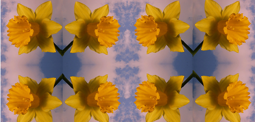
Very nice effect. The image has nice depth, colors and lighting. To me, there is some blue distraction between the mirror images. As most of the members commented about stems not coming together, I tried a quick trial in photoshop by cutting the image into 4 and rearranging them. But now the reflections are on different planes!! |
Jan 23rd |
 |
| 68 |
Jan 19 |
Comment |
Very nice landscape in 3D. I see nice depth in the image. The colors look natural in the side-by-side image. The anaglyph image shows green sand, I think you might have used 'Dubios (red/cyan)' anaglyph of SPM. I feel Half color red/cyan or Optimized anaglyph may look better. |
Jan 23rd |
| 68 |
Jan 19 |
Comment |
Excellent creative image. I appreciate your hard work and patience. The image has nice depth and the composition looks good to me. I do not have much experience in creative 3D image preparation and getting a little confused in fully understanding the steps you mentioned!! |
Jan 19th |
5 comments - 2 replies for Group 68
|
| 79 |
Jan 19 |
Reply |
Yes I remember the image. I think it is using radial blur of PS. I have posted a similar image for the month of Feb, 2019 in Group-16, using an image I posted in April, 2015. Here I used 3 layers and later deleted one. I think if one needs gradual blur, you can make it in more layers at different levels and delete the area at different thresholds in different layers. (The Feb, 2019 image is already available on site for viewing. You can post your comments from Feb 1st onward) |
Jan 26th |
0 comments - 1 reply for Group 79
|
11 comments - 3 replies Total
|