|
| Group |
Round |
C/R |
Comment |
Date |
Image |
| 63 |
Apr 21 |
Reply |
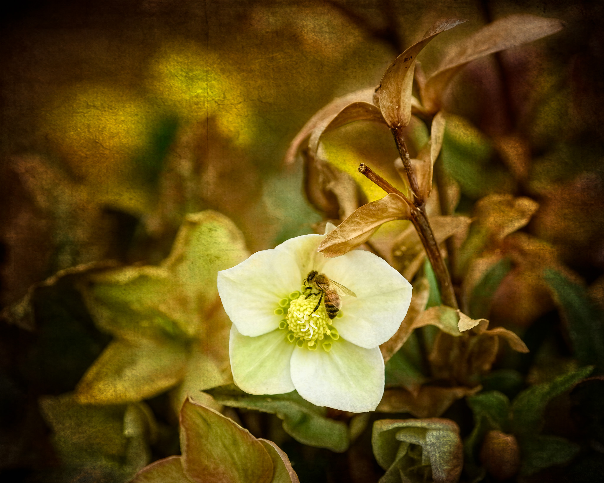
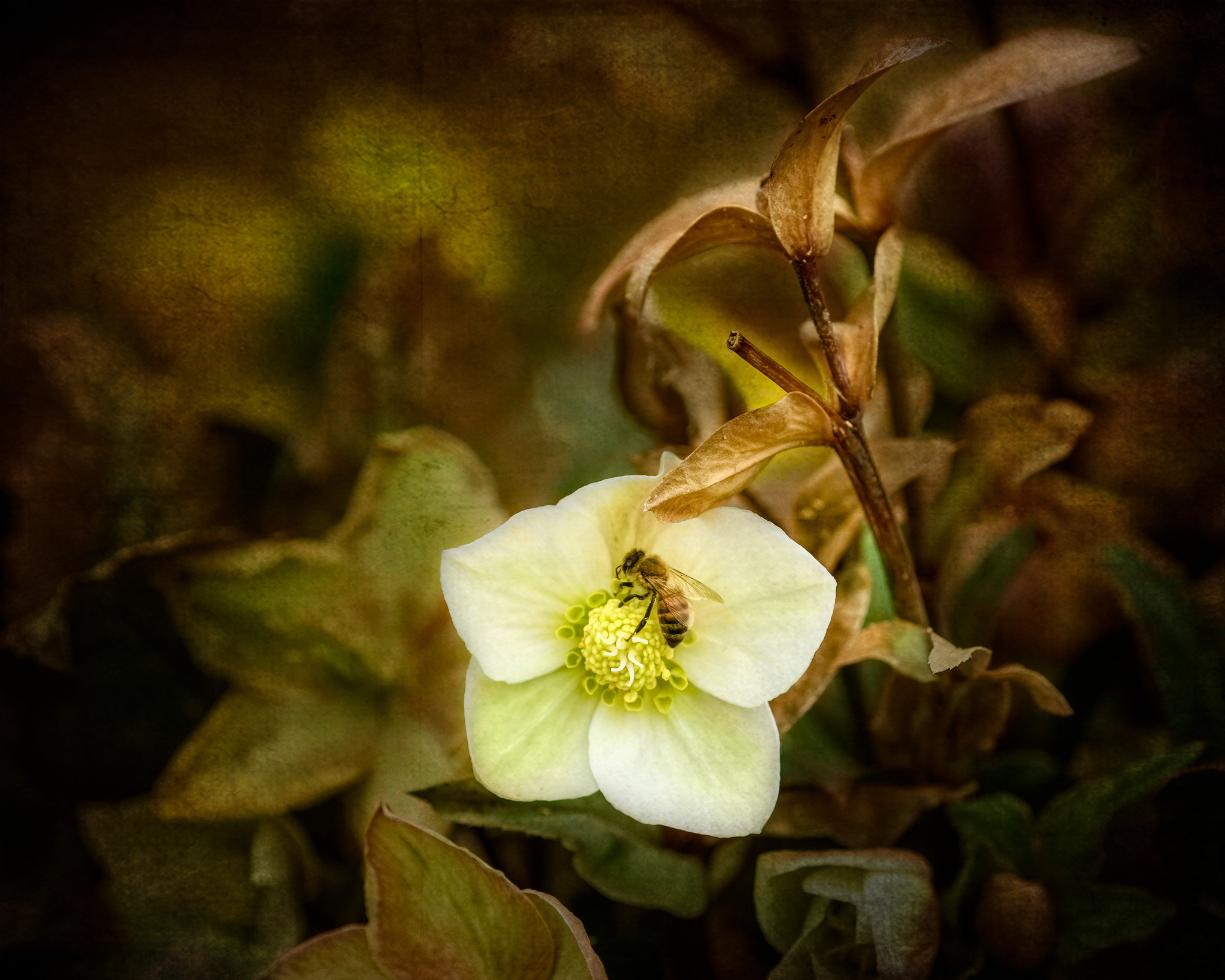
Good idea. I have a radial mask over the background already, but with some experimentation (spurred by your comment) I realized I didn't go far enough. Here's the current edit. |
Apr 10th |
 |
| 63 |
Apr 21 |
Comment |
Love the color of the tulip, it's placement in the frame, and just enough stem to anchor it. A beautiful specimen.
At the risk of offending, I'll point out that the background is not a complementary color. If it were, it would be blue-ish. What we have here are analagous colors.
Due to the color, I am not a fan of that background. For my eye, it seems to soft, and too close to the flower color, to be effective. Have you considered something a bit more textural? (Again with the demo image.... just say no if you'd rather I didnt') I've attached a modified version that, for me, provides a bit more contrast while keeping the same basic color. I also added a slight shadow behind the flower. I toyed with blue, but couldn't arrive at anything that made sense. Moving toward tan seemed to be helpful.
Great focus on this flower. That Tamron 90mm is popular :-)
Well done! |
Apr 10th |
 |
| 63 |
Apr 21 |
Comment |
Love the colors and tones which create a wonderful mood. Nice!
Love being able to see the life of this leaf in the details. I would like this to be sharper at this larger size; taking this to PS to see it at its actual 1024px on the long edge makes it look much better.
I'm not convinced about the pine needle. I'll agree that an acorn or two might make more sense. As it is, it just seems disconnected, and superfluous. I think you want us to consider the oak leaf.
I wrote a comment stating that I'd like to see the leaf turned clockwise against the background. But then I though, "turn the background". I'll be bold enough to attach a quick edit demonstrating the idea. If you object, no worries, just say so, and I'll never edit again. |
Apr 10th |
 |
| 63 |
Apr 21 |
Comment |
Excellent composition, love the colors. I think the best thing about this is the lack of clues as to size. Those blossoms could be 2" across, or 1/2". And there is lots to look at here. The limited color palette is super, as well.
Really lovely intimate landscape. Depth of field captures everything that is needed. I'd like to see a bit of vignette to darken the edges (there are some bright areas), and I wonder what some D&B on the sedum (not the blossoms) as well as the stones would do to add some drama to the image.
Cool find. Well done. |
Apr 10th |
| 63 |
Apr 21 |
Comment |
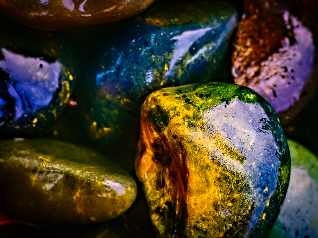
I initially thought those were horses' hooves. Bedazzled. Ew.
You appear to have captured the color and detail beautifully. I'll assume a larger image would read better.
Did you try moving to your right, and take a shot at an angle? For me, the most interesting item is the center triangle on the right. One wonders if a different perspective might make it more of a focal point?
I like the color here, not too warm, and likely very representative of the exhibit. |
Apr 10th |
| 63 |
Apr 21 |
Comment |
Very clever capture. Have not seen that behavior in a non-hummer before.
Love the color: bold and honest. It is, for me, hard to tell if the head is as in-focus as the plant. Given the suitably dark background, I might suggest lightening the head (exposure, lift the shadows) to bring more attention to it. Or at least get it on par with the plant. And adding some brightness to the eye would help keep attention on the bird.
I like the square crop here, along with the strong diagonals in the background.
Amazing that even 1/3200s couldn't freeze the wings. It really is working hard! |
Apr 10th |
| 63 |
Apr 21 |
Comment |
Ew. :-D
The detail is fantastic, and the light and color excellent. Really well done, IMO.
The tricky part when doing shots like this is deciding how to handle the background when it's out of focus. For me, since those body parts are quite close, the blur is a bit odd. Since you got so much of the insect in 40 shots, one wonders what 80 slices would have done?
That said, the background is not, for me, distracting. I think the image draws focus precisely where it needs to be: the eyes, "face", and legs. |
Apr 10th |
6 comments - 1 reply for Group 63
|
6 comments - 1 reply Total
|

