|
| Group |
Round |
C/R |
Comment |
Date |
Image |
| 63 |
Mar 21 |
Comment |
Love the composition; excellent idea.
The background looks odd to me, along the top stem, as mentioned by Murphy. Not sure what that color change is. The light spilling onto the foam board? A card to protect the strobe might do the trick.
I also find the upper half of the image to be hazy... maybe it's just me? Dehaze to crisp it up, and deepen the yellow and green might be advantageous. Or maybe not. Just a thought. Perhaps some margin on the left and top, too, to match the bottom?
A lovely image, and super idea. |
Mar 28th |
| 63 |
Mar 21 |
Comment |
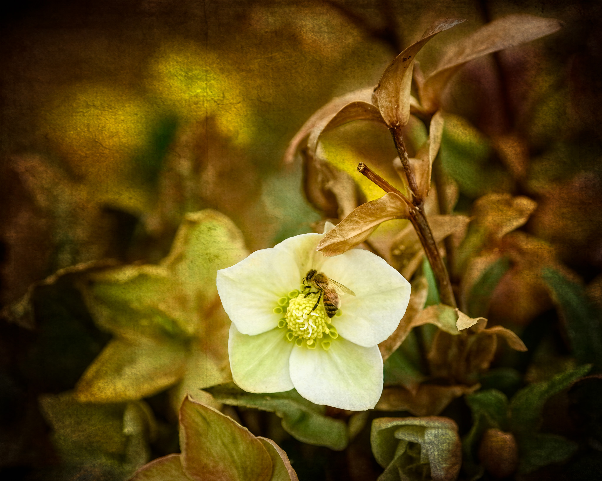
Excellent detail. Poor spider.
I've been looking at getting a focus rail and Helicon. Nice to see what they can do. |
Mar 28th |
| 63 |
Mar 21 |
Comment |
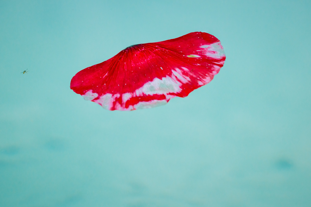
Beautiful detail here. I find that a 5x4 crop (losing a bit off the left and bottom, and quite a bit off the right (no background at all), strengthens the image. Or try a vignetted to darken the edges. As-is, my eye keeps going to the background on the right (the sharp/soft contrast). |
Mar 28th |
| 63 |
Mar 21 |
Comment |
+1 on a white border/edge to your image. Needs to mark the extent of the image.
Focus stacking worked very well. I find the light and color a bit flat (histogram agrees with me), but I understand that wasn't the point. |
Mar 28th |
| 63 |
Mar 21 |
Comment |
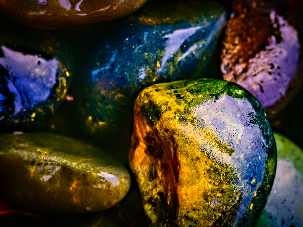
For me, based on the direction of the light, as well as the shapes, I would rotate CW and crop to 4x5, losing part of the left side.
Why? The composition seems top-heavy to me. The main interest seems to be in the top 2/3s of the frame, making the bottom portion less integral. Rotation seems to solve that problem, and keeps my eye in the middle swirl.
Again, for me.
|
Mar 28th |
5 comments - 0 replies for Group 63
|
5 comments - 0 replies Total
|