|
| Group |
Round |
C/R |
Comment |
Date |
Image |
| 75 |
Jul 21 |
Reply |
I would also slightly decenter the beefly ,leave leading lines on the left It would look better then smack in the center |
Jul 11th |
| 75 |
Jul 21 |
Reply |
thank you ...indeed it looks better |
Jul 11th |
| 75 |
Jul 21 |
Comment |
I indeed had to look twice ...what an amazing place .I don't personally think you need a tighter crop ...the mountainside in the front distracts because of its color in the last photo so to my eye original 2 feels better .I would decrease the red tinge even more but darken the front and the back mountain...just try and see... |
Jul 10th |
| 75 |
Jul 21 |
Comment |
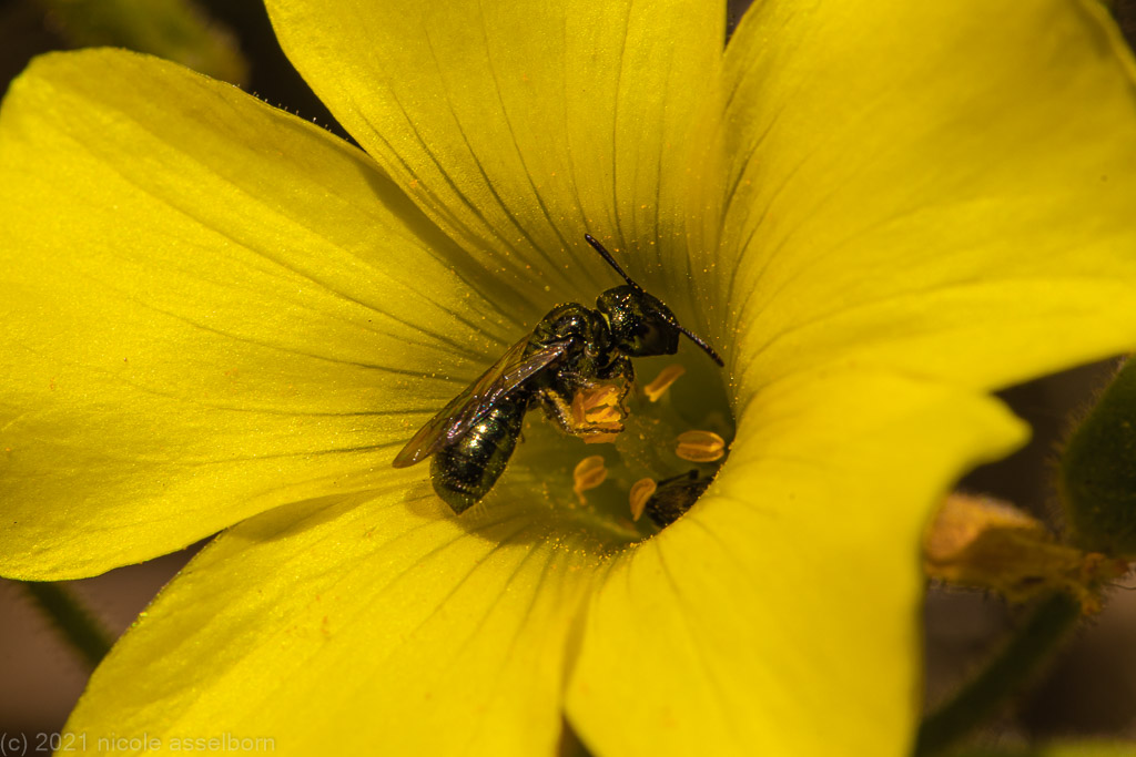
after looking at all your photos ,I realized that I also had not cropped as tight as I could have ,gotten rid of the stem and focused on the bee and pollen more |
Jul 9th |
| 75 |
Jul 21 |
Comment |
I am glad you increased the red color ,the contrast is pleasing to the eye and the reflection is great.the sky by contrast is bland ..its reflection orange ..was it sunset? ,it would also look great without the bridge |
Jul 9th |
| 75 |
Jul 21 |
Comment |
very very nice ,leading lines are great ,the shadows are perfect and add to the image .Maybe a little too much sky |
Jul 9th |
| 75 |
Jul 21 |
Comment |
my favorite insect ..I have spent many hours tracking the fast flying dragonflies .A beautiful shot ..cropped well still slightly out of focus to my eyes ,the higher contrast works well .I wonder what would happen if you cropped even closer to the "face " |
Jul 9th |
5 comments - 2 replies for Group 75
|
5 comments - 2 replies Total
|