|
| Group |
Round |
C/R |
Comment |
Date |
Image |
| 77 |
Dec 22 |
Reply |
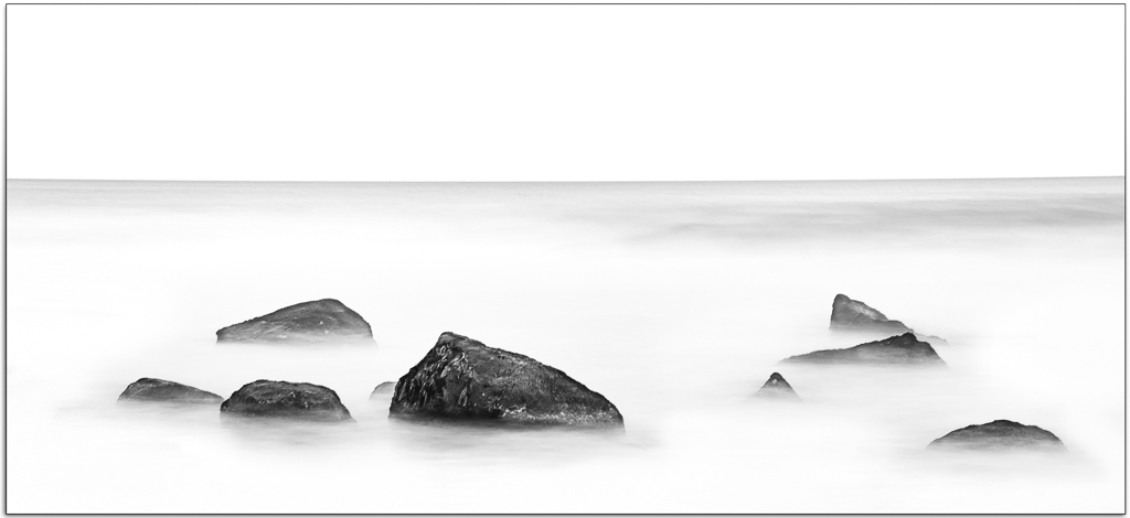
Thanks Carol. I see your point and like the idea of reducing opacity to give a sense of distance. I will absolutely give that a try. |
Dec 22nd |
| 77 |
Dec 22 |
Reply |
Thank you for your extremely kind comments Connie. |
Dec 22nd |
| 77 |
Dec 22 |
Reply |
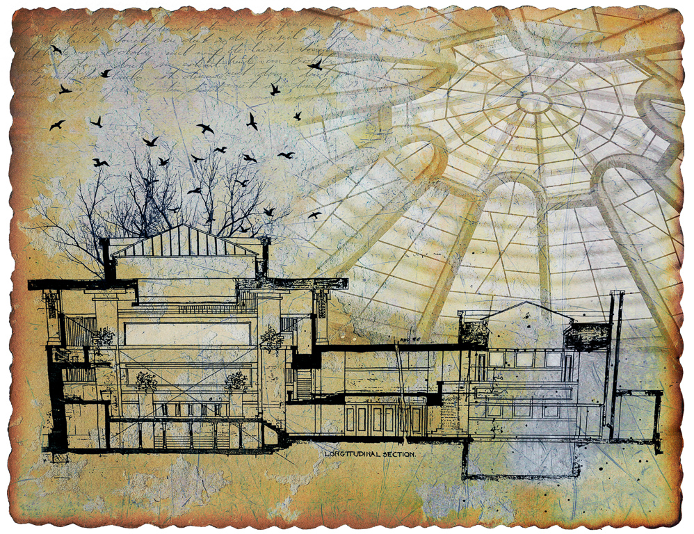
Thanks Denise. Your comments echo my sons observations. When I started this piece, I had a bigger project in mind and the image I posted was a postcard lying on top of this larger image. My wife suggested that I just develop the "postcard" piece of the work and I moved in that direction but kept the postcard edges. I can see now that it really makes no sense in this context - thanks for your confirmation. |
Dec 15th |
| 77 |
Dec 22 |
Reply |
Thanks Stephen. We certainly are fans of Frank and I can completely understand your reaction to Falling Water - what a spectacular space. I can highly recommend Taliesin - you will not be dissappointed. |
Dec 15th |
| 77 |
Dec 22 |
Comment |
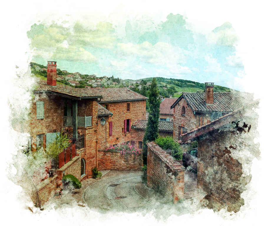
What a beautiful scene - so calm and inviting. I like where you have taken this image and how you have softened it. It already looks like a painting and I think lends itself to possibly going further with that look. As you used Topaz you might take your final image back into Topaz and play with AI Remix. It's one of my favorite tools for achieving a painting effect. I really liked the Rosy Haze preset on this image. Use the opacity slider to season to taste. Just a thought for further exploration. |
Dec 15th |
| 77 |
Dec 22 |
Comment |
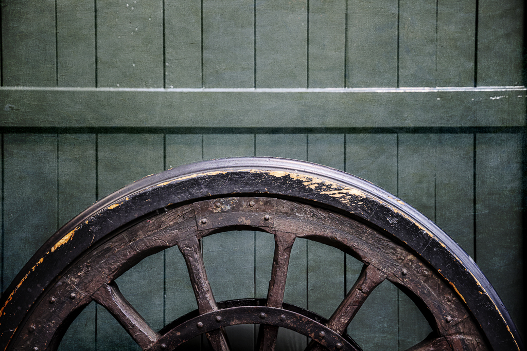
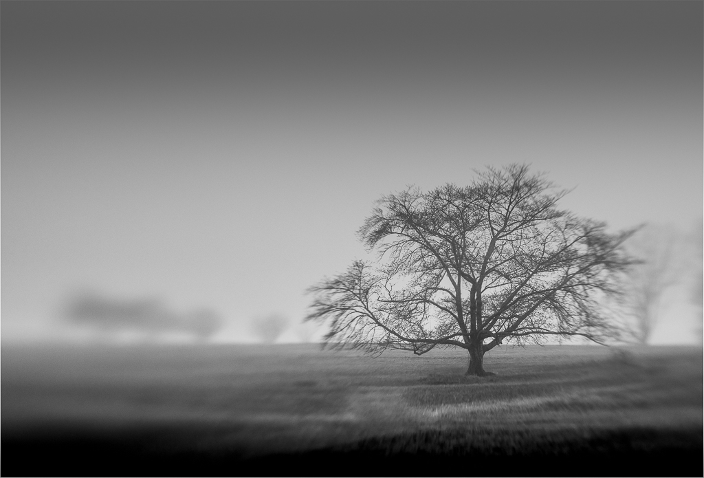
You have captured a beautiful image here Carol. Your B&W conversion is well done and flipping the image provides nice leading lines from the power lines. I really like your processing. I typically like to see blacks and whites in a B&W image but your original image contains mostly midtones. I might try to darken the sky to bring in a few more blacks but it works perfectly well as is. |
Dec 15th |
| 77 |
Dec 22 |
Comment |
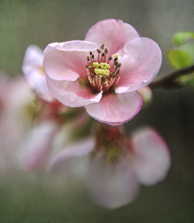
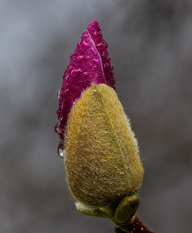
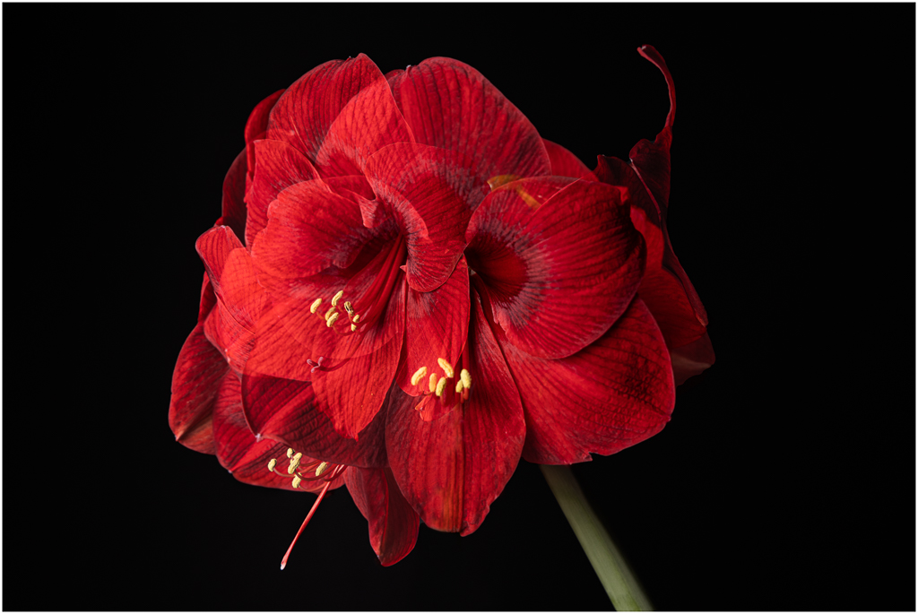
This is a beautiful image Connie. I love all the detail in your capture and can see why you wanted to work with this image. The colors in your original are beautiful but I think your B&W conversion has resulted in a much stronger image.
I agree with Denise that a bit of stem would help to ground the image and I like how she has cleaned up the background leading to more visual impact to my eye. |
Dec 14th |
| 77 |
Dec 22 |
Comment |
This is a great example of taking an image to an entirely new level Linda. I like your processing which really takes us back into a past era. I do agree with Denise on removing the trash can. |
Dec 14th |
4 comments - 4 replies for Group 77
|
4 comments - 4 replies Total
|