|
| Group |
Round |
C/R |
Comment |
Date |
Image |
| 77 |
Aug 22 |
Comment |
You have captured a fantastic image Mary. As Denise says, it has this otherworldly appearance that your processing has brought out. I can see this on the wall easily - well done. |
Aug 9th |
| 77 |
Aug 22 |
Reply |
See my comments and revised image below. |
Aug 8th |
| 77 |
Aug 22 |
Reply |
I like your version Linda and tried to move more in that direction. See my comments and revised image below. |
Aug 8th |
| 77 |
Aug 22 |
Reply |
See my comments and revised image below. |
Aug 8th |
| 77 |
Aug 22 |
Reply |
See my comments and revised image below. |
Aug 8th |
| 77 |
Aug 22 |
Reply |
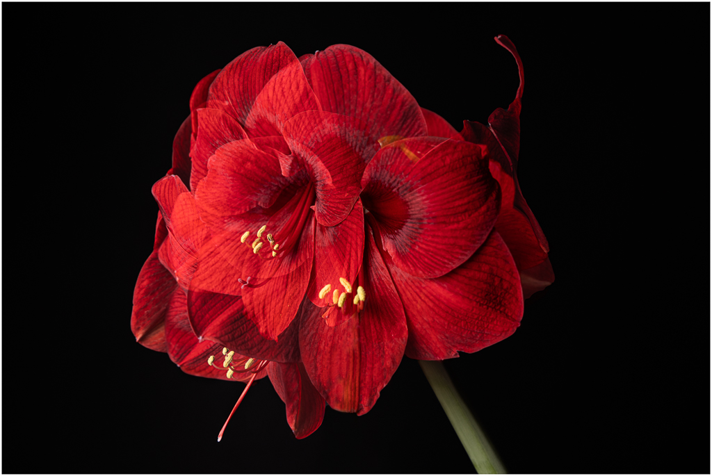
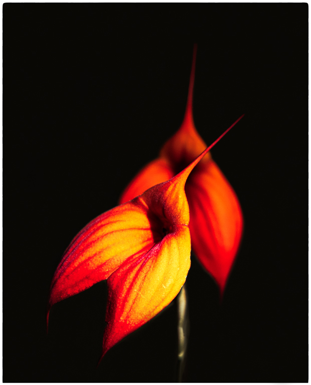
Here is the next version of my image. All the texture has been removed from the flower but I used Carol's suggestion of toning the flower by applying Average Blur to the texture. I think this worked very well. Without the toning the flower looks stark and unnatural with the rest of the image to my eye. I played with a darker vignette but didn't like the way it was turning out in my hands so went with what you see. Thanks for all of your suggestions! |
Aug 8th |
 |
| 77 |
Aug 22 |
Comment |
Thanks for a great idea Carol. I have not tried using Average Blur to apply toning without the texture and will definitely give this a try. |
Aug 6th |
| 77 |
Aug 22 |
Reply |
Thanks Linda. I like your version and will darken my vignette as I rework this image to take into account all of the good feedback I have received. I might have the final vignette fall somewhere between my original and yours. Thanks. |
Aug 6th |
| 77 |
Aug 22 |
Reply |
Thanks Connie. I normally never let my textures bleed onto my flowers and understand your perspective. In this case, as I masked out the texture on the flower I thought that it not sit as well in the image and so I selectively brought some of the texture back. Nonetheless, I think everyone would like to see the original flower with no texture and I will absolutely give that a shot. |
Aug 6th |
| 77 |
Aug 22 |
Reply |
Thanks Witta and clearly the rest of the group agrees with your opinion. I plan to rework this a bit. |
Aug 6th |
| 77 |
Aug 22 |
Comment |
This is a very pleasing image Witta and your processing has helped give a very painterly quality - I agree with Connie that this has a Wyeth vibe going on.
The harsh directional lighting in the original is not consistent with the sky you have selected - look at the shadow on the lighthouse. With so many clouds we should expect softer light so I might select a sky with fewer clouds but it's a very minor point. A wonderful image overall. |
Aug 6th |
| 77 |
Aug 22 |
Comment |
You captured a really great image here Carol and I really like your processing. Your choice for a B&W conversion is a good one and your touch is very light. Your Original 2 is a great image as is but the B&W really gets the viewed more focused on this marvelous highland cow IMO. |
Aug 6th |
| 77 |
Aug 22 |
Comment |
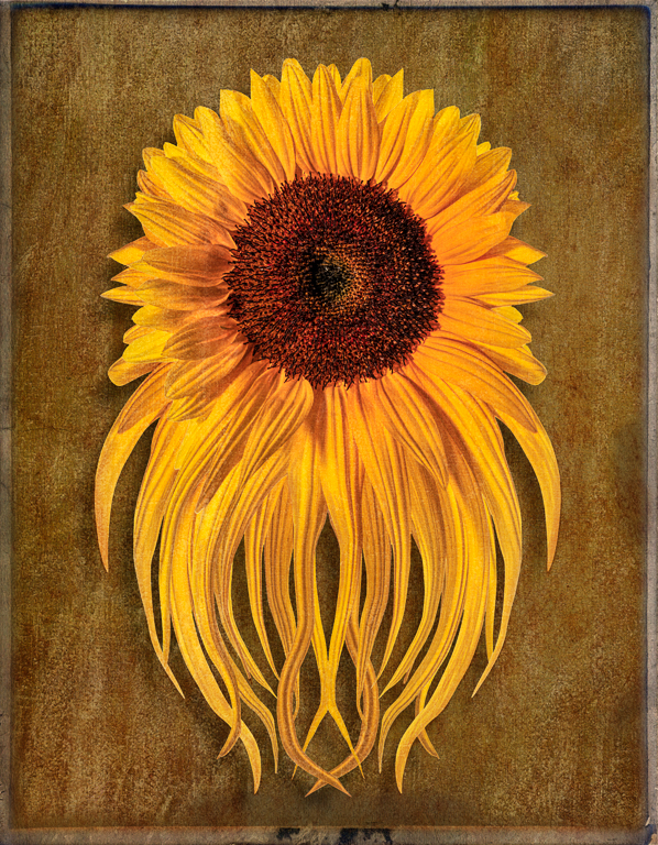
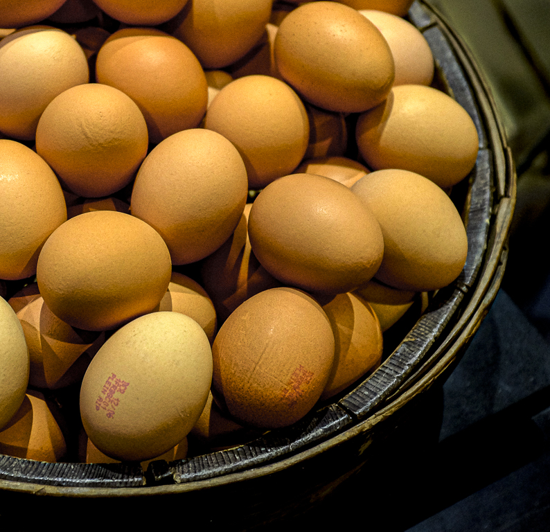
I like your idea of taking a "standard" photo and creating something special and think this would make for a fun image on a greeting card.
I might reduce the opacity of the drop shadow a bit to soften the effect. The black background makes for a dramatic image and works. Would a lighter texture work well here? |
Aug 4th |
| 77 |
Aug 22 |
Reply |
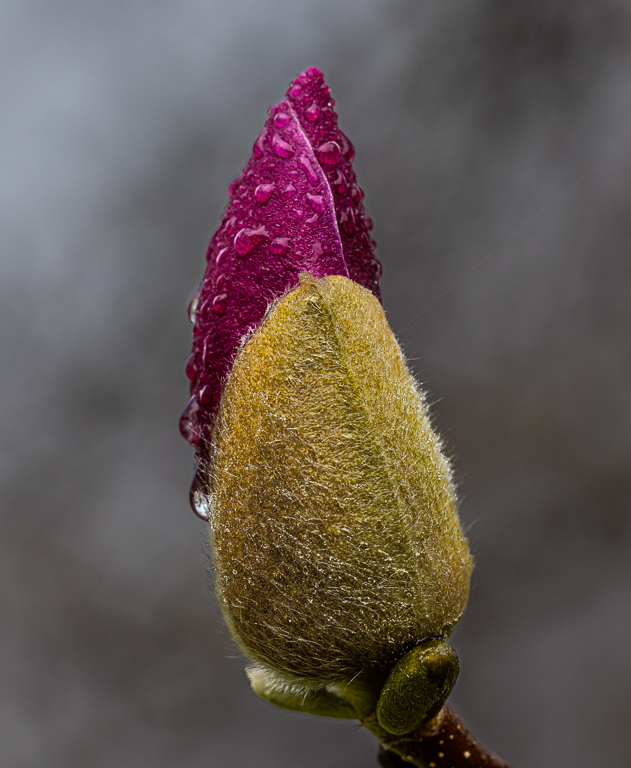
I think it looks a lot better Linda. Removing those distractions adds to the impact of this lovely image IMO. |
Aug 4th |
| 77 |
Aug 22 |
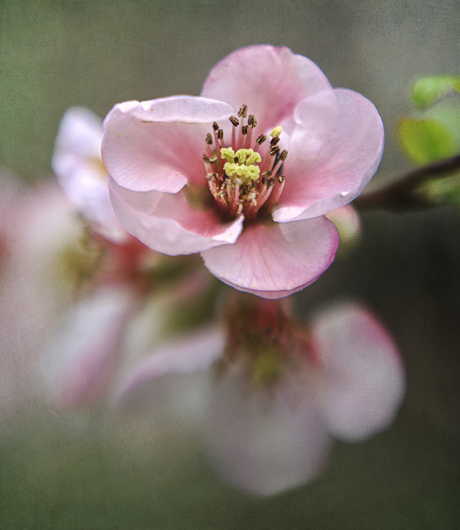
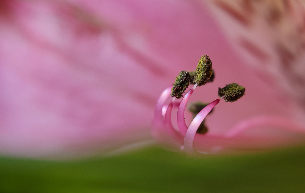
Comment |
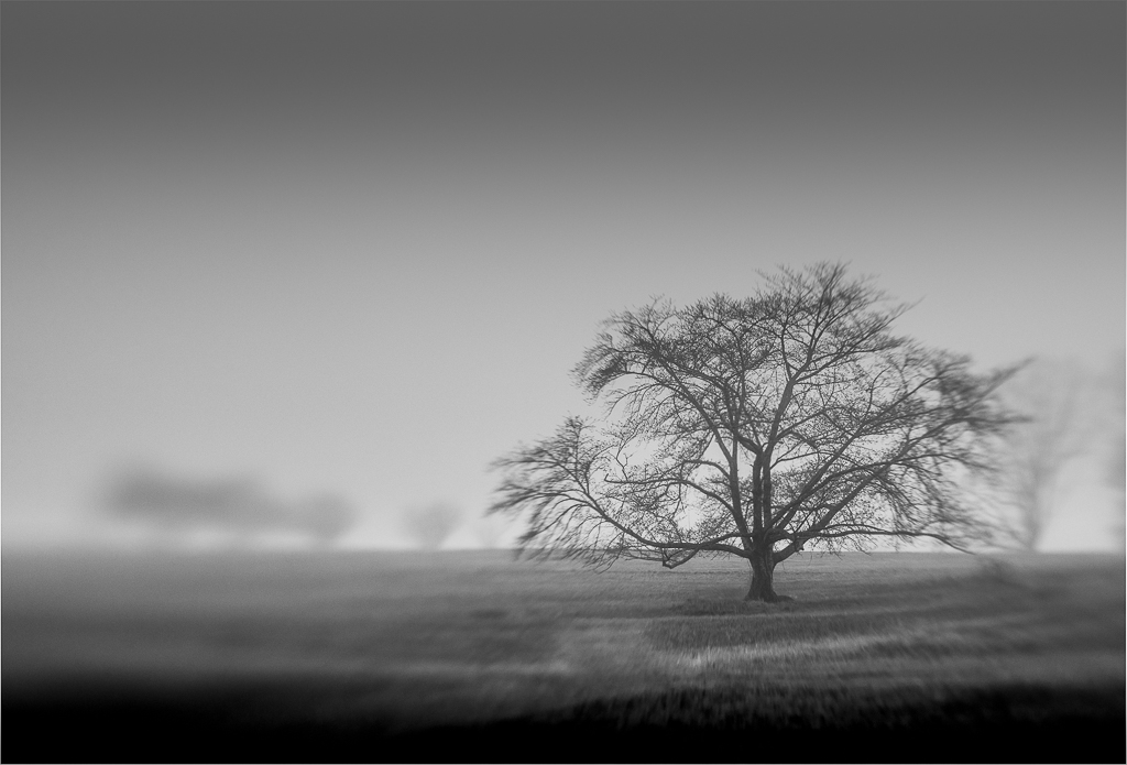
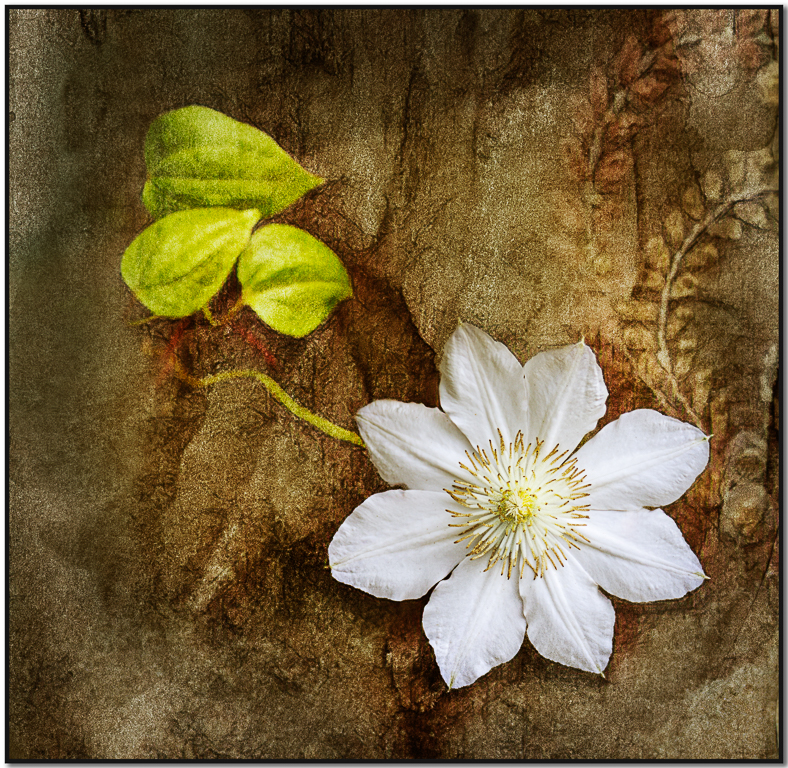
A beautiful image Linda. Your zoom did a lovely job of compressing the background and your treatment of the background is perfect for this image and adds a very ethereal look. Well done.
My only suggestion is that I might remove the two lower leaves either through cropping, cloning or a combination. They are pulling my attention away from the composition. |
Aug 4th |
6 comments - 9 replies for Group 77
|
6 comments - 9 replies Total
|