|
| Group |
Round |
C/R |
Comment |
Date |
Image |
| 77 |
May 22 |
Reply |
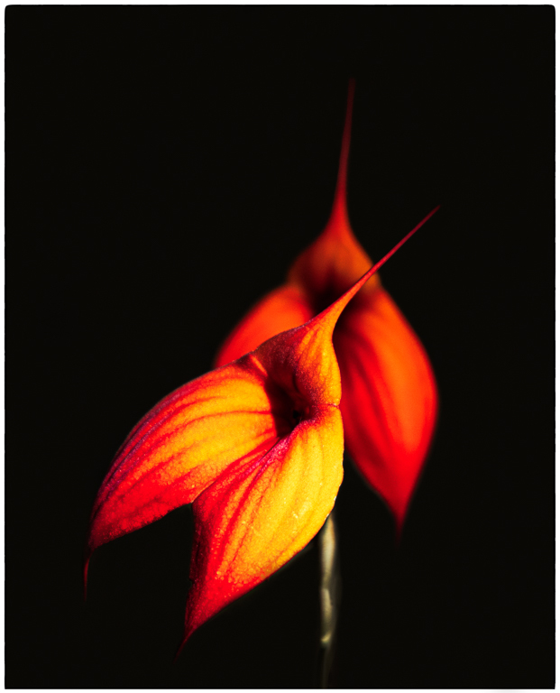
Thanks Denise. I agree that ghost koi need to …….well, be ghosty. I enjoy working with reflections and certainly will keep working here to find the right balance between detail and the ethereal. |
May 17th |
| 77 |
May 22 |
Reply |
Thanks Witta. I will be working more on this technique in the future with an eye towards capturing a little more detail in the fish. |
May 15th |
| 77 |
May 22 |
Reply |
Thanks Linda. It can be tricky to catch the fish at just the right depth to get the detail I would like. This was a fun technique to play around with and I'm sure I will return to the site and try and improve on my initial efforts. |
May 15th |
| 77 |
May 22 |
Comment |
I really enjoy images that use reflections and really like the abstract nature of your photo. The viewer needs to pause for a moment and try to absorb what we are seeing in your image. Nice warm colors and those repeating vertical lines really work here. Also, it looks like you get to regularly enjoy a beautiful view! |
May 14th |
| 77 |
May 22 |
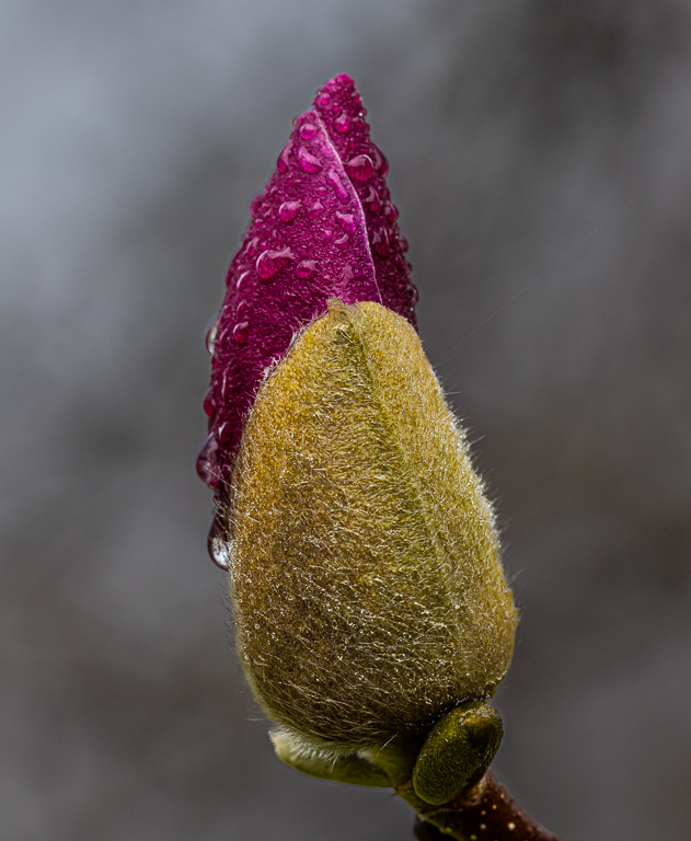
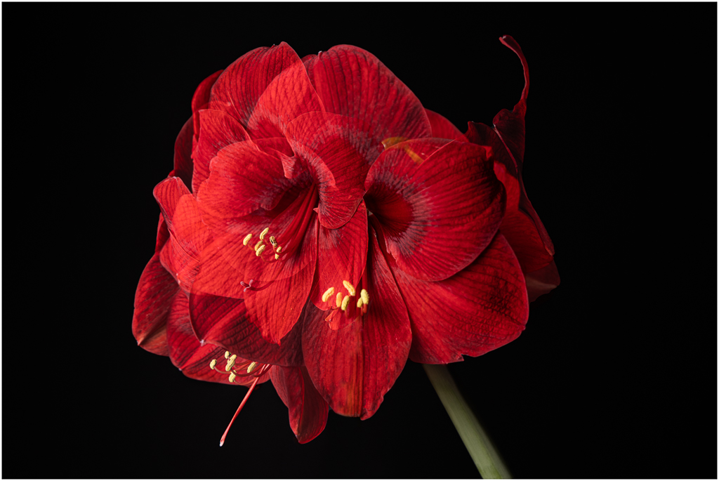
Comment |
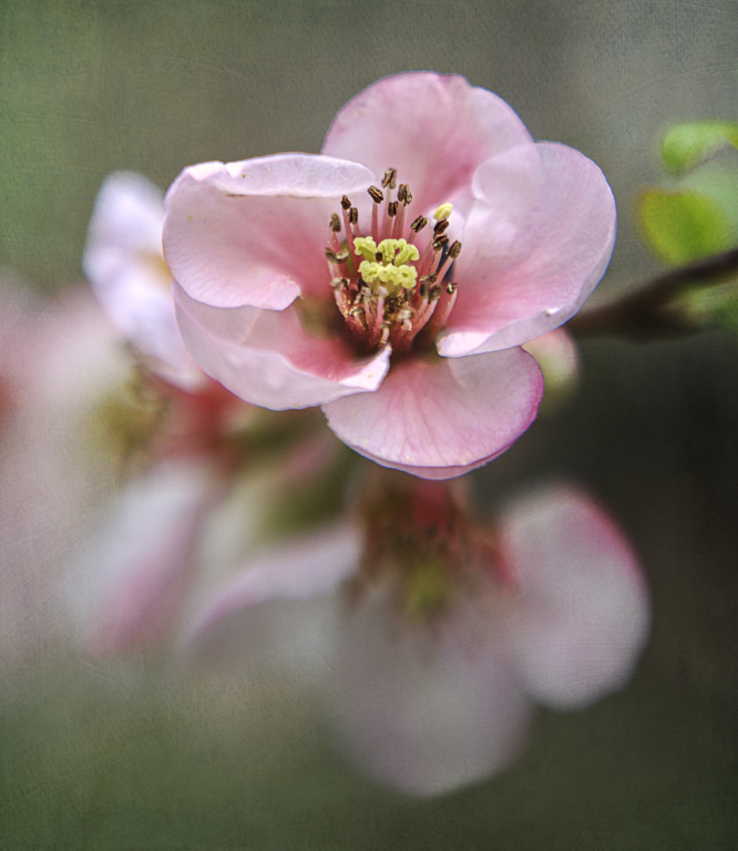
I really like your high key capture and all of the texture you have brought out in the flower petals. Like Linda, I quite like your Original 2 - particularly the color combination. I think this is definitely in the sweet spot of fine art photography.
My only suggestion for both your final image and Original 2 would be to darken your texture. I think this might make the flower pop a bit more but also help with a more dramatic presentation. |
May 14th |
| 77 |
May 22 |
Comment |
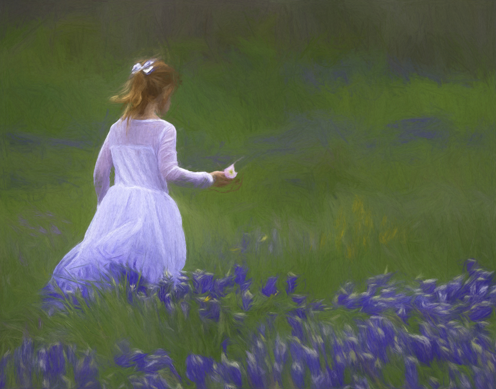
This is an absolutely beautiful image Linda - what a great capture. I think your processing here is perfect and does give the image a painterly quality. I brought your finished image into Topaz and used the Cezanne preset just to see what your photo would look like as a "painting". I like your effort better but can also see using Topaz to create some interesting looks for greeting cards. |
May 11th |
 |
| 77 |
May 22 |
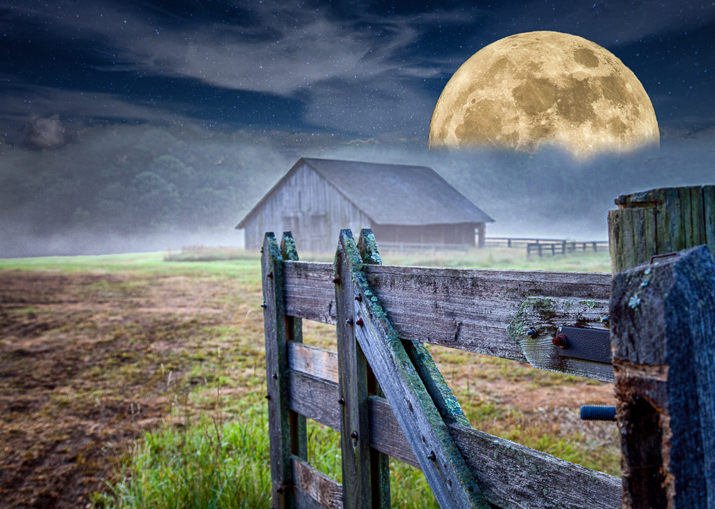
Comment |
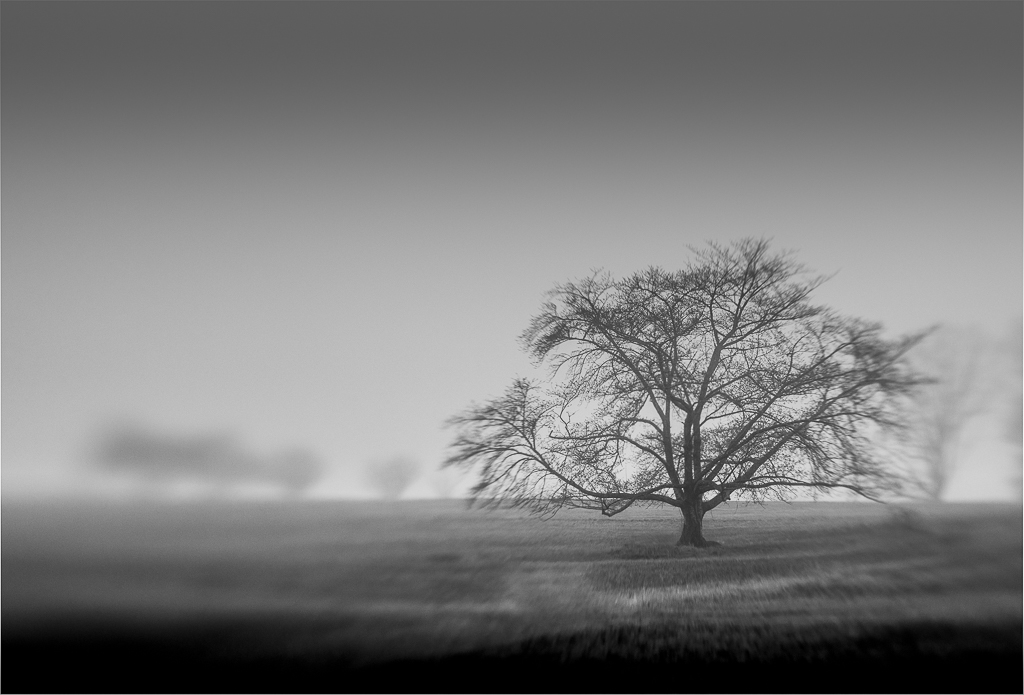
This is a nice composition with strong leading lines to draw us into your scene which is beautiful. I think your processing has brought a lot of life to the image but that maybe the sky is a little over baked. I would experiment with reducing the saturation or shifting the hue to see if that might result in a more natural look. |
May 11th |
| 77 |
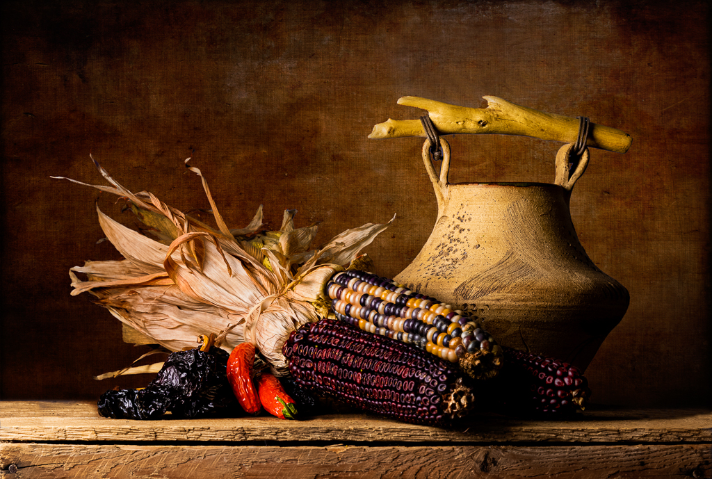
May 22 |
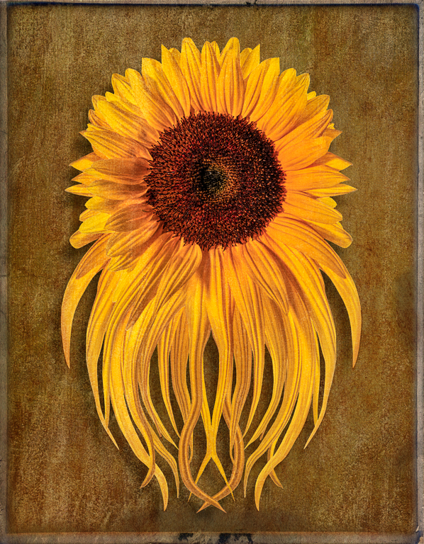
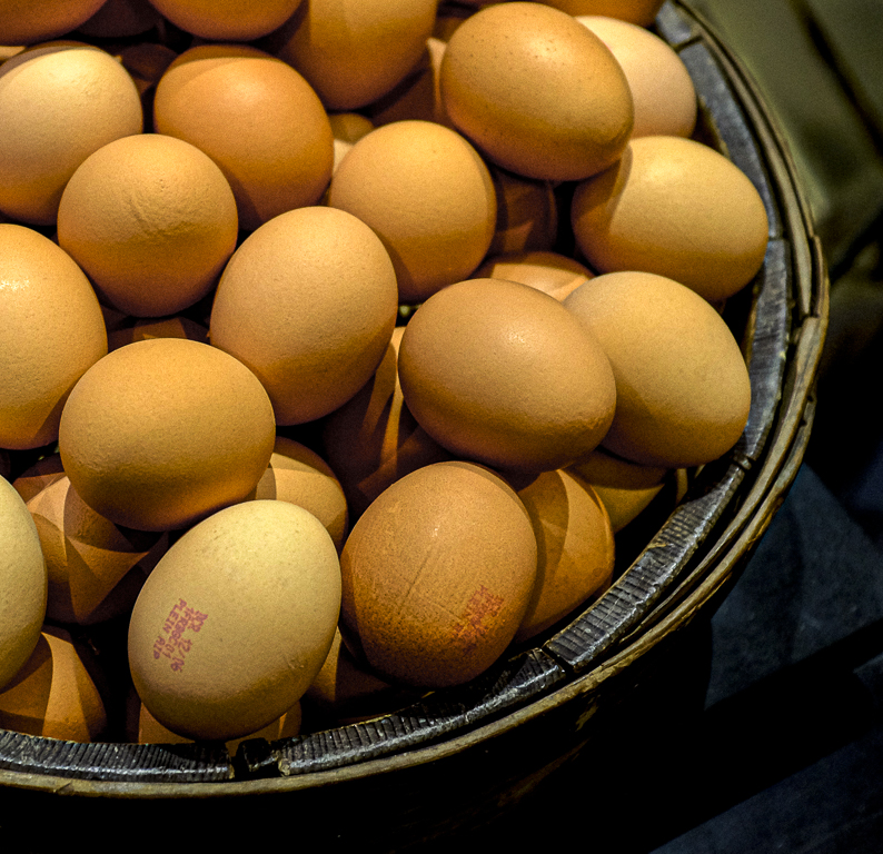
Comment |
What a very creative approach Denise! I love how you have taken the mundane and elevated it to fine art photography. I love all the detail in this image and absolutely see this printed and on the wall. Like Linda, I like the color in the original but feel your B&W conversion adds drama and accomplishes what you had in mind. Congratulations on your move and upcoming retirement - the next chapter is the best! |
May 11th |
5 comments - 3 replies for Group 77
|
5 comments - 3 replies Total
|