|
| Group |
Round |
C/R |
Comment |
Date |
Image |
| 77 |
Dec 21 |
Reply |
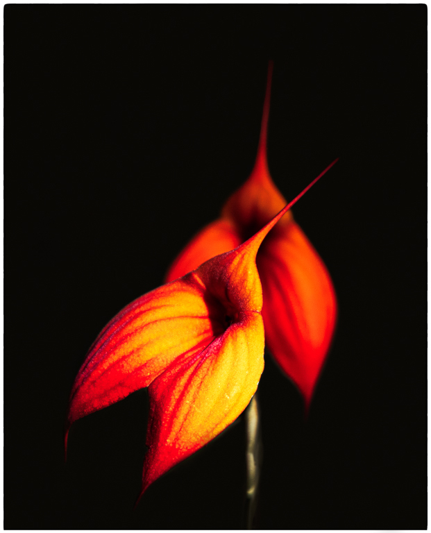
Your final edits have taken this image to the next level - it really is fantastic. The bottom of the vase adds a lot and the bubble in the bottom of the vase looks like a bubble that has snuck in from your background and provides such a unifying element. What you have done to fill the vase and particularly your work at the top results in an amazing image to my eye. Really well done Witta! |
Dec 23rd |
| 77 |
Dec 21 |
Comment |
Your original high key image is lovely and you have absolutely taken that image to the creative/altered reality zone. Your finished image is very festive and creative and thanks for sharing the details on your processing which has been very effective.
I would be interested in seeing what the image looks like with the bottom of the vase included. At the top left hand side of the vase there is a gap with no flowers which I might clone out. I think this image will do very well in competition in the creative category - well done. |
Dec 22nd |
| 77 |
Dec 21 |
Reply |
I did in fact use a reflector in my original shot but probably did not find the optimum angle as I was so focused on the vase and did not look around carefully enough at the rest of the image. I will pay closer attention on my next effort and see if I can solve this as I agree that another light can introduce the potential for harshness to creep in. Thanks. |
Dec 21st |
| 77 |
Dec 21 |
Comment |
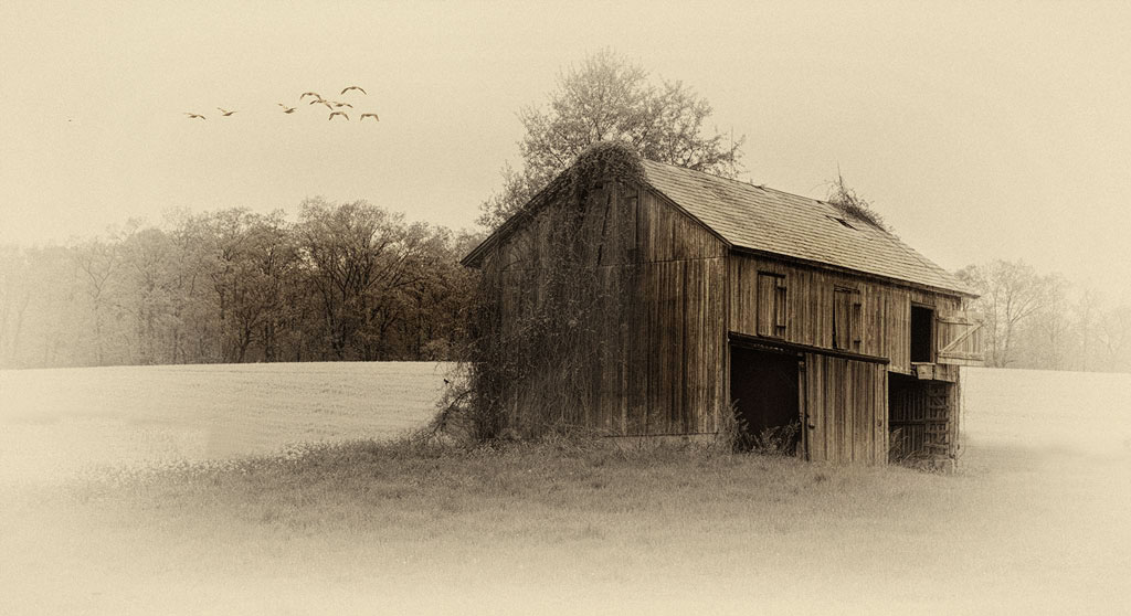
I really like what you have done with this image Connie. Your edits give the photo an "old timey" vibe that I'm sure is what you were going for. The addition of the birds really adds to the image and has been stated, draws your eye into the scene.
The only suggestion I might offer is that after your B&W conversion, it's no longer clear that there is canola along with grass. The yellow green contrast is obvious in the original image but lost here. Might cloning out the darker strip of grass on the left hand side of the barn lead to a more focused image? I took a crack at it and added a Curves adjustment layer to bring out a little more depth and detail to the wood of the barn. |
Dec 21st |
 |
| 77 |
Dec 21 |
Reply |
Thank you Linda. Wow - your work in ACR really did bring out a lot of detail that I missed. Thanks for taking the time to edit and improve this image. |
Dec 21st |
| 77 |
Dec 21 |
Reply |
Thanks Witta. I like your idea of using a flashlight or alternately a low level LED to bring out more detail in the shadows. As I get more into printing I can really appreciate your comment that plugged shadows do not print well. |
Dec 21st |
| 77 |
Dec 21 |
Reply |
Thanks Denise. It is tricky with one light to bounce enough light back into the nooks and crannies to bring some detail to those shadows. I think for my next still life I might try a second very low level light to try and address this issue. |
Dec 21st |
| 77 |
Dec 21 |
Comment |
I think you had a lot of vision to see where you wanted to take your original image. I love the result you have achieved with your editing. Your textures do give the image the painterly quality you were going for and your decision to flip the image is the right one. I agree with Witta that the right hand corner has gone a little too dark - her edits nicely address this issue. |
Dec 11th |
| 77 |
Dec 21 |
Comment |
Jessica has to be thrilled with this image. I really like your crop and decision to convert her dress to black which results in a very focused portrait that has that classic studio vibe. Well done! |
Dec 11th |
4 comments - 5 replies for Group 77
|
4 comments - 5 replies Total
|