|
| Group |
Round |
C/R |
Comment |
Date |
Image |
| 77 |
May 21 |
Reply |
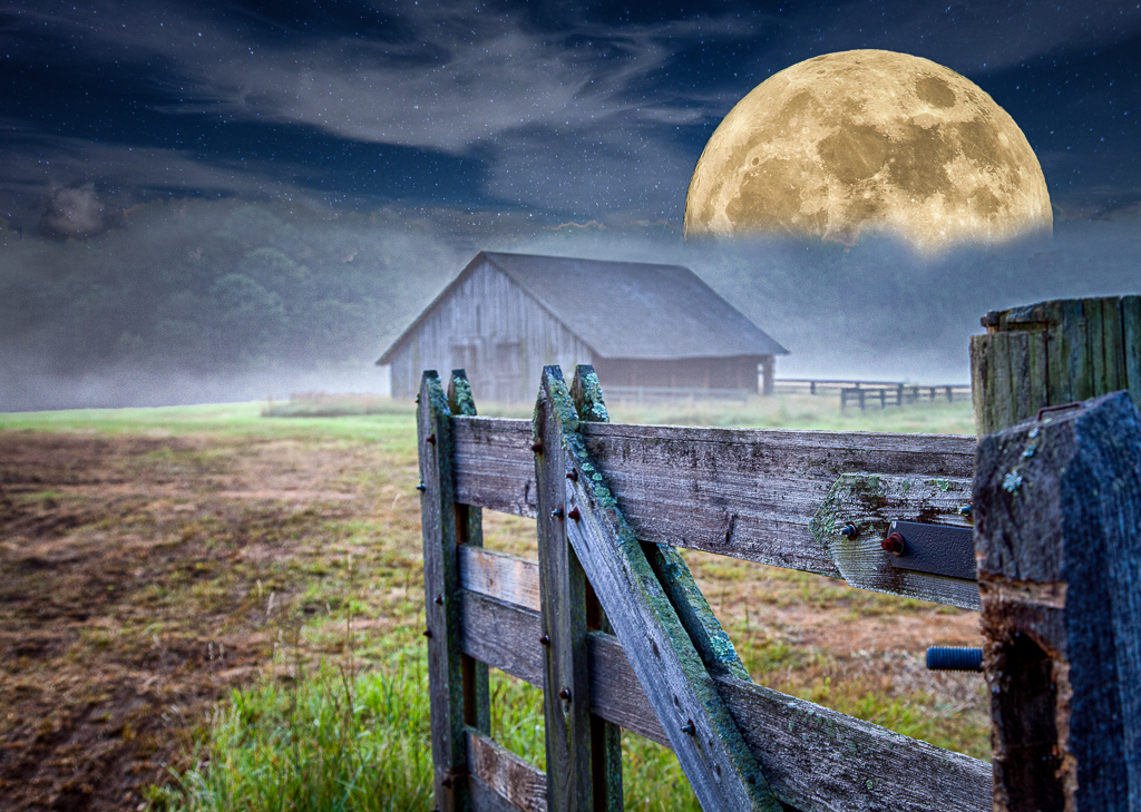
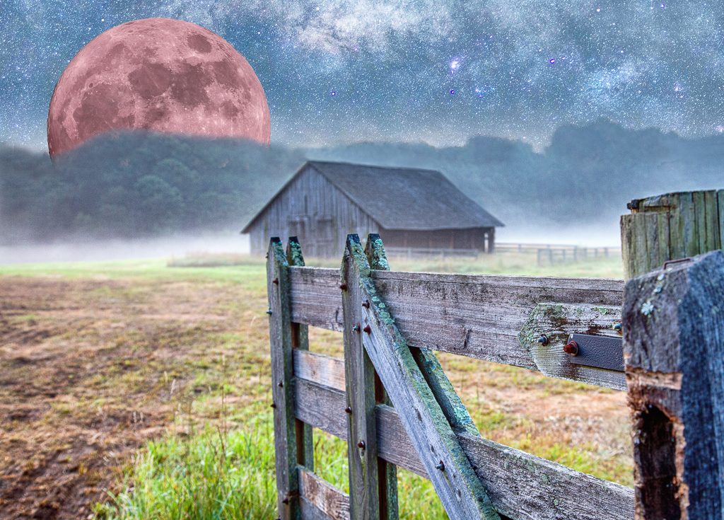
Thanks for taking the time to breath some life into my moon. I like what you have done and by desaturating a little you achieve a more realistic effect. |
May 24th |
| 77 |
May 21 |
Reply |
Thanks for your comments Connie. You are correct - I made the moon a little smaller in this version. I agree that the moon is a little too pink. Denise did a nice job of toning my moon down a bit. I used a hue/saturation adjustment layer in PS which was a simple fix but I could not get to a color I really liked using that approach. I'm sure there is a better way to correct color in this case. |
May 24th |
| 77 |
May 21 |
Reply |
Here is my second attempt which incorporates many of the suggested changes. This has proved to be a difficult image to work with and I'm not satisfied with my ability to blend the elements into a unified whole but ......... I'm learning a lot along the way! |
May 17th |
 |
| 77 |
May 21 |
Reply |
Thanks Denise. I am here to learn and I think the groups comments on my image are all right on track. I will work up a second version of this image with a red/pink tinted moon moved to the left to balance the composition and clone out the distracting screw. |
May 9th |
| 77 |
May 21 |
Reply |
Thanks Witta - You make excellent points here which I intend to address in second version. Thanks for your perspective. |
May 9th |
| 77 |
May 21 |
Comment |
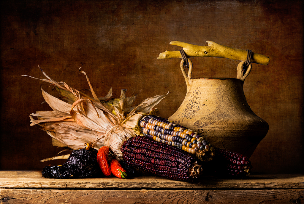
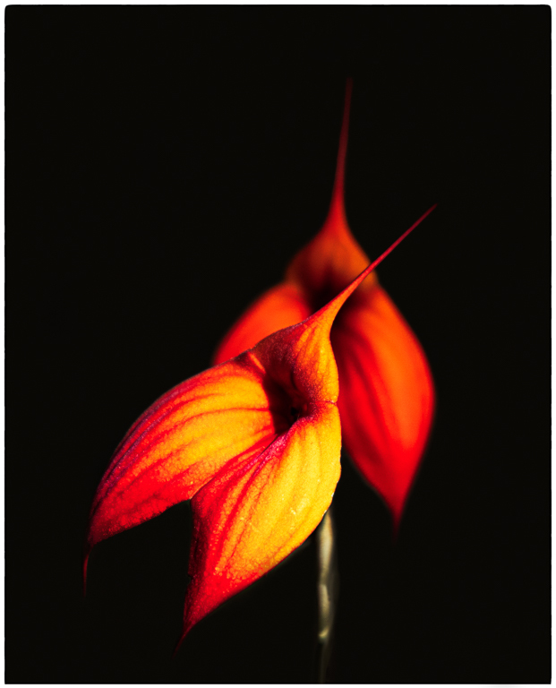
This is a super capture and I really like your processing. Cleaning up the rocks makes them appear magical as they lead your eye into the frame. I like your choice to use green paint on the sky - this eliminates what I see as a distraction. Very nicely done. |
May 9th |
| 77 |
May 21 |
Comment |
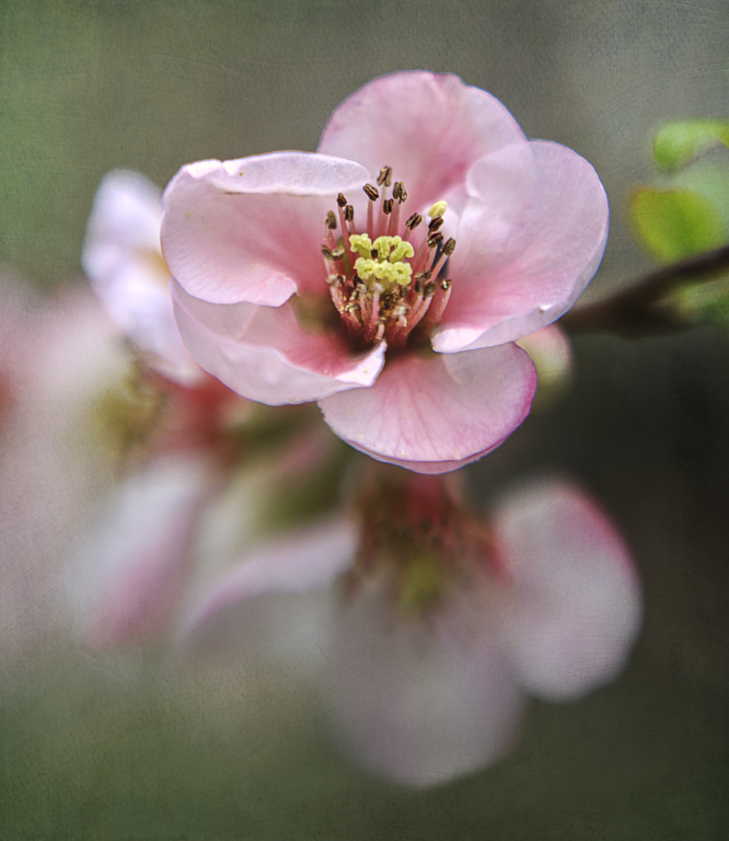
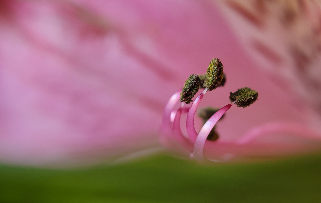
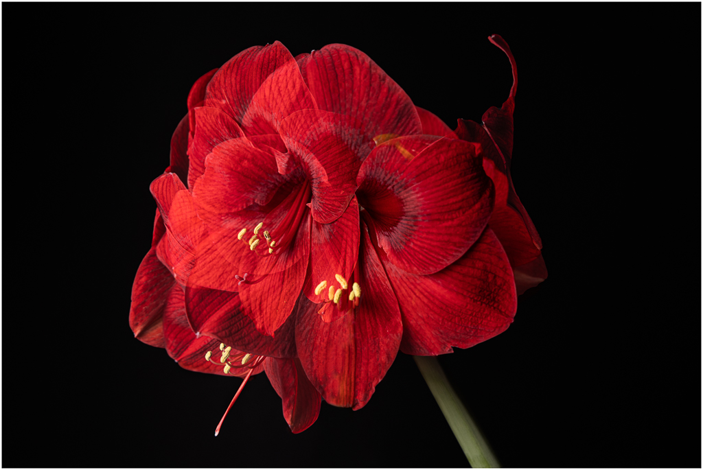
This is a lovely image and your crop has resulted in a strong and pleasing composition. I like your brighter final version which you went with - it's more vivid and spring like.
Your addition of the texture is a little distracting to my eye although I think I understand your direction. Would a smoother texture accomplish your goal? |
May 9th |
| 77 |
May 21 |
Comment |
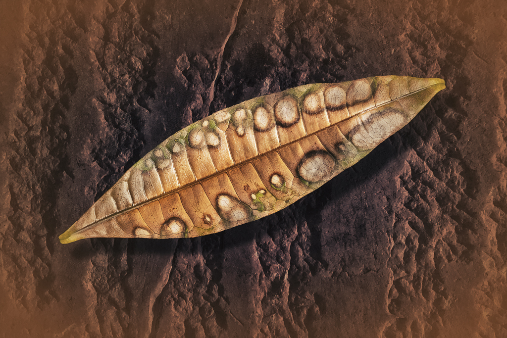
This is a lovely image. The soft background keeps my attention on the angel and allows the viewer to develop their own ideas about what's going in this composition. Your choice of colors really add a more etherial vibe well suited to your subject matter. |
May 9th |
| 77 |
May 21 |
Reply |
I think you are right on target with the color of the moon and I should tint it which would add both realism and warmth to the image. Regarding realism - I knew the moon was huge in my composition and that such a view is not possible from planet earth but thought it added to my fairy tale concept. I can probably reduce the size and still achieve the aesthetic I had in mind. |
May 5th |
3 comments - 6 replies for Group 77
|
3 comments - 6 replies Total
|