|
| Group |
Round |
C/R |
Comment |
Date |
Image |
| 65 |
Oct 23 |
Comment |
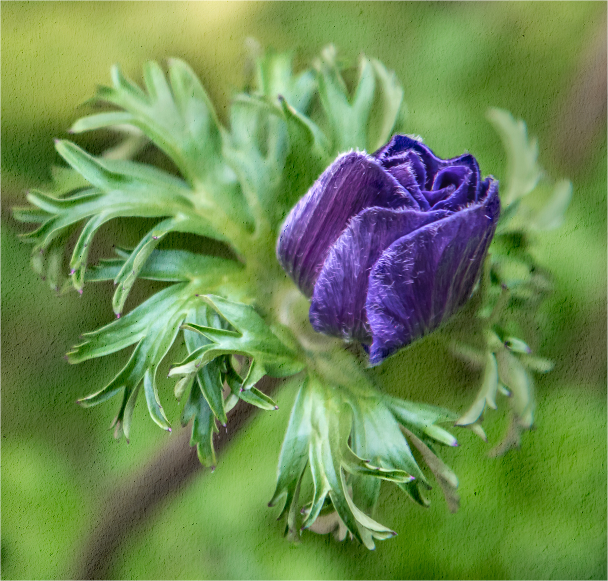
Hi Rebecca,
I agree with the others' comments about shooting in bright sunlight. Having said that, though, I think you did a great job with your focus. It's nice and sharp. I think I might have tried to darken the bright green on the right side to balance it out with the darker left side. Otherwise, I think a tighter crop to showcase the gorgeous center would be quite pleasing as well. Beautiful flower! |
Oct 20th |
| 65 |
Oct 23 |
Comment |
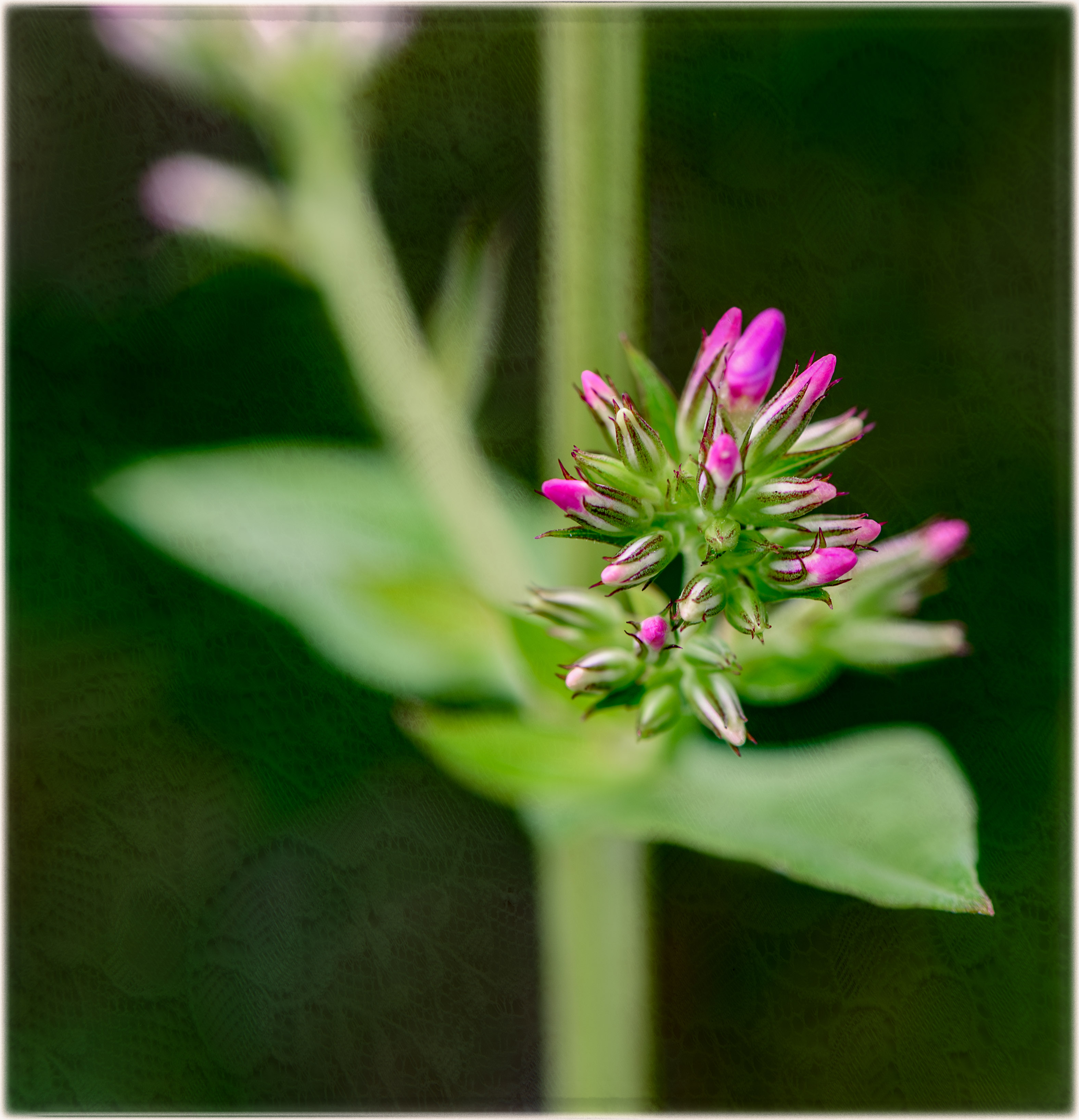
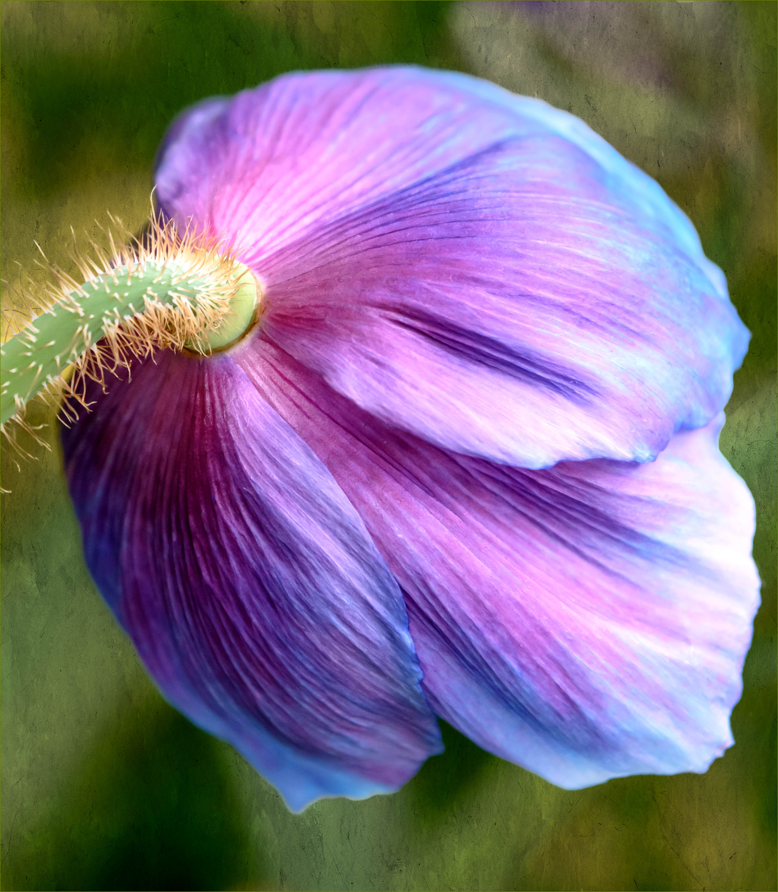
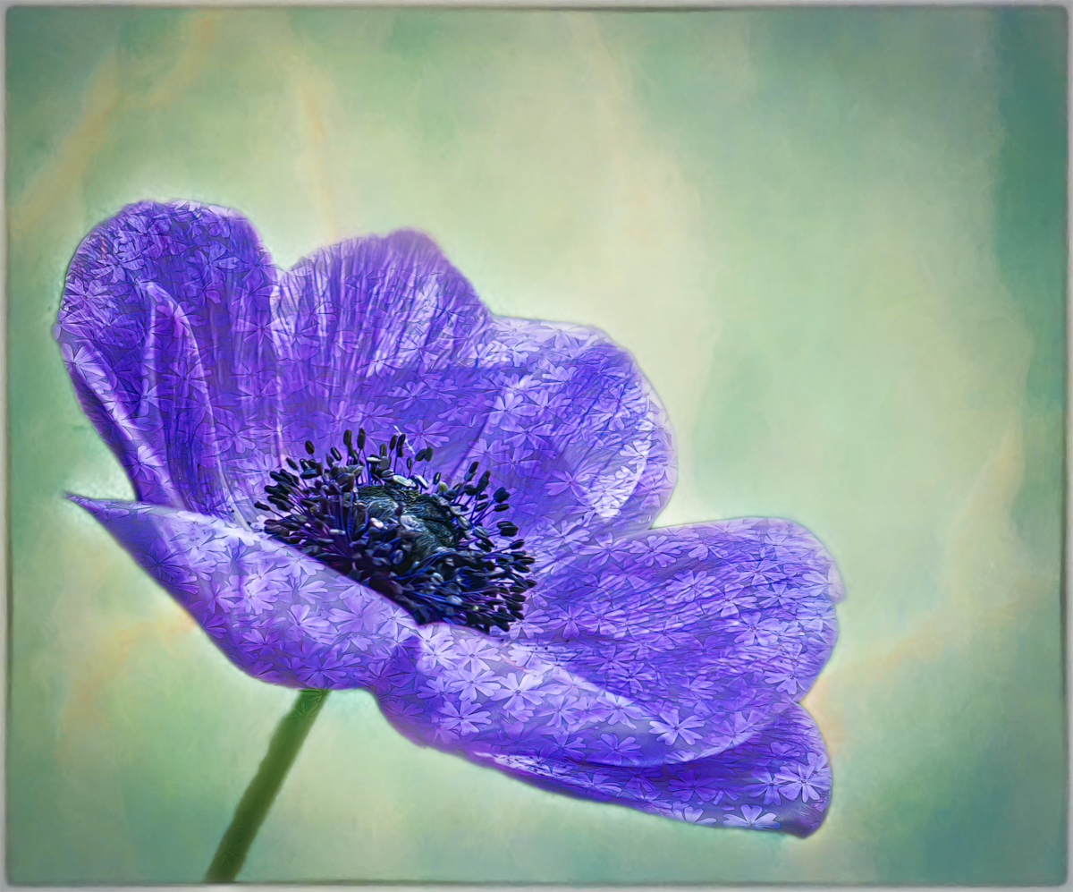
Hi Melanie, your globe thistle image is so striking! I don't think I've ever seen one of these before. I love the colors and the repetitive starburst pattern in the flower.
The green areas at the bottom of the image are a bit distracting to my eye, but I don't think the stem should be cropped out, as Dick suggests. Perhaps you could add a little more of the soft purple background in that area.
May I ask how you used the background color to make a texture? It really makes your flower stand out. |
Oct 20th |
| 65 |
Oct 23 |
Comment |
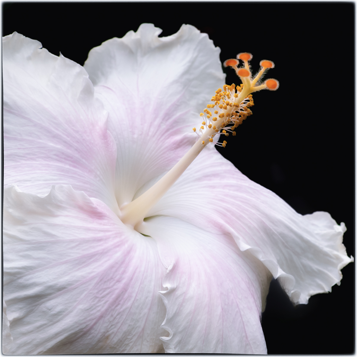
Hi Maria,
I, too, really love the colors and textures of your pink protea. The soft background really showcases your lovely flower. I do not care for Dick's crop. I agree with Melanie's crop suggestion because I like how the red stem leads the eye on a curved diagonal up to the interesting flower. |
Oct 19th |
| 65 |
Oct 23 |
Comment |
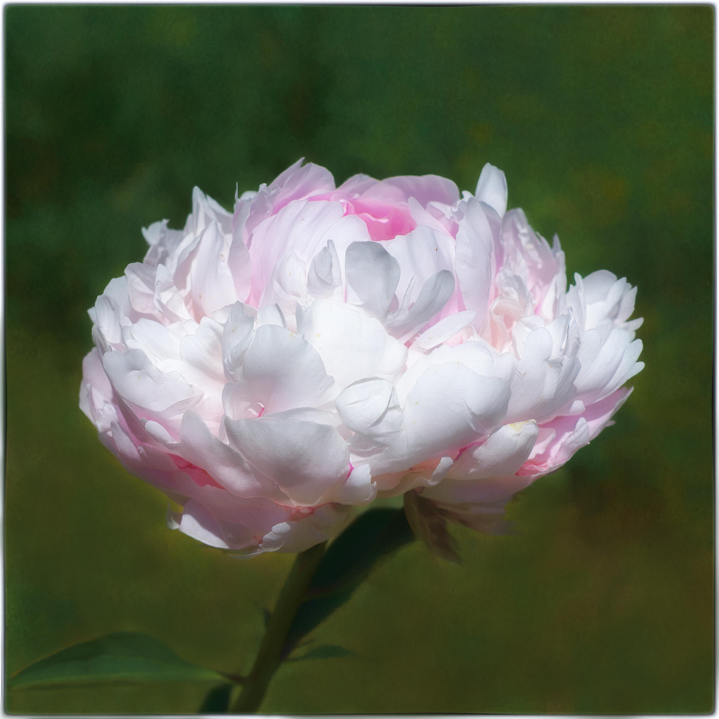
Hi Fran,
You've created a lovely image! I agree with the others about cropping out the bud. I also think Maria has a good idea about reworking the green leaves on the bottom right.
The color and composition are stunning and it's sharp where it needs to be. I, like Dick, love that there are three flowers which create a triangle.
Beautiful!! |
Oct 19th |
| 65 |
Oct 23 |
Comment |
Hi Dick,
Beautiful image of a colorful autumn leaf. I love how the point of interest is in the bottom left, in keeping with the Rule of Thirds. The bold colors and leading lines have created a dynamic image. Another great job!! |
Oct 19th |
| 65 |
Oct 23 |
Comment |
Thank you all for your thoughtful suggestions and critiques. I take all you've taught me and go back to the drawing board and re-work it.
~Jodi |
Oct 19th |
6 comments - 0 replies for Group 65
|
| 77 |
Oct 23 |
Reply |
Hi Connie! Thank you so much for your kind words:) I appreciate your feedback! |
Oct 22nd |
| 77 |
Oct 23 |
Reply |
Thanks so much, Jan! I appreciate your thoughtful feedback. It was a breathtaking view! |
Oct 20th |
| 77 |
Oct 23 |
Reply |
Absolutely, Jan! Have a nice weekend:) |
Oct 20th |
| 77 |
Oct 23 |
Comment |
Hi Denise,
I love this image! I am enjoying the natural framing the leaves provide, keeping my eye on the interesting mushrooms and their texture and placement.
My only suggestion, based solely on my personal preference, would be to drop your green border down a pixel or two. I just like a thinner border.
Great job! I, too, like the tangled grasses in the foreground; they add more interest without being a distraction!
|
Oct 20th |
| 77 |
Oct 23 |
Comment |
Hi Linda,
Beautiful edit! I love how you brought out the detail in the sky/clouds. It provides a lovely background to show off your geese. I'm also really enjoying the complementary colors and textures in the foreground, middle and background. Great job! |
Oct 20th |
| 77 |
Oct 23 |
Comment |
Hi Jan,
Such a lovely fine art image! The softness of the egg shape is nicely complemented by the geometrical shape of the plate and the interesting texture you've added.
I have to disagree with the others. I like your composition with the egg on the left more than Linda's flipped version. Perhaps that's because I saw your rendition first, but it appeals to my eye more. We read from left to right. I feel your placement of the egg on the left appears to be more balanced by the edge of the plate, which diagonally extends upward and to the right and then back around to the egg, holding my focus in the image.
A lovely frameworthy image!!
|
Oct 20th |
| 77 |
Oct 23 |
Comment |
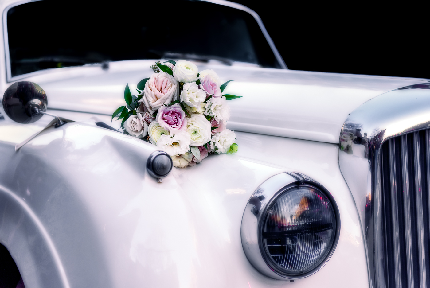
Hi Mary,
You've made a fantastic image! I love the black and white conversion, which definitely adds drama and mood. The monochrome conversion makes the viewer take notice of the contrast in the greys, whites and blacks as well as the shapes, forms and patterns in your photo.
I also agree with Linda; I would add more room in front of the car!
Excellent edit! The driver will proudly display your image! |
Oct 20th |
| 77 |
Oct 23 |
Comment |
Hi Connie,
I love the composition of the silhouetted tree and the natural framing it provides to showcase the gorgeous sky and light rays at sunset. I, too, think the little branch on the left could be edited out.
This image is very beautiful without the lantern. |
Oct 20th |
| 77 |
Oct 23 |
Comment |
Hi Carol,
Sheer perfection! I love the conversion to B&W and the way you're removed the distracting background from the original image, both of which have intensified the dramatic feel. Outstanding! |
Oct 20th |
| 77 |
Oct 23 |
Reply |
Thanks so much, Carol. I appreciate your kind words. |
Oct 20th |
| 77 |
Oct 23 |
Reply |
Thank you, Denise! I love the story it tells as well! |
Oct 20th |
| 77 |
Oct 23 |
Reply |
Thank you, Linda! I appreciate your thoughtful feedback. |
Oct 20th |
6 comments - 6 replies for Group 77
|
12 comments - 6 replies Total
|