|
| Group |
Round |
C/R |
Comment |
Date |
Image |
| 29 |
Jul 25 |
Comment |
Hi Bob, still really like this especially with the symmetry. Surrealism still abounds and the difference in the color palette top and bottom halves is very striking. |
Jul 22nd |
| 29 |
Jul 25 |
Reply |
Thanks Bob, I was trying to put in something different this month, but then was disappointed to see I don't shoot much else. |
Jul 18th |
| 29 |
Jul 25 |
Reply |
Thanks Judy, you must have done well to get to five stars even with publishing credits. |
Jul 18th |
| 29 |
Jul 25 |
Reply |
Hi Bob, I had to go back to the RAW file to look at color cast, and it does not seem as pronounced until I cropped the image, but there are a lot of fumes in there and when developing it the foliage seems to leak through a bit, but is pretty much as it occurred. I shall try it as a mono next. |
Jul 18th |
| 29 |
Jul 25 |
Comment |
Well it is very green Bob and green is meant to be calming. From your explanation it should make a good base image for composites |
Jul 7th |
| 29 |
Jul 25 |
Comment |
Hi Bob, Well you have certainly given this the treatment and I tend to like it more each time I look at it. As Karen as mentioned I do prefer the more level water line. I actually like the heavy saturation which makes it a little like a surrealist painting particularly in the water element. |
Jul 7th |
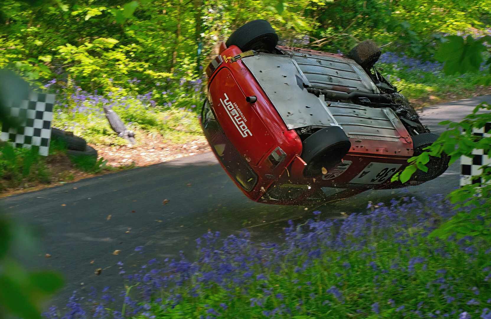
| 29 |
Jul 25 |
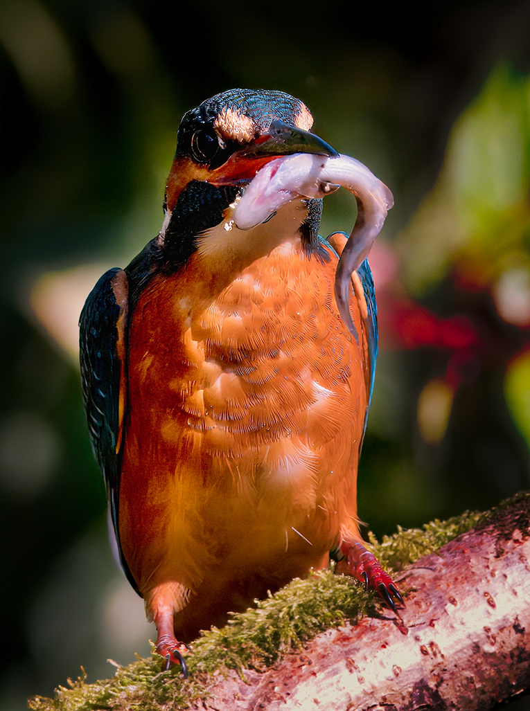
Comment |
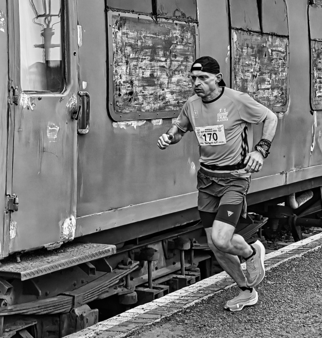
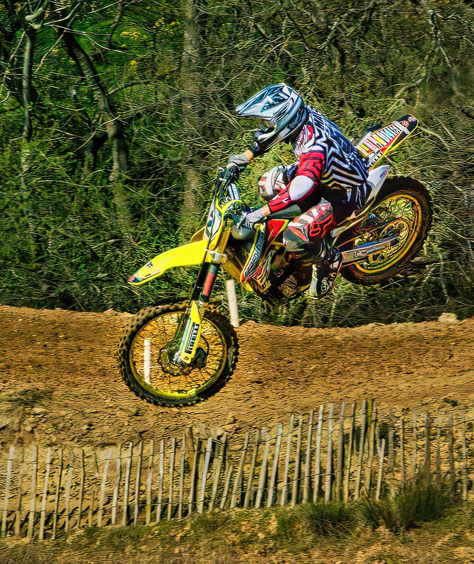
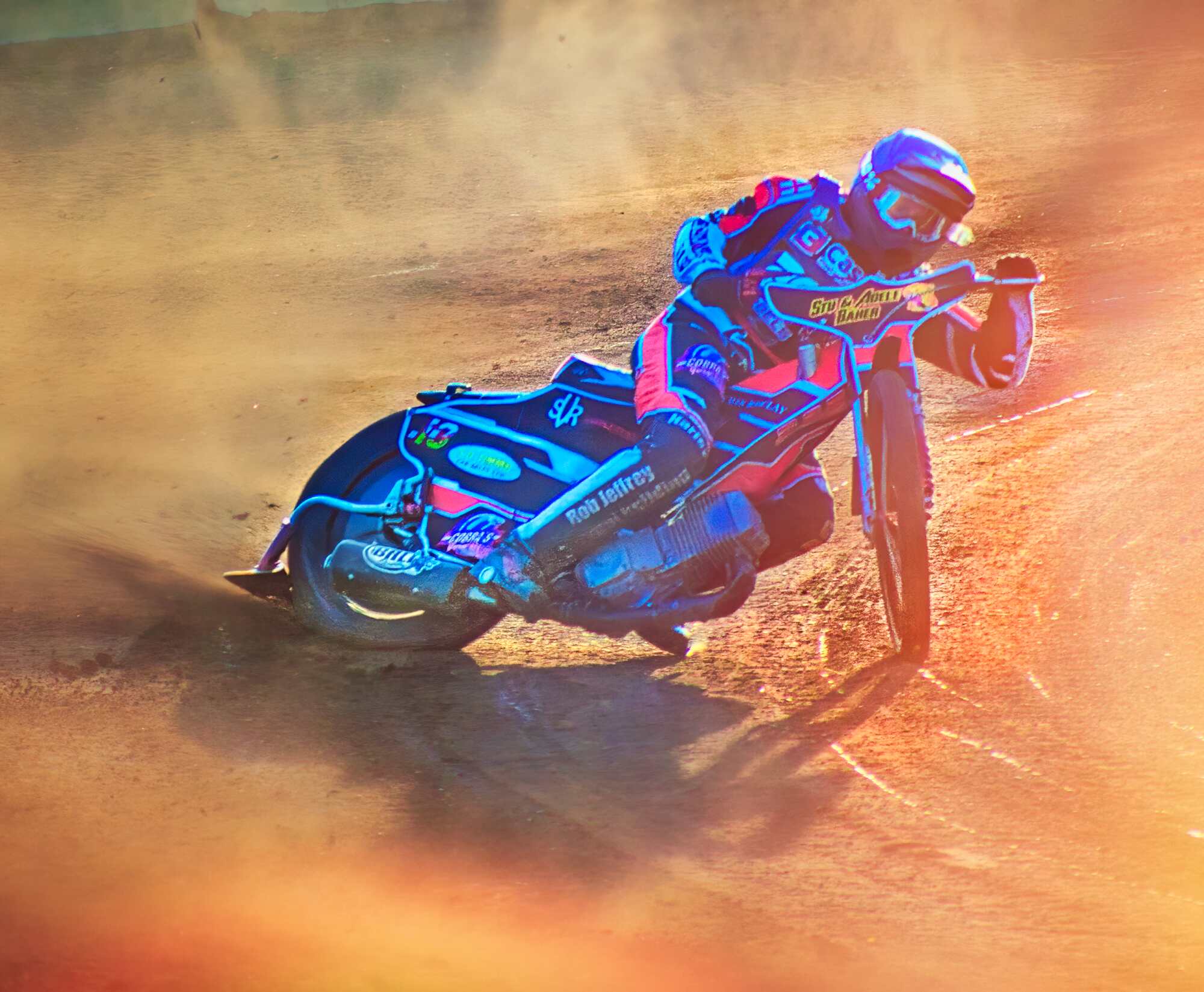
Welcome Kathy,
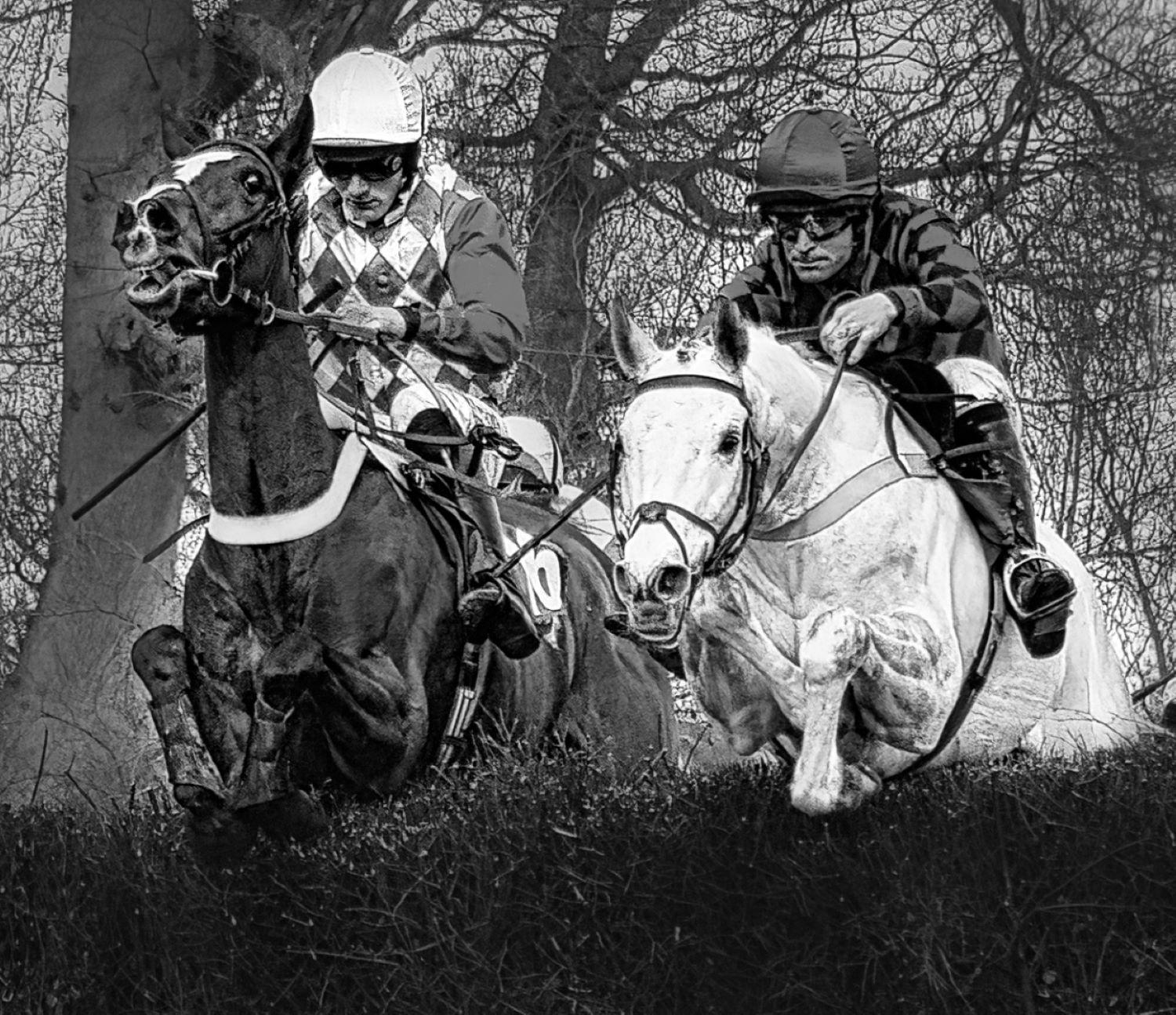
A super action shot, I have slightly cropped it and opened the shadows. See what you think. |
Jul 7th |
 |
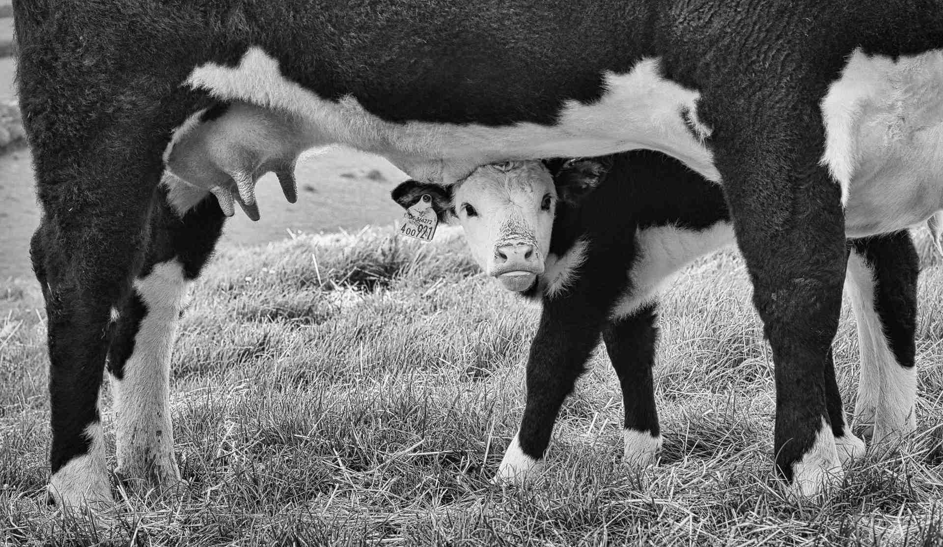
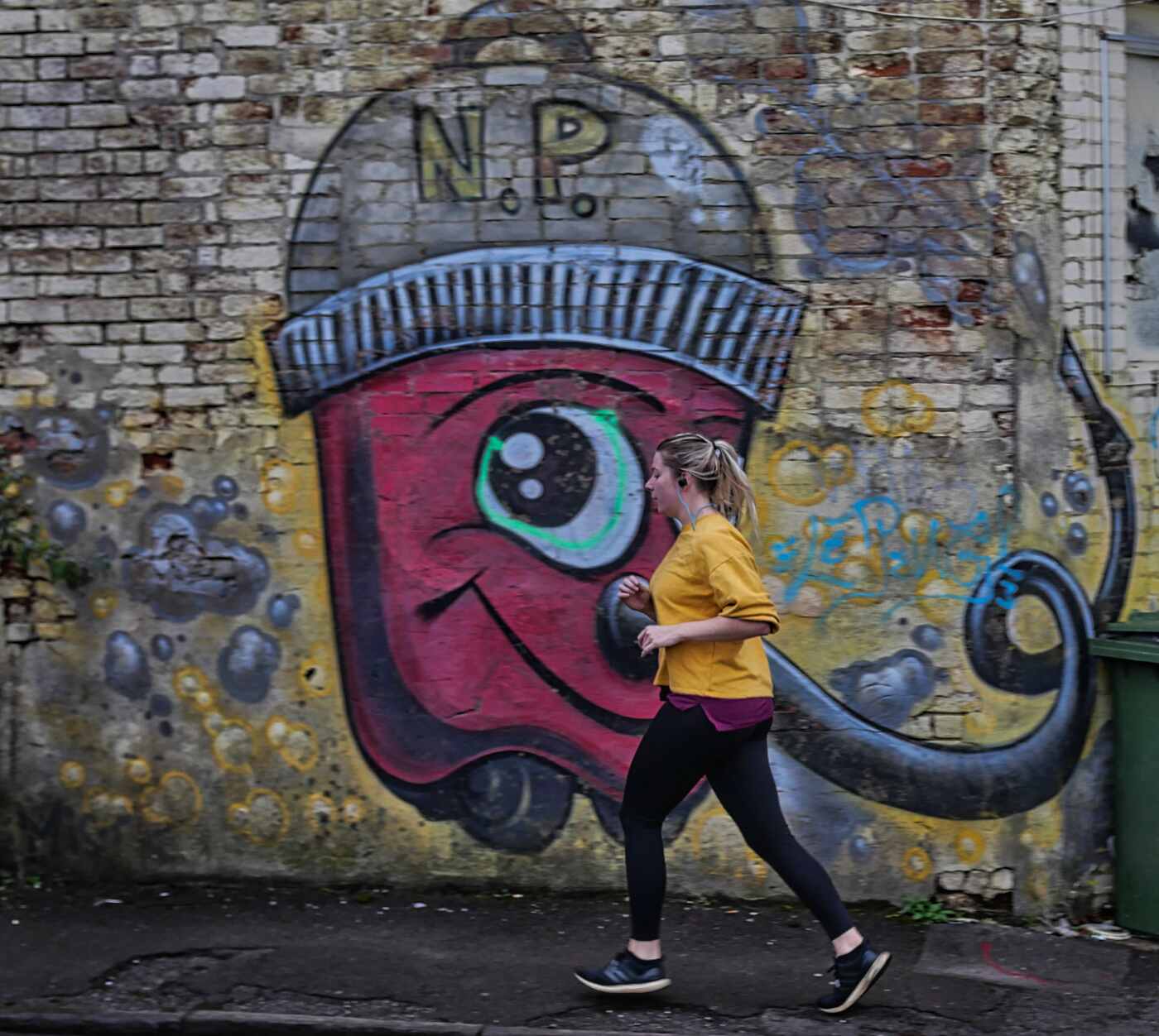
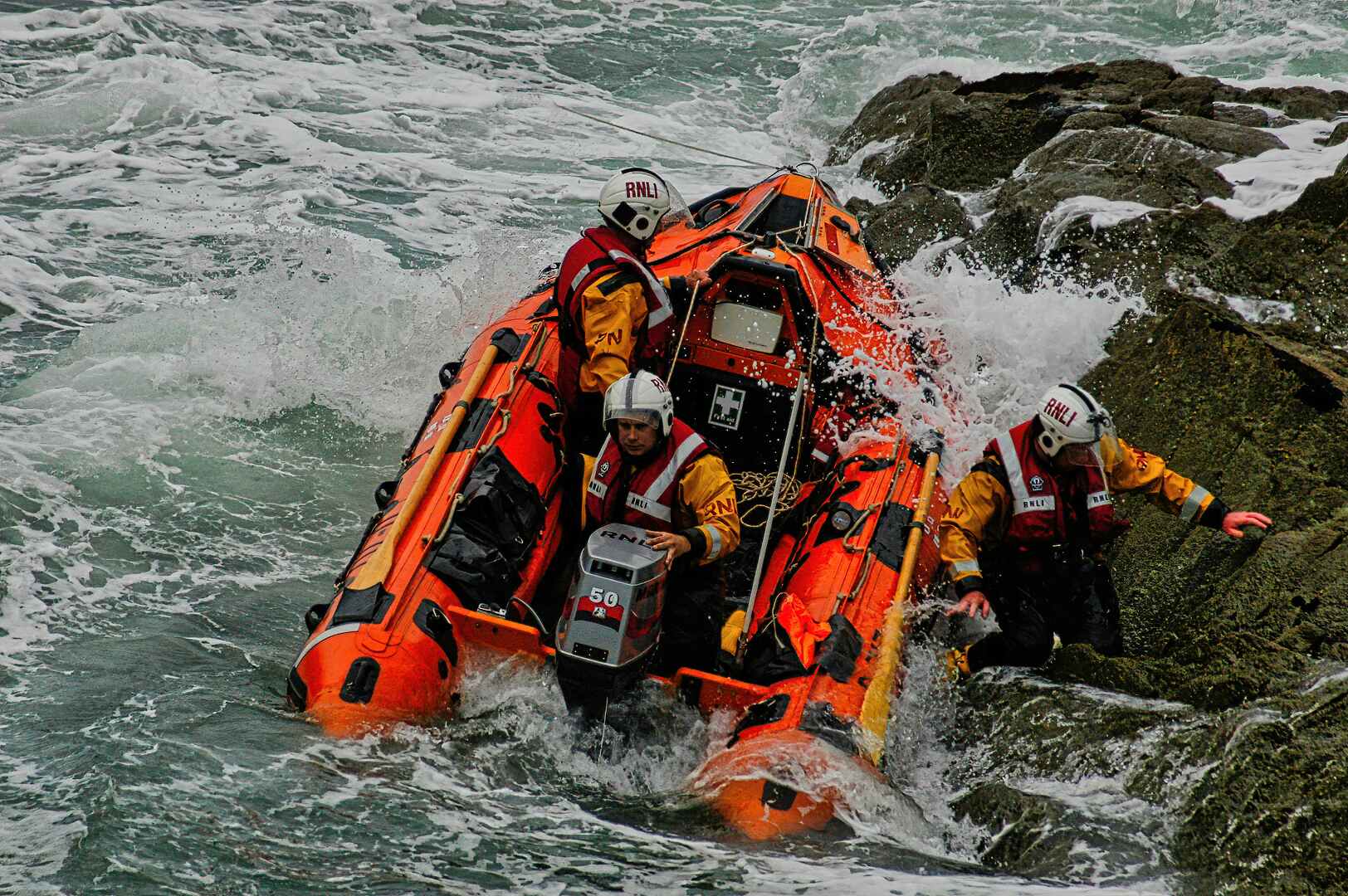
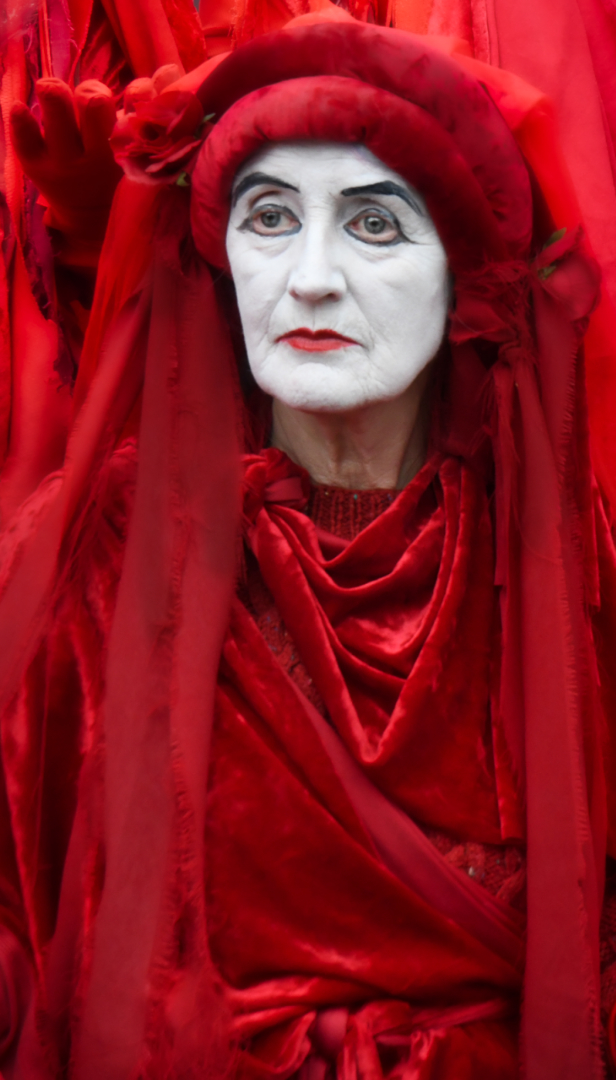
| 29 |
Jul 25 |
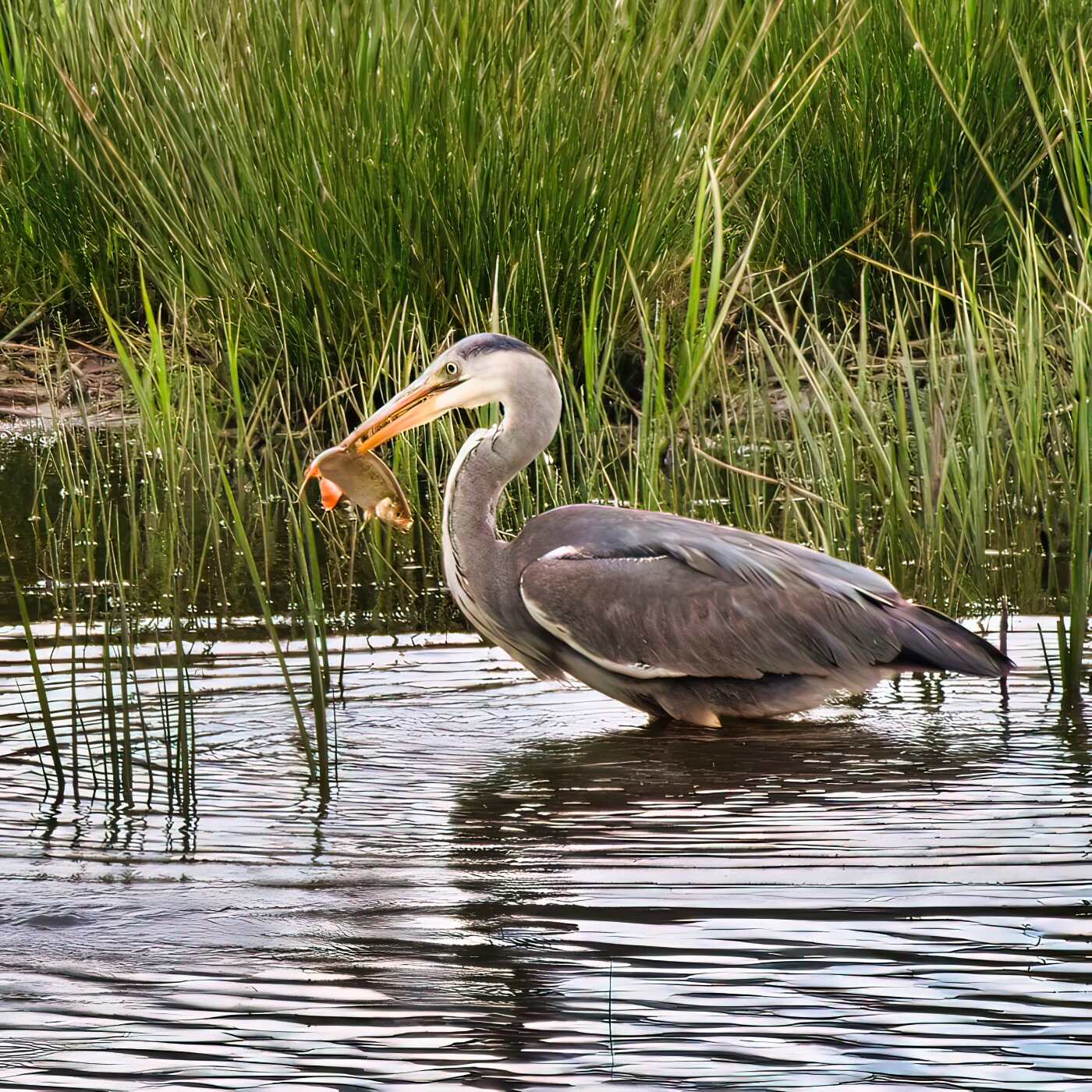
Comment |
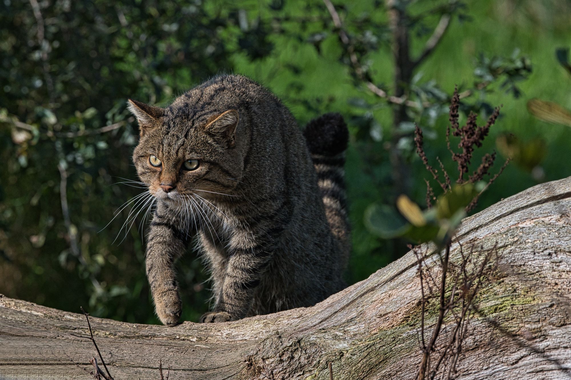
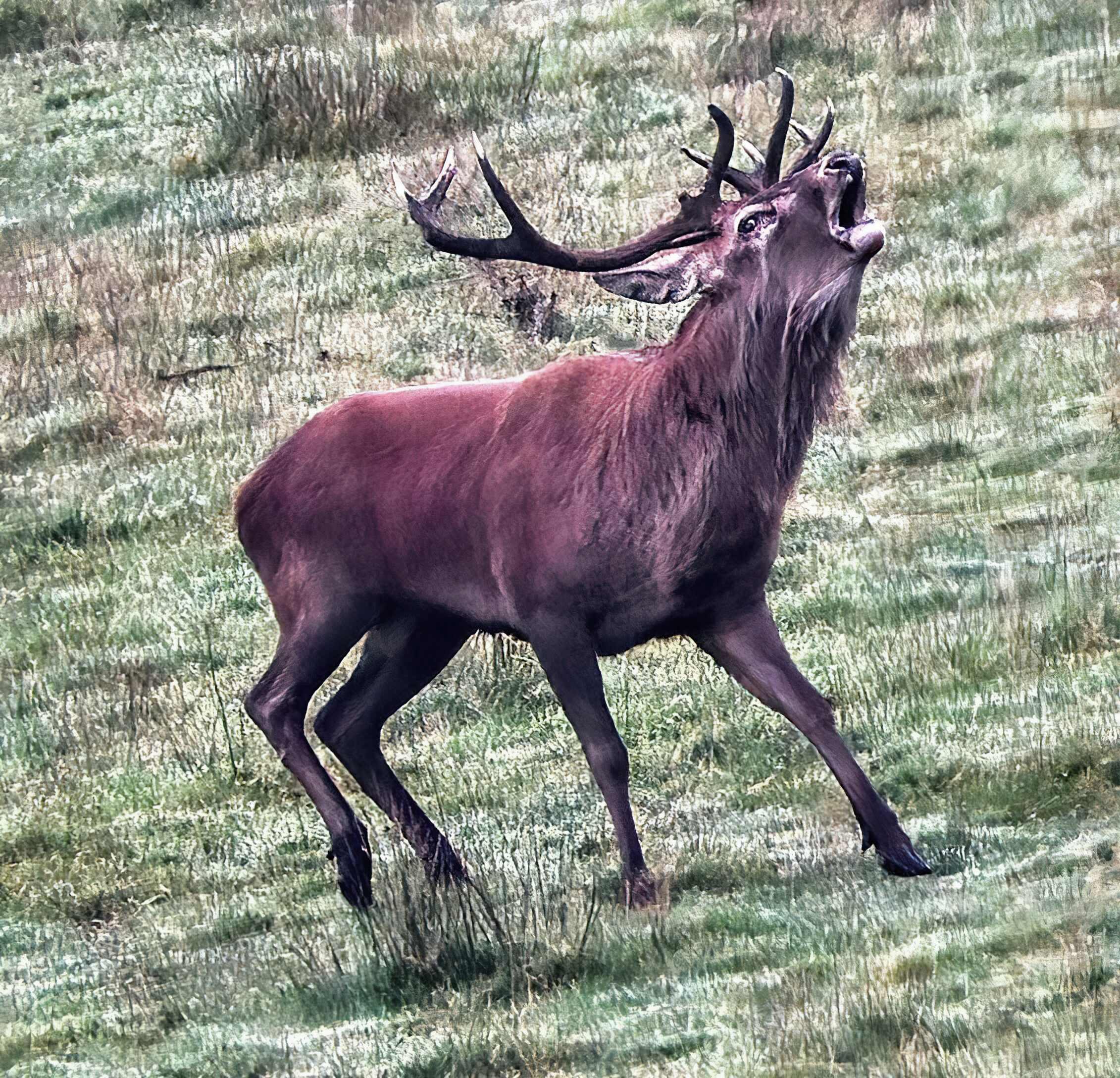
Hi Karen, I really like the minimalist presentation. Personally I would have used the rule of thirds with a crop with the lower third line running horizontally through the eye. |
Jul 6th |
 |
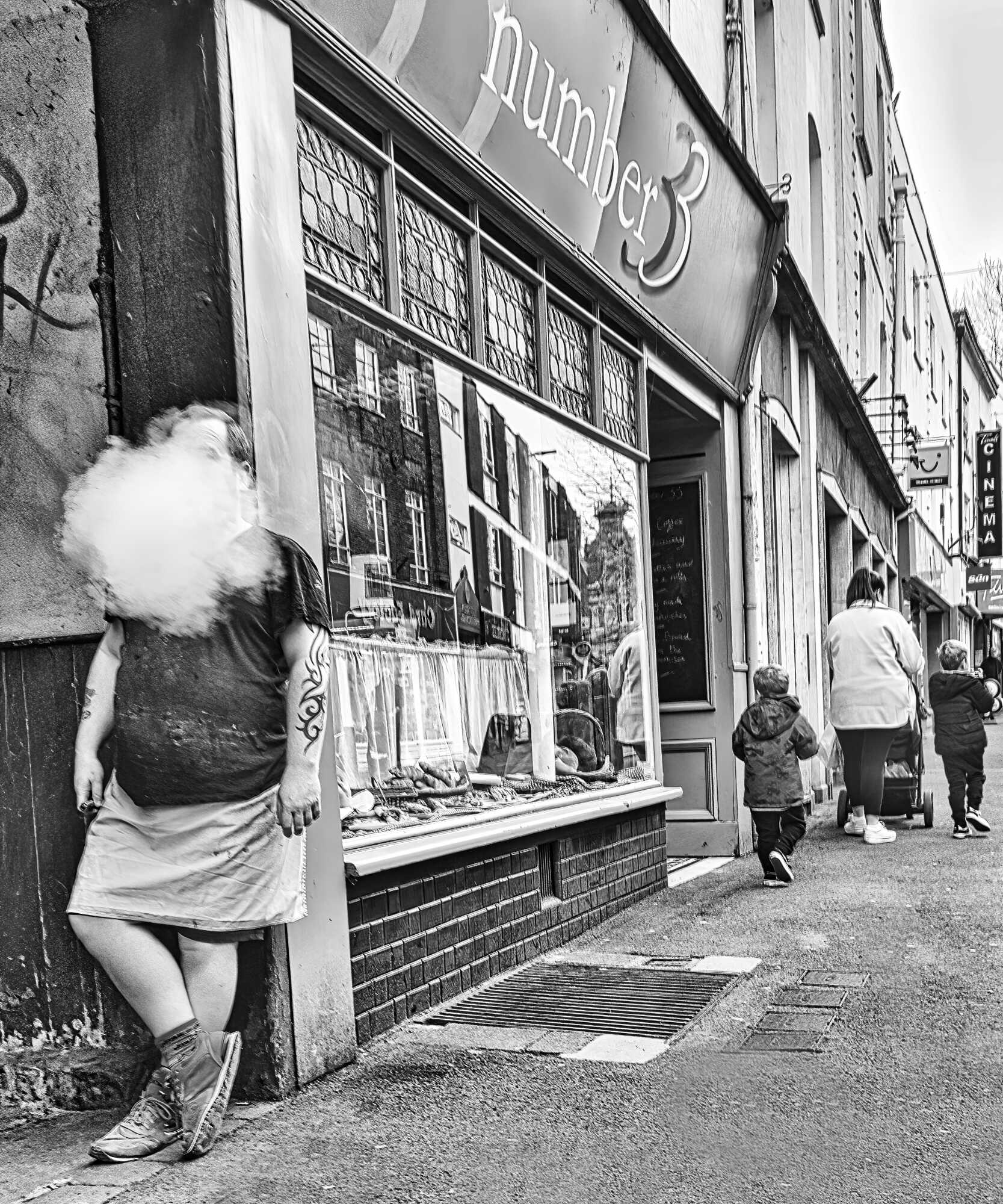
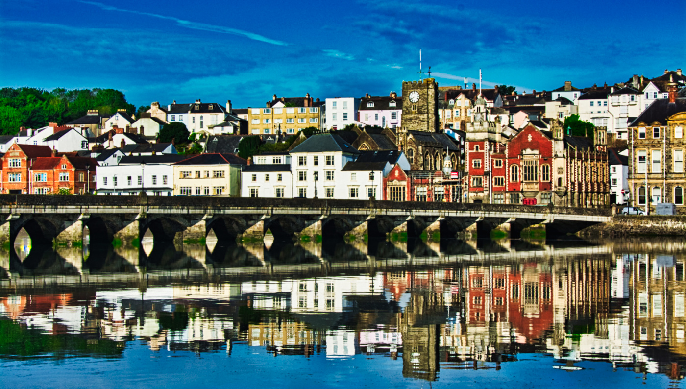
| 29 |
Jul 25 |
Comment |
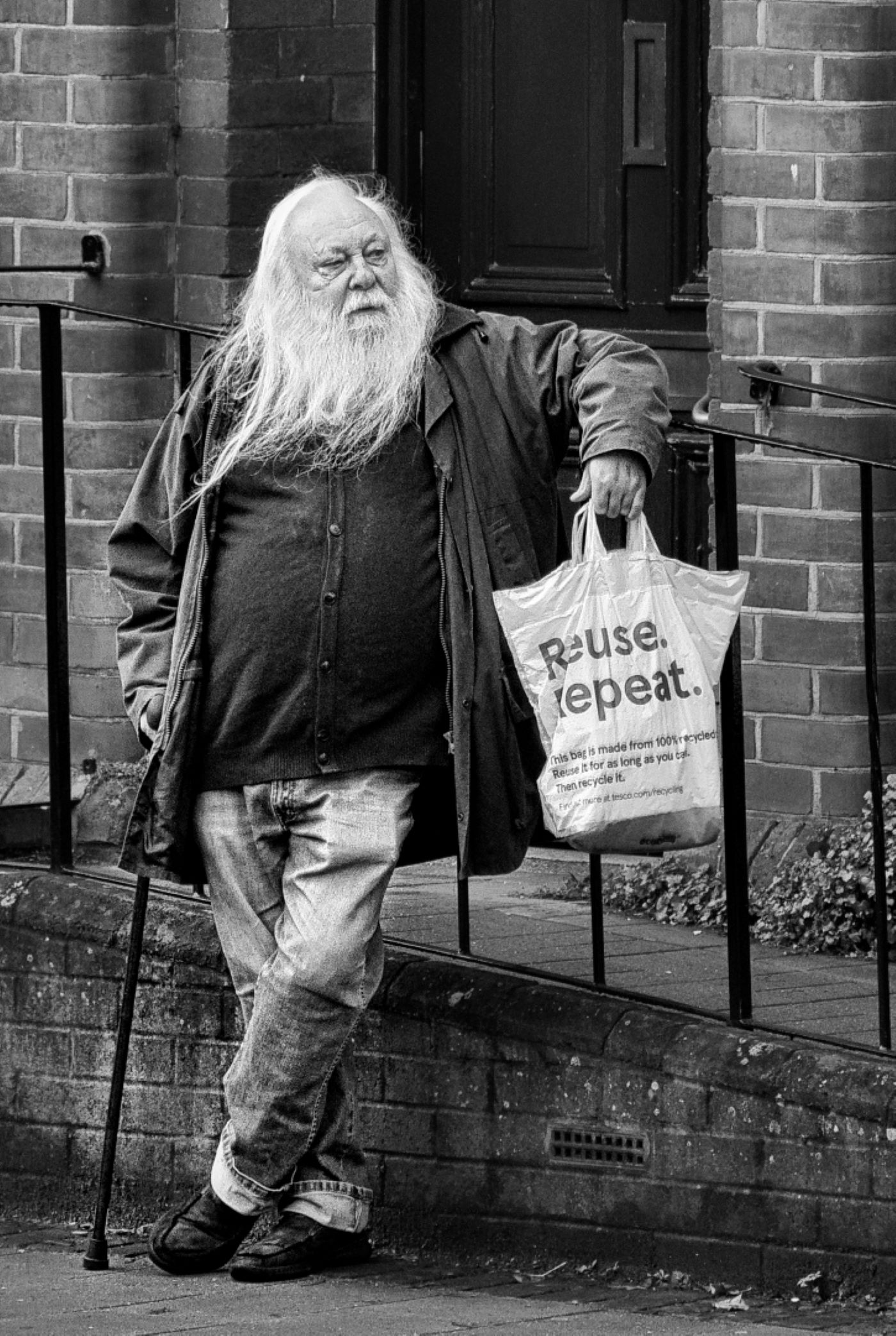
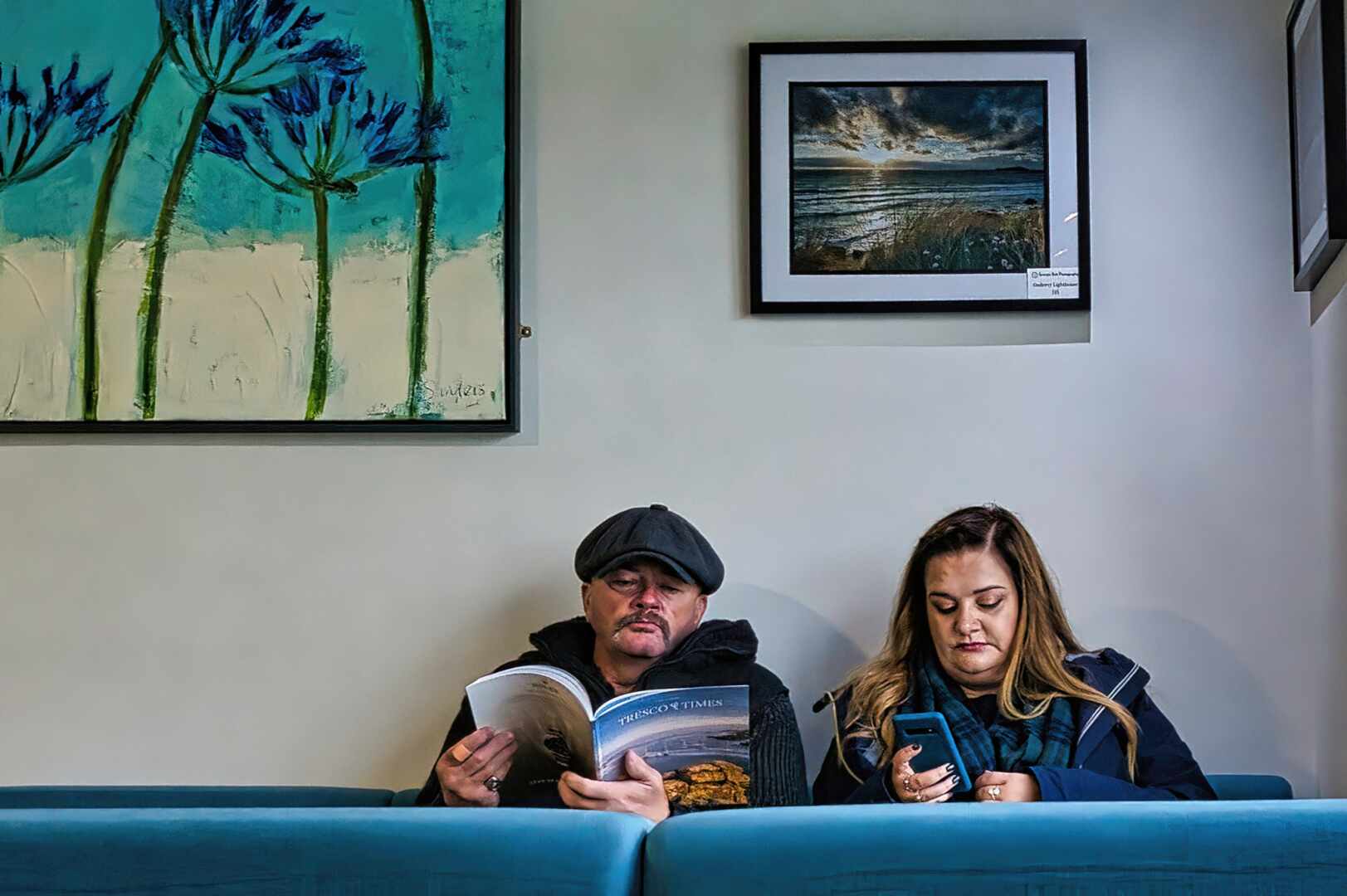
Hi Judy, It works well as a documentary travel shot. They were really inconsiderate leaving their bags lying around in shot. I do find the reflections in the window a little distracting, but obviously there was little you could do about that. I looked at cropping but actually like them being tied to the building, putting it into context. |
Jul 6th |
| 29 |
Jul 25 |
Comment |
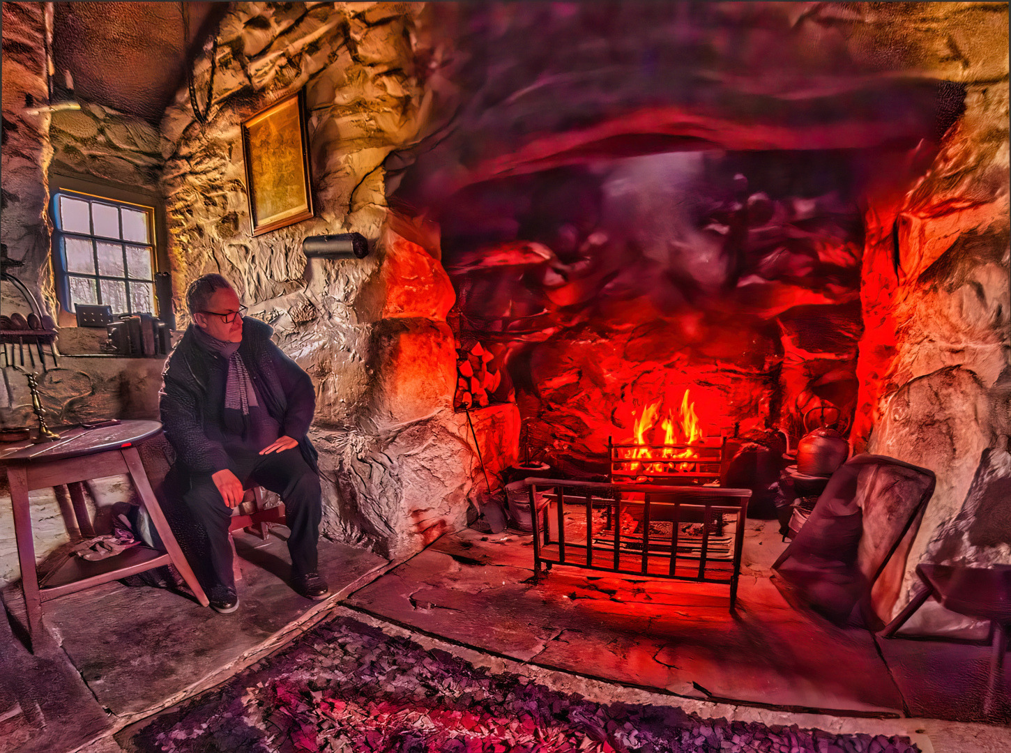
Hi Elaine,
Really nice image, I tried different crops, but none work as well as your original. I did indulge myself and brought down the highlights and enhanced the colors a little to warm it up a little - see what you think. |
Jul 6th |
 |
| 29 |
Jul 25 |
Comment |
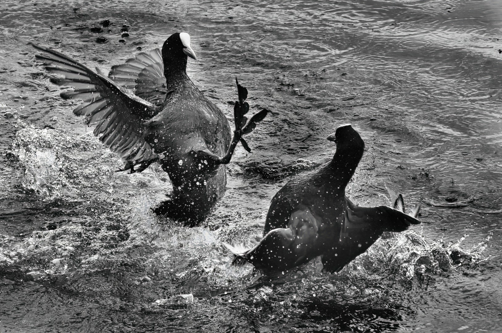
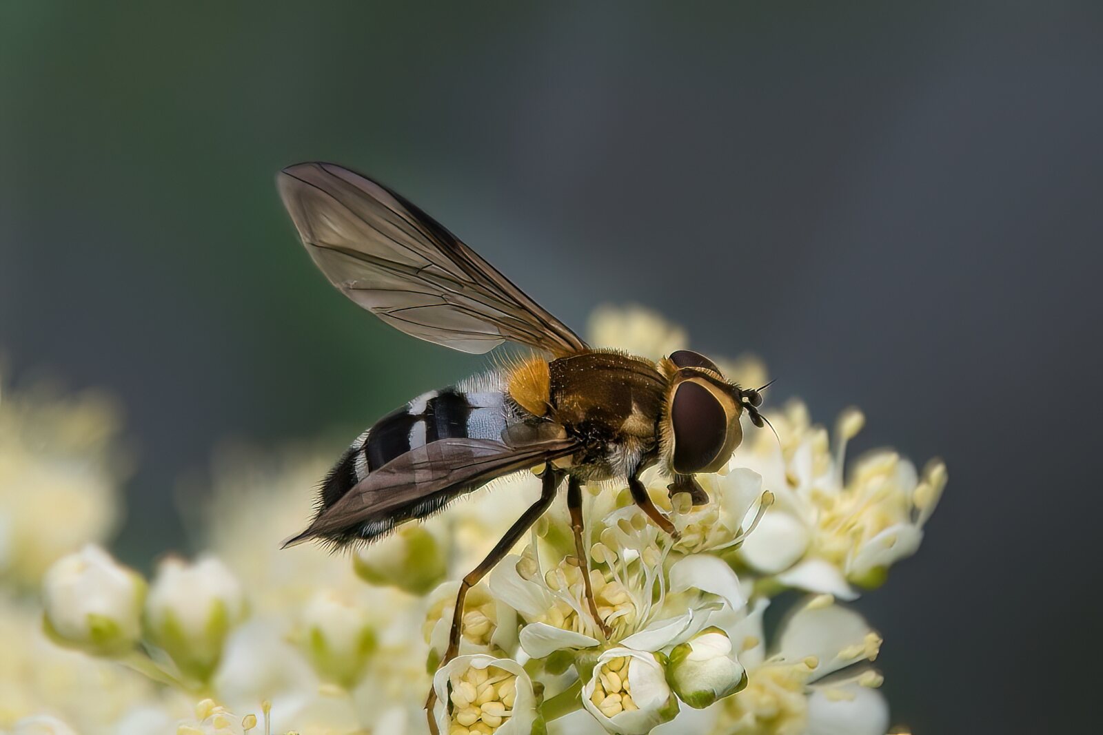
Hi Kathy, welcome to the group. Thanks for your suggestion and I agree filling the frame does give it more visual impact. |
Jul 6th |
8 comments - 3 replies for Group 29
|
8 comments - 3 replies Total
|