|
| Group |
Round |
C/R |
Comment |
Date |
Image |
| 87 |
Jul 25 |
Comment |
As Gordon said to Thomas in an episode of Thomas the Tank Engine, "It's not wrong, we just don't do it." Ok that's too glib, I know. My opinion is mine alone and NOT a rule one must follow or even a criticism of the image. It's just that, IMHO, if you see a nonstandard ratio, it means the maker was reluctantly forced to crop something out. For me, this detracts from the image, perhaps because in a perfect world where we were all perfect photographers, we would perfectly frame the image in camera. My two cents. |
Jul 17th |
| 87 |
Jul 25 |
Reply |
Thanks. I have posted the source images. |
Jul 8th |
| 87 |
Jul 25 |
Reply |
Thanks. I have posted the source images. |
Jul 8th |
| 87 |
Jul 25 |
Reply |
Thanks. I have posted the source images. |
Jul 8th |
| 87 |
Jul 25 |
Reply |
thanks. I have posted the two source images. |
Jul 8th |
| 87 |
Jul 25 |
Comment |
here is the other |
Jul 8th |
 |
| 87 |
Jul 25 |
Comment |
I have posted the two images that were combined to make this image. The first is the iris. The second is an out of focus image showing highlights of some moss glowing in the sun. |
Jul 8th |
 |
| 87 |
Jul 25 |
Comment |
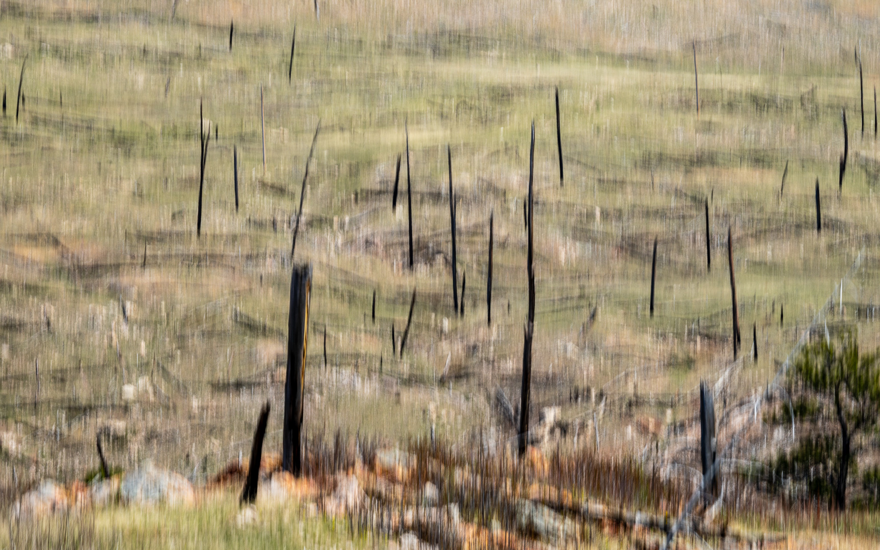
You did a great job seeing the patterns. The image is too busy, though. Some simplification is needed but, as is usually the case, one does not carry the 500mm lens in one's pocket. Good job on the black and white. |
Jul 8th |
| 87 |
Jul 25 |
Comment |
This composition has a lot going for it, and the scene is peaceful and interesting. As for improvements: 1)The scene is nearly monochromatic, and in such cases may benefit from black and white treatment. 2) the water blends too closely with the background. I suggest some darkening of its C-shaped curve area. |
Jul 8th |
| 87 |
Jul 25 |
Comment |
Agree, it's and excellent environmental portrait as is, don't change a thing. I would add that in this situation it can be hard to catch a good exposure that is not either too dark or blowing out the highlights of the molten glass, you did well. |
Jul 8th |
| 87 |
Jul 25 |
Comment |
This image is quite interesting, particularly since it is so much more eye catching than the source image. Wonderful technique. We have not really talked about the composition, though. the white tent takes up a lot of real estate and draws the eye. Perhaps you could select it as an object and convert it to a muted color. |
Jul 8th |
| 87 |
Jul 25 |
Comment |
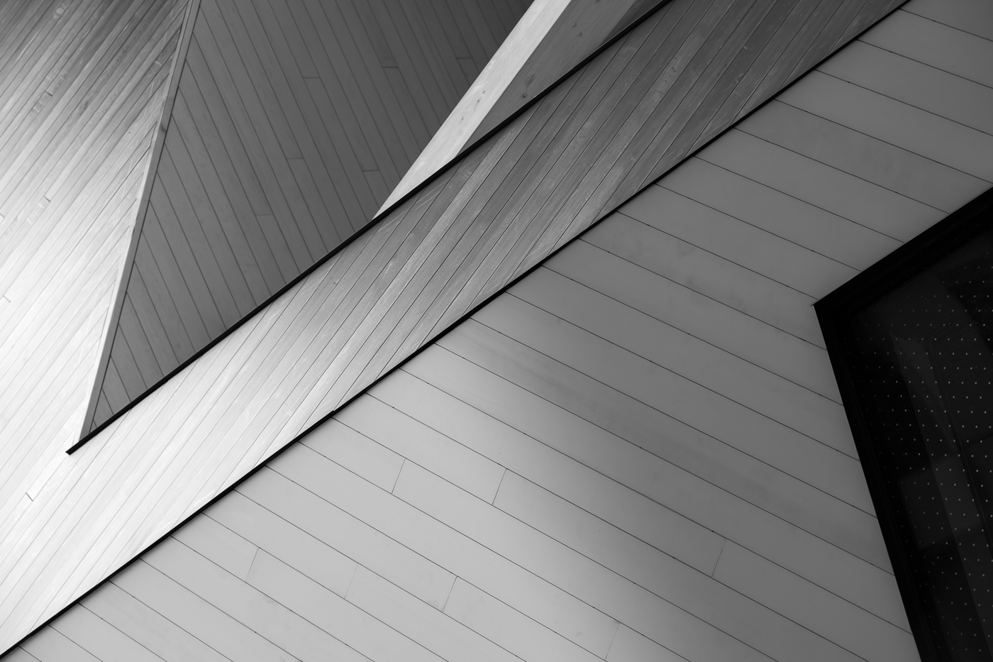
This is and image that makes you stop and think, and look all around. That's fantastic. I like what Steven did but maybe a little less lightening of the face to preserve the mystery of the man's visage. It's a scene that provokes thought. I think the wires should stay because let's face it, it's really hard to find places these days that are truly devoid of civilization. I like the symmetry of the hills, the tree and the man. I would add that the nonstandard cropping is unsettling, as it usually indicates there was some element that you had no choice but to remove. I would suggest making it square, or taking some off the top and bottom to make it landscape mode. |
Jul 8th |
8 comments - 4 replies for Group 87
|
8 comments - 4 replies Total
|