|
| Group |
Round |
C/R |
Comment |
Date |
Image |
| 9 |
Jul 18 |
Comment |
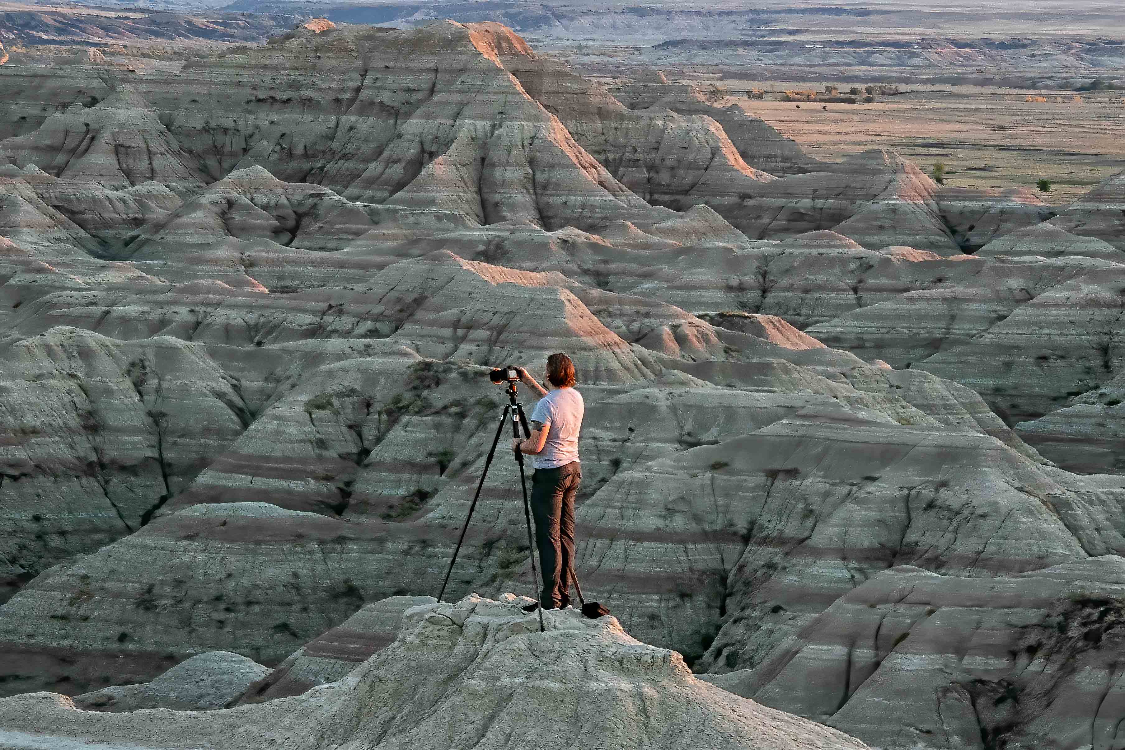
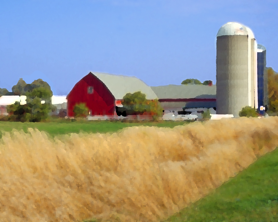
A nice image that reminds me of the sand dunes near my alma mater in Valparaiso, IN. I would crop enough of the image to put the photographer in the lower one third of the image. I would also clone out the person closer to the water. the blues are nicely done. |
Jul 26th |
| 9 |
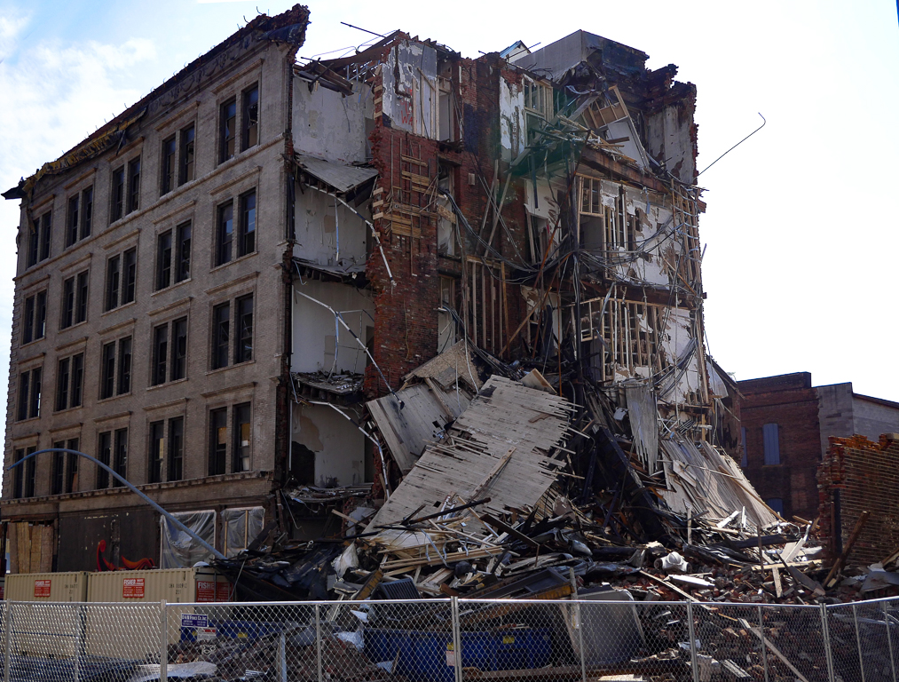
Jul 18 |
Comment |
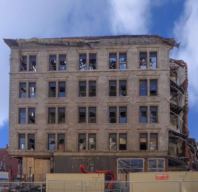
Your work improved this image by a factor of 100. You have taken it from the scrap heap and moved it into competition. Nice job. Hope you were not affected by the bombing. |
Jul 26th |
| 9 |
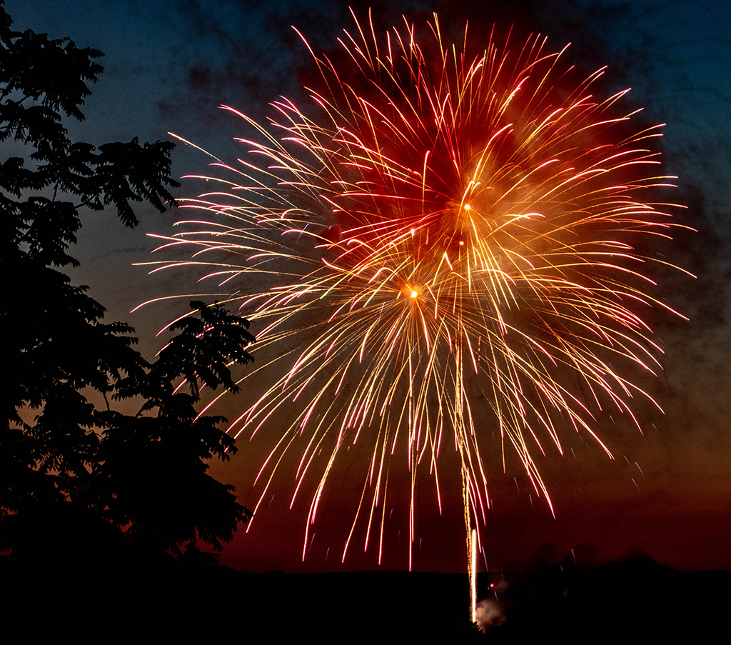
Jul 18 |
Comment |
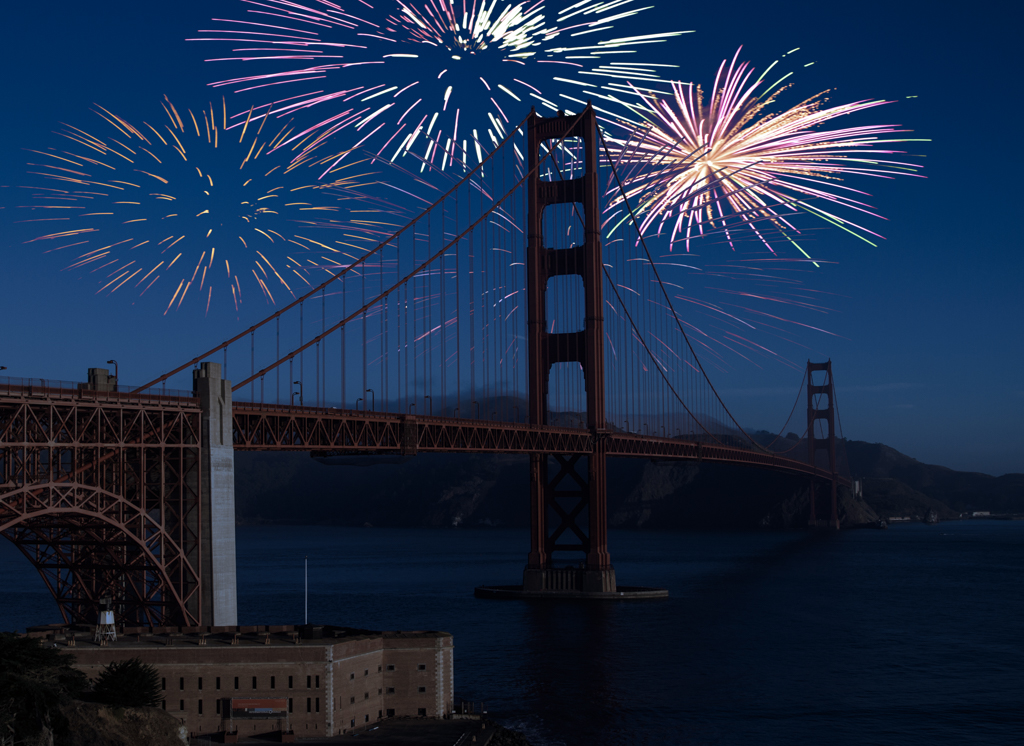
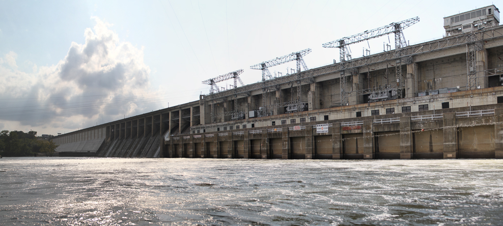
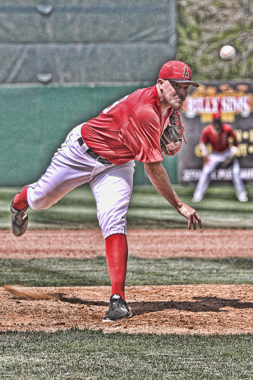
Wonderful capture of the fireworks. I am afraid I have to go along with Allen's comments. I think the image would be more pleasing if you have more of the building in it. |
Jul 26th |
| 9 |
Jul 18 |
Comment |
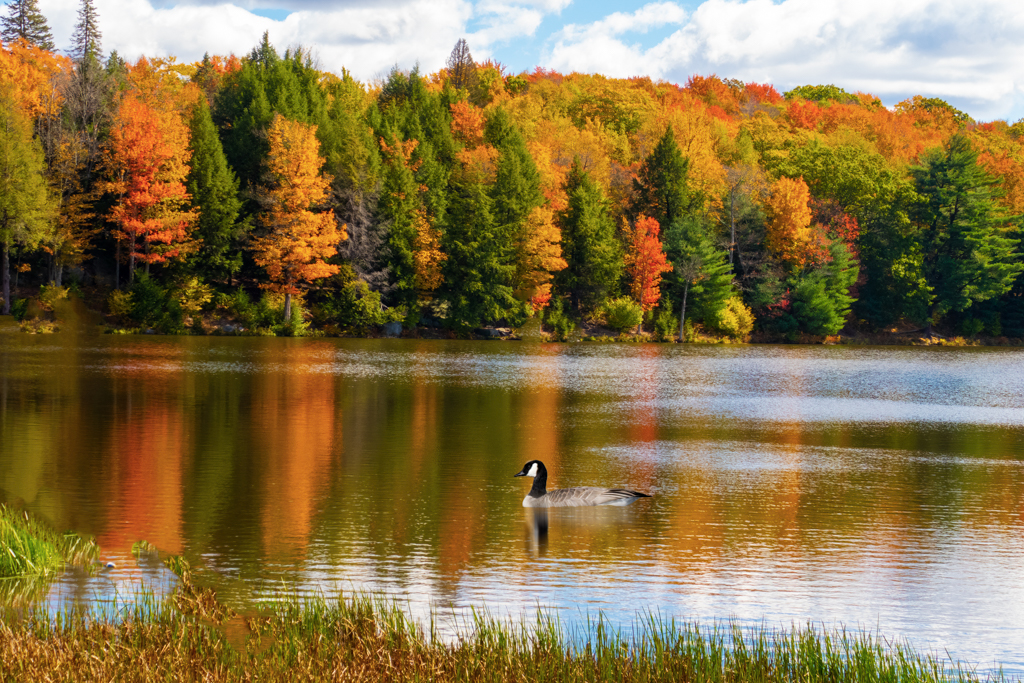
The interaction between the two ducks is what makes this image a winner. I agree there are a few bright spots that could be burned to tone them down. |
Jul 26th |
| 9 |
Jul 18 |
Comment |
A very nice portrait of this horse. I also would have cropped the fence on the bottom. I also don't feel that the "grunge" border adds anything to the image. |
Jul 26th |
| 9 |
Jul 18 |
Comment |
What a pair of choppers. Somewhere, perhaps in another e-mail which I cannot find I thought I saw an image of this tiger with the same expression but in a much more inclusive background. Wherever I saw that image I prefer it to this closeup. It showed an impressive tiger but also some of its habitat. |
Jul 26th |
6 comments - 0 replies for Group 9
|
| 21 |
Jul 18 |
Comment |
A very inventive image. I agree with Brian that the spirit on the left looks the most like a spirit. |
Jul 26th |
| 21 |
Jul 18 |
Comment |
A lovely combination of colors and shapes. It almost looks like part of a mask for a human with two eyes. I think I would at least partially agree with Brian's idea to just keep the one flower in the middle. |
Jul 26th |
| 21 |
Jul 18 |
Comment |
A nice creative image and a very good use for the moon image that I am sure most of us have in our library. I like the flip because I am a left to right person and I did not see the bug until I reread your description. |
Jul 26th |
| 21 |
Jul 18 |
Comment |
An interesting use of some of your slide library and the montage is well done. If this background is meant to portray snow I would prefer that it be closer to white. |
Jul 26th |
| 21 |
Jul 18 |
Comment |
I really like this image and the thought that is portrayed by it. I particularly like the gold band. I am not convinced about the Radial Blur filter and think I would like it better with just the texture of the hand. |
Jul 26th |
| 21 |
Jul 18 |
Comment |
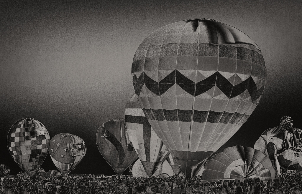
Your coloring of the balloons and strings is quite well done. My preference goes to the "front" lit image. |
Jul 26th |
| 21 |
Jul 18 |
Reply |
Peter I tried to follow your steps to get the effect you showed but was not able to even come close. I would like to try this approach on some other images that appear to be merged together. I would appreciate it if you could explain the process in more detail. Thanks. |
Jul 25th |
6 comments - 1 reply for Group 21
|
12 comments - 1 reply Total
|