|
| Group |
Round |
C/R |
Comment |
Date |
Image |
| 36 |
Apr 26 |
Comment |
Hi Adi. What a wonderful place to hike and spend the night (or two). I love the colorful tents and the arrangement on the hillside. The subtle sky color along with what looks like fog or a low lying cloud adds a nice touch. I agree with the others about the leaning trees. I tend to prefer them straightened, even though that means cropping the image a bit. Either way, it's a place I'd love to be. Thanks for sharing! |
Apr 8th |
| 36 |
Apr 26 |
Comment |
Hi Bill. Love the narrow streets as they have such visual appeal and a great place to wander with a camera. The composition and crop work very well and the white line down the middle pulls my eyes through the frame. The colors definitely convey that Mediterranean feel. I especially like the addition of the cat - a perfect touch of life. As the others mentioned removal of the shiny object by the cat would help. I'd also consider removing the partial planter on the left and slightly lifting the shadows on the street to bring out the cat a bit more. |
Apr 8th |
| 36 |
Apr 26 |
Comment |
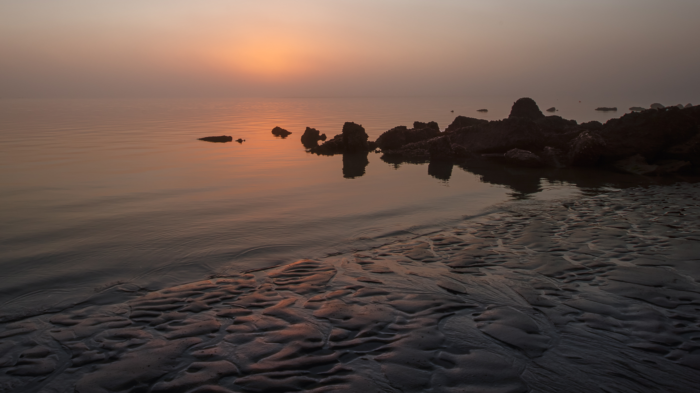
Hi Tracy. I love how this photo captures the canyon's textures in an abstract, almost painterly way. The diagonal rock slopes and horizontal rock layers pull my eye through the frame. The sun washed pastels create a nice hazy palette. Possibly adding contrast and selective sharpening will enhance the canyon strata while preserving the dreamy atmosphere. |
Apr 8th |
| 36 |
Apr 26 |
Comment |
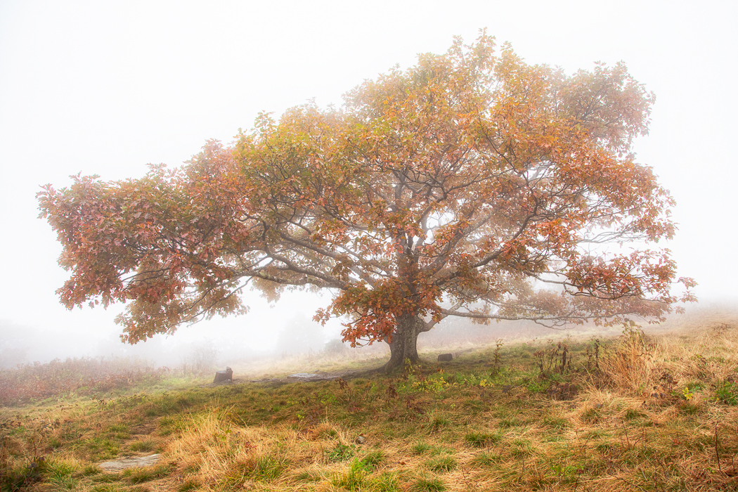
Hi Grace. Tracy nailed it with the Peter Rabbit vibe. The angle works compositionally, and the partial house on the left paired with the surrounding gardens creates a fairytale village feel. I love the light and airy processing as it adds to the magic and location charm. |
Apr 7th |
| 36 |
Apr 26 |
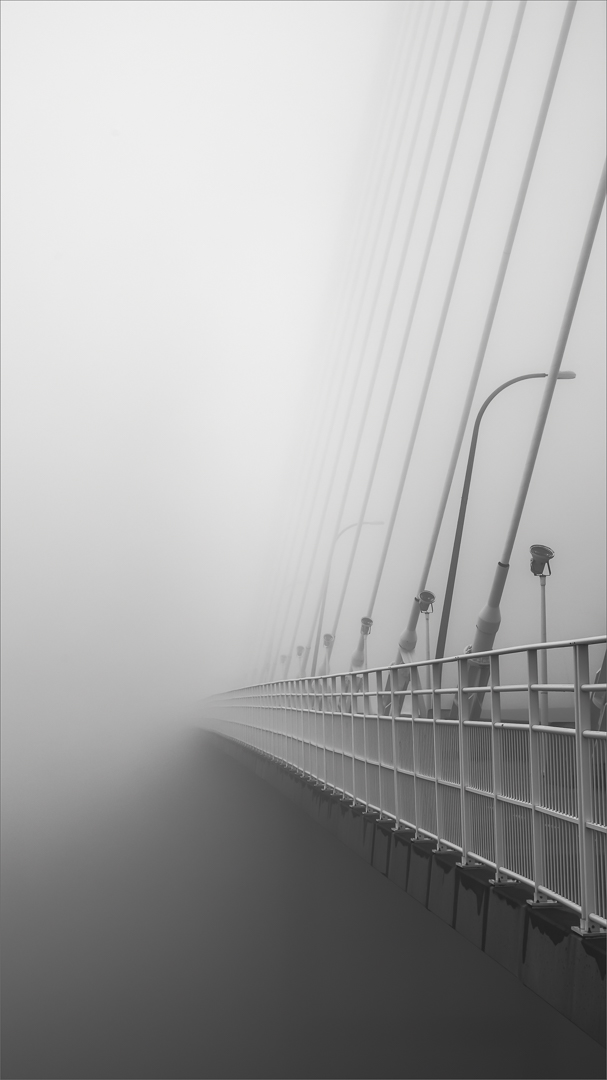
Comment |
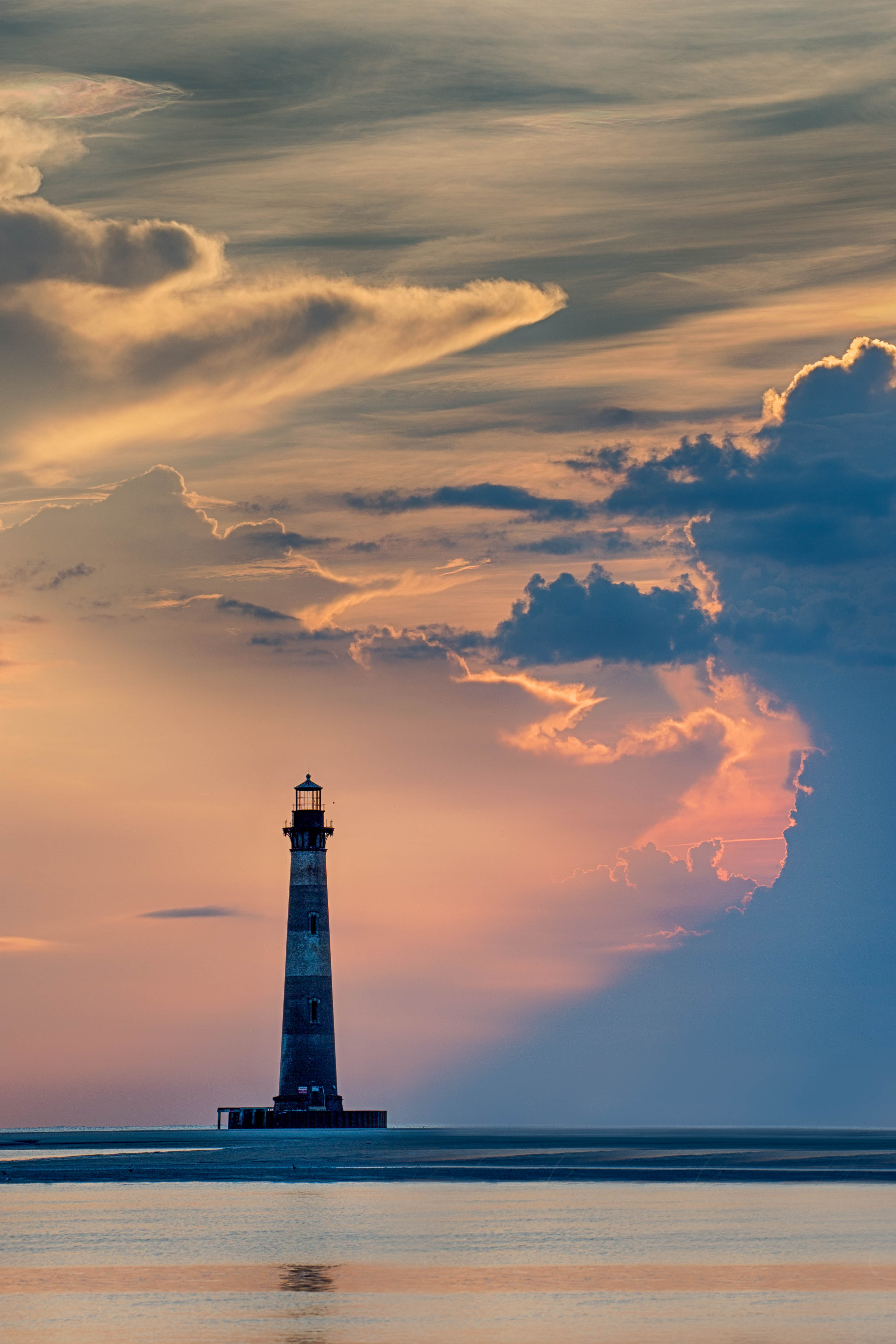
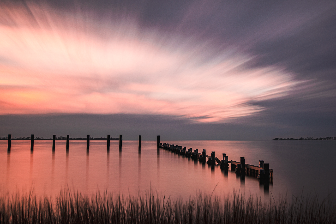
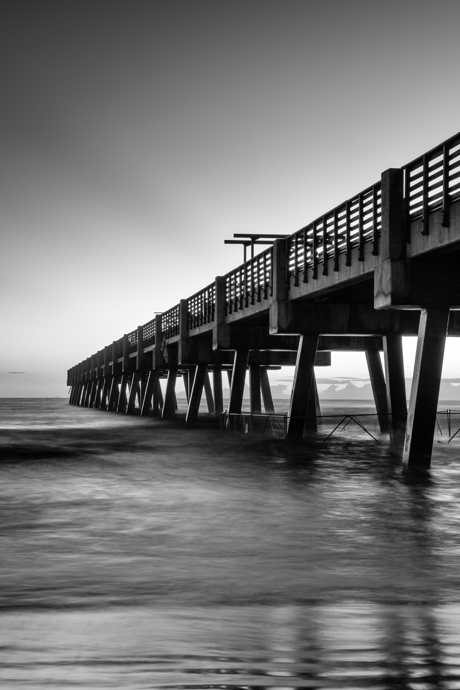
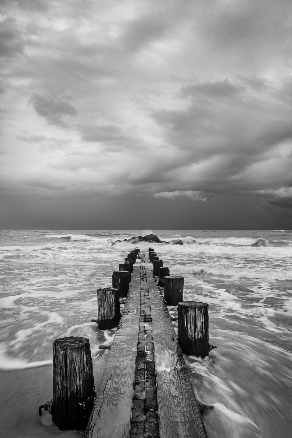
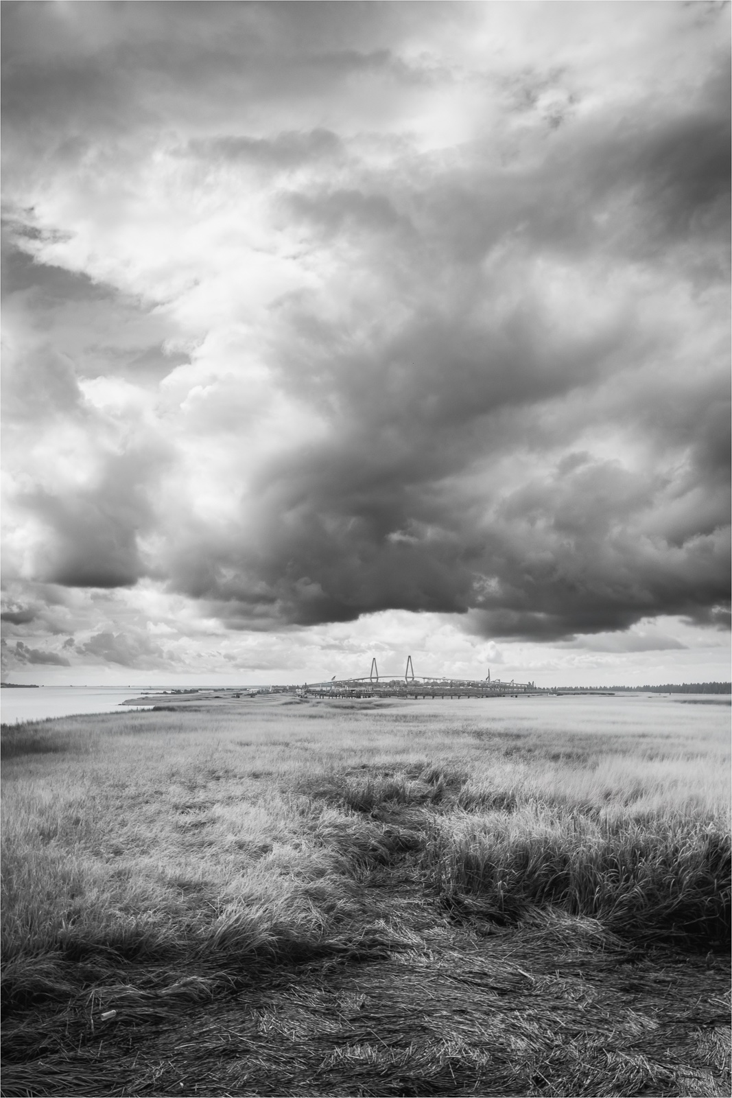
Hi Michael. Very chilly looking image! The catwalk leads my eye to nicely toward the lighthouse, and the cool tones enhance that crisp, cold feeling. The seabirds add a nice accent to the scene. I do notice a dip in the catwalk - was it caused by the strong winds or is it part of the design? The horizon seems to be wavy behind it but that could be from the strong wind gusts or just my eye playing tricks on me. |
Apr 7th |
| 36 |
Apr 26 |
Comment |
Hi Larry. From here in North Carolina, 35 degree temps felt warm this past winter - it was definitely a bitter couple of weeks here when it dipped into the single digits. Glad you got out to hike - actually winter is my favorite season to hike. In the image, I kept looking for some ice in the waterfall...maybe there's some on the left? The shot has a really nice sense of motion and texture. The lighting is soft and even which helps to keep the details in the water and rocks. The silky water gives it a painterly feel especially against the dark rocks. I might suggest cropping slightly from the bottom so it doesn't take away from the water. Nice image. |
Apr 4th |
| 36 |
Apr 26 |
Reply |
Hi Larry. Thanks for your feedback. I know exactly how you feel when trying to make a forest image pop. For this image I made adjustments to enhance the color, separation and depth but looking at it again on this site, it still doesn't quite capture that soft, ethereal fairytale feel I had in mind. I tried a quick re-edit to see if I could bring out more richness in the image. I'm not sure how much difference it makes, but talking through forest scenes helps me to refine how I approach these kinds of images. |
Apr 3rd |
 |
6 comments - 1 reply for Group 36
|
| 47 |
Apr 26 |
Reply |
Thanks Steve. Finding locations with strong foreground interest and a decent dark sky is always the biggest challenge for me in MW photography. Here on the east coast of the US, the night sky often feels like one giant light bulb. |
Apr 20th |
| 47 |
Apr 26 |
Reply |
Thanks for your comments Ed. |
Apr 20th |
| 47 |
Apr 26 |
Comment |
Hi Al. This is a very nice seascape. I've never converted a camera to IR, and a simple IR filter just doesn't work as well for me. I really like the range of tones in the upper two-thirds of the frame - the sky, trees, and rocks add a lot of interest to the composition. My only thought is the lower portion feels dark and heavy and I wish it was a bit brighter so the rocks and water have more tonal detail. That said, I understand it's the maker's choice. |
Apr 20th |
| 47 |
Apr 26 |
Comment |
Hi Kirsti. Ahh, the wilted tulip - my favorite flower for sure. I tend to leave them long after their prime just to watch how they go from their poised elegance to a more artistic character. It's probably the only flower I don't rush to discard. I'm especially drawn to the petal on the left with its long, sweeping curve balanced nicely by the petal on the right as it s towards the edge. The grain adds a nice texture and helps to bring together the background with the main subject. I do wish there was a bit more stem and space at the bottom of the frame to give the flower some additional breathing room. Nice job. |
Apr 20th |
| 47 |
Apr 26 |
Comment |
Hi Ed. Very nice capture. I'm especially drawn to it because one of the women reminds me of my late sister-in-law. The way they're interacting - so focused and engaged - makes me curious about what has captured such serious attention. The lighting is low in contrast, giving the image a slightly washed out look that complements the mood. Compositionally, the balance is strong and works nicely. |
Apr 20th |
| 47 |
Apr 26 |
Comment |
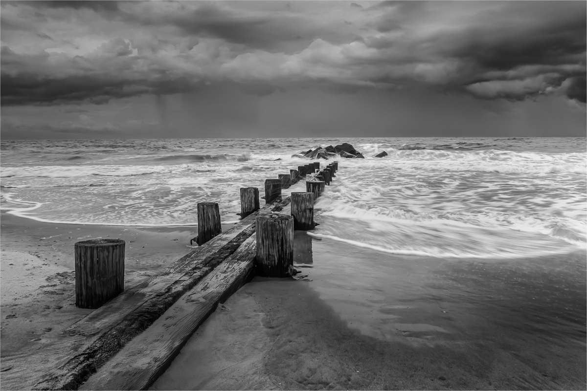
Hi Steve - welcome to the group! This is a strong image showing the energy of the waves. The conversion to B/W works well and adds drama to the scene. There's a nice variation of light and dark throughout the frame. Compositionally, I always look for balance within an image. Although the upper right rocks and trees add some weight I think the land in the distance helps to balance it. My only thought would be to see if creating more tonal variation in the clouds would make the image more impactful. |
Apr 16th |
| 47 |
Apr 26 |
Comment |
Hi Robert. What I like about this image is that it captures an everyday detail most people would overlook. The authenticity of the moment comes through nicely. I like the original composition, but Ed's flipped version highlights the window washer's refection more effectively. My only thought would be to slightly increase the contrast so that the darks are richer and the lights pop a bit more. |
Apr 14th |
| 47 |
Apr 26 |
Comment |
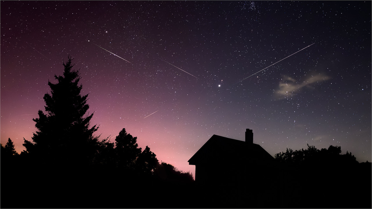
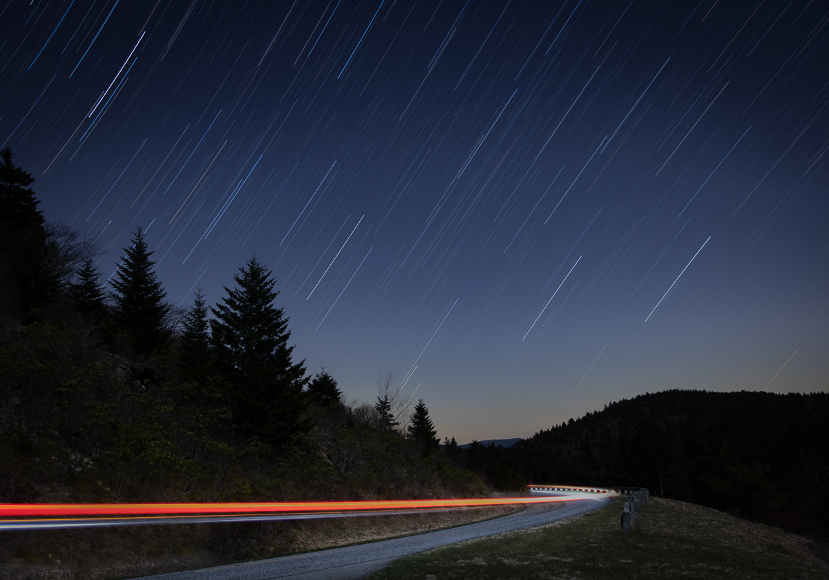
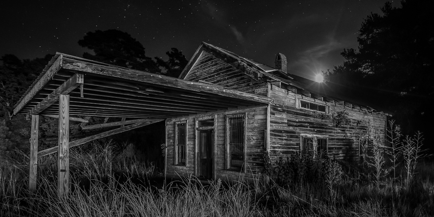
Title: Fortress of Time, Sky of Infinity
This image was captured some time ago at Fort Moultrie Historic Site along the Atlantic coast of South Carolina. I don't typically convert my Milky Way shots to black and white but this scene felt like an exception. With a waxing gibbous moon about 45 degrees up, thin clouds, and its light fading the MW, the character of the fort seemed to lend itself to a monochrome treatment. The image was cropped and denoise applied in LR. The b/w conversion was done in Silver Efex Pro and a subtle stroke was added in PS to frame it. Canon 5D Mark III, ISO 640, 16mm, f2.8, 25 sec. Tripod mounted.
|
Apr 10th |
6 comments - 2 replies for Group 47
|
12 comments - 3 replies Total
|